|
This week's Spoonflower Design Challenge is "Garden Party" and I had a really hard time trying to decide which design to enter. But I finally decided on my "Fresh-Picked" design because it has Fresh Veggies in Rainbow Colours! That just says GARDEN PARTY to me! Voting for this challenge is now open until Tuesday April 12! Check out the Voting Page to see all the entries. And click HERE to see this design in my Spoonflower Shop! **ADDENDUM: My "Fresh-Picked" design placed 24th (out of a whopping 1148 entries!) in the Spoonflower "Garden Party" Design Challenge! See all the winners HERE! 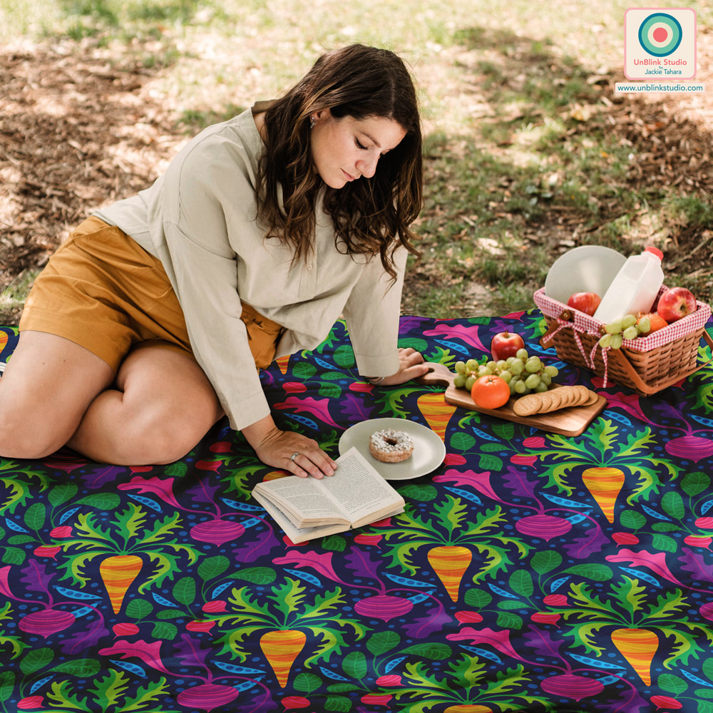 With thanks to The Indoorsy Project for this picnic mockup! 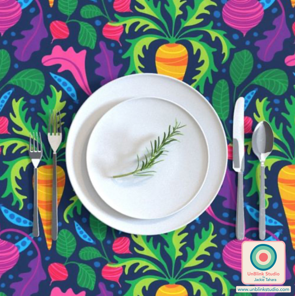
0 Comments
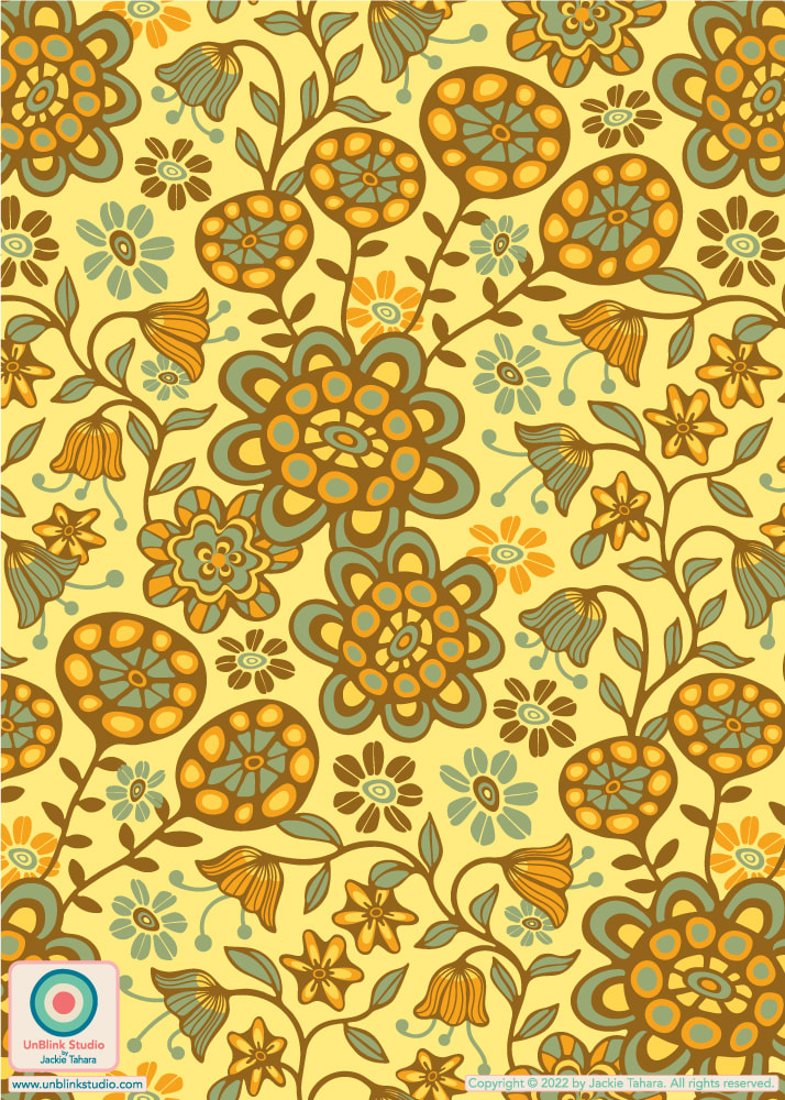
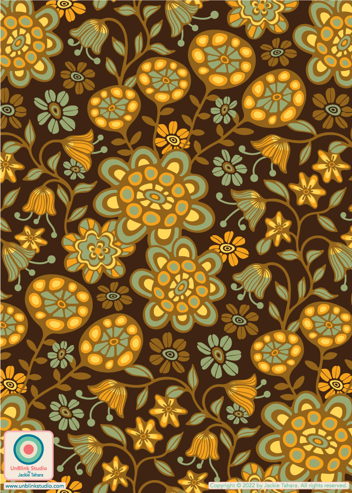
For this week's Spoonflower "LainSnow X Spoonflower: Floral Wilderness" Design Challenge, Spoonflower partnered with woman-owned swimwear brand LainSnow which requested a small-scale, boho-influenced floral print in sage green, yellows and coffee browns. The winner will have their design licensed by LainSnow! I entered the first yellow version of my "Garden Wild" floral, but also couldn't help adding a coffee brown version to my Spoonflower Shop too! I would love a vote for this one, so I've added a handy link to the Voting Page! Thanks to all (voting closes April 5)!
I've entered my "Blooms" design in this week's Spoonflower "Maximalist Folk" Design Challenge! BTW: this design is available in other co-ordinating colours too! I wasn't sure which colourway to enter in the Challenge, but I ended up entering the first version. What do you think, which one would you have entered? Voting ends Tuesday March 29! Check out the design in my Spoonflower Shop HERE or click on each image below!
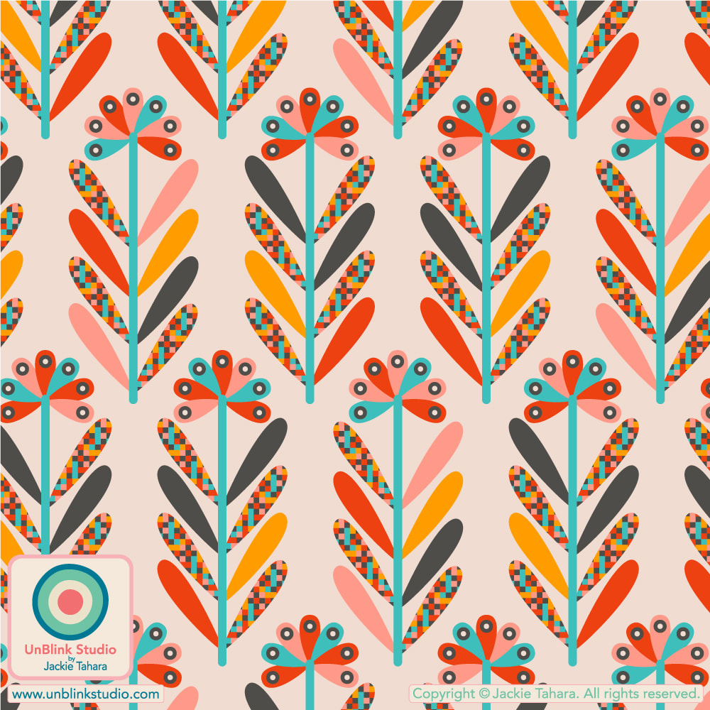
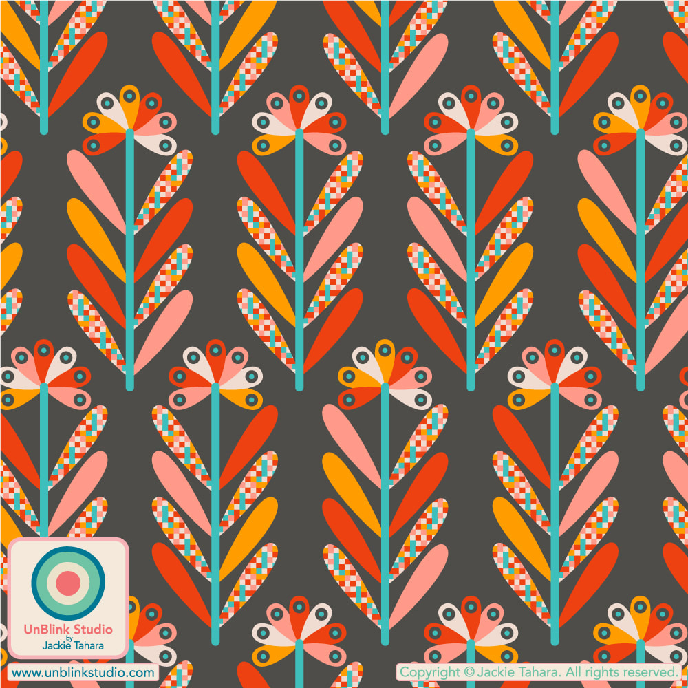
This Week's Spoonflower Design Challenge: "Petal Coordinates Limited Color Palette: Candy"!3/10/2022 The idea behind this week's Spoonflower "Petal Coordinates Limited Color Palette: Candy" Design Challenge was to create a pattern design using the 3 given colors of Cotton Candy, Lilac and Seaglass with optional Black and White (I love these kinds of challenges!) Here is my entry, "It's A Jungle Out There"! Voting is open now until March 15, and you can check out all the entries at the Voting Page! BTW: This floral now comes in a bunch of other colourways too...Of course, I couldn't resist the opportunity to play with colour! Check out all the colourways HERE!     If you know me, you probably realize that I don't really do "neutral" alot! So when I saw this week's Spoonflower Design Challenge is "Neutral Botanicals Grasscloth" Wallpaper, I felt some chagrin. But I rose to the occasion and created my "Gladiolus Garden" design in warm neutrals...And you know what? I like the soft colours! Then I realized: Neutrals Are Colours Too!! . OF COURSE, there is a more brightly-coloured version of this design in my Spoonflower Shop too, see below! If you want to check out the entries, head to the Voting Page! And if you would like to see these designs in my Spoonflower Shop, check them out (and other co-ordinating designs) in my "Abstract Floral" Collection!
 So I must admit to some chagrin when I saw that this week's Spoonflower Design Challenge was "Pockets". I mean...What to do with this one?! I procrastinated for awhile, and then some more, then sat down and started making random pocket shapes, then added some "lace", then I decided I needed some bright colours, then thought pockets full of flowers might be fun...And after ALOT of fiddling around with placement, colours, wavy stems, and finally, adding some polka dots...Here is my "Rainbow In My Pocket" design. I entered the first version with the dark background, but did add both colours to my Spoonflower Shop in 3 sizes! What do you think, did I enter the right one?! 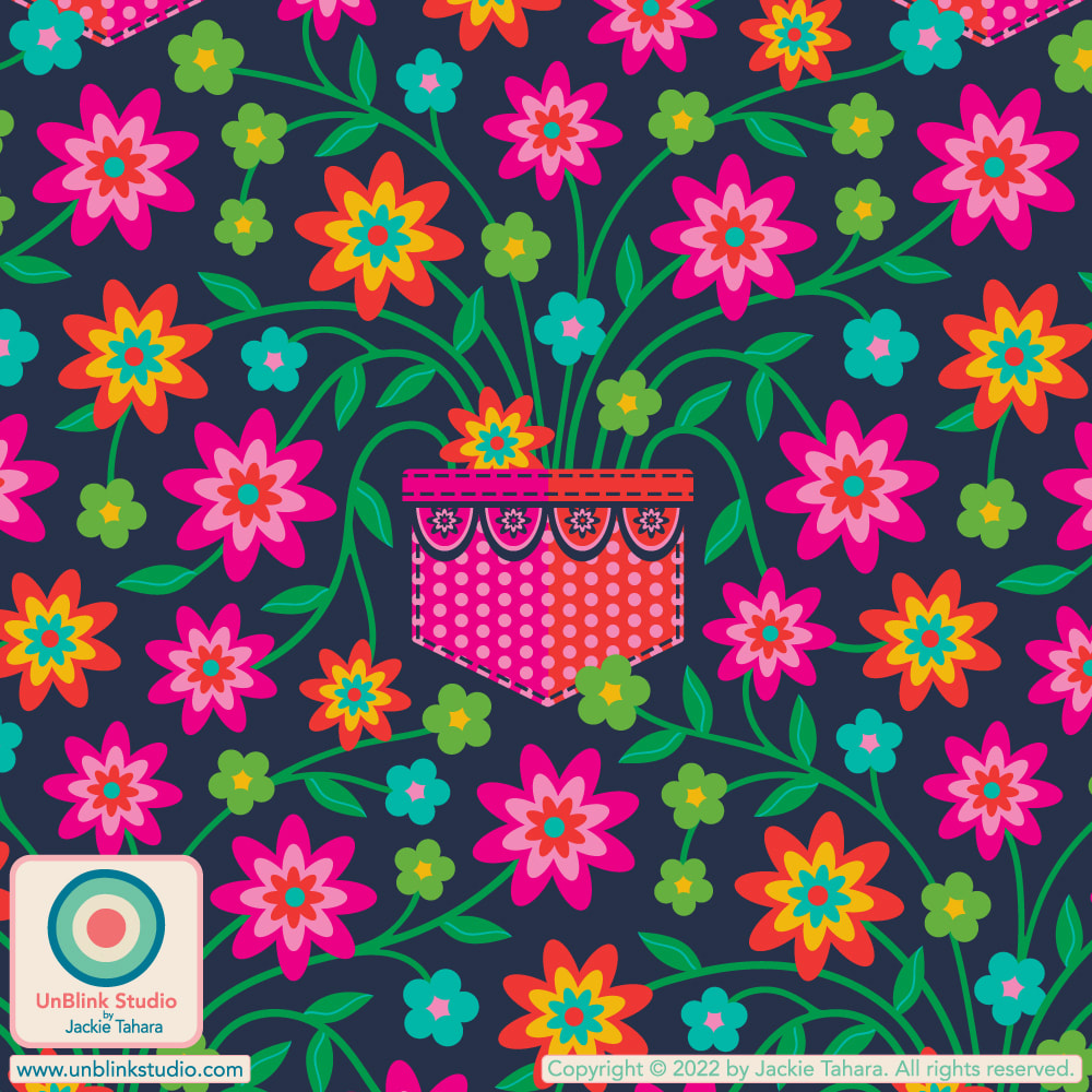 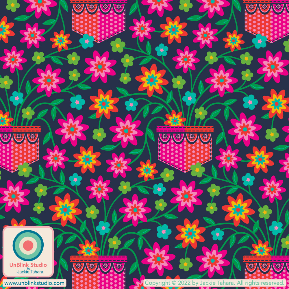 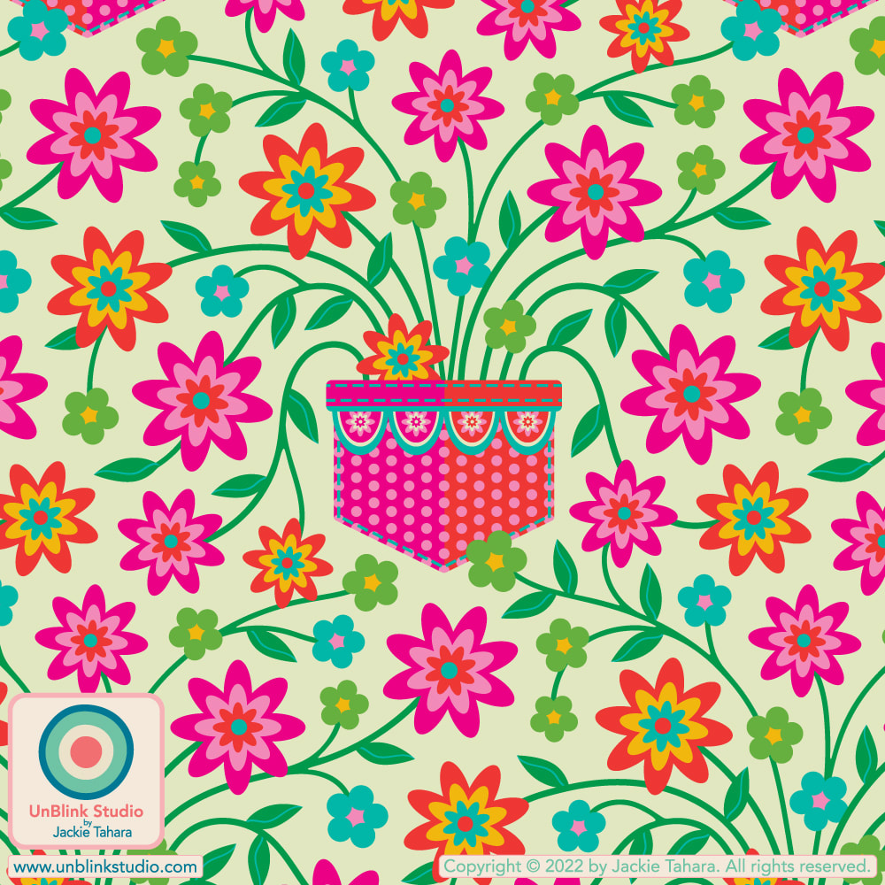 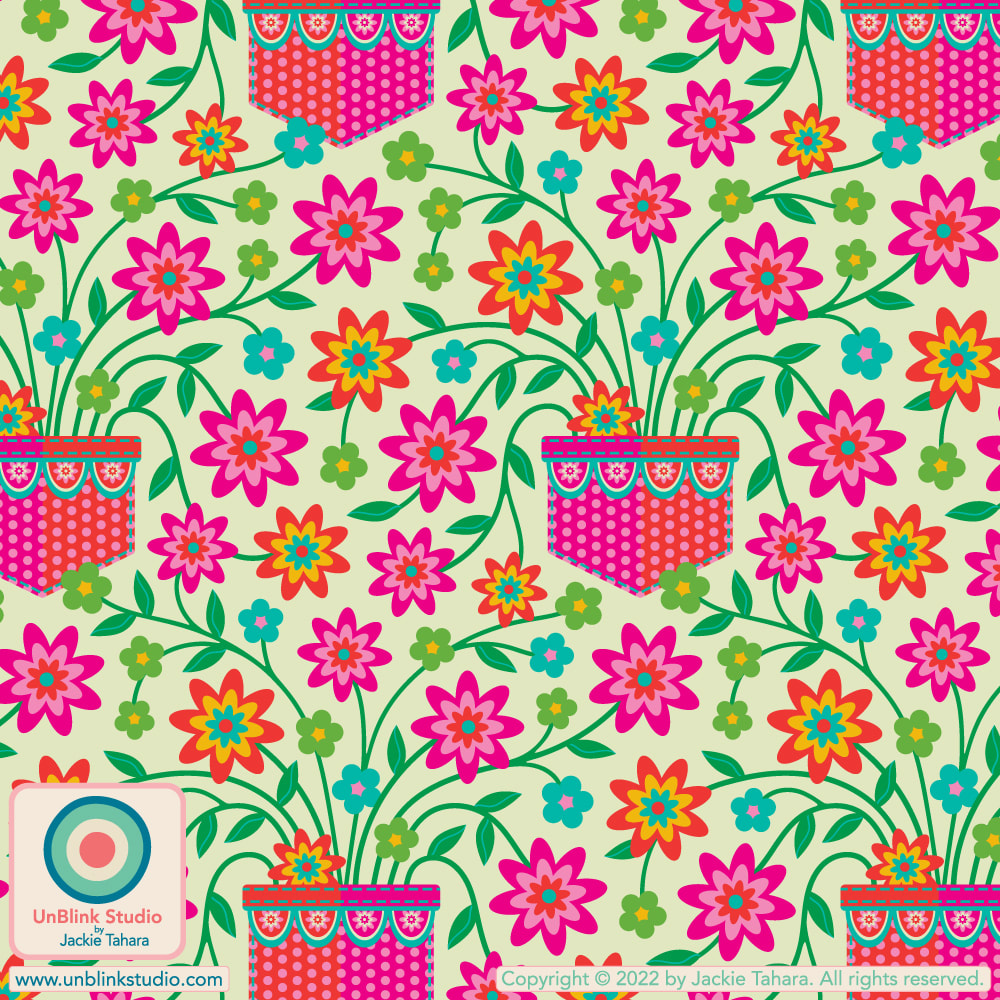 Here is a portrait of Kenny G shot by amazing photographer Chris Chapman at the Deadline Studio at last years TIFF 2021 with my “Folk Flutter” design in the background (printed by Spoonflower)! Read on for what Chris says about this collaboration (as quoted from his Jan 25 2022 Instagram Post @ccphotophoto)... . With THANKS to Chris Chapman Photography and Spoonflower for the rush printing! . If you love this design, check it out in my Spoonflower Shop HERE. 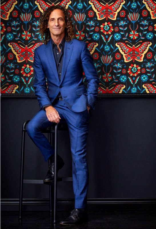 Photographer Chris Chapman says: "Here’s an unpublished portrait I shot of #smoothjazz phenomenon @kennyg at the @deadline studio during last year’s tiff. Love him or hate him , the man is a bonafide success story…one of his albums is the highest selling instrumental album of all time , and his total worldwide sales are 75 million and rising ….a remarkable accomplishment for an instrumentalist. He was in town to promote the @hbomax documentary #listeningtokennyg from director #PennyLane. From Wikipedia :
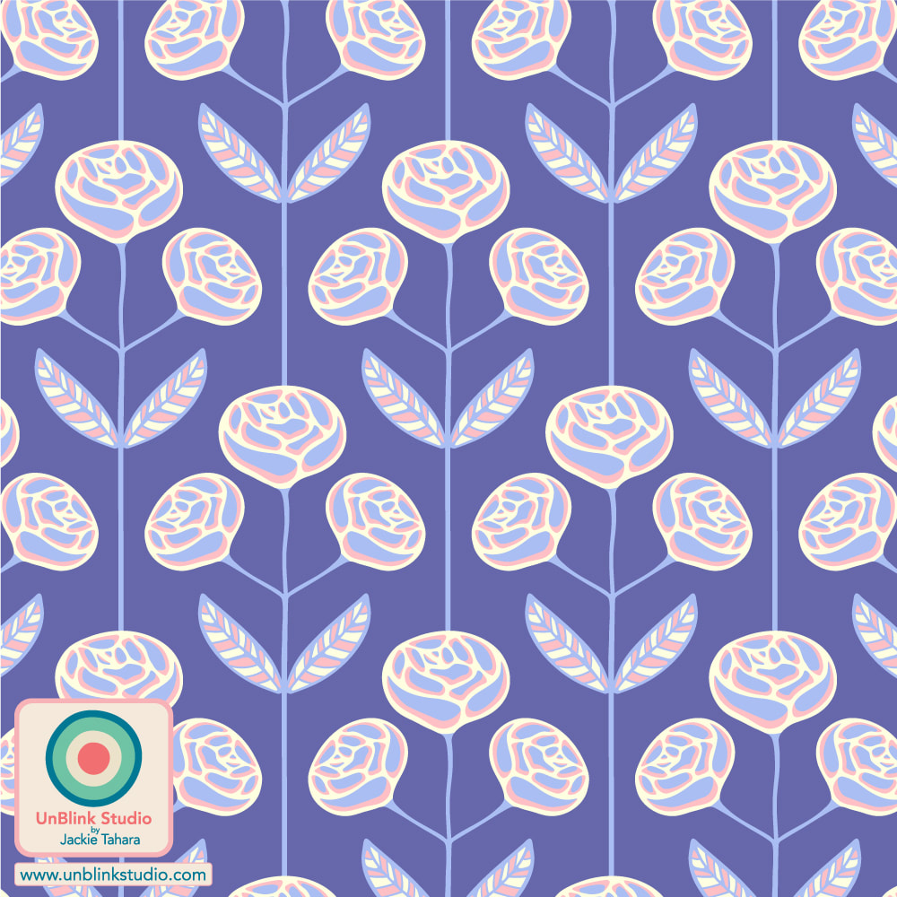
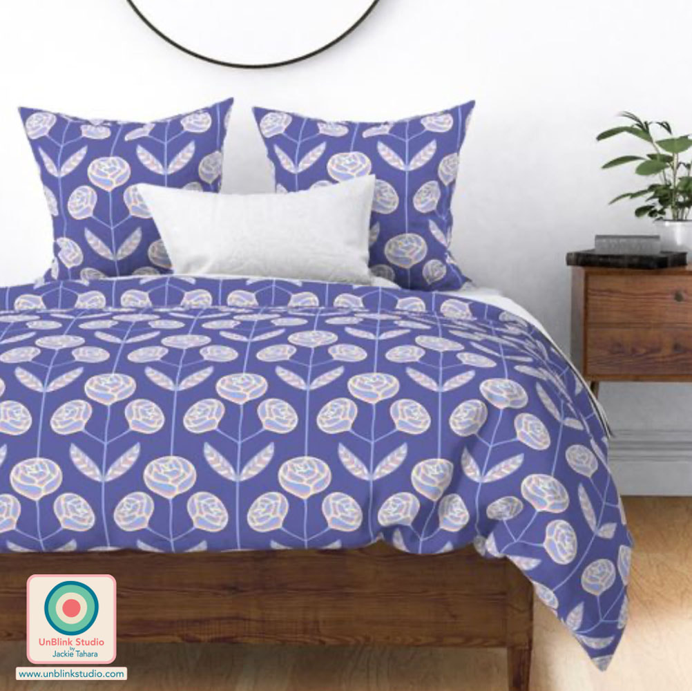
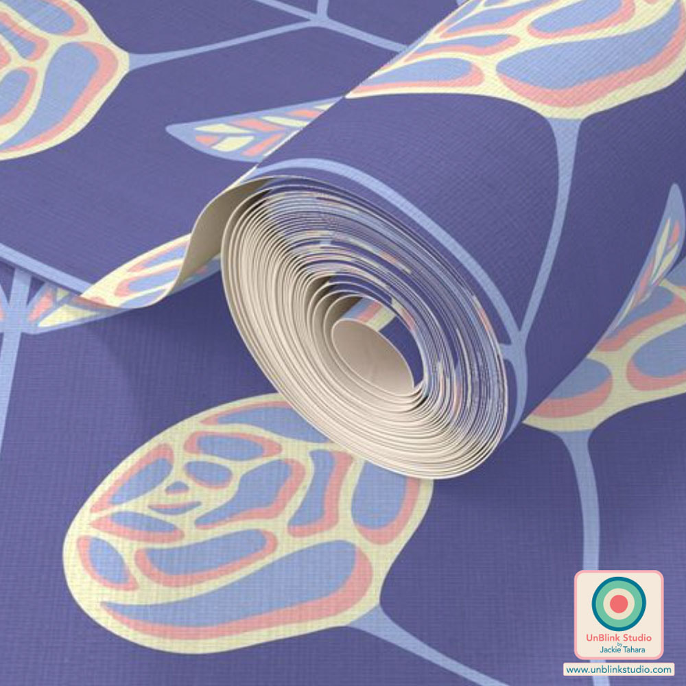
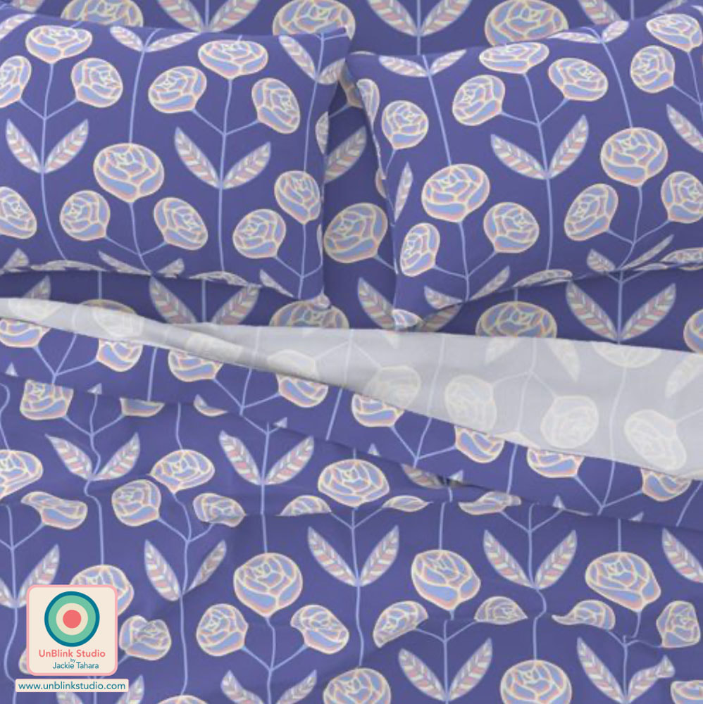
“In 2021, HBO Max started streaming director Penny Lane's documentary Listening to Kenny G, with the subject of the film not having had any control over its content. Lane stated she chose Kenny Gorelick as her subject because he is "a musician who is objectively popular, by way of record sales, but is also hated by the 'critical class'."Richard Brody, in a New Yorker report, cited Kenny G in the film responding "cheerful[ly]" to a question about what he loves about music, with, "I don’t know if I love music that much," and continuing, "when I listen to music, I think about the musicians and I just think about what it takes to make that music and how much they had to practice." I haven’t had a chance to watch it yet , but it’s def on my list for 2022. Either way , the man himself was extremely cordial and a pleasure to meet and photograph . He expressed to me how much he personally liked this shot , which is something you always hope to hear from your subject . No doubt , the whimsical background with its rich colors and graphic style ( from the super talented Jackie Tahara’s @unblinkstudio and her production collaborator @spoonflower ) are what makes this pic so special …i felt like it was a good fit, evoking a kind of musical playfulness, and made his electric blue suit pop . Shout out to @klaus_on_king for lending me the stool Mr.Gorelick is perched on. #tiff21 #deadlinehollywood #kennyg #hbomax #unblinkstudio #spoonflower #klausonking #tifftuesday ©️Chris Chapman" **Photo courtesy of Chris Chapman Photography and @deadline. I've entered my "Lola" symmetrical rose design into this week's Spoonflower "Pantone Color of the Year: Very Peri" Design Challenge! I do LOVE this colour...Check out the Voting Page to see all the entries, and check out my design in my Spoonflower Shop (it comes in 3 sizes)! . NOTE: Spoonflower has just added natural woven textured Grasscloth Wallpaper to its product range, made of 100% handcrafted natural sisal!
|
AuthorJackie Tahara of UnBlink Studio Archives
April 2024
Categories
All
|
 RSS Feed
|
|
|
|
|
|
All images on this website are Copyright © Jackie Tahara. All rights reserved.
If sharing, pinning or blogging my images, please always credit me and link back to my website. Supporting artists is a good thing to do! Thank you!
If sharing, pinning or blogging my images, please always credit me and link back to my website. Supporting artists is a good thing to do! Thank you!