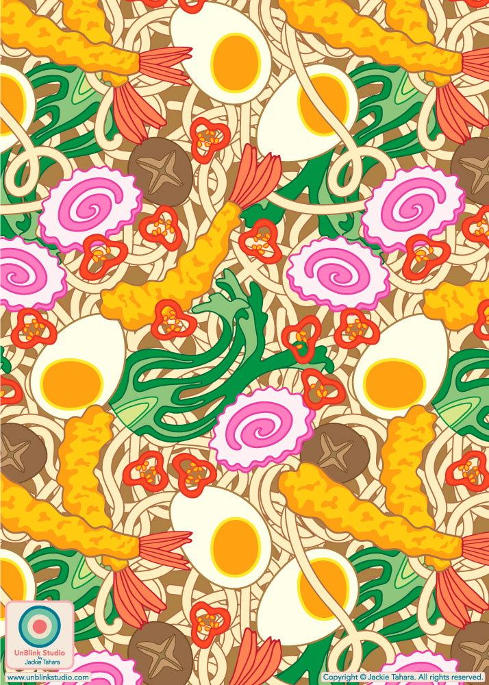
My Entry for the Spoonflower "Treat Yourself" Design Challenge: "Tempura Udon" (Of Course!)4/3/2024 The current Spoonflower Design Challenge is “Treat Yourself” and here’s my idea of a special treat! Imagine staring into a big steaming bowl of “Tempura Udon”, especially if you’re sitting in a little noodle ya in Kyoto after a full day of sightseeing and wandering about, on holiday...but I digress...
Public voting for the “Treat Yourself” Challenge opened Thursday March 28 and closes next Tuesday April 9. You can link to the Voting Page HERE! . Eye Roll Note: When I asked my husband what he thought of my new “Tempura Udon” pattern design (I really like it, so I thought he’d say “Cool!” or “Groovy!”), you know what he said? “It looks like it’s in a square bowl”. Yeeees, but it’s a repeat pattern, soooo....🙄 . SHOP This Design! This yummy design is now available in my Spoonflower Shop on Fabrics, Wallpaper and Home Decor in several scales. You can SHOP the Medium-Scale HERE, but there is also a Large-Scale and Small-Scale version in my Shop too! If you prefer, my "Tempura Udon" print is also available in my Happywall Shop on FUN Wallpaper too! Ships from Sweden!
0 Comments
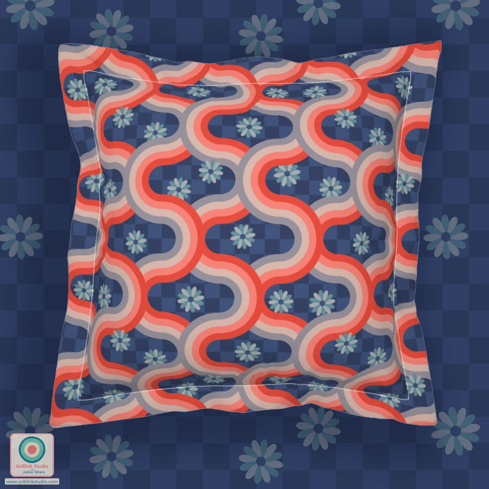
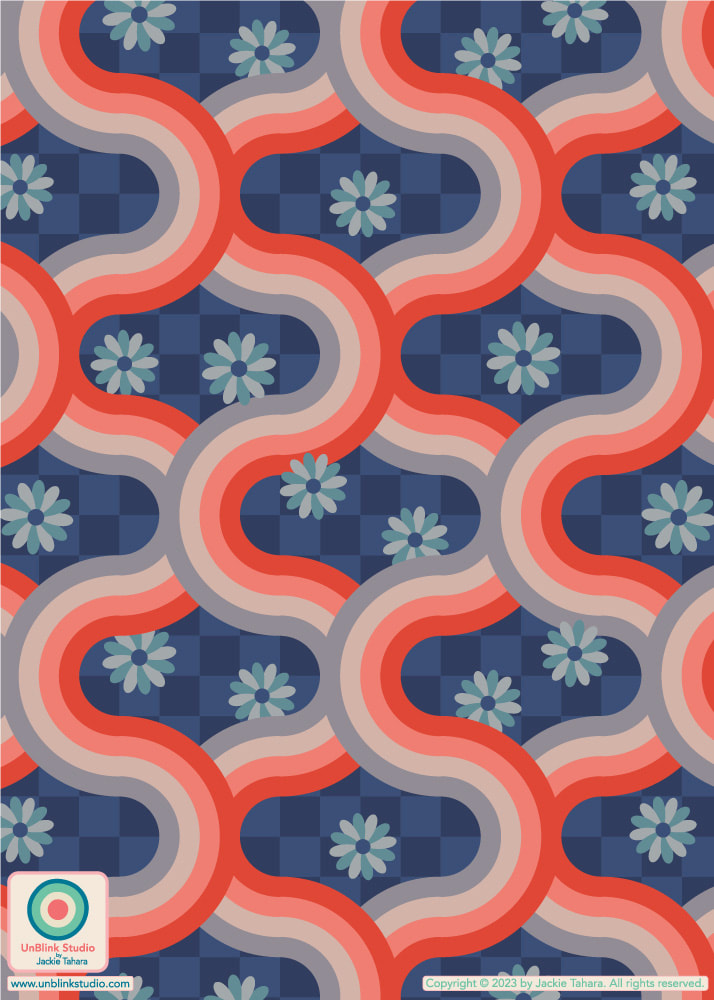
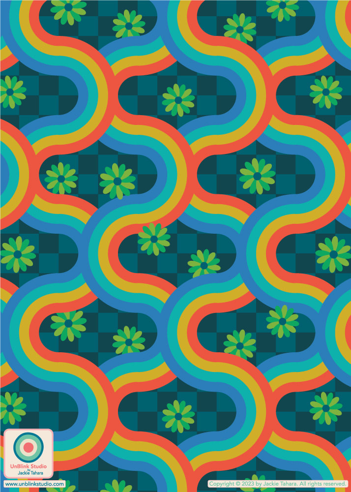
This week's Spoonflower Design Challenge is "Pattern Clash". The idea is to combine different types of patterns in one design for maximalist home decor or funky apparel fabric. So here is my brand new "Kyoto" pattern: it's a retro geometric on a checkerboard with florals. Pattern Clash, right?! Currently, it's available in TWO different colourways: Rust Red Blush Gray on Blue Checkerboard and Bright Rainbow Colours on Teal Checkerboard (see below), although I just might have to try this one out in some other colours! I did decide to enter the first version on the advice of many of you, thanks for letting me know your preferences!
Voting for this Challenge opens Thursday May 11 and you can link to the Voting Page HERE. If you would like to see these designs in my Spoonflower Shop, just click on the IMAGES below. Each colourway is available in four sizes: Tiny-, Small-, Medium- and Large-Scale! To quote from one of my favourite 90’s TV Shows: THE TRUTH IS OUT THERE...
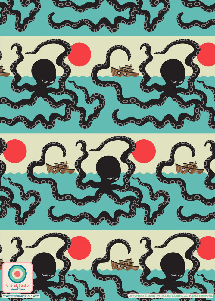
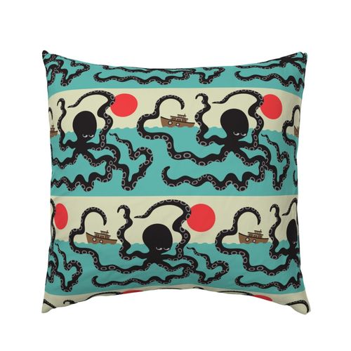
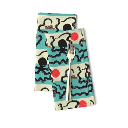
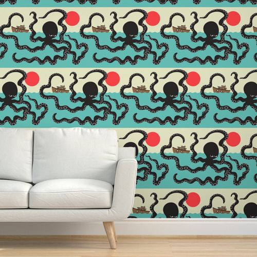
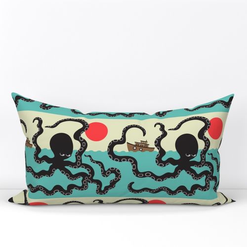
For this week's Spoonflower "Cryptozoology" Design Challenge, I decided to make a design featuring the Akkorokamui, a giant octopus sea monster believed by the Ainu people to live off the coast of Hokkaido, Japan, and feared by local fishermen. Given the subject matter, I tried to give this design a Japanese-style graphic design feel! Check it out at the Voting Page and in my Spoonflower Shop! FYI: Cryptozoology is the study of creatures, called cryptids, whose existence has not been scientifically proven or disproven (other examples: the Loch Ness Monster, the Yeti, Sasquatch or Chupacabra!) Cue: X-FILES theme music... For this week’s Spoonflower “Off the Wall Toile” Design Challenge I thought my “Edo” design would be perfect! And it made me nostalgic for the family trip we took to Japan in 2018...what a different world we live in now.
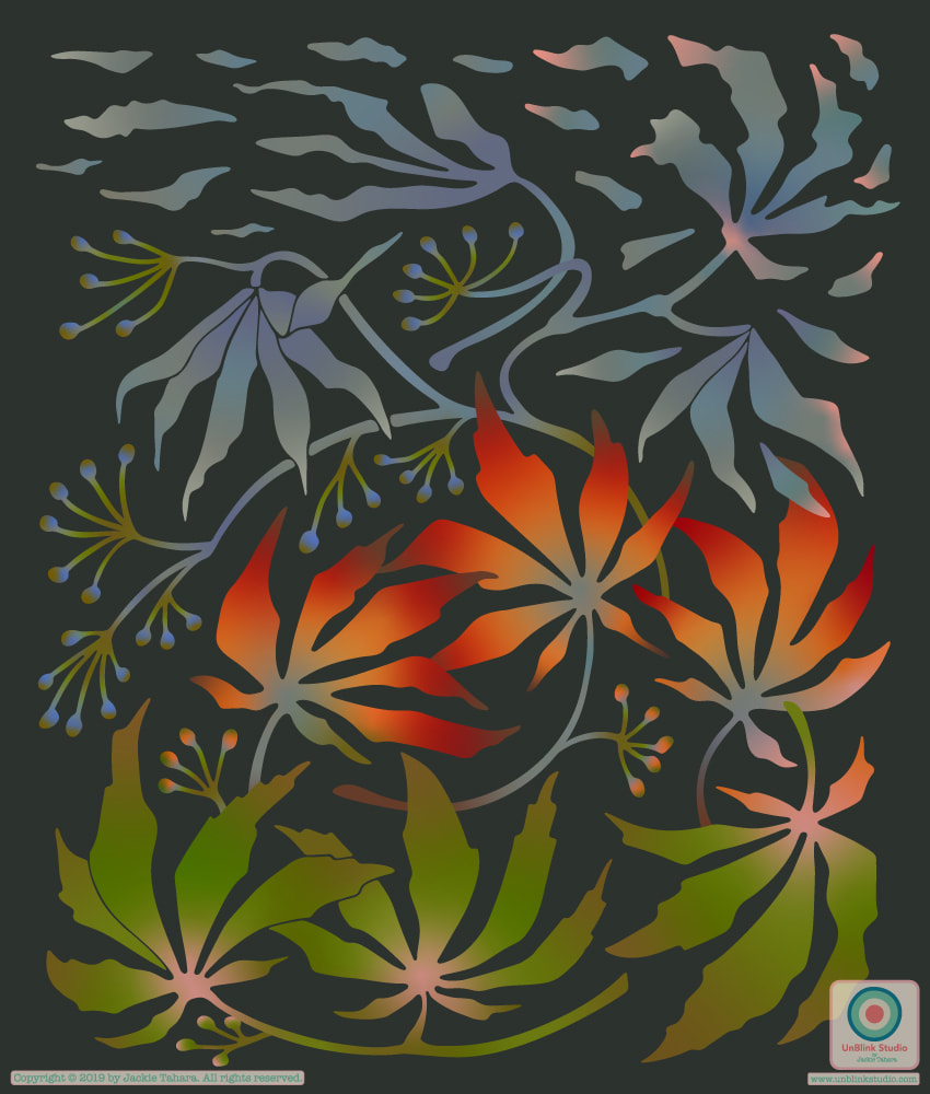
If you want to see all the entries, check out the Voting Page! This month's MATS Bootcamp assignment was to illustrate a magazine article about the Japanese concept of wabi sabi which celebrates transience and the beauty of imperfection. I decided to show the Japanese maple leaf in a changing cycle of seasons, Summer to Fall to finally, blowing away in the wind. I also tried to keep the colours a bit subdued (it started out way brighter!), to give it a more quiet and calm feel, and maybe with a bit of Japanese kimono colour too. BTW: I decided to try out the spot gradient tool in Adobe Illustrator for the first time, and boy, is it fun! In a way, it felt very wabi sabi to me (even though digital) because you can add these spots of colour here and there and the resulting gradations and interactions of the spot colours resulted in some surprising colour gradations which I thought were kinda beautiful, so in a way using this tool felt a bit wabi sabi because you never knew quite what was going to result!
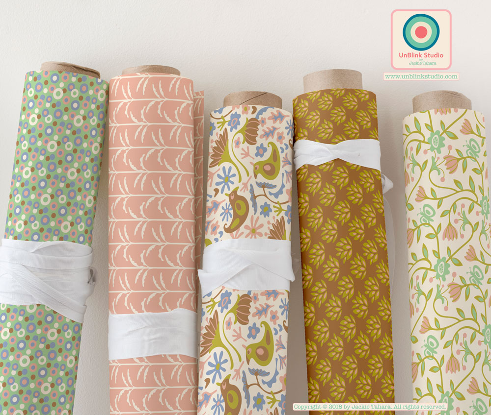
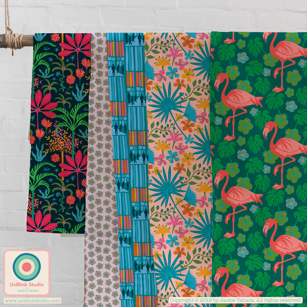
I've been playing with my newest pattern designs the last few days, and visualizing them on pillows and fabrics! I think my Far East Collection would look gorgeous on a set of pillows; my Fanciful Collection would be great for quilters or girl's dresses; my newest tropical patterns, including my Botanical Gardens Collection, Celestun and Hibiscus, would cheer up any wardrobe or interior space, and I think my Koyasan Collection would be so calming in any room! What do you think?! Can you envision these designs on other products? Let me know!
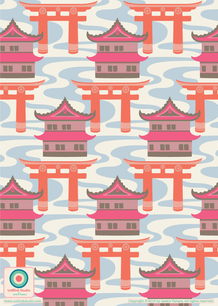
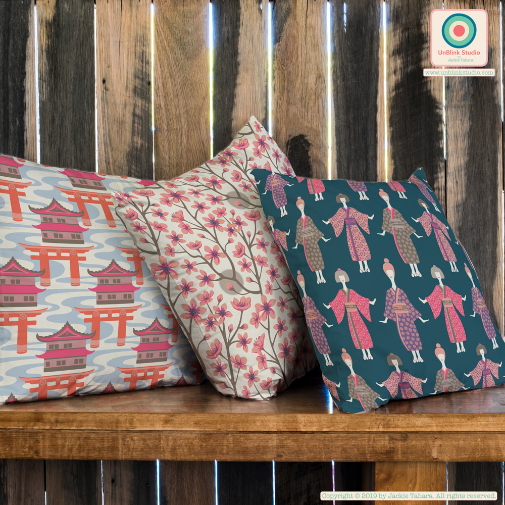
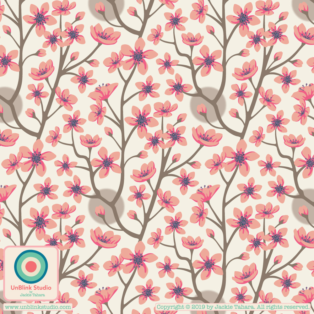
Thought I would share one of my latest pattern designs today! This month's theme in The Colour Gang, as I've mentioned in previous posts, is travel inspiration and I chose Japan as my inspiration (since I was fortunate to have visited there last summer!) So here is my "Edo" design named for the name of the ancient Japanese capital where Tokyo now stands. The temples, castles and torii gates are amazing and are part of everyday life all over Japan. I MUST go back! Although I posted them in previous posts, here also are the other two designs in this collection, "Kimono Ladies" and "Cherry Blossoms".
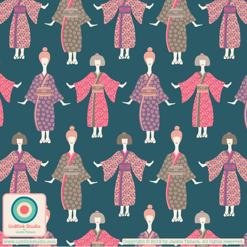
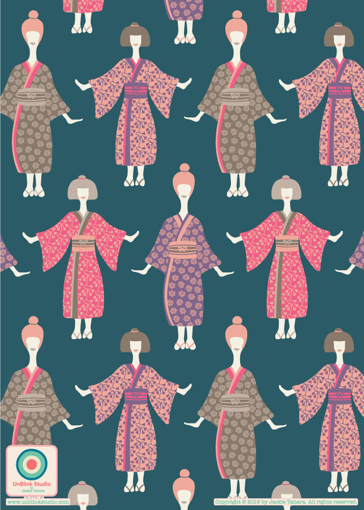
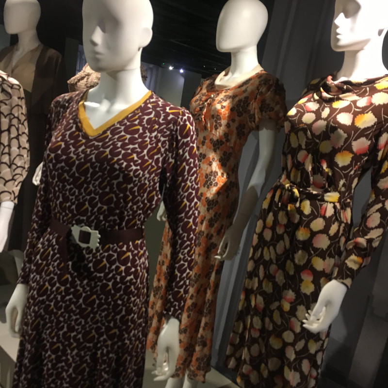
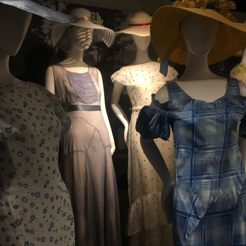
Still Thinking About Japan...Two New Co-ordinating Patterns: "Kimono Ladies" and "Cherry Blossoms"1/14/2019 I think I tried a gazillion different colour combos for this one. All I knew is I liked the colour of the blue background and that I wanted some neutral-y colours too. I tried to use the Japan moodboards I had created last week (see my earlier post!), but it just didn't work for me! So here is a brand new colour palette for this one! And I guess it was influenced by 2 trips I took recently: one to London where I saw all the dressed mannequins in a show of 1930's fashion at the Textile & Fashion Museum and my summer trip to Japan! Let me know what you think of the colour palette AND whether you think it is a little "weird" looking! I also included a couple photos of the mannequins too.
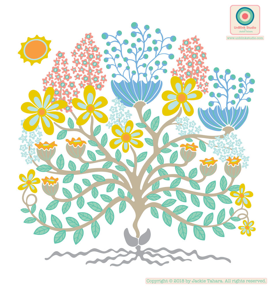
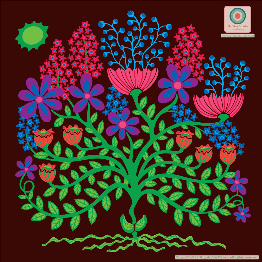
AND I had to add another Japan-inspired pattern to coordinate with this one...Cherry Blossoms, of course! Check out my previous post for the brand new colour palettes I developed in the Colour Gang for this month's "Cultural Influences" theme, including one I am calling "Neon Nights". Here is the first re-colour of one of the two designs I originally created to submit to the Uppercase Magazine cover contest (it didn't get printed in the magazine, but my other submission did!) The first image is the original design, as submitted to Uppercase. The second one shows how the re-colour based on my "Neon Nights" colour palette really changes it! I love both, but would be very curious to know which you prefer?! As a designer, it is always hard to decide between going bright or more subtle, or a combo of both. Oh, and I think "Flower Burst" would be a great name for this one!
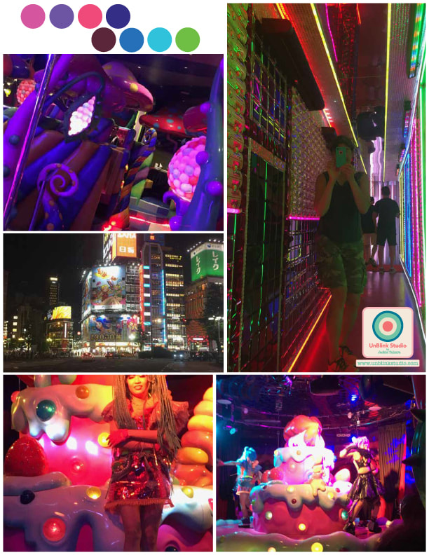
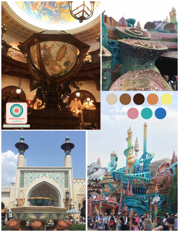
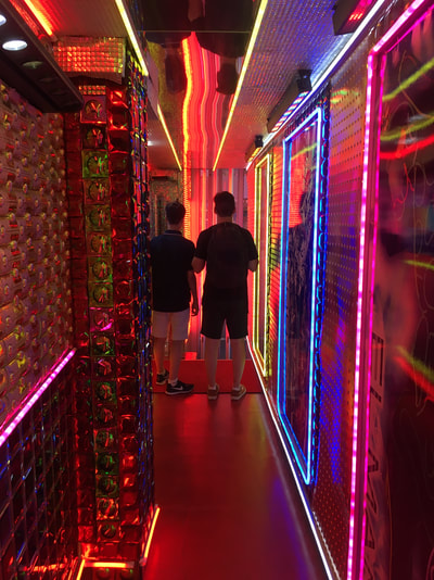
Ohhh, I'm going to like this month's theme in the Colour Gang--Cultural Influences! I love to travel, and was fortunate this summer to visit Japan, so I'm going with Japan for the first January Colour Challenge. Step 1: create a colour palette inspired by Japan! Using photos from our trip, I created two, deciding to forgo the more "traditional" images of Japan (kimonos, temples, gardens, etc.) and focusing on the less traditional. The first moodboard, "Neon Nights, is all about the "wacky" side of Tokyo/Osaka...neon lights, Robot Restaurant, Kawaii Monster Cafe (google it!) The second one, called "Warm Fantasy" has scenes from Tokyo DisneySea which my kids (and I) thought was beautiful, particularly the Arabian Coast area and Magellan's Restaurant (with Ariel's Playground in there too). Colours are amazing in Japan! Next step: some new pattern designs!
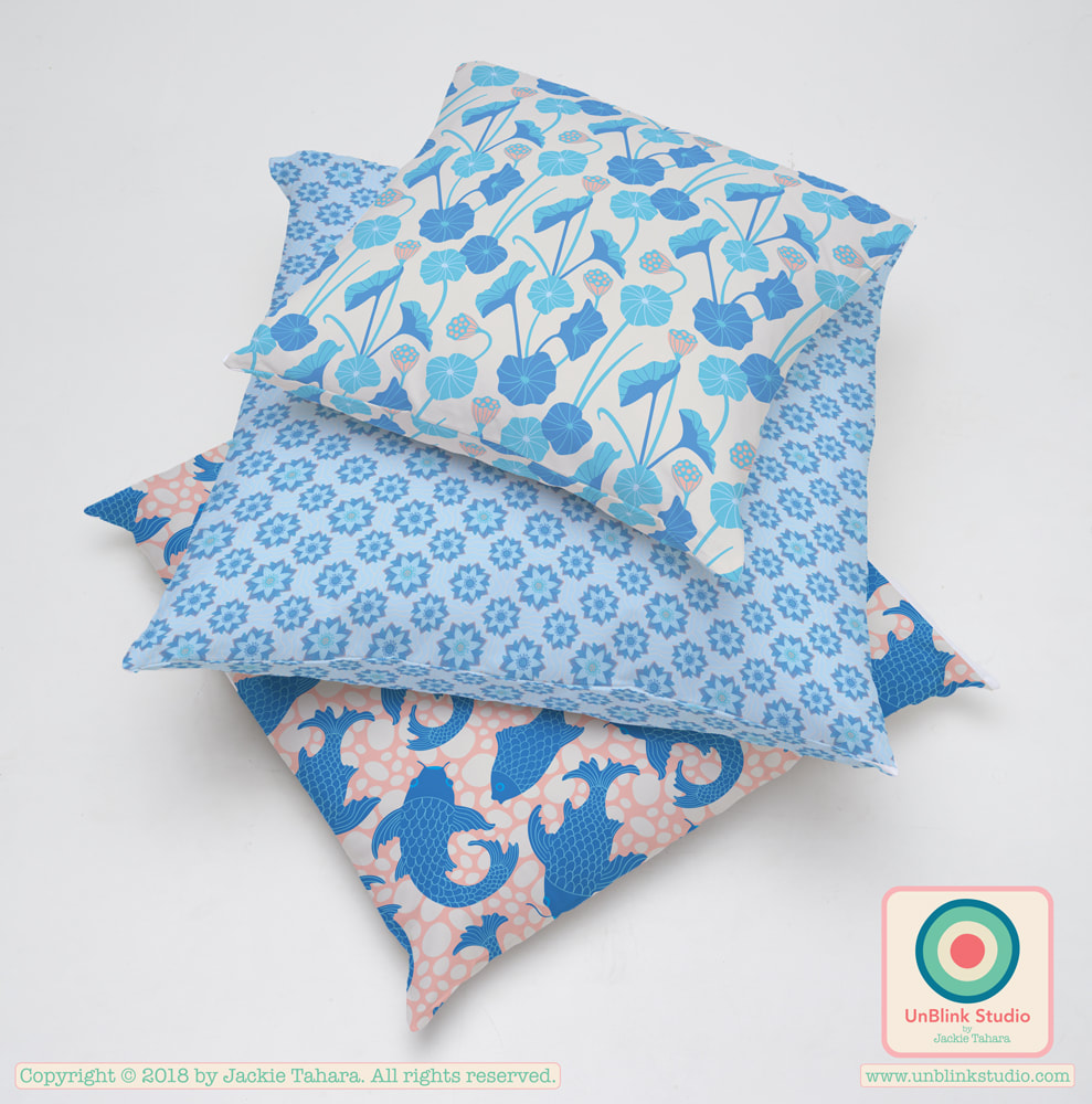
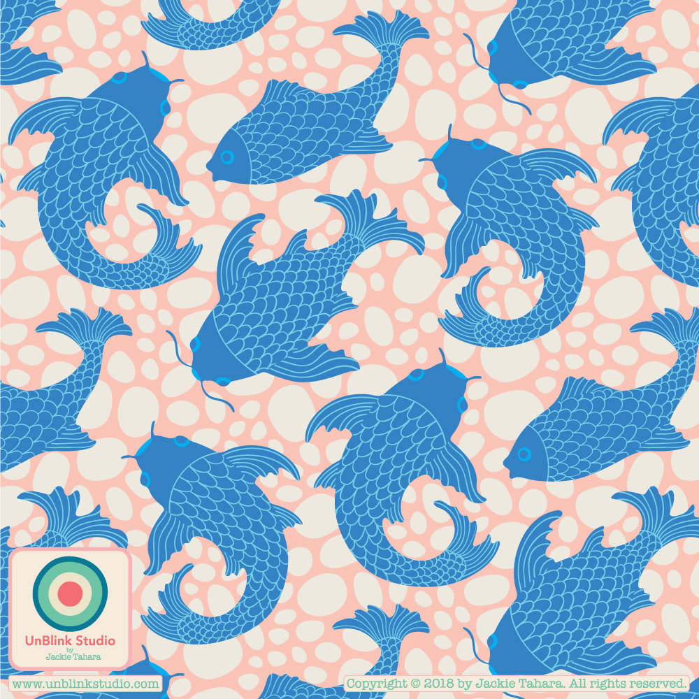
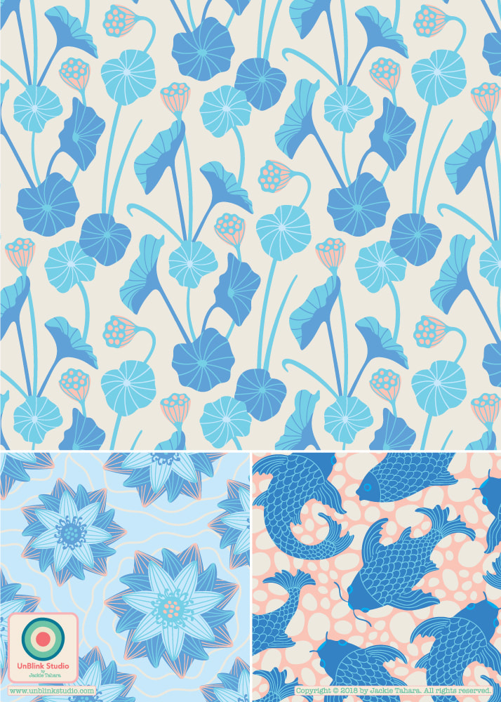
Thought I would keep going with the blue palette this week in The Colour Gang...so I added this new "Koi" pattern design to go with my "Lotus Pond" and "Enlightened" pattern designs. The second image here puts them all together! Hope this collection makes you feel calm and peaceful!
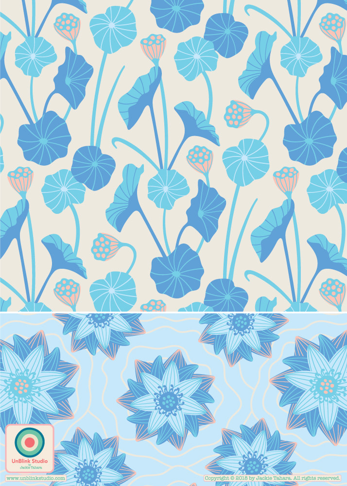
Happily, one of this month's creative challenges in The Colour Gang was to design an all-blue pattern design! Blue in all it's variations are favourites of mine: turquoise, azure, sky blue, cobalt, indigo, cerulean, cornflower, ultramarine, royal blue, lapis...I love them all. Blue is also calming and ethereal, so I thought what better subject but the lotus flower, often associated with spiritual enlightenment! Here is my "Lotus Pond" and "Enlightened" pattern designs. I also thought that the Lotus Pond pattern would be wonderful as wallpaper! Enjoy!
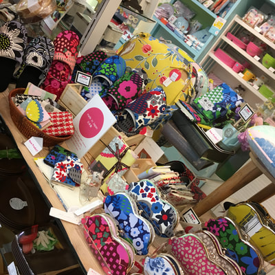
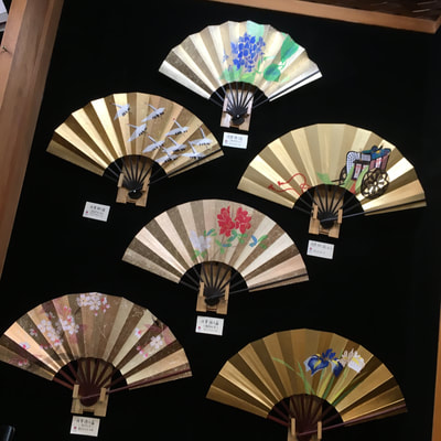
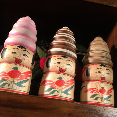
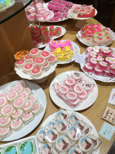
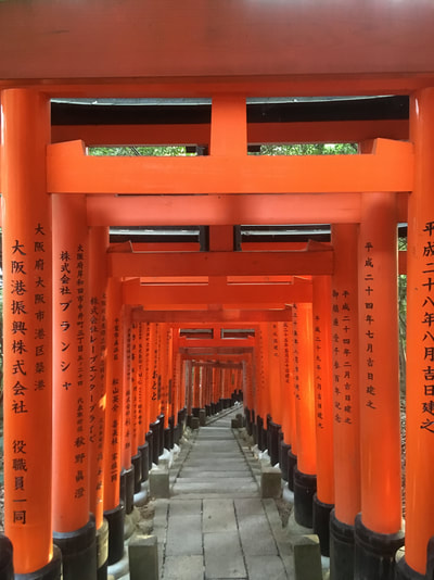
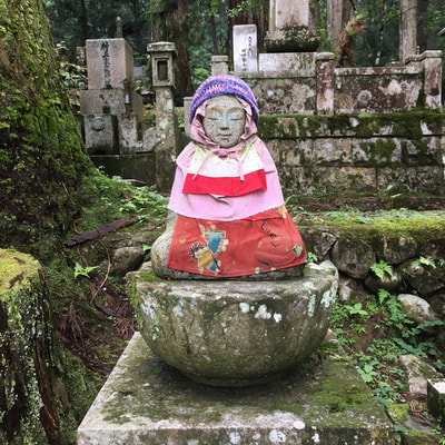
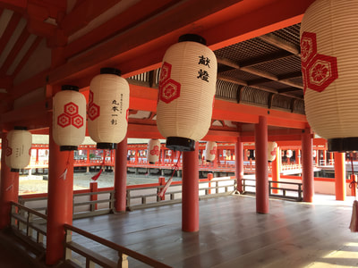
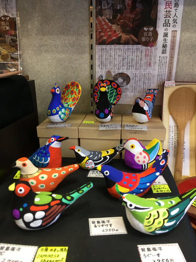
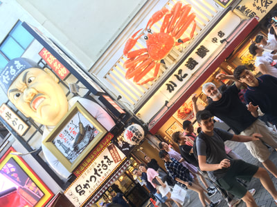
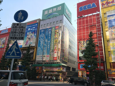
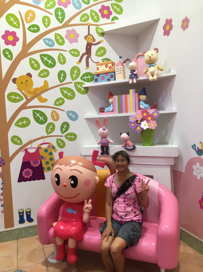
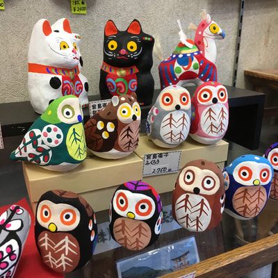
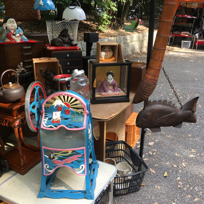
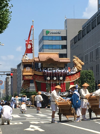
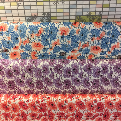
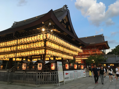
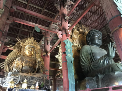
Hello! It's been awhile since I posted here because my family and I were fortunate enough to travel to Japan for an extended summer vacation and I just got back. Japan is inspiring, wacky, efficient, spotless, sparkling, colourful, calm, ancient, cutting-edge modern, delicious, solemn, thought-provoking, mysterious...in a word, MARVELOUS! I have travelled quite a bit over the years, and I have never been anywhere quite like it. The food is outstanding, the people are wonderful, travel is easy (once you get the hang of it!), the design and art are utterly fabulous. It gave me all kinds of design inspiration: from flea markets full of fabulous "junk", antiques and kitsch; food markets filled with all kinds of seafood, grilled things, perfect fruits, beautiful sweets; temples, gorgeous gardens and incredible architecture everywhere; and shops, selling wares that they have been making for generations or fabulous modern design I haven't really seen anywhere else.
I am eager to start designing new patterns inspired by this amazing country! Here is just a sampling of the hundreds of photos I took, in no particular order (check out all that wonderful surface pattern design inspiration!)...If you want to see more of my Japan photos, I invite you to check out my Instagram feed! |
AuthorJackie Tahara of UnBlink Studio Archives
July 2024
Categories
All
|






 RSS Feed