|
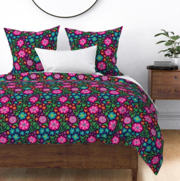
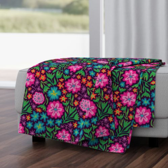
I must say this week's Spoonflower "Vintage Sportswear" Design Challenge was a tough one! I mean, what do you think of when you think of 70s, 80s or 90s sportswear?! After trying and tossing a bunch of ideas, I ended up with my "Anemone" retro floral in bright 1970s colours (first pic)! I can see a pretty cool fleece jacket or ski suit in this (what do you think, my Nelson, BC ski buddies?) Public voting is open now and you can link to the Voting Page HERE! . I also want to thank the team at Make It In Design whose "Creative Tip Of The Week" posted on their Blog on August 25 about how to use Adobe Illustrator's Blend Tool inspired me to try something new! . Click the IMAGES below to link directly to the Medium-Scale versions of this design in TWO colourways in my Spoonflower Shop. They also come in Small- and Large-Scale versions too! 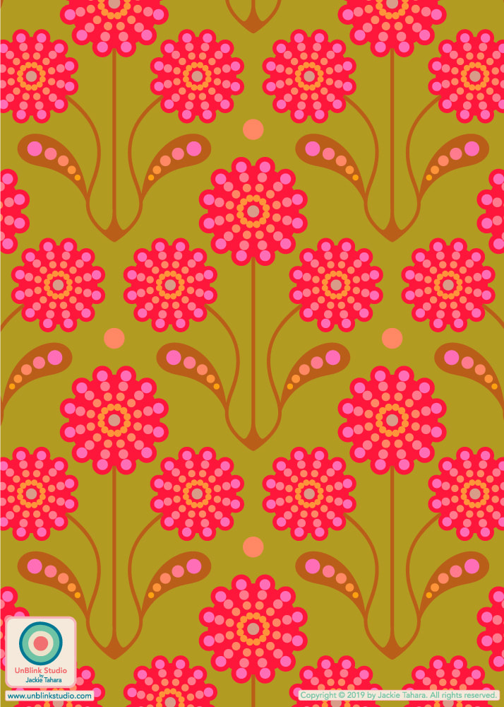 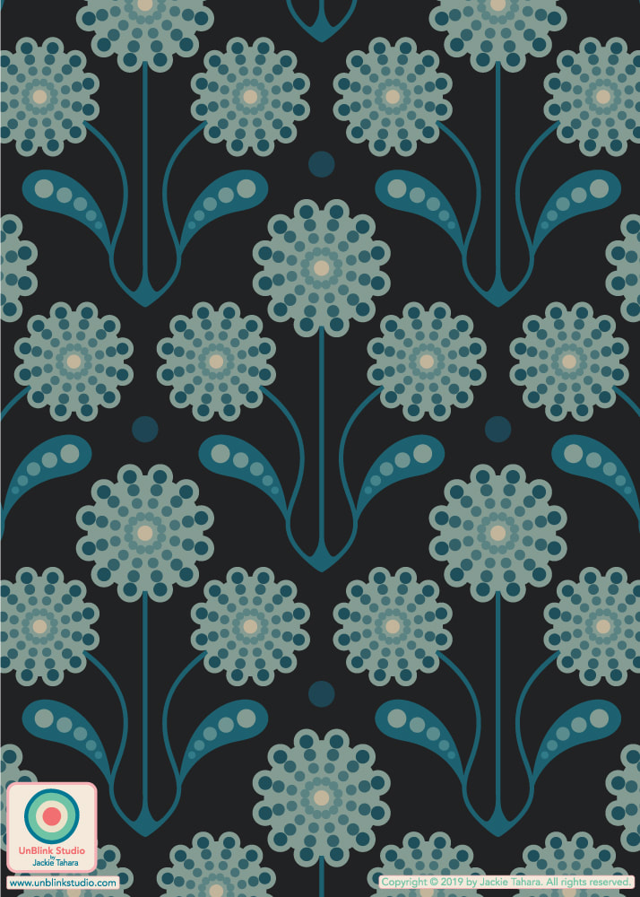
0 Comments
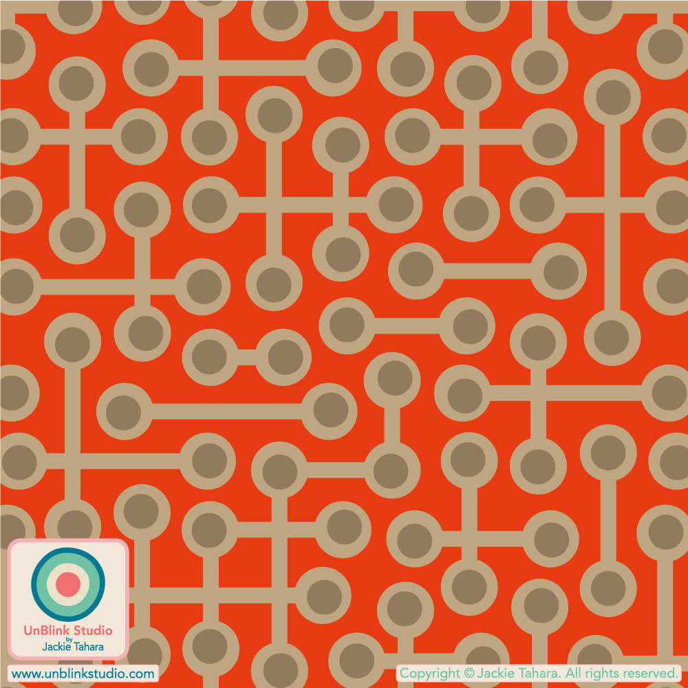
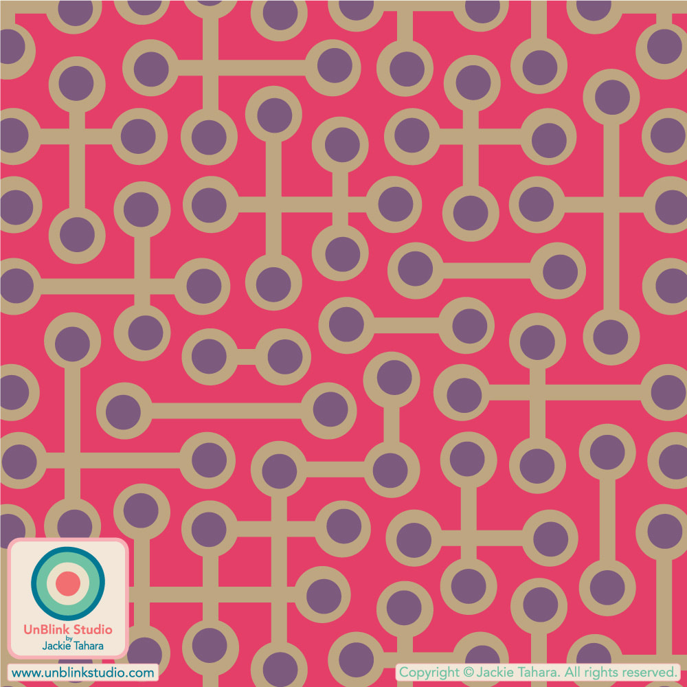
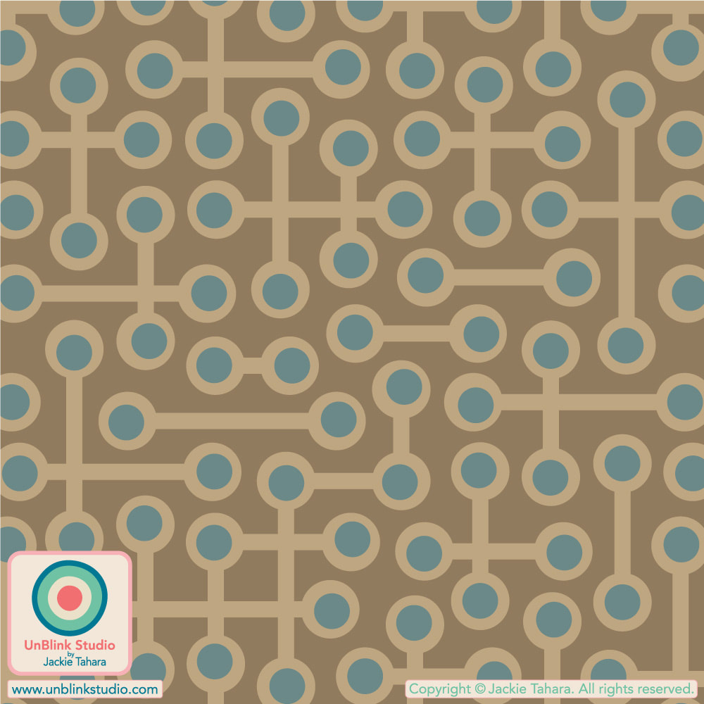
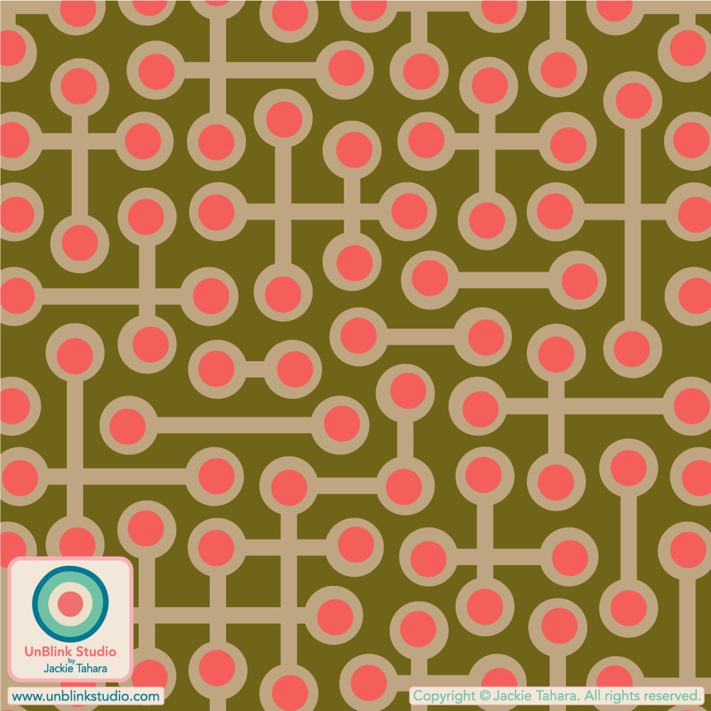
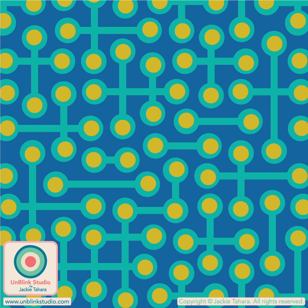
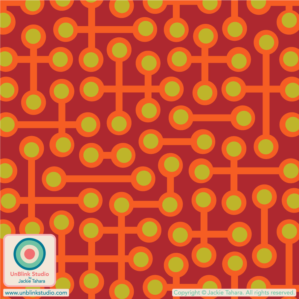
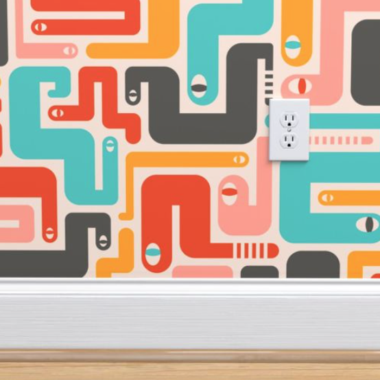
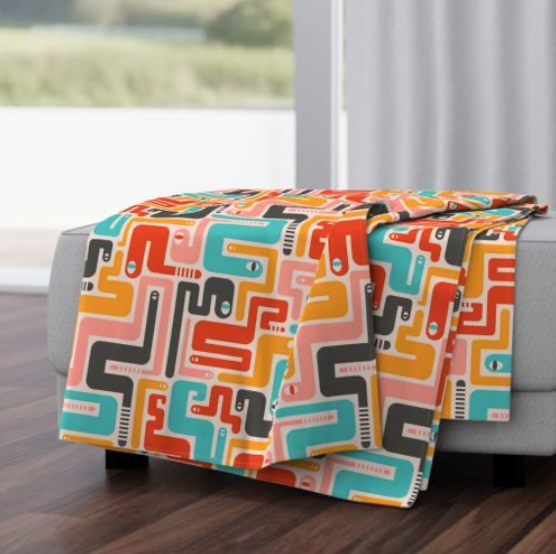
When you need to get your RETRO fix! Here is my abstract geometric "Circuits" pattern design in Coral Orange (on wallpaper) and Neutral Sand Brown (on cupboard and floor). I've entered the Coral Orange version in this week's Spoonflower "Non-Directional Wallpapers" Design Challenge, but you KNOW it comes in a bunch of other colourways too (see below)! Public voting for this Challenge is on now until next Tuesday July 4 (July!?) and you can link to the Voting Page HERE! I'd love your vote for this one! If you want to see all the colourways of this design now available in my Spoonflower Shop, it's easiest to see them all in one place in my "Abstract and Geometric Themes" Collection. Each one comes in 3 scales on Fabrics, Wallpaper and Home Decor! 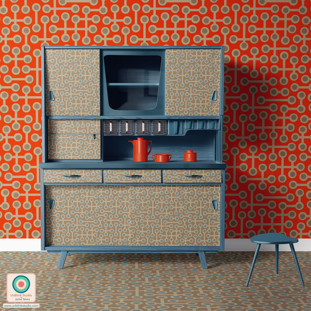
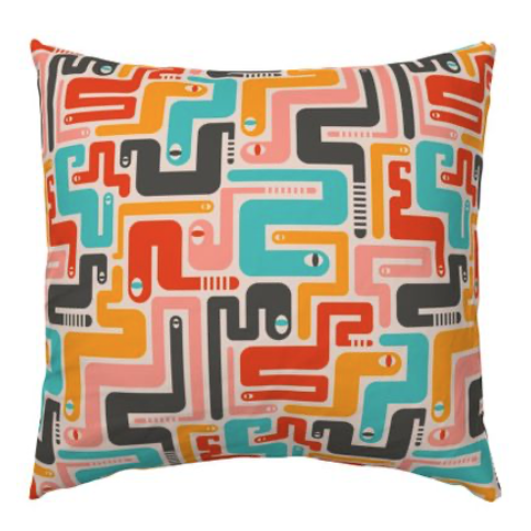
This week's Spoonflower Design Challenge is "Passementerie" and this is my entry which I'm calling... "Passementerie" (I like the word!) For those who don't know, passementerie are gorgeous trims and embroidery used for clothing and furnishings. I created this design in some other colours, but I entered the first one in Delicate Colours because they felt like Spring to me (if you're feeling more like Summer, you'll like the tropical-colour version, scroll down below)! Voting for this Challenge opens tomorrow Thursday March 9 and you can link to the Voting Page HERE! And click each of the images below to go directly to the Medium-Scale of these designs in my Spoonflower Shop! These are also available in a Small-Scale and Large-Scale version too! 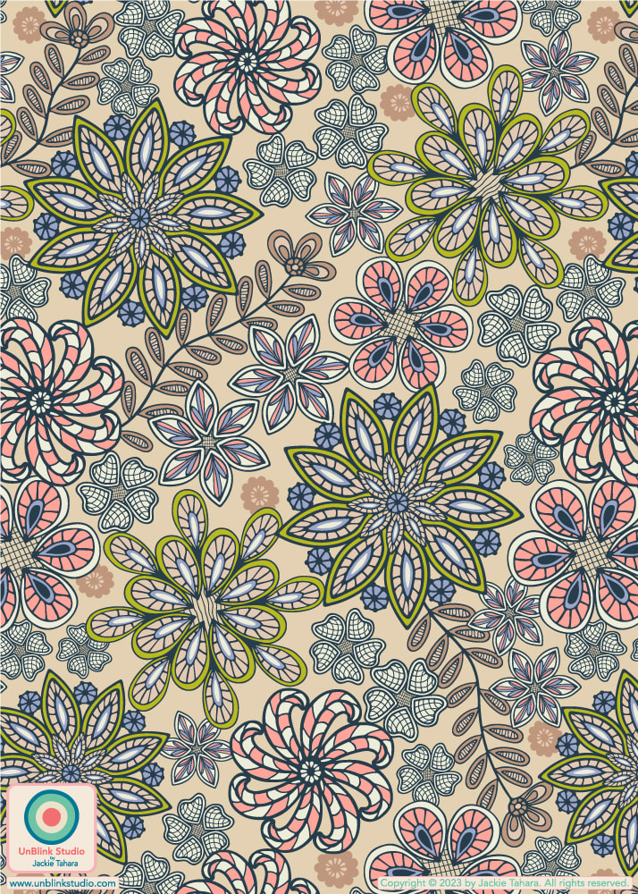 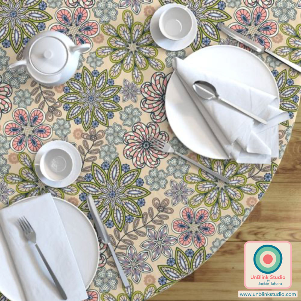 And see below for some other colourways of my "Passementerie" floral pattern design: Tropical Retro 70s Colours and Viva Magenta with Pink! Any favourites? 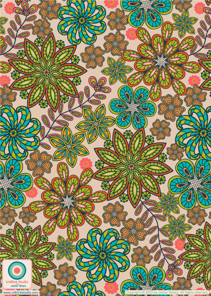 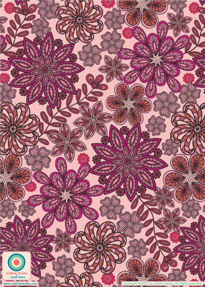 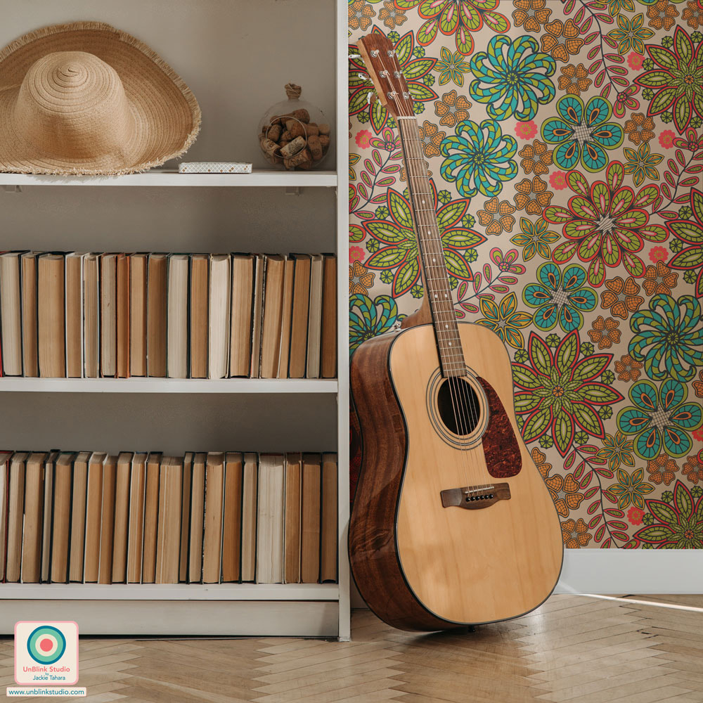 I’ve just entered my new “Retro Rattlers” design in this week’s Spoonflower “Brightly-Colored Reptiles” Design Challenge! This is something a little different for me...OR is it? What do you think, does this design still look like my work? I’m very curious to hear what you think. I am very much liking this graphic “look” and I find my work is always a bit of a tug-of-war between clean, graphic shapes and a more hand-drawn style. Not sure if others see that too?? See it below with a coordinating design I think emulates a closeup view of snakeskin! Check out the Voting Page to see all the colourful entries! And I've just added this design to Throw Pillows in my New Shop...Check them out! 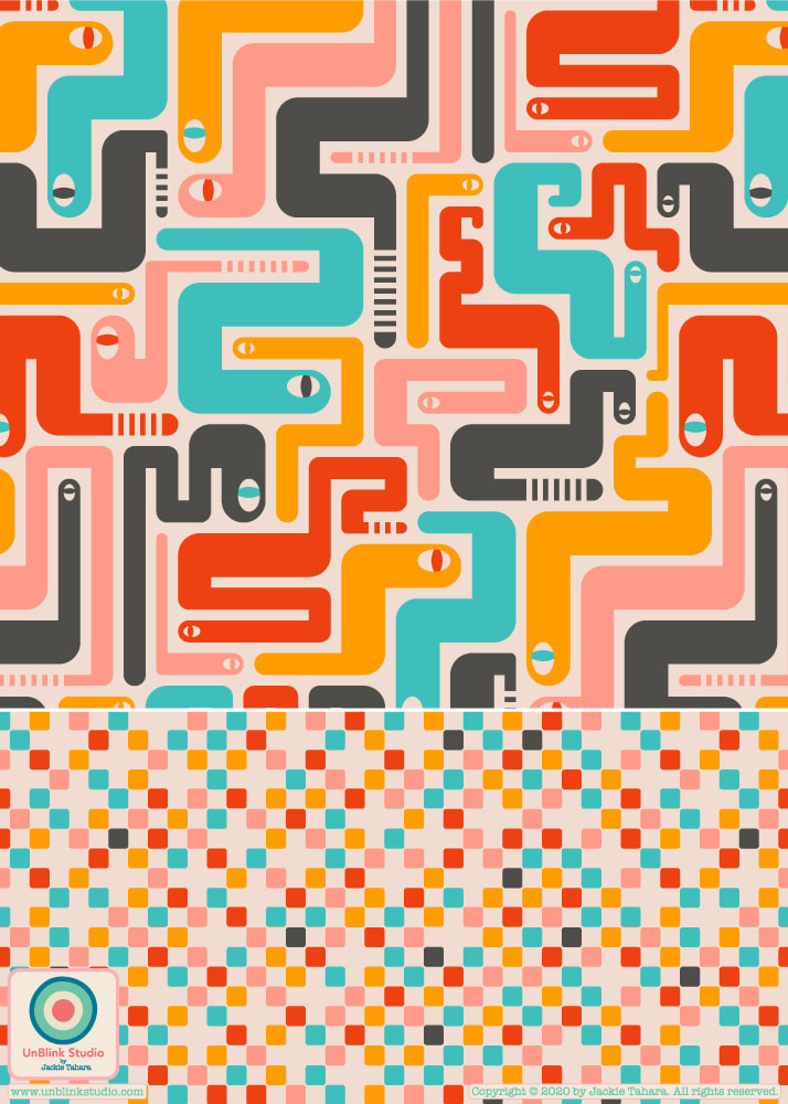
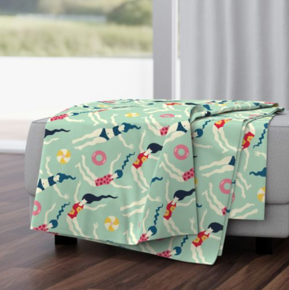
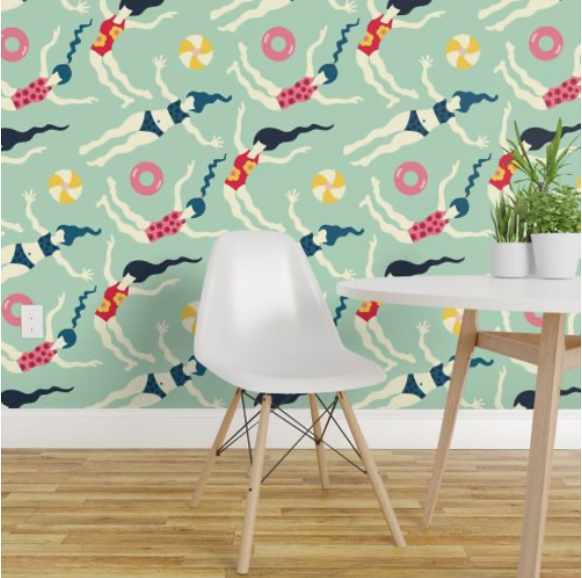
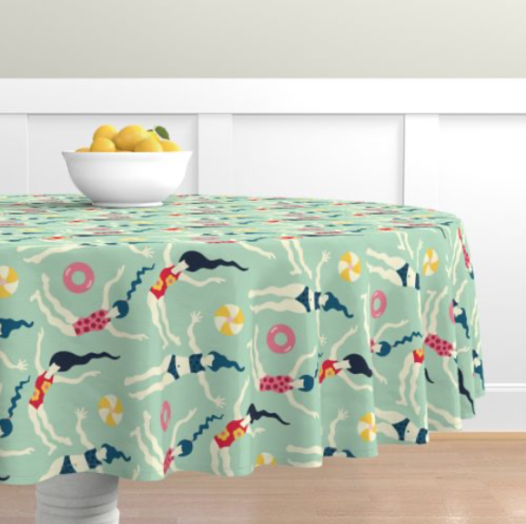
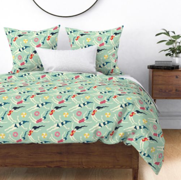
Many of you have seen my “Floating World” pattern design before and asked if it was available on fabric, so I decided to enter it in this week’s Spoonflower “Vintage Kitsch” Design Challenge (one of my favourite themes so far I think!) If it is voted into the Top 50 it will be immediately available to purchase on fabric and lots of other products next week (see below), but even if not it will still become available but will just take a bit longer. If you would like to check out all the fun designs this week, you can link to the Voting Page here...Groovy! And check out my Spoonflower Shop here if you like! 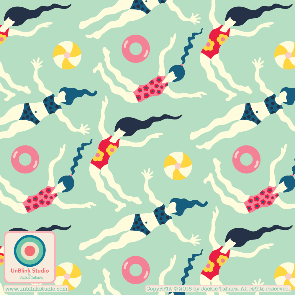
Originally designed after a trip to Mexico, someone recently referred to my “Sayulita” pattern as a “70s floral” so I thought...okay its a sign! I’ll enter it in this week’s Spoonflower “Jewel-Tone 70’s” Design Challenge! Check out all the GROOVY designs at the Voting Page!
Something Different For Me...This Week's Spoonflower Design Challenge is "Abstract Minimalism"!5/18/2019 This week's Spoonflower Design Challenge is "Abstract Minimalism". So taking Morse Code as my starting point, I designed this new pattern design which I call "Secret Message". I really put a lot of thought to the colour palette and like how it really references mid-century modern design...If you want to see the entries and vote, here is a link to this week's Spoonflower Voting Page!  The brief for Week 3 of FolioFocus 2018 is called "Hobby House", all about everyday objects, especially sewing paraphernalia! So here is my final "Sewing Obsession" Collection and a fun journal set with this collection. Wouldn't this set be a great way to keep notes about all the fun sewing and quilting projects you want to do! 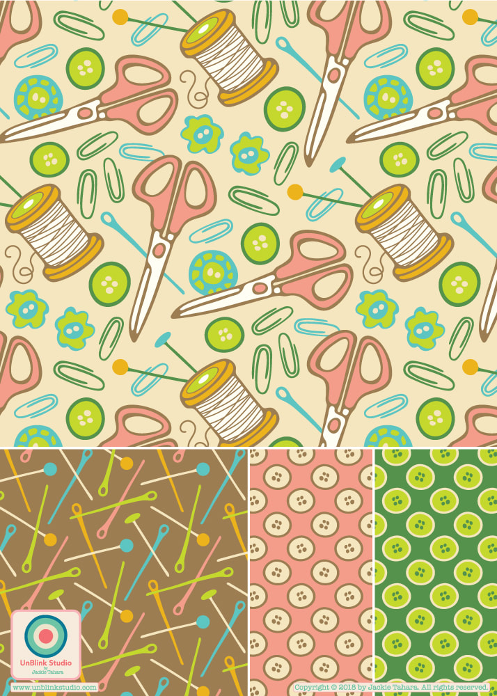 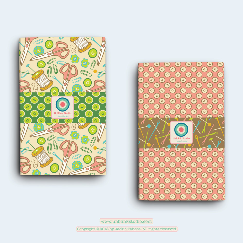 I've still been working on this week's "AstroSynergy" brief for FolioFocus2018. Here is the next in my Signs of the Zodiac series, "Aries" (see my earlier post for "Taurus"), again with a placement print and several repeat pattern designs. I would like to create a collection for each Sign of the Zodiac, each with its own unique colour palette and motifs, but also have all the different collections working together. Are you an Aries? Would love to hear what you think of this one! Do they work together? 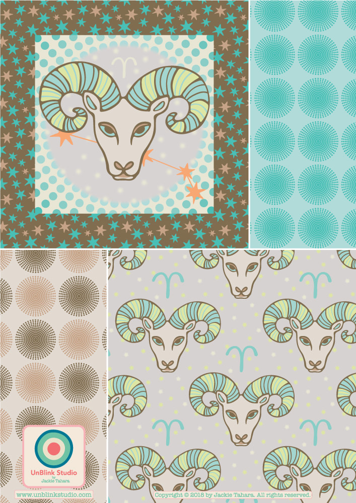 Oh, I am having so much fun with that retro pop brights palette suggested by the Colour Gang! So here is another new pattern I call "Snake Eyes" with coordinate. Do you think it's a bit weird? What types of products would you see this one on??! 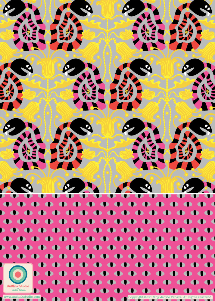 Had a great time with the two Retro Colour Palettes from last week's Colour Gang creative challenge...Earthy and Pop Brights! Here is a new pattern I am going to call "Chirp Chirp" (with coordinates). Please do tell me which one you like best! I'm on the fence with this one! 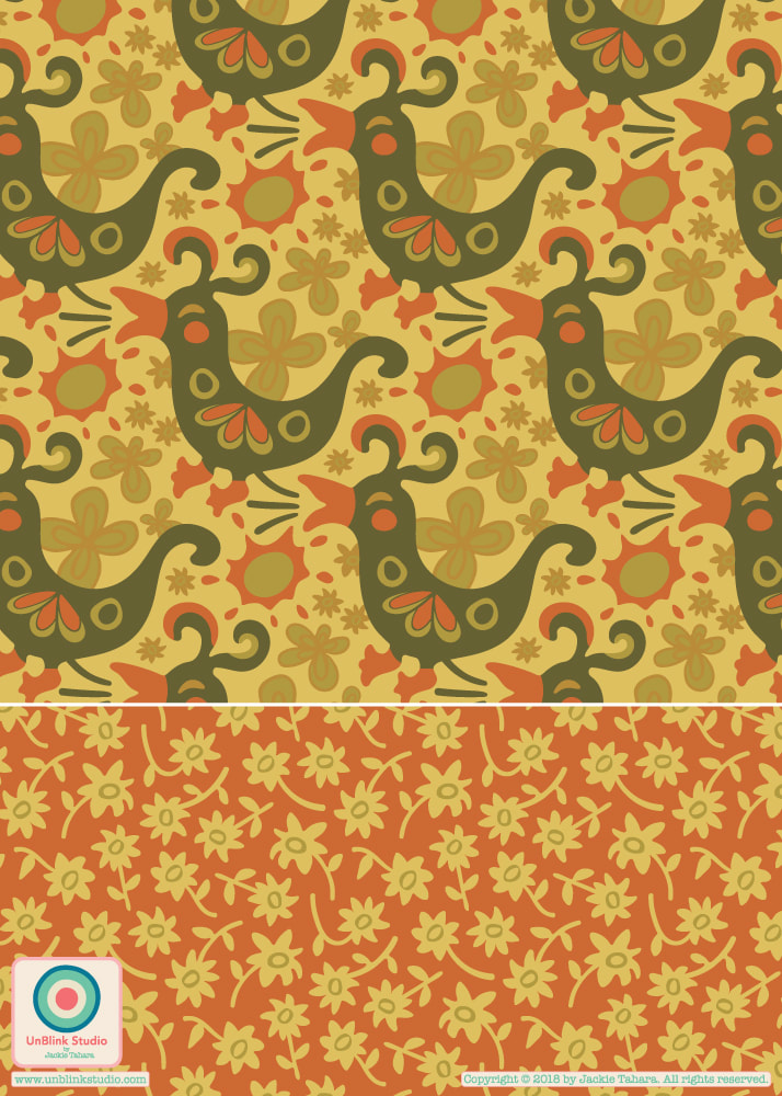 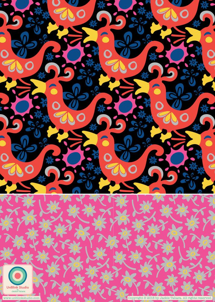 |
AuthorJackie Tahara of UnBlink Studio Archives
July 2024
Categories
All
|
 RSS Feed
|
|
|
|
|
|
All images on this website are Copyright © Jackie Tahara. All rights reserved.
If sharing, pinning or blogging my images, please always credit me and link back to my website. Supporting artists is a good thing to do! Thank you!
If sharing, pinning or blogging my images, please always credit me and link back to my website. Supporting artists is a good thing to do! Thank you!