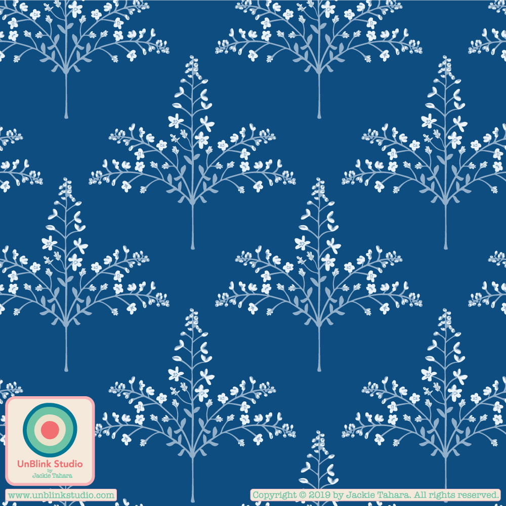
Another Catch-Up Post: My Entry for Spoonflower's "French Country Table Linens" Design Challenge!7/20/2023 I found it quite difficult to figure out what exactly "French Country" meant when it comes to pattern design (other than toile). I researched quite a bit and what struck me were the use of soft colours, especially blue and white. I hoped my "Thicket" design is French Country, at least in "feel", because I entered the Blue and White on Periwinkle version below in Spoonflower's "French Country Table Linens" Design Challenge (it also comes in the Blue White and Deep Cream version too)! And then I created my "Fanciful" Collection around this theme in Blue & White too! Have a look at the full "Fanciful" Collection on Fabrics, Wallpaper and Home Decor in my Spoonflower Shop! Each print comes in 3 sizes and there are co-ordinating solids too! BTW: Public voting for this Challenge is now closed, but you can check out the current Challenge at the Voting Page! 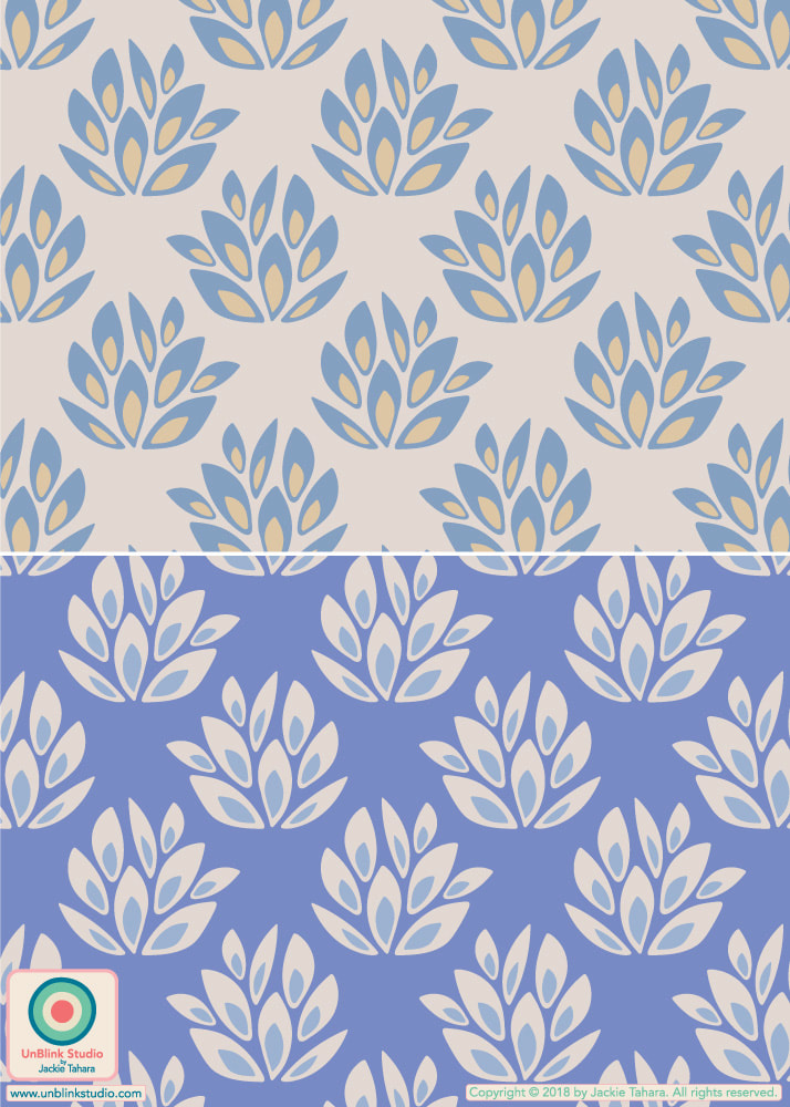 "Thicket" in Blue White Deep Cream (top) and in Blue and White on Periwinkle Purple (bottom)  "Country Cottage"  "Daydreamy"  "Leafy"
0 Comments
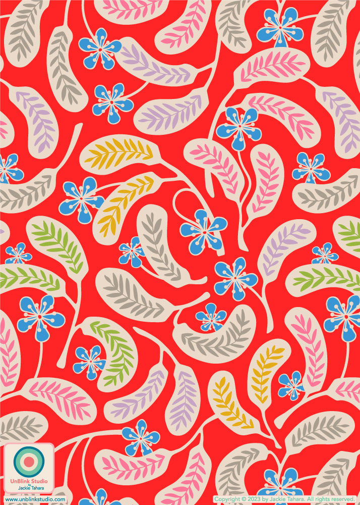
This week's Spoonflower Design Challenge is "Miniature Dollhouse Wallpaper" and I planned to enter my "Daisy May" design, either in the original "Dark Blue" or "Light Gray" version in a cute Tiny Scale, but I wasn't sure which. But then I thought, well, neither just didn't seem very Dollhouse-y to me, so I tried it in a Turquoise version, hmmm, better (see below for all these colour options!)...But I thought it still needed more Dollhouse-iness! So then I tried it out in Pink and Lavender Purple. Now THAT says Dollhouse-y to me, so I entered it! Public voting for this Spoonflower Design Challenge opened on Thursday April 13 and closes next Tuesday April 18! You can link to the Voting Page HERE! Click the images below to see the Tiny-Scale versions of my "Daisy May" design in my Spoonflower Shop. They are all available also in Smalll-, Medium- and Large-Scale versions too!     My new "Garden Burst" pattern might look "simple", but trust me when I say it took a very long time to arrive at this final design. I had started out with a whole bunch of sketched flower motifs and was trying to jam all of them into a single design, moving them around, bigger, smaller, overlapping...I had in my mind something quite spare (wanting to just use the dark blue and the two grays), but still playful and fun. It took me, OH, maybe two days of fiddling to realize that I should take out ALL the other motifs, and just make the design with these fun bulb-y flowers! Then I added some curly vines, and some bright playful colours here and there...and voila!...the simple design that took DAYS. And wonder what I'm going to do with all those other floral motifs I didn't use? More pattern designs, of course! Stay tuned! . I've entered my "Garden Burst" design in this week's Spoonflower "Garden Bedding" Design Challenge. Public voting opens Thursday March 16 and you can link to the Voting Page HERE! 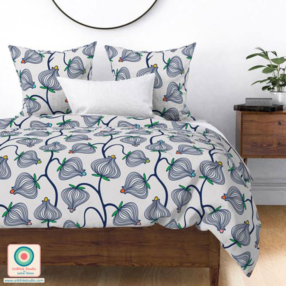 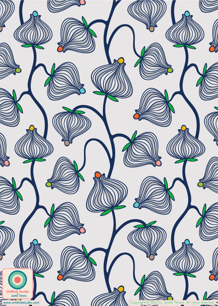 This week's Spoonflower Design Challenge is "Passementerie" and this is my entry which I'm calling... "Passementerie" (I like the word!) For those who don't know, passementerie are gorgeous trims and embroidery used for clothing and furnishings. I created this design in some other colours, but I entered the first one in Delicate Colours because they felt like Spring to me (if you're feeling more like Summer, you'll like the tropical-colour version, scroll down below)! Voting for this Challenge opens tomorrow Thursday March 9 and you can link to the Voting Page HERE! And click each of the images below to go directly to the Medium-Scale of these designs in my Spoonflower Shop! These are also available in a Small-Scale and Large-Scale version too! 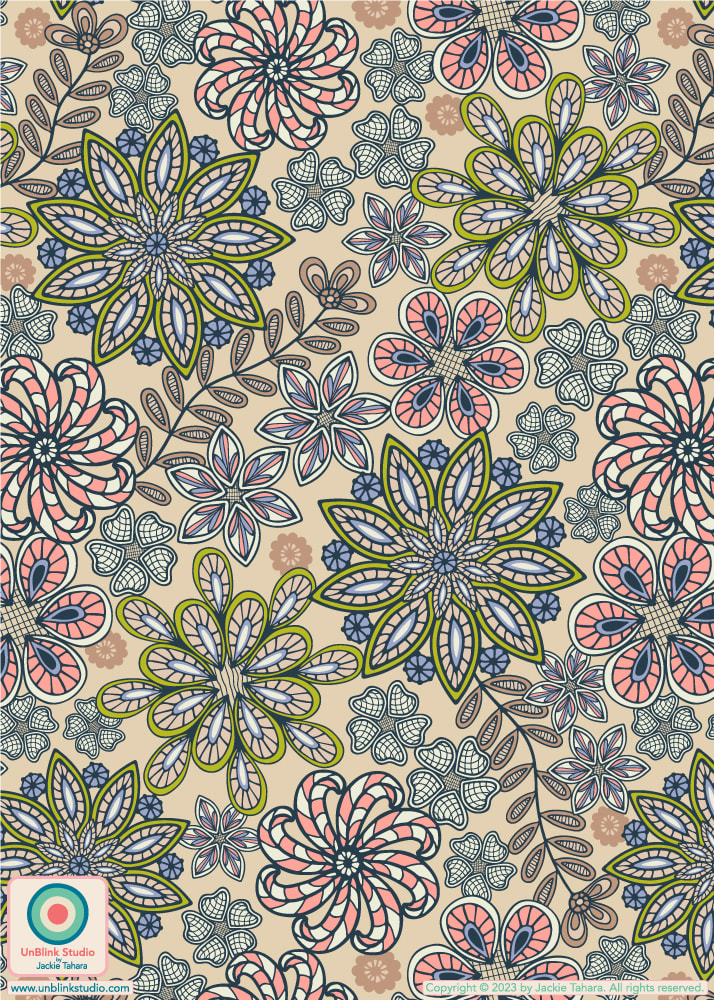 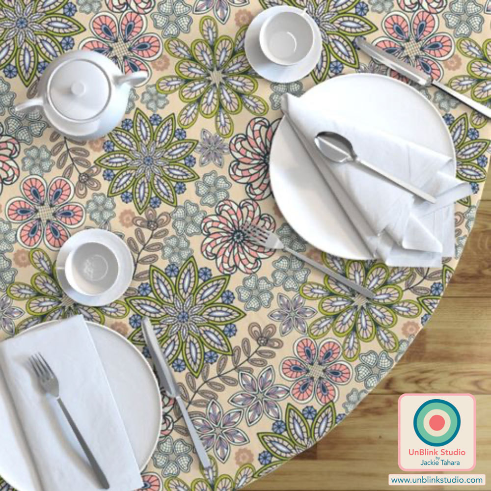 And see below for some other colourways of my "Passementerie" floral pattern design: Tropical Retro 70s Colours and Viva Magenta with Pink! Any favourites?    This week's Spoonflower Design Challenge is "Hidden Whimsy Wallpaper" and one of the examples they gave to explain the theme was "a traditional damask pattern created entirely of macaroni". So because I've really been thinking of geometric shapes lately, I decided to make a botanical pattern created entirely of geometric shapes! Here is my "Sunny Day" wallpaper. I'm not sure you can even imagine how fun this one was to create, and now I MUST do it in some other colours too! Public voting for this Challenge is open now until Tuesday March 7 and you can link to the Voting Page HERE! 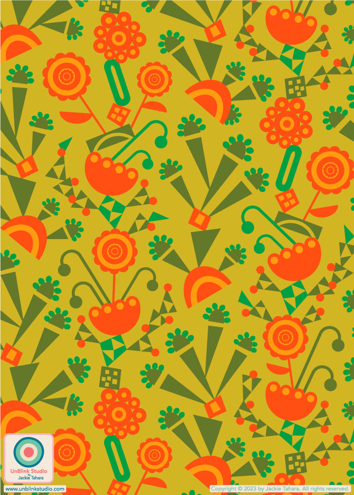
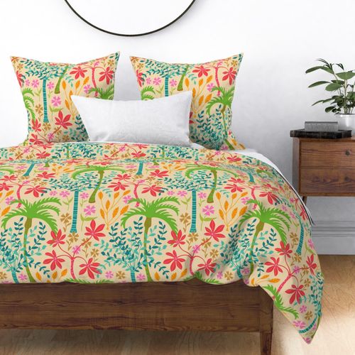
For This Week's Spoonflower "Room-Specific Wallpaper" Design Challenge I Chose the Boudoir!2/8/2023 This week's Spoonflower Design Challenge is "Room-Specific Wallpaper" and the idea was "to choose a room and create the perfect wallpaper" for it! How could I even resist...I chose a Boudoir (or Dressing Room, but I like the sound of "Boudoir" better), and created this Fuchsia Pink and Lavender Purple design. It's called "Glamour"! Public voting for this Challenge opens tomorrow Thursday Feb 9 and closes Tuesday Feb 14 (Valentine's Day, which suits this design I think!) You can link to the Voting Page HERE if you'd like to see all the entries! . This new floral pattern is available in my Spoonflower Shop on Fabrics, Wallpaper and Home Decor in 3 sizes. Imagine it in VELVET! . EDITOR NOTE: I originally named this design "Boudoir", but that seems to have some "naughty" connotations, so I changed it to "Glamour" after the Challenge closed because it kept getting flagged in various uploads and searches. Go figure! 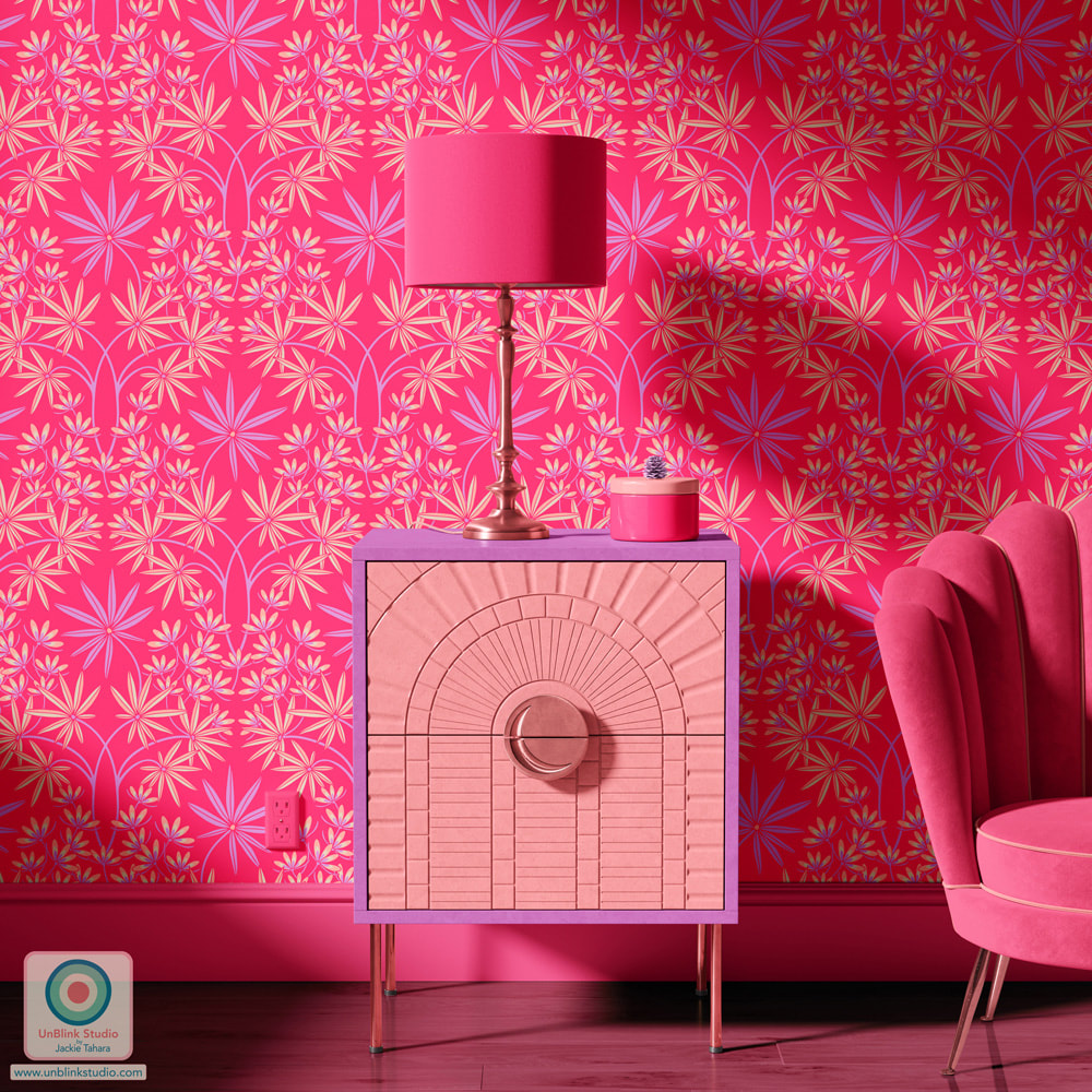 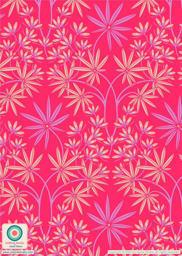 I've entered my new "Hilo" pattern design in this week's Spoonflower "Time Machine" Design Challenge. The idea behind this challenge is to create a design inspired by a particular time period. I chose the 1950s, and even more specifically, I was inspired by all those vintage 1950s Hawaiian prints that I love so much (and my hubby has a BIG collection of them!) I called this one "Hilo" for one of my favourite towns on Big Island, Hawaii, with its colourful downtown, where my kids used to play soccer games with Kona Crush, and where LOTS of rain keep it filled with gorgeous tropical greenery. Sigh. Public voting for this Challenge opens today Thursday Feb 2 and closes next Tuesday Feb 7. You can link to the Voting Page HERE (and it's a pretty fun Challenge with so many different kinds of entries)! AND if you'd like to see "Hilo" in several colours in my Spoonflower Shop where they're available in 3 sizes on Fabrics, Wallpaper and Home Decor, click on the images below! 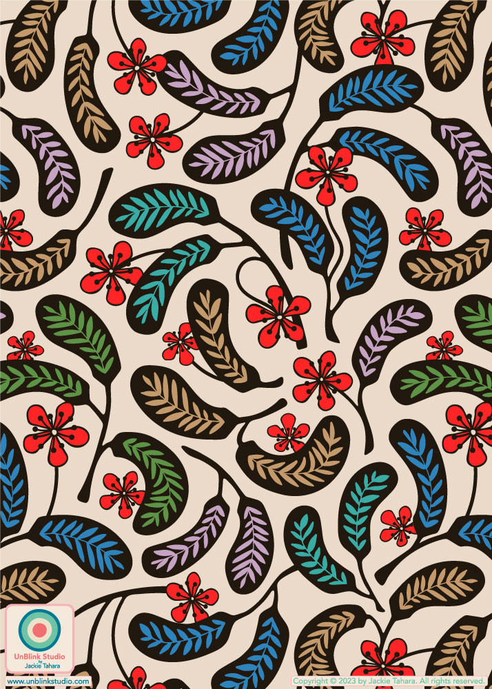 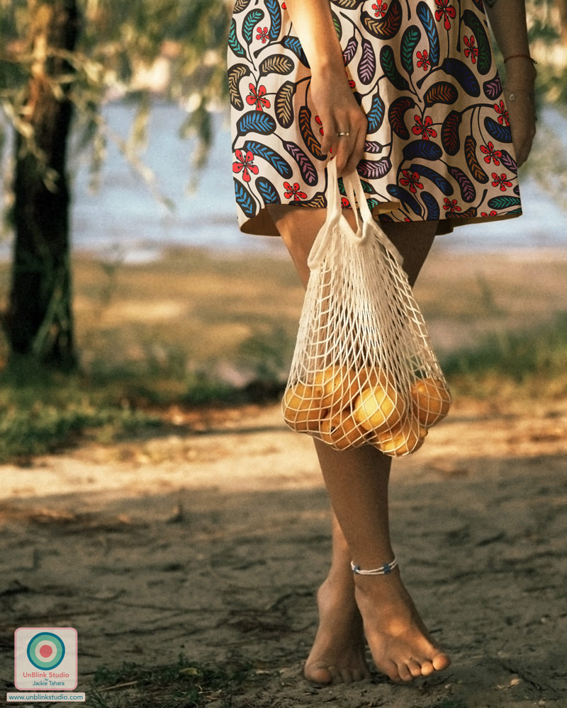 OF COURSE, I had to try this "Hilo" design out in some other colourways too, see below for this design in Charcoal and Coral Red. Click the images if you'd like to see them in my Spoonflower Shop!
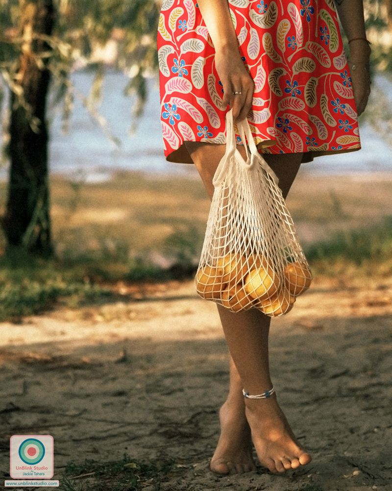 With thanks to The Indoorsy Project for this skirt mockup.
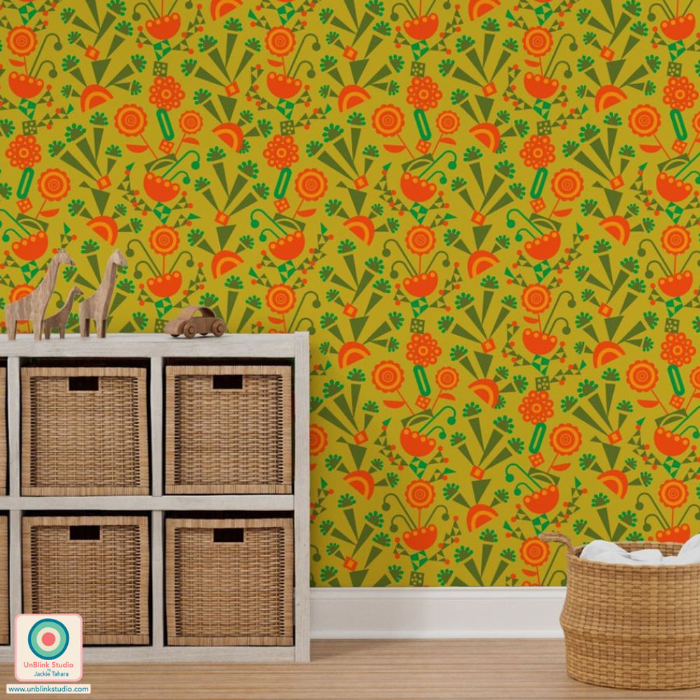
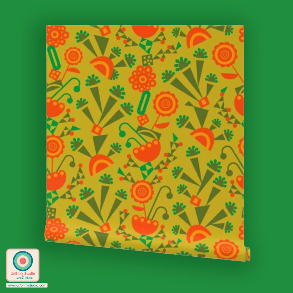
When I travel to other places, I love going to markets where it's so interesting to explore all the unfamiliar things, particularly food, and especially fruits and veggies I have never seen or tasted before. So when I saw that this week's Spoonflower Design Challenge was "Otherworldly Botanicals", I immediately thought about strange fantastical fruits as a subject matter. So here is my new "Ambrosia" pattern design which I filled with graphic melon-like fruits on curly vines (of course, it HAD to have curly vines!) Voting for this Challenge is now open and you can link to the Voting Page HERE. I would love your vote for this one (voting closes Tuesday Sept 20)! This design is also now available in my Spoonflower Shop on Fabrics, Wallpaper and Home Decor in 3 sizes, and you can SHOP this design HERE (in the Medium-Scale, it's also available in a Small- and Large-Scale too!) 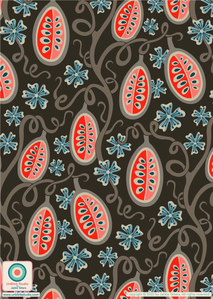 Ambrosia in Coral and Earth Tones on Dark Brown And of course, I couldn't resist adding this design to my Spoonflower Shop in some other colourways too, see below! Each colourway also comes in 3 sizes. Click on an image to link to the Medium-Scale versions directly in my Spoonflower Shop! 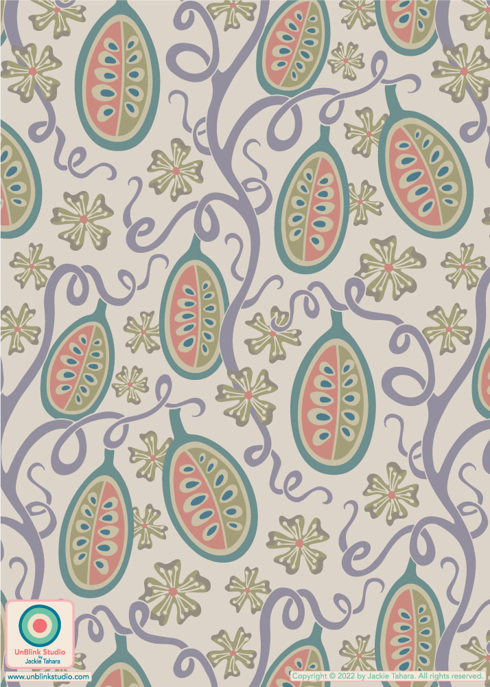 Ambrosia in Pastels and Warm Neutrals on Cream 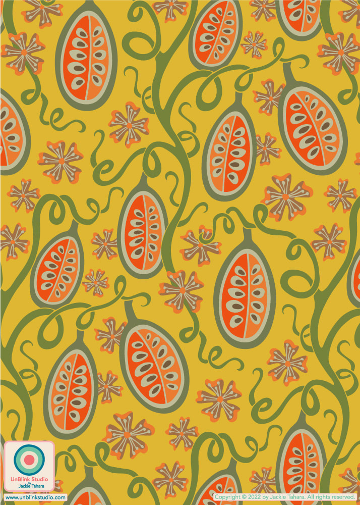 Ambrosia in Orange and Olive Green on Yellow This week's Spoonflower Design Challenge is "Vintage Nostalgia Wallpaper" so I decided to enter my "Orangerie" design in this Avocado Green and Burnt Orange colourway. Although I've created this design in a bunch of other colourways, I have a sentimental attachment to this one because I grew up in a house with a kitchen in these colours! We even had Avocado Green appliances and wall-to-wall carpeting in various shades of Avocado Green (if I knew then what I know now, I would have taken pics of that carpet)! But then my parents renovated the kitchen, and to me it ended up being much less interesting (they also repainted the garage door and window shutters from Bright Turquoise to Dark Brown, and although I do like a good Brown, I never forgave them)! If you would like to Vote, you can link to the Voting Page HERE (and I would greatly appreciate your vote for this one!) . With thanks to @theindoorsyproject for this mock-up! 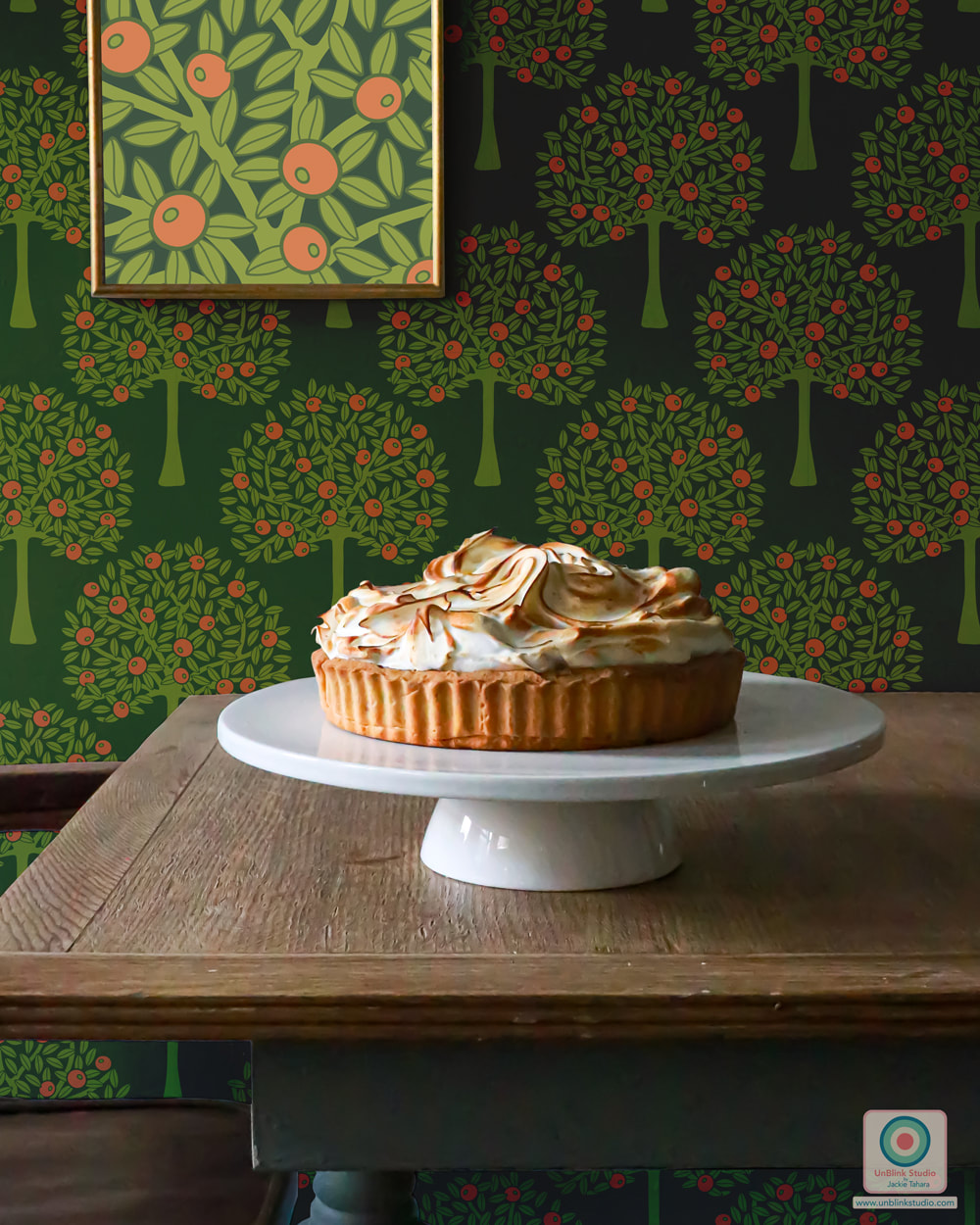 Here is my entry for this week's Spoonflower "Petal Solids Coordinates: Calm" Design Challenge! The idea behind this challenge was to use up to three given colours (this week it was Mushroom, Sky Blue and Pine) to create a design that will coordinate with the new Petal Signature 100% Cotton Solids coming soon to Spoonflower! I had a REALLY hard time with this challenge and ultimately entered the version using just one colour (Sky Blue) and optional White! BUT I also created a version using all 3 colours too which I think has a more earthy, cozy feel. BOTH versions are now available in my Spoonflower Shop in 3 sizes! And if you would like to vote, check out the Voting Page too! 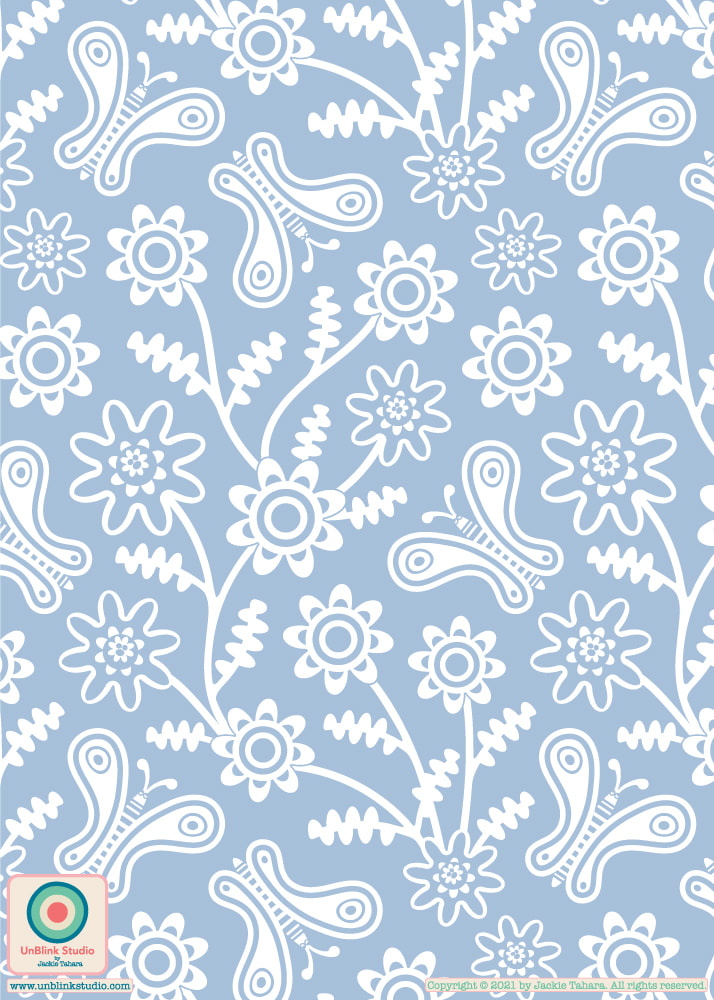 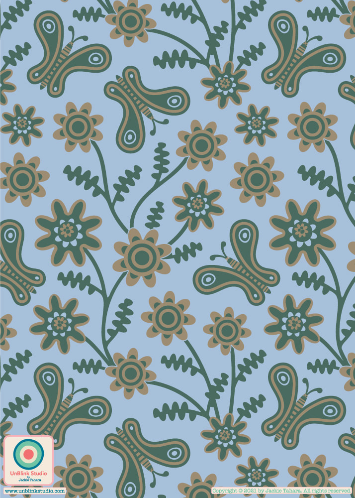 Awhile back I posted some pics on Instagram and Facebook of a gorgeous tree that I run by in the morning but had no idea what it was. I asked if any of you knew and you did...MIMOSA! I kept it in my mind to turn into a pattern design, so here it is...I entered this one in this week's Spoonflower "Petal Solids Coordinates: Joy" Design Challenge! The idea behind this challenge was to use three given colours (Mustard, Cotton Candy and Lagoon, and I added optional Black) to create a design that will coordinate with the new Petal Signature 100% Cotton Solids coming soon to Spoonflower! My "Mimosa" is now available in my Spoonflower Shop in 3 sizes on fabrics, wallpaper and home decor!  Weird and wonderful and WHY NOT?! I created my imaginary "Alien World" pattern design for this week's Spoonflower "Intergalactic Adventures" Design Challenge because I couldn't resist channeling all those sci-fi concept art posters (and maybe even a bit of Avatar) to create this alien botanical landscape! This one is just for fun! Link to the Voting Page and to my Spoonflower Shop where you can purchase this design on fabric, wallpaper and home decor! . AND SALE ALERT! Spoonflower is offering FREE STANDARD SHIPPING Worldwide on Everything until tomorrow Friday April 16 2021! 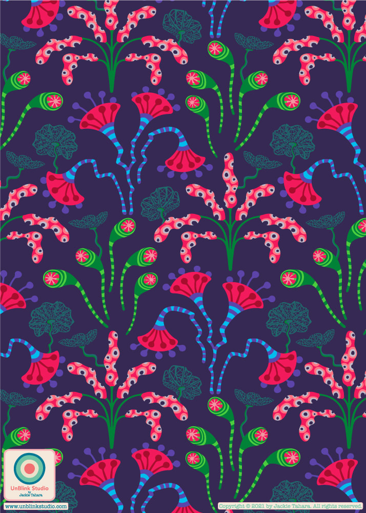 Something a little more soft and delicate for this week's Spoonflower "Wild Grasses" Design Challenge! I entered the first earthy pink one, but see it in a couple of other colourways too below, all available in my Spoonflower Shop on fabrics, wallpaper and home decor, of course! Link to the Voting Page and my Spoonflower Shop! 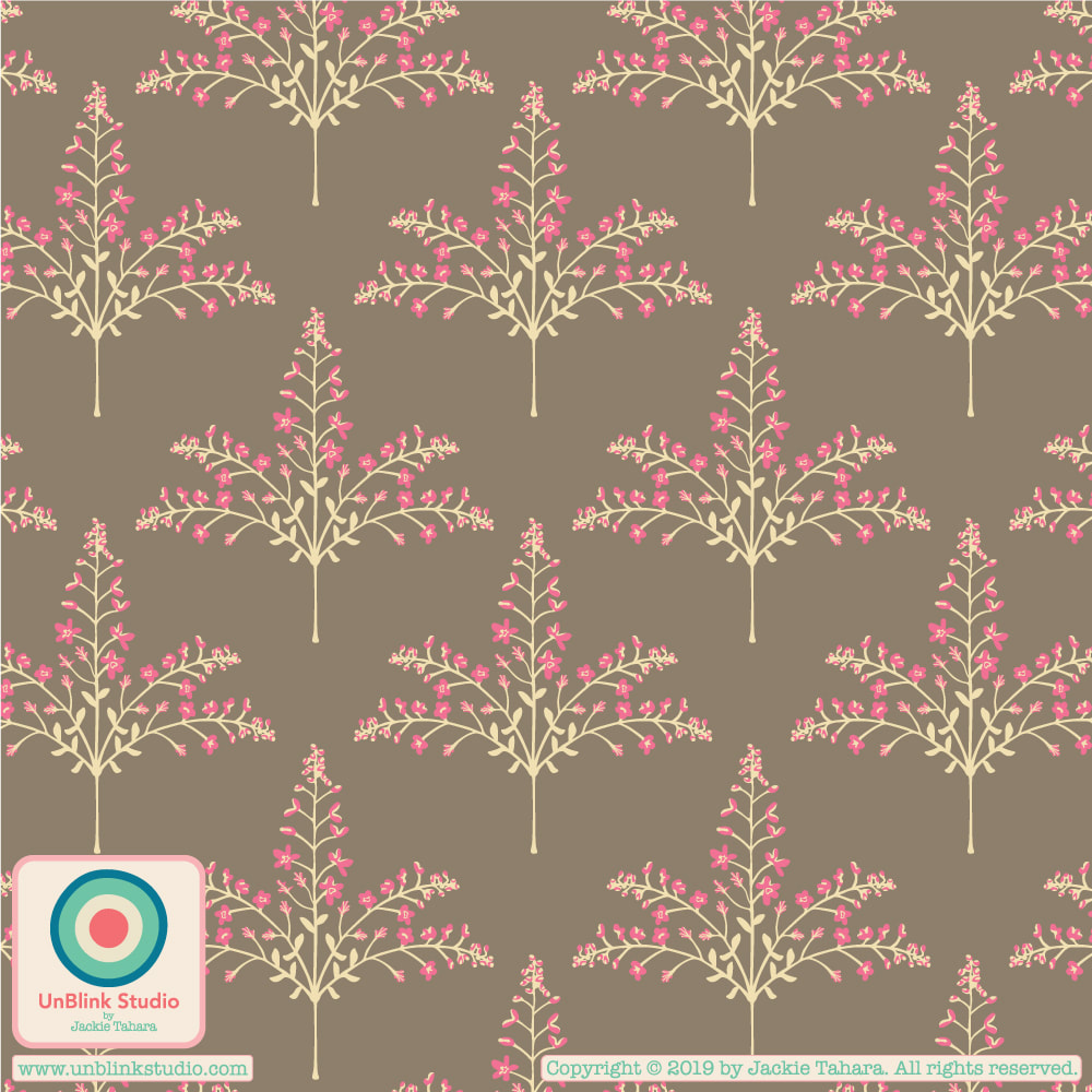
Do you wish you could ESCAPE to a colourful tropical locale every time you took a break at work (if, of course, you are not working from home right now)? Here is my entry for this week's Spoonflower "Break Room Wallpaper" Design Challenge! The winning wallpaper design will be installed in the break rooms in the new US Spoonflower factory! . AND SALE ALERT! Spoonflower is offering 15% OFF Wallpaper Rolls until tomorrow Friday April 2 2021! Link to the Voting Page to check out all the entries! And my Spoonflower Shop where you can find this pattern not only on wallpaper, but also on fabric and home decor in both a Small- and Large-Scales! ADDENDUM: This design placed in the Top 50 of the Spoonflower "Break Room Wallpaper" Design Challenge (actually #61 out of 782 entries taking into account ties)! Thanks to all who voted for it! 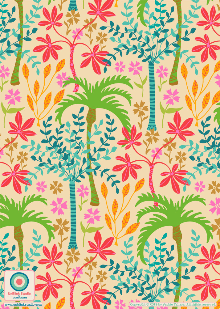
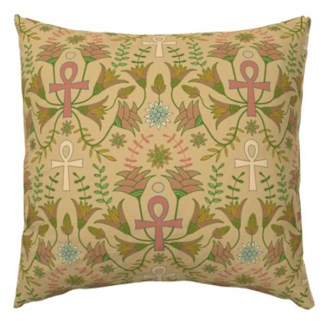
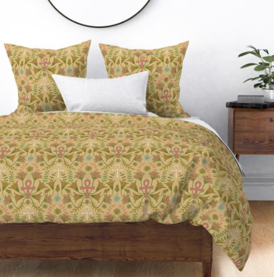
I first discovered the ANKH, the Egyptian hieroglyph meaning "life" on a months-long trip to Egypt many years ago while visiting tombs, the Great Pyramids and the Temples of Luxor, Karnak and Abu Simbel amongst many others. Because ancient Egyptians believed that one's life on Earth is just a part of eternal life, the ANKH hieroglyph has come to also symbolize "Everlasting Life". It was because of this meaning and my love of Egypt, that I decided to get this symbol as my only tattoo (so far). So when I saw that this week's Spoonflower Design Challenge is "Talismans", I immediately knew that the Ankh would be the one I would use for my design. Here is my entry, coloured to emulate ancient scrolls! It's now available on fabric, wallpaper and home decor in my Spoonflower Shop! And check out the entries at the Voting Page! 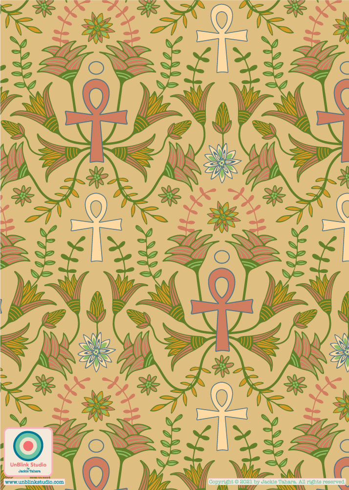 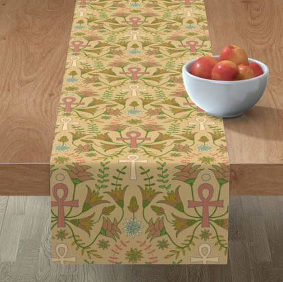
|
AuthorJackie Tahara of UnBlink Studio Archives
July 2024
Categories
All
|
 RSS Feed
|
|
|
|
|
|
All images on this website are Copyright © Jackie Tahara. All rights reserved.
If sharing, pinning or blogging my images, please always credit me and link back to my website. Supporting artists is a good thing to do! Thank you!
If sharing, pinning or blogging my images, please always credit me and link back to my website. Supporting artists is a good thing to do! Thank you!