|
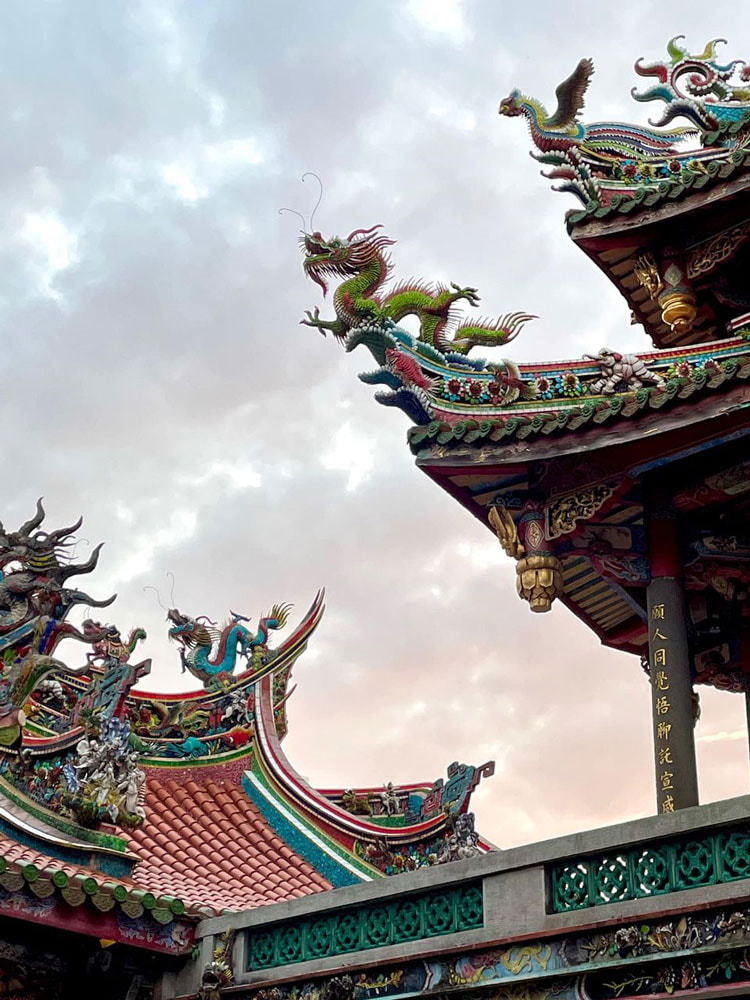
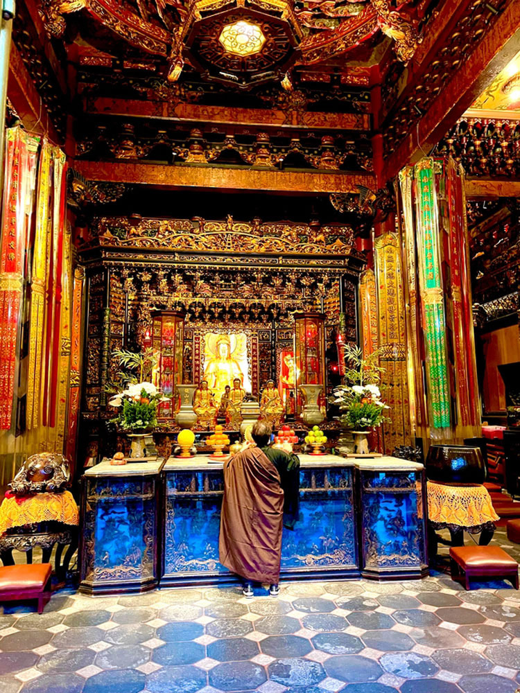
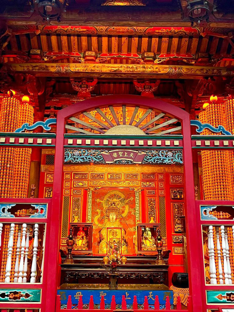
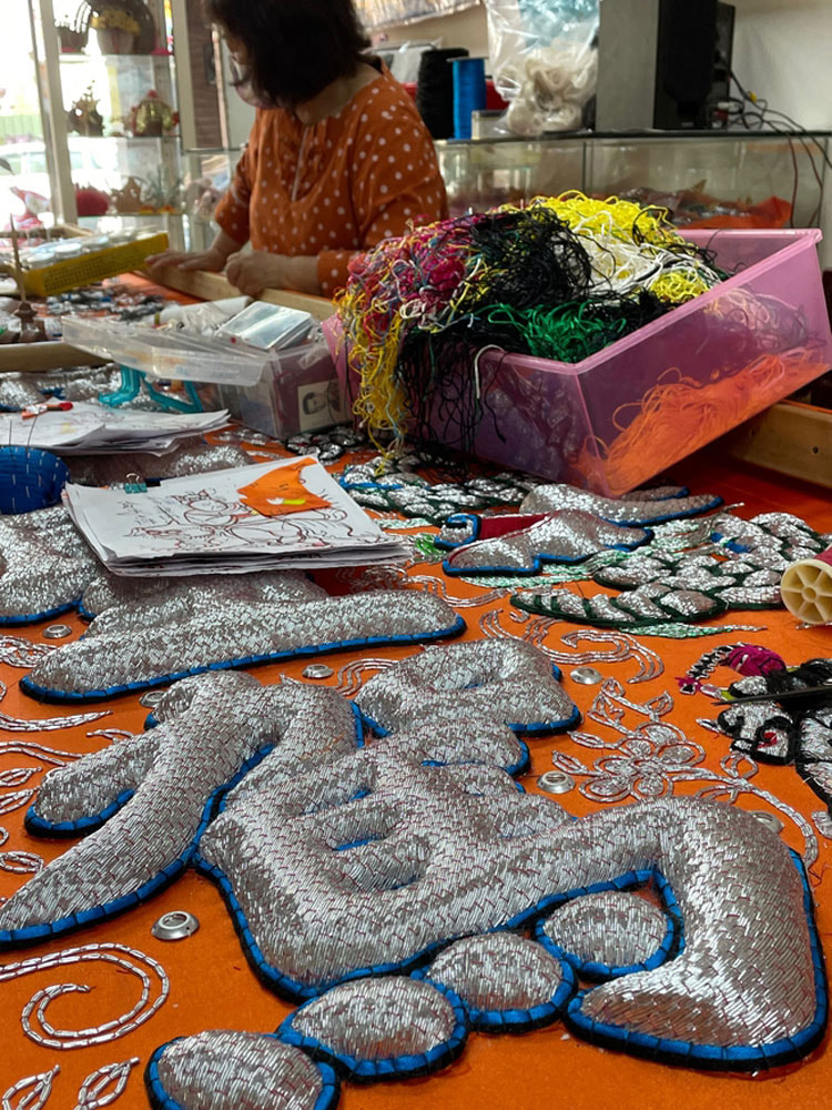
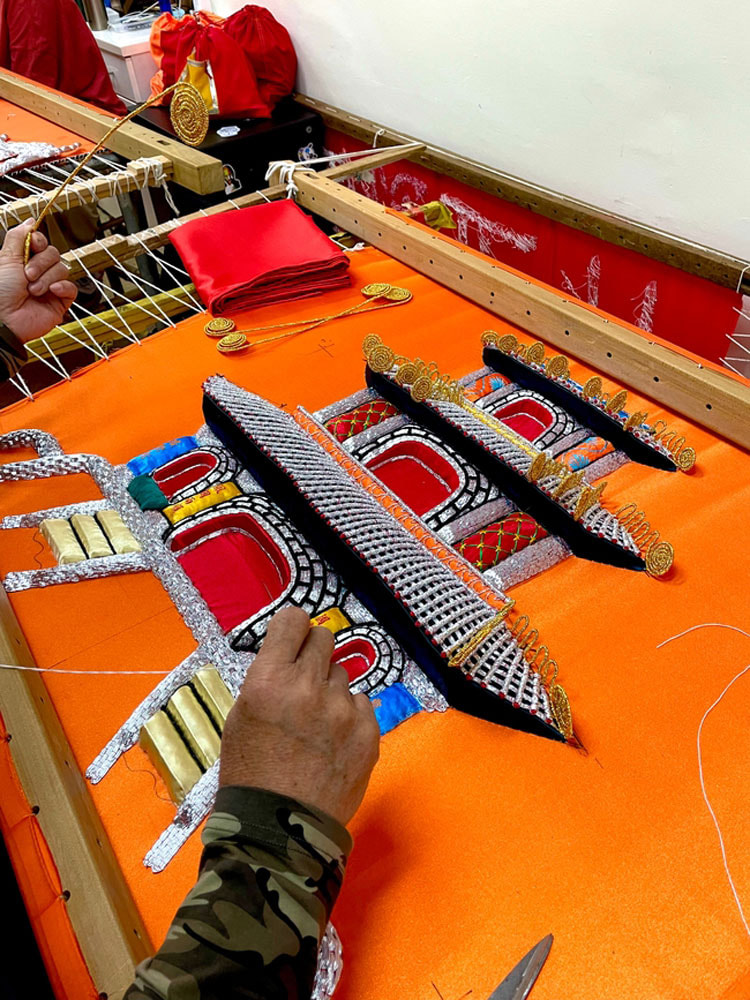
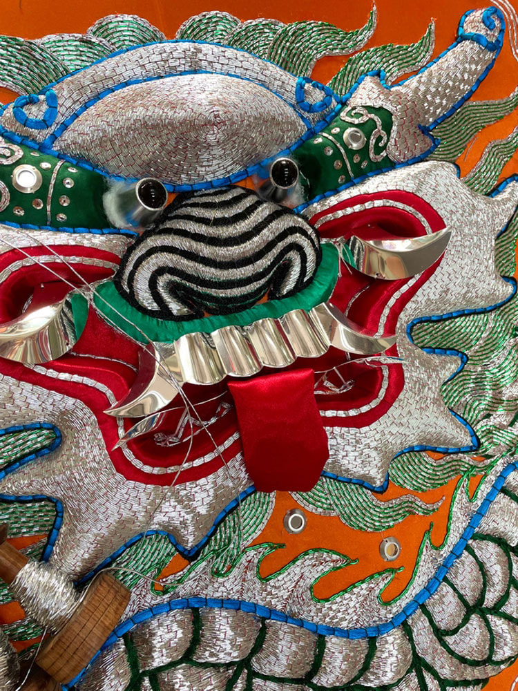
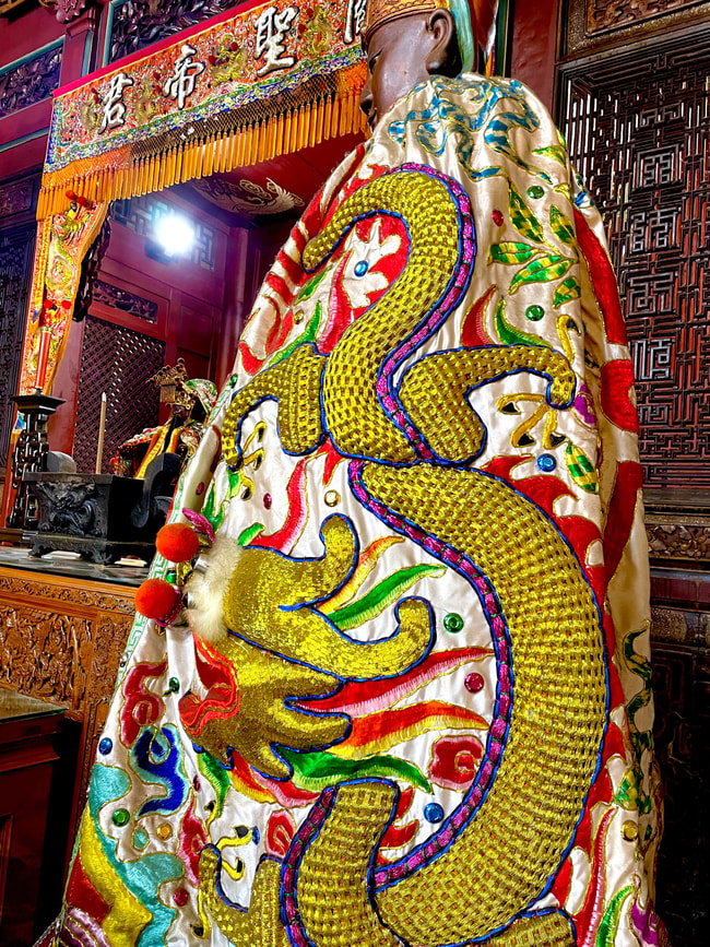
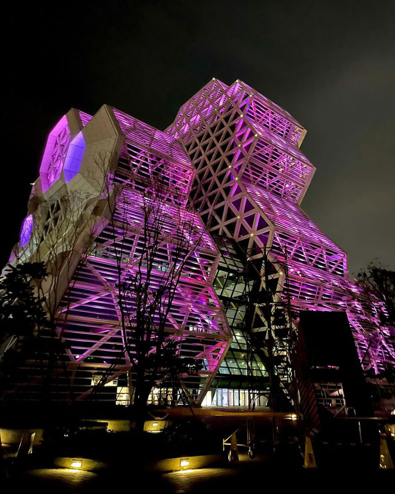
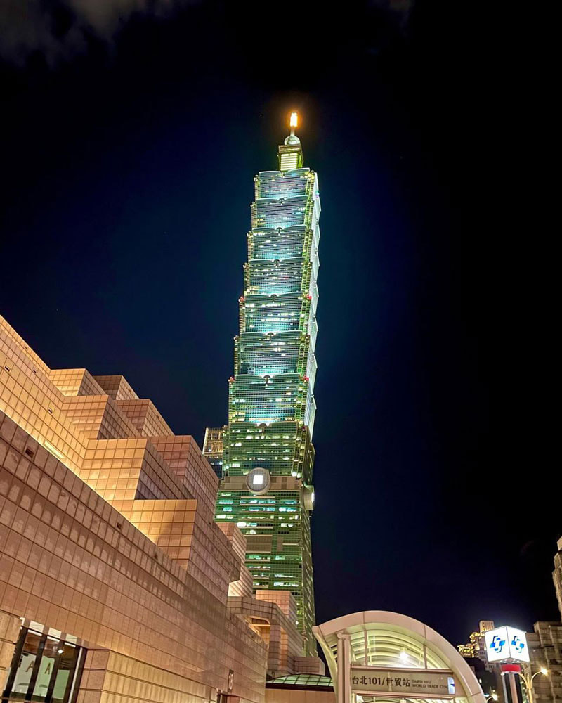
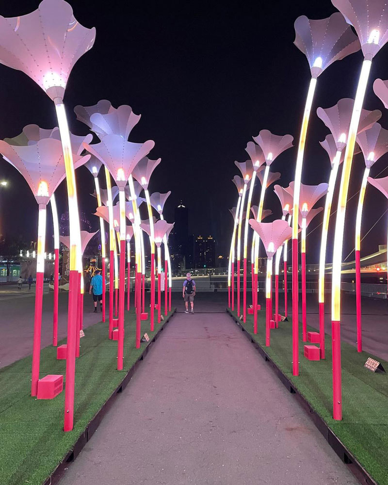
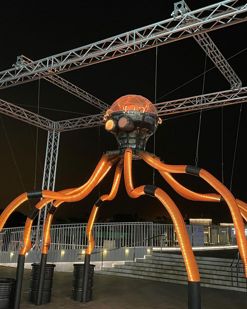
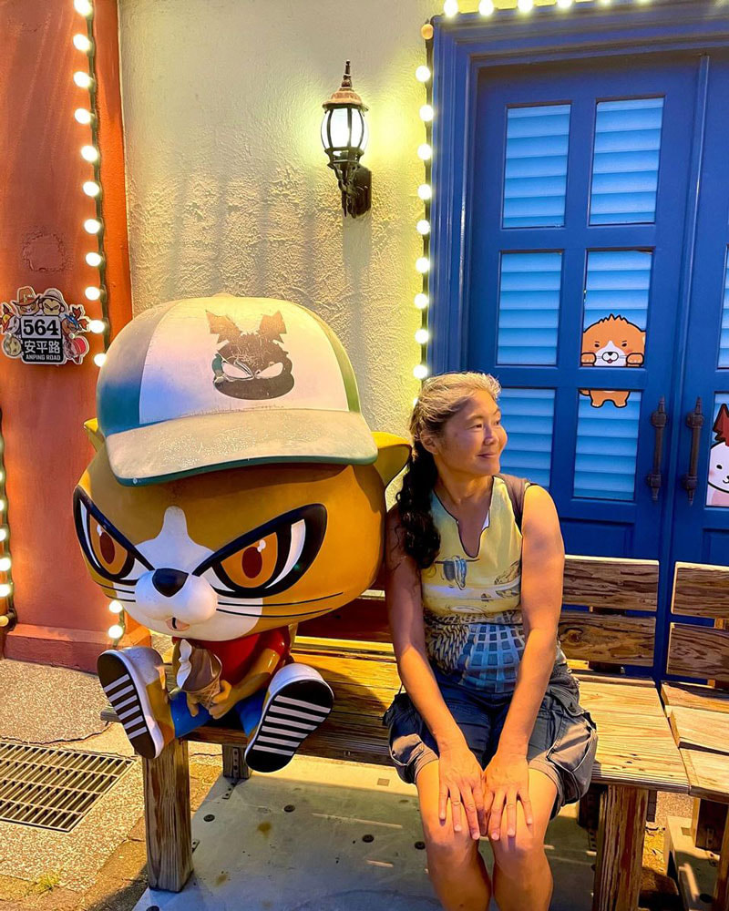
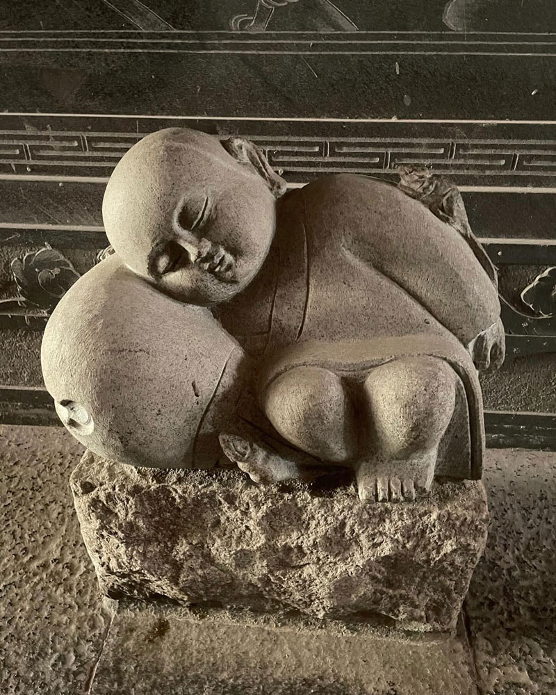
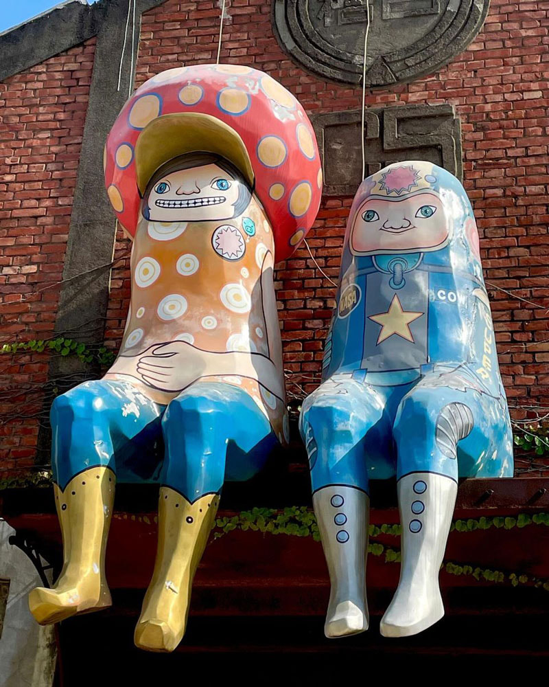
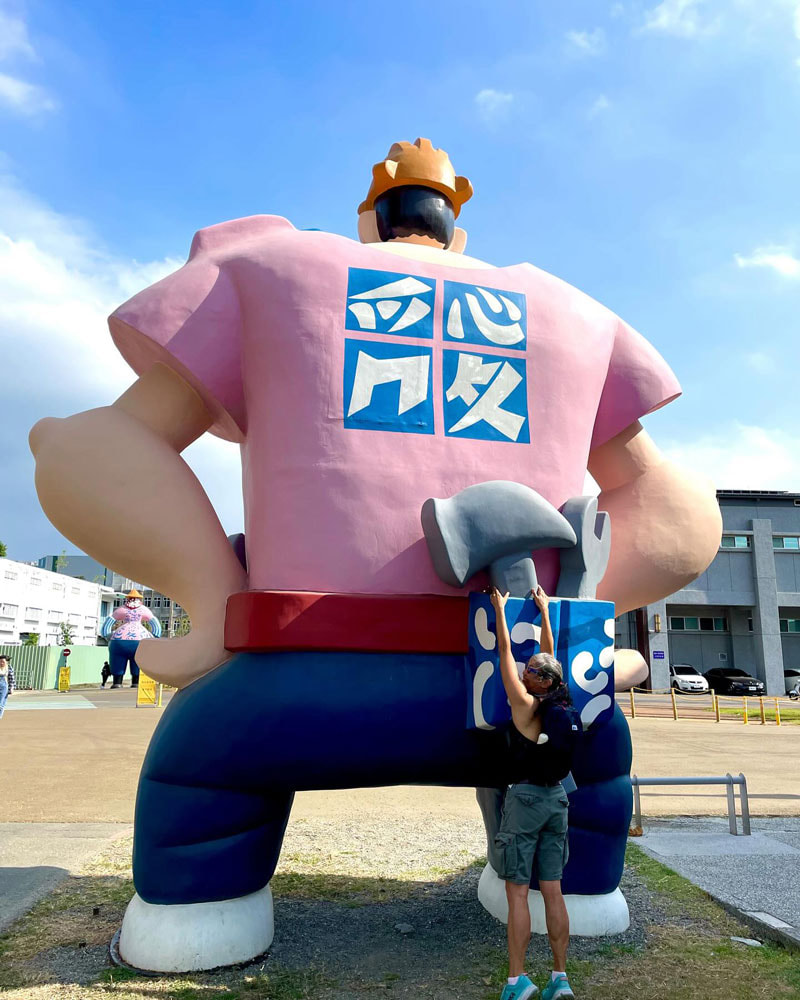
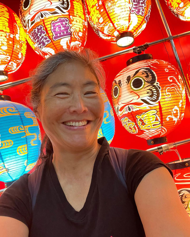
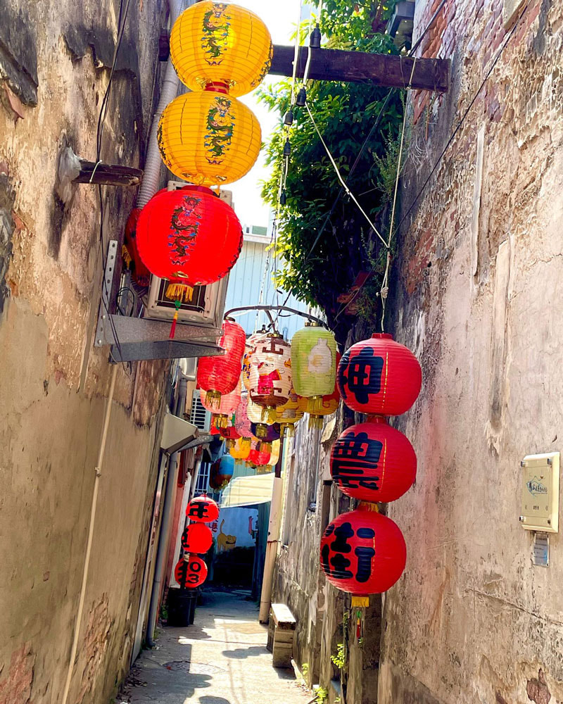
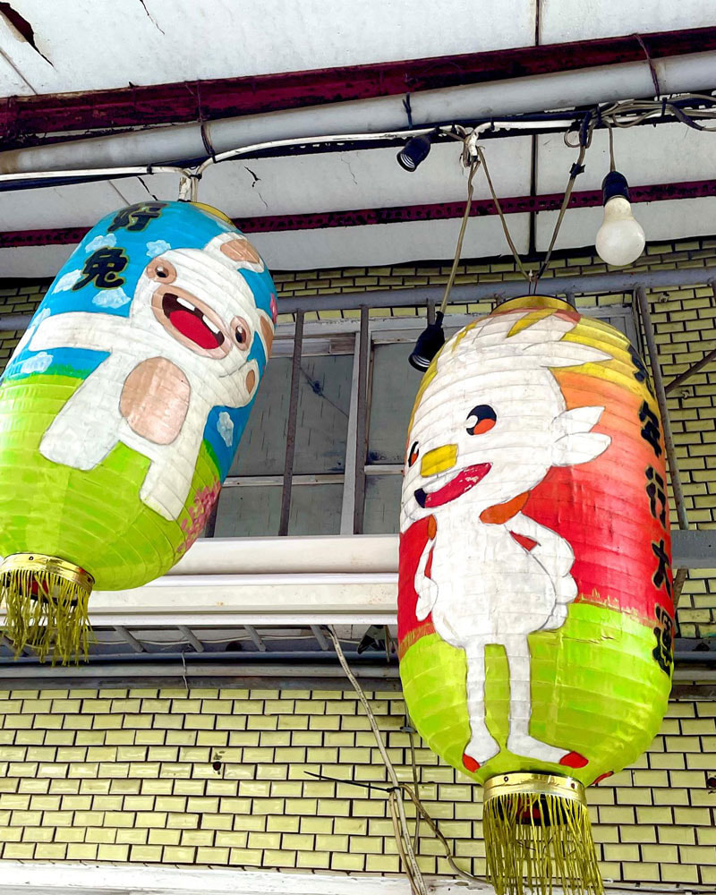
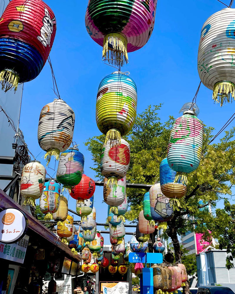
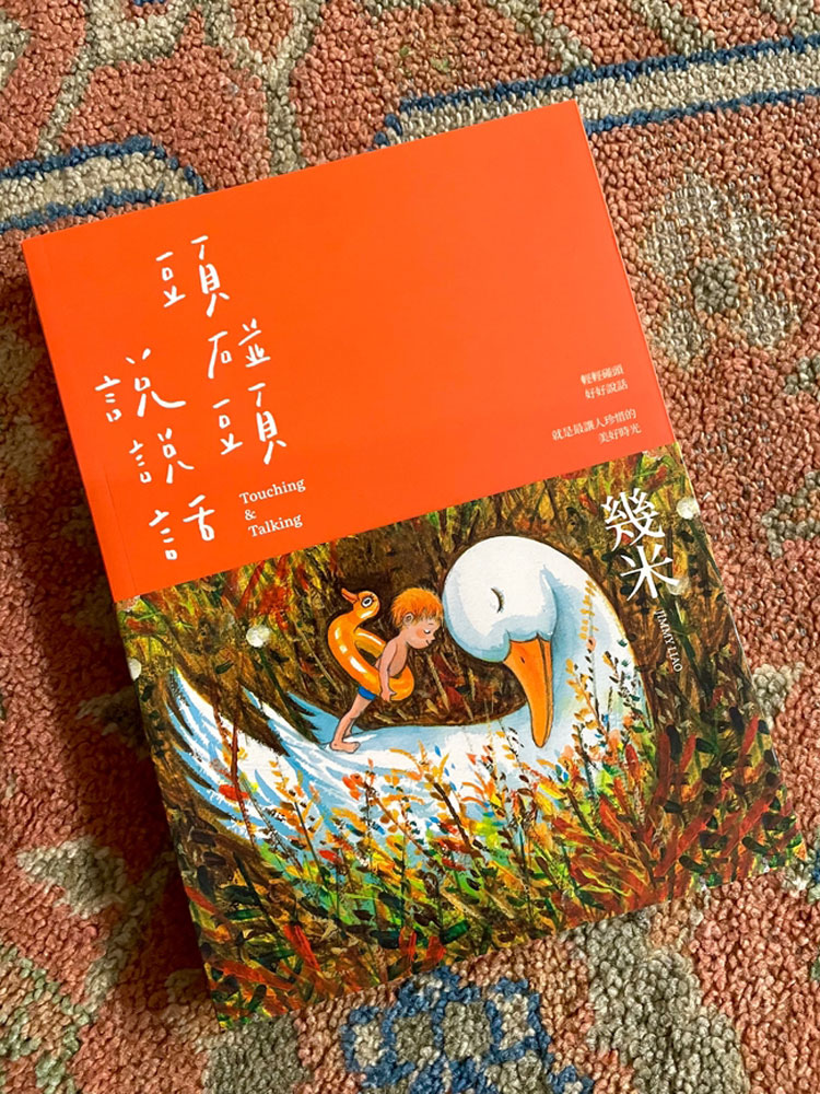
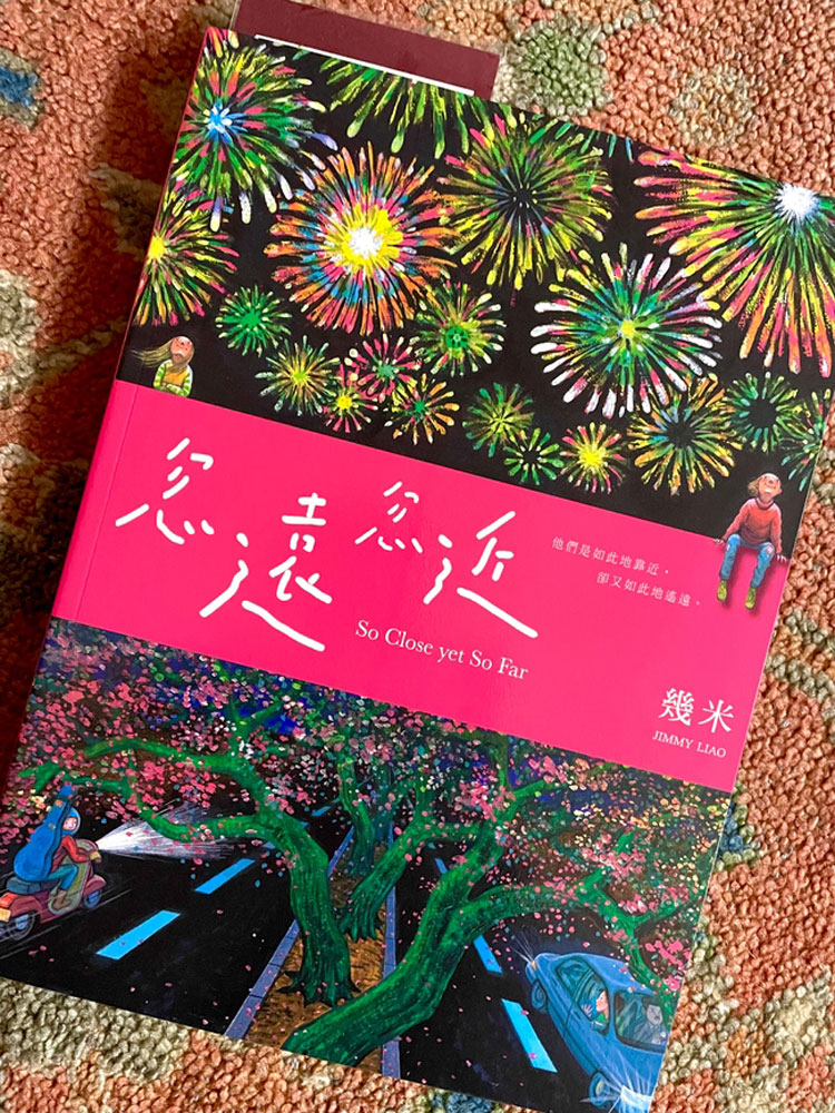
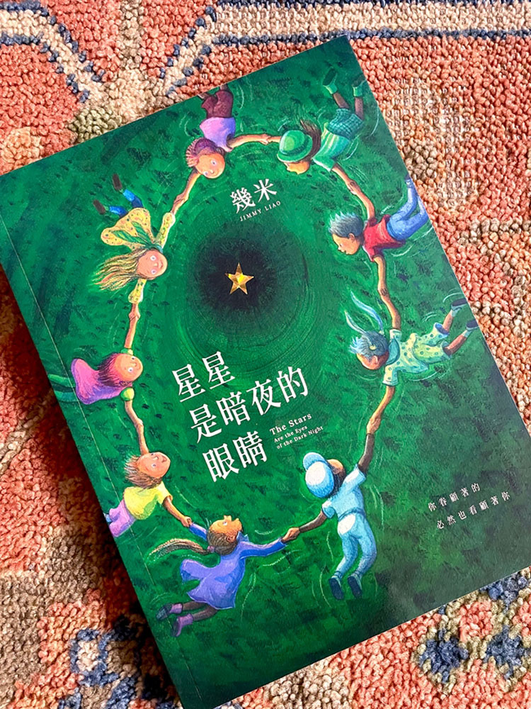
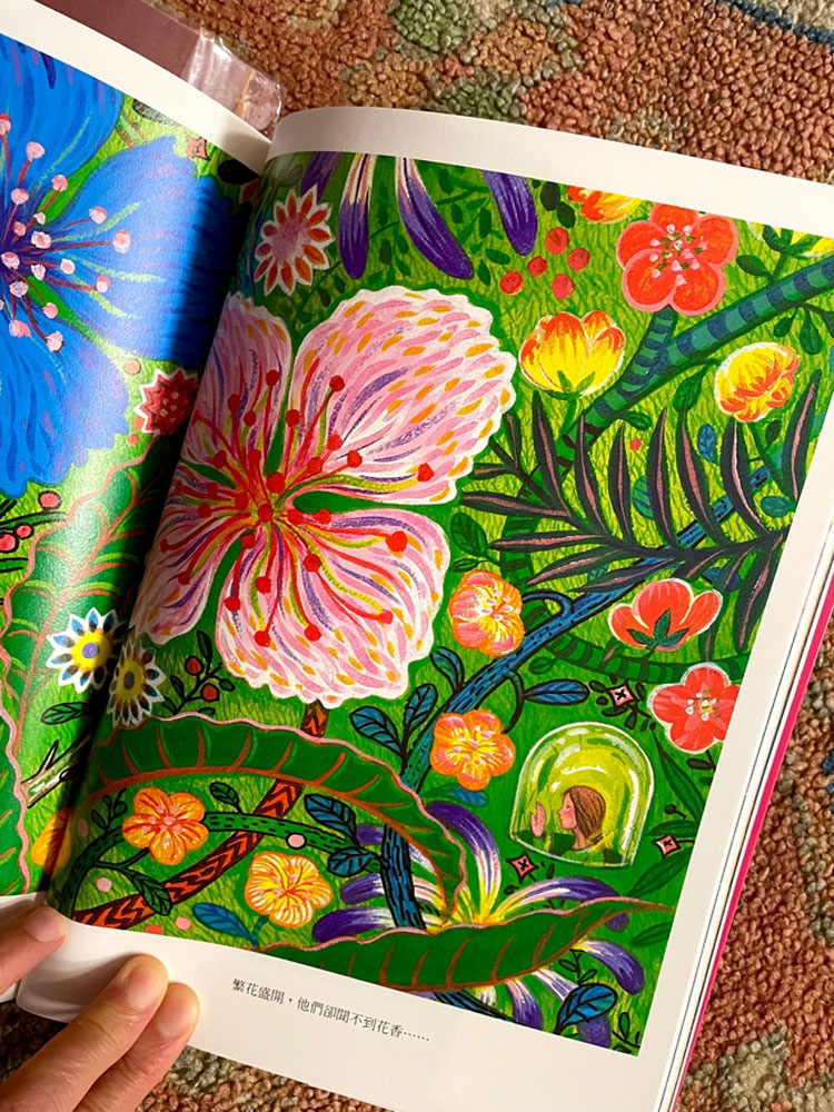
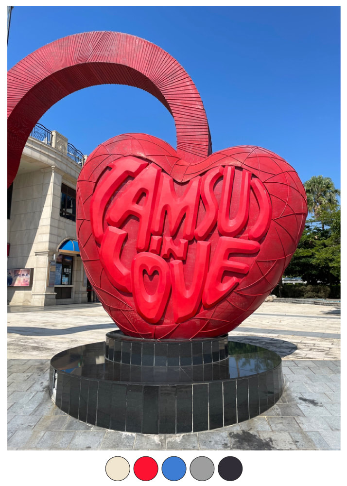
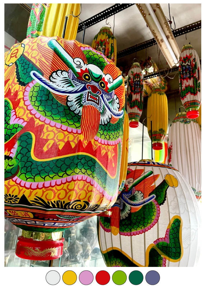
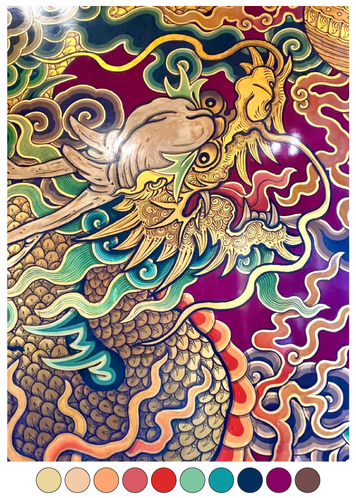
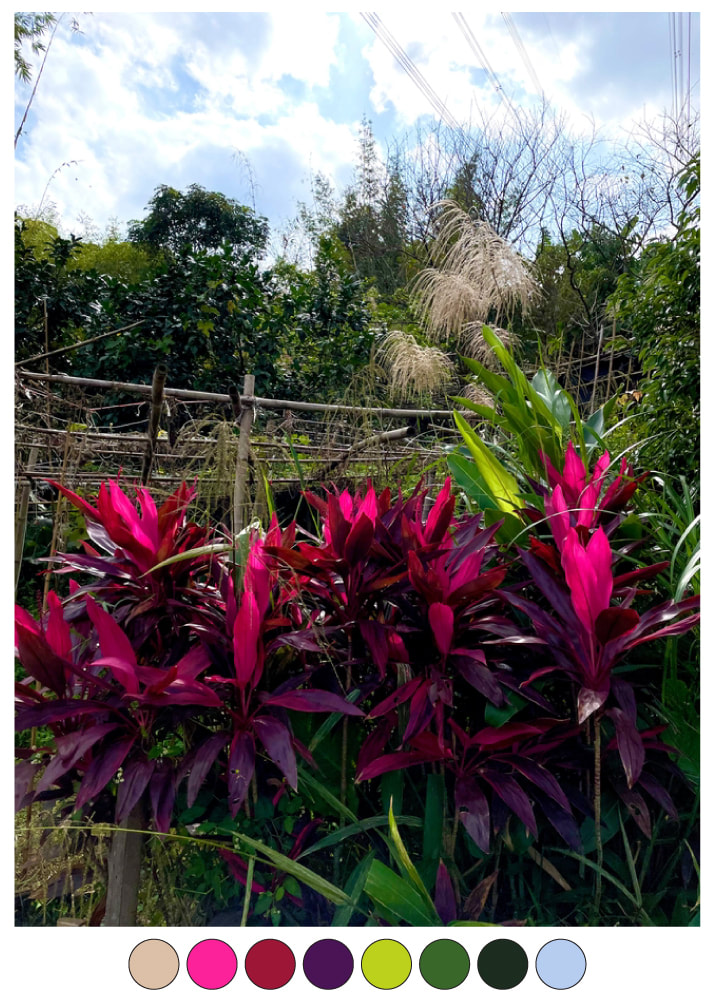
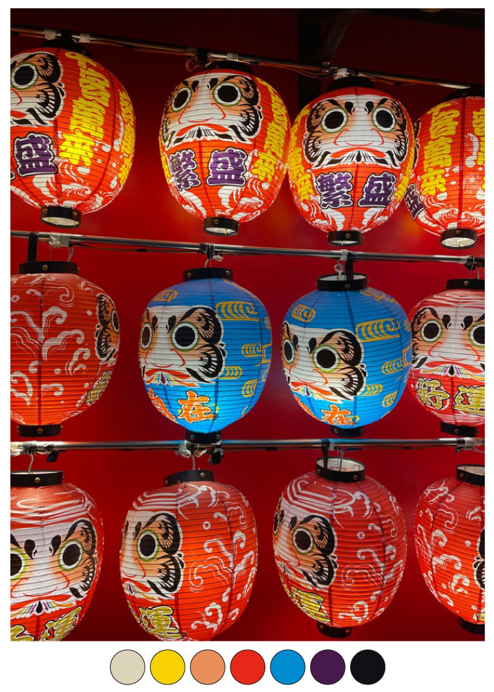
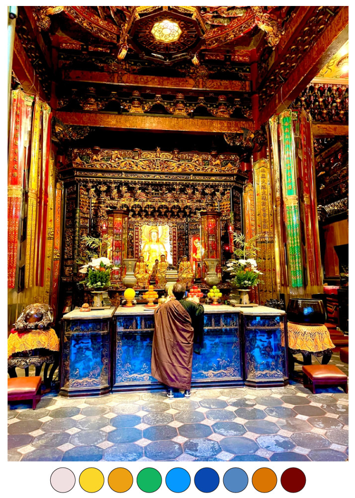
I recently had the good fortune of spending two fantastic weeks in Taiwan. Although my time there was too short for such a fascinating and varied place, I did manage to spend time in the capital city of Taipei, Hualien on the picturesque East Coast, including the nearby Taroko Gorge (a natural wonder), historical Tainan and arts-filled Kaohsiung. Rather than simply outlining my travel itinerary, I wanted to show you some of the things this surface pattern designer found particularly inspiring, and that I’m sure will inspire some new pattern designs! I hope they inspire you too! Here they are in no particular order… The 15000 Temples of Taiwan Yup, apparently there are 15000 temples in Taiwan devoted to Buddhism, Confucianism and Taoism! We visited famous Longshan and Bao’an Temples in Taipei, of course, and numerous others, including small neighbourhood temples that are absolutely everywhere. It’s hard to walk any distance without passing a temple, and you will always spot several in every town you pass by on the high-speed rail. The bright colours and shimmering gold, large-scale paintings, tilework, glowing lights, carvings and sculptures of gods, heroes and animals, and hand-embroidered robes and banners (more on this below) are jaw-dropping. See more Temple pics at my Instagram post HERE. Artisan Hand-Embroidery I searched out one of the small shops that still hand-embroider the magnificent robes and banners that embellish Taiwanese temples. Here are pics I took at the Tainan Kuang Tsai Embroidery Shop, and an example of a finished robe spotted in a temple. Common motifs include temple buildings, dragons, Chinese calligraphy, clouds, animals and flowers, and are often “3-D” and wrapped in glittering silver and gold threads. Wow! See more pics from this Tainan embroidery shop at my Instagram post HERE. Taiwan Glows at Night Taiwan's fantastic cities REALLY come to life and sparkle at night...From modern architecture lit up in bright colours, including Taipei 101 (once the world's tallest building) and dusk views from its 91st-floor Observatiory watching the city lights blink on; to public sculptures that light up arts districts (sometimes with music!); to glowing temples and historical shops open late; to bustling night markets and neon-lit places to eat, drink and socialize...Fantastic! You can see more Taiwan At Night pics at my Instagram post HERE. Characters Everywhere Taiwan is so FULL of colour and charm, evident in all the characters I spotted around Taipei, Hualien, Tainan and Kaohsiung...Some of these are honest-to-goodness "public art", while some are "just" storefront or restaurant mascots. But whether they're art pieces commissioned to be installed in Taiwan's numerous "creative and cultural parks" or temples, or cute kitsch designed to attract customers to a shop or restaurant or to endorse tourism, I LOVE THEM ALL! There's more Character pics at my Instagram post HERE. Colourful Paper Lanterns Just SOME (and I stress, SOME) of the paper lanterns I spotted while wandering the streets, small traditional shops and magnificent temples of Taiwan. See more of these colourful Paper Lanterns at my Instagram post HERE. Jimmy Liao: Taiwanese Children’s Book Illustrator The huge Jing Si Hall in Hualien has a wonderful bookstore, and it was here that I discovered the Taiwanese children’s book author and illustrator Jimmy Liao. On further research, I’ve learned he is an internationally-acclaimed illustrator. Even though the 3 books I bought are all in Chinese, I couldn’t resist his beautiful sweet images. I’ll just have to fire up Google Translate! Check out his beautiful illustrations on Instagram at @jimmy_liao_official. The Colours Of Taiwan When I return to the studio after a trip (especially one as colourful as this one!), I often use my travel photos to develop new colour palettes. With this process, I always try to first pull out the brights (just because I love bright colour!), then I add in some of the more neutral, earthier and muddier colours to round out the palettes. I find that this is a fantastic and useful exercise: it’s a great way to understand your own colour “style” and to develop colour palettes that are uniquely your own. See below for examples.
I’ll Have To Go Back! This is just a small compilation of some of the design and arts inspirations I saw during my trip to Taiwan. But Taiwan is full of natural wonders, wildlife and flora; layers of interesting history including colonization by the Dutch, Spanish and Japanese whose legacies still colour present-day Taiwan; and delicious and unusual foods (stinky tofu anyone?!), drink (it is the birthplace of bubble tea!) and desserts (my favourite is matcha shaved ice!) offered in numerous small neighbourhood eateries, high-end restaurants, and bustling neon-lit night markets. I’ll just have to go back!
0 Comments
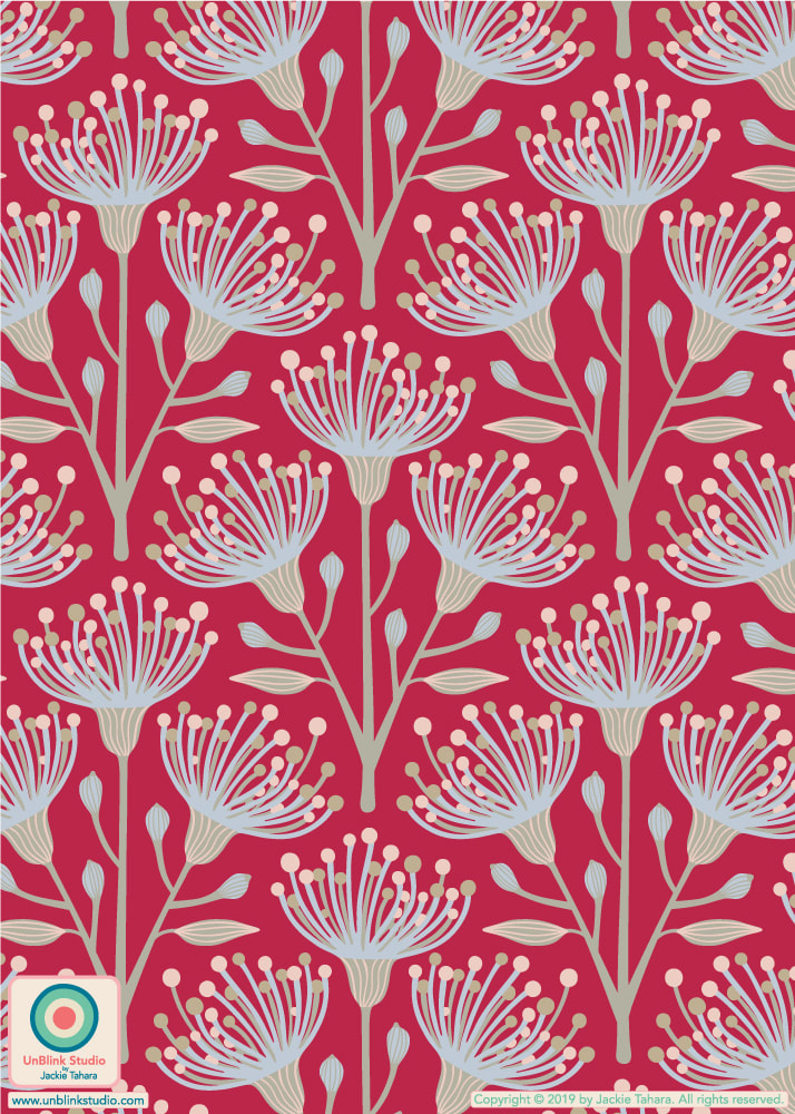
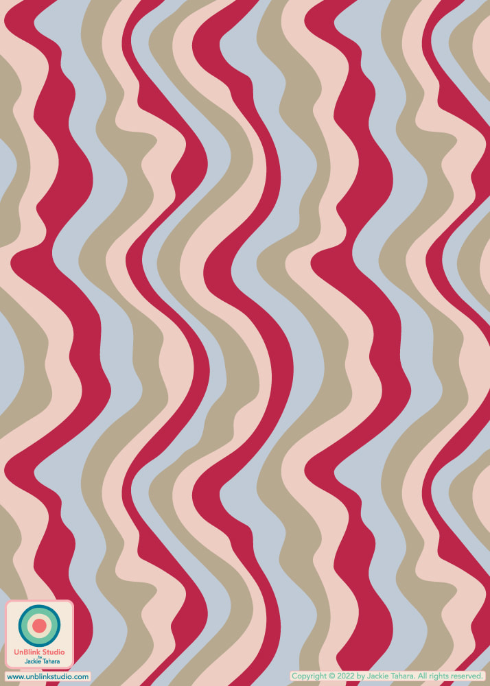
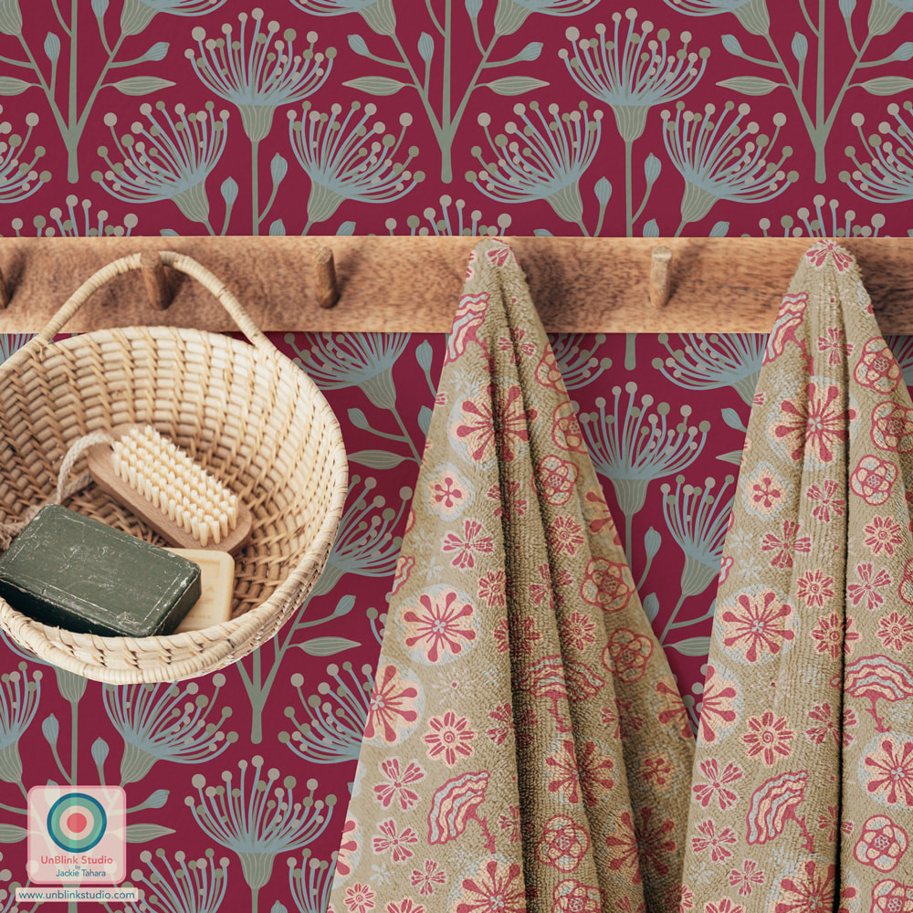
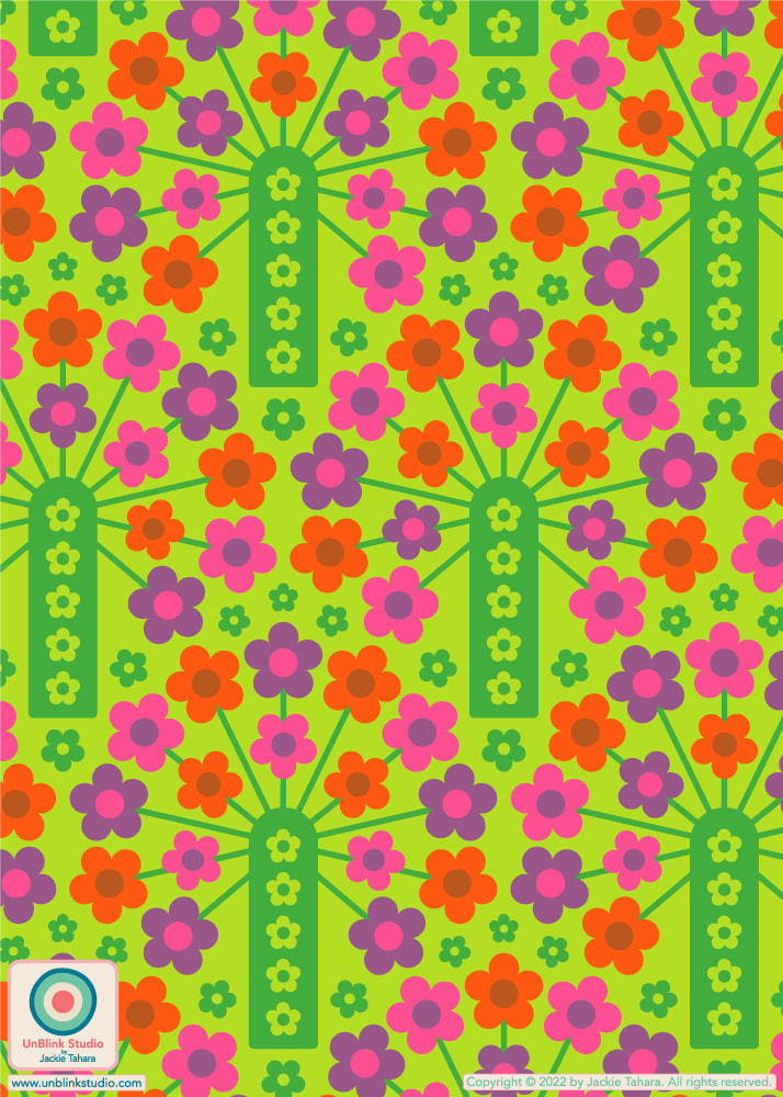
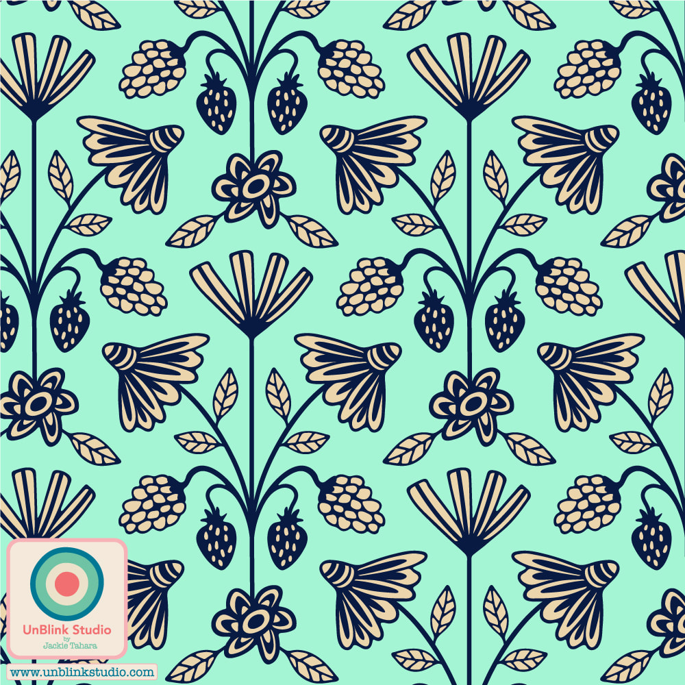
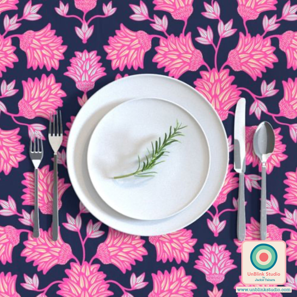
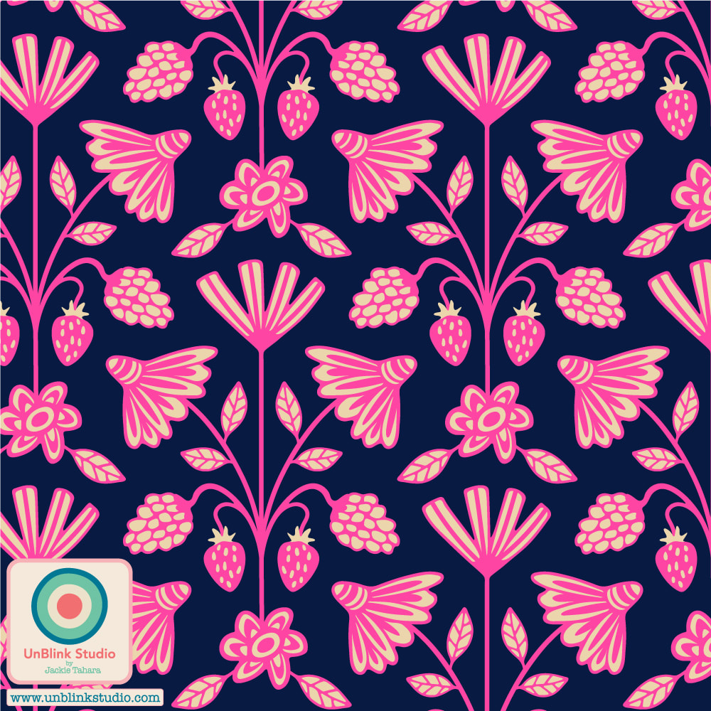
This week's Spoonflower Design Challenge is "Passementerie" and this is my entry which I'm calling... "Passementerie" (I like the word!) For those who don't know, passementerie are gorgeous trims and embroidery used for clothing and furnishings. I created this design in some other colours, but I entered the first one in Delicate Colours because they felt like Spring to me (if you're feeling more like Summer, you'll like the tropical-colour version, scroll down below)! Voting for this Challenge opens tomorrow Thursday March 9 and you can link to the Voting Page HERE! And click each of the images below to go directly to the Medium-Scale of these designs in my Spoonflower Shop! These are also available in a Small-Scale and Large-Scale version too! 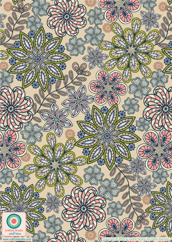 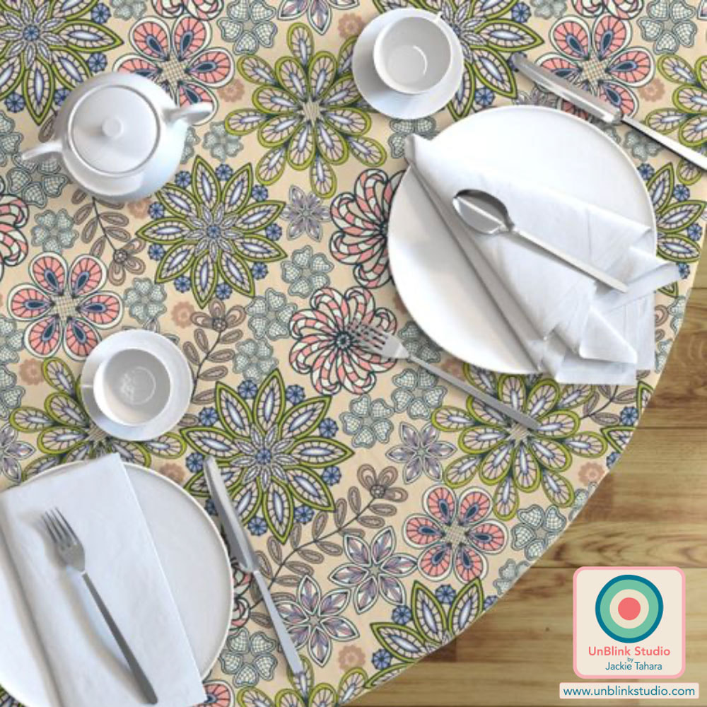 And see below for some other colourways of my "Passementerie" floral pattern design: Tropical Retro 70s Colours and Viva Magenta with Pink! Any favourites? 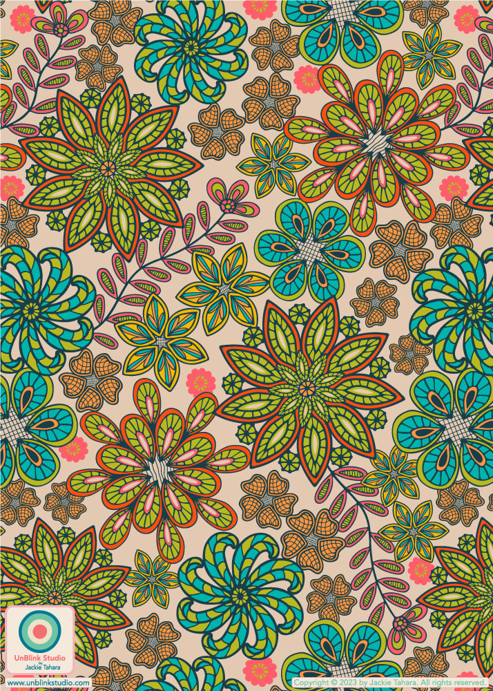 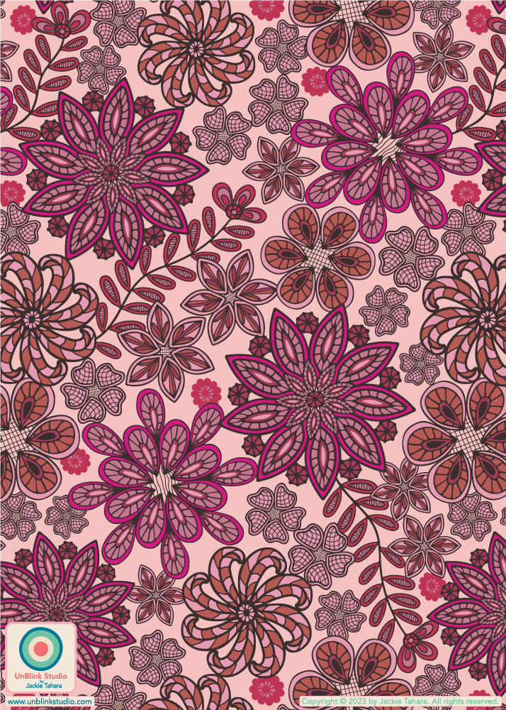 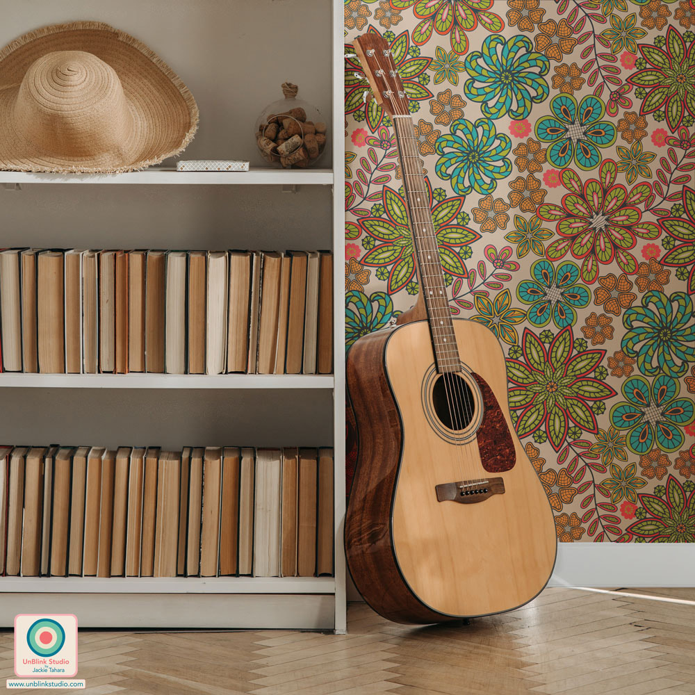 If you haven’t heard already, the 2023 Pantone Color of the Year is “Viva Magenta”, described as “a shade rooted in nature descending from the red family and expressive of a new signal of strength. Viva Magenta is brave and fearless, and a pulsating color whose exuberance promotes a joyous and optimistic celebration, writing a new narrative”. When Pantone announced their colour choice, I immediately started experimenting with this colour and the Pantone “Inspire” colour palette. See some of the results below, and check out more in my “Viva Magenta Collection”! All of these pattern designs are now available in my Spoonflower Shop on Fabrics, Wallpaper and Home Decor! AND I entered my "Hana-Dark" Japanese-inspired design (first pic) in the Spoonflower "Viva Magenta" Design Challenge! I was a bit distracted over the holidays so I forgot to post about this Challenge earlier, but you can still vote until tomorrow January 3 2023!
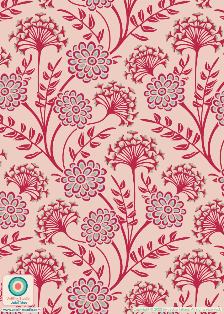
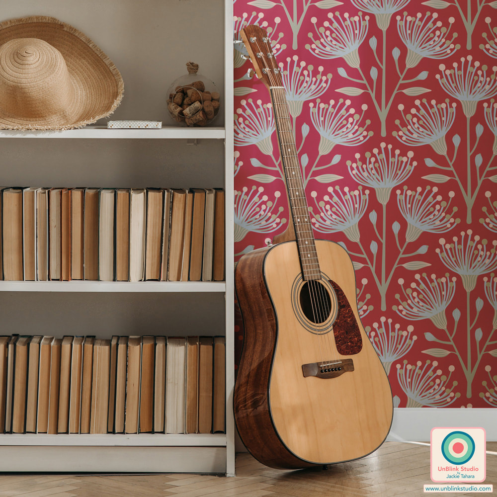
When I snap a pic that for some reason I just really like, it's often because there's just "something" about the captured colours. Picking out these colours is one of my favourite ways to come up with new colour palettes for pattern designs. For example, here is a photo I took at the Santa Cruz Beach Boardwalk while on a coastal roadtrip to California in June, and I just really love this pic of a vintage-inspired ride. So I picked out some gorgeous colours to create a new palette...Expect to see these colours in a new design! How do you come up with new colour palettes? Do you use your photos too? 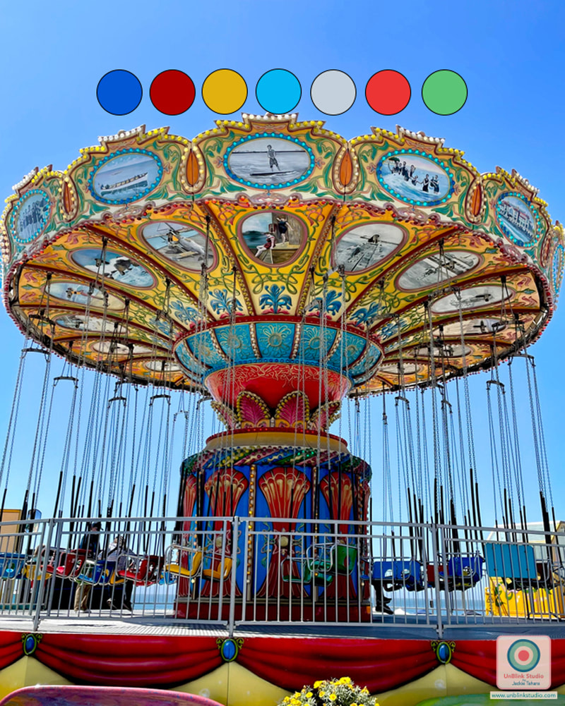 I entered my "Cow Parsley" design in this week's Spoonflower "In the Weeds" Design Challenge! But you know me, I had to try it out in a BUNCH of colours! Although the first version below is the one I entered in the Challenge (link to the Voting Page HERE), now that I'm seeing them altogether, I'm not sure which one I prefer?! Anyway, the first one is the only one I had finished before the deadline, and all the colours are now available in my "Cow Parsley" Collection in my Spoonflower Shop on Fabrics, Wallpaper and Home Decor in 3 sizes, so I guess it doesn't matter which one I prefer?! Although I'd be interested to know which one YOU prefer...
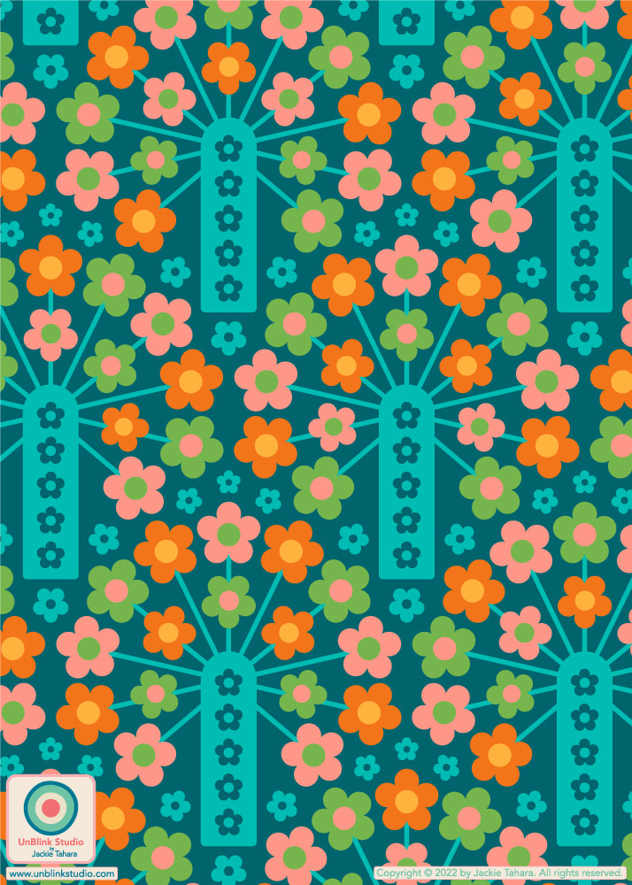
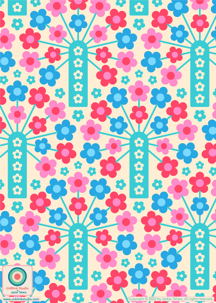
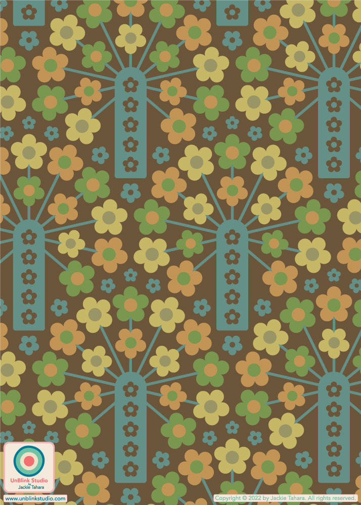
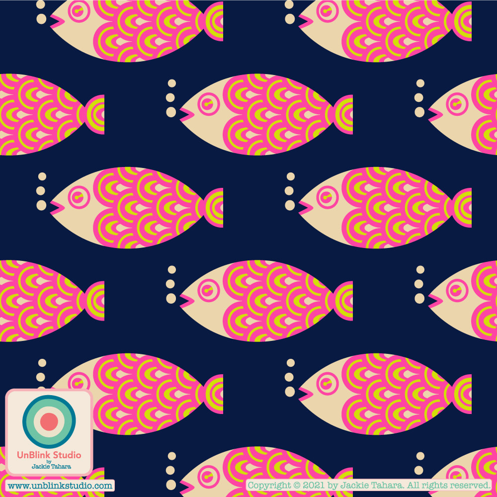
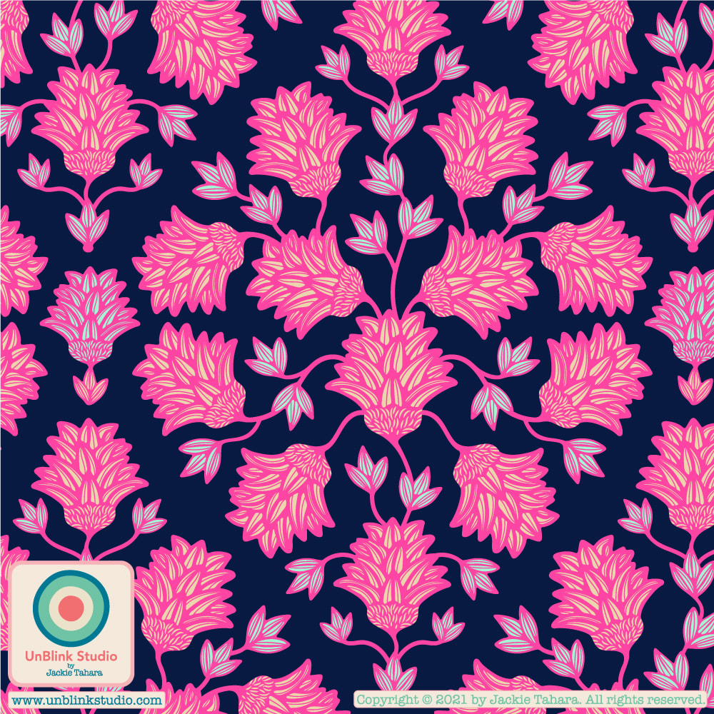
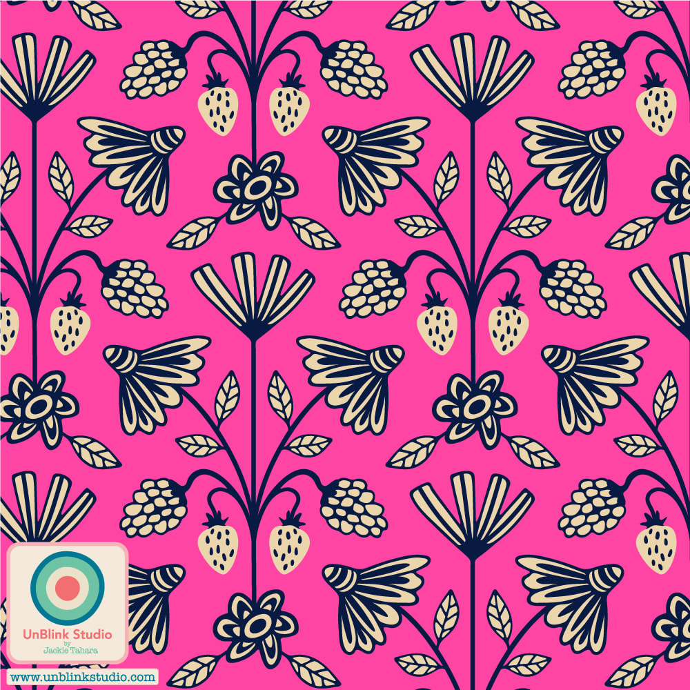
This Week's Spoonflower Design Challenge: "Petal Coordinates Limited Color Palette: Candy"!3/10/2022 The idea behind this week's Spoonflower "Petal Coordinates Limited Color Palette: Candy" Design Challenge was to create a pattern design using the 3 given colors of Cotton Candy, Lilac and Seaglass with optional Black and White (I love these kinds of challenges!) Here is my entry, "It's A Jungle Out There"! Voting is open now until March 15, and you can check out all the entries at the Voting Page! BTW: This floral now comes in a bunch of other colourways too...Of course, I couldn't resist the opportunity to play with colour! Check out all the colourways HERE! 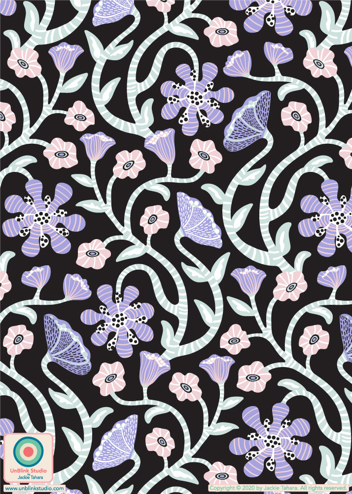 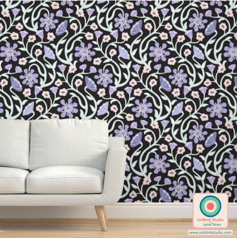 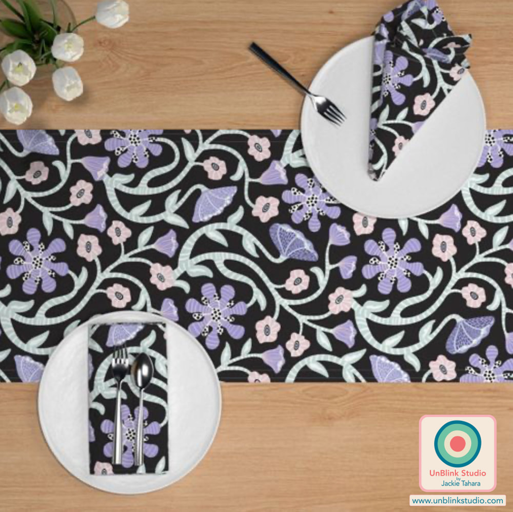 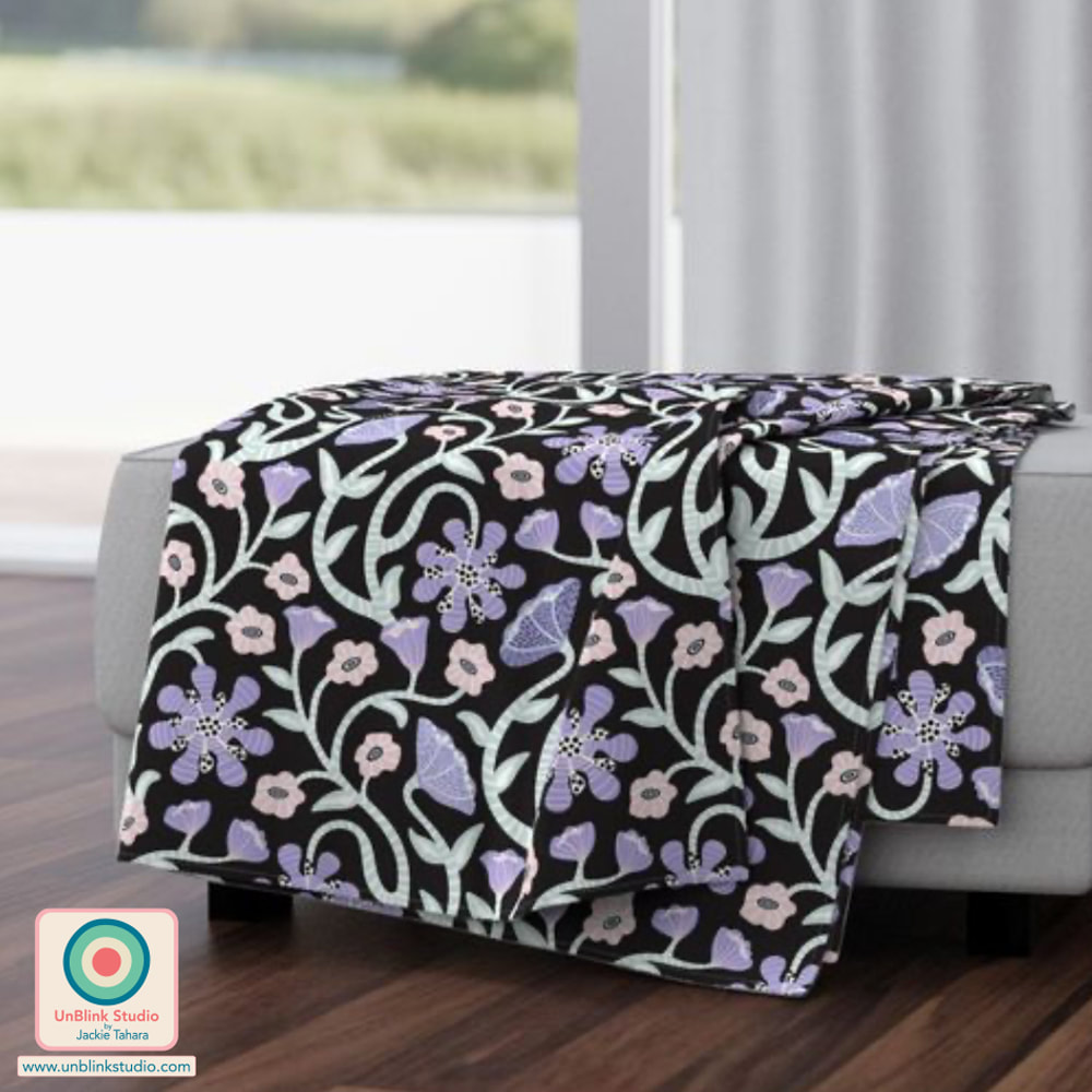 I'm participating in a very fun and inspiring pattern design project which is launching today...the "Collectively Independent Spring 2022" Collection on Spoonflower! For this project, 59 Designers from 14 Countries used 1 Colour Palette to create 1079 (!) Pattern Designs, all organized into 6 Sub-Collections: HERO PATTERNS, FLORALS, BASICS, PLAID, BLENDERS and CHECKS. Because each of us pattern designers had the freedom to design whatever we wanted to fit within each Sub-Collection (each designer was limited to 5 designs per Sub-Collection), there's a fabulous mix of themes and styles (I have my eye on some favourites!), but all are united by the single chosen colour palette. So it's a snap to MIX & MATCH different patterns for your next project, whether you need Fabrics, Wallpaper or Home Decor! There really is something for every taste! I might suggest you have a look at the HERO PATTERNS and FLORALS first, then start adding BASICS, PLAID, BLENDERS and CHECKS to round out your project. And maybe you should "limit" your time since once you start looking you might not be able to stop! Have FUN! THE COLOUR PALETTE The chosen colour palette consists of 7 beautiful colours. Some designers used all 7 colours in their designs and some used only a few. To see more from the Designers, be sure to check out #designerspr22 on Instagram! 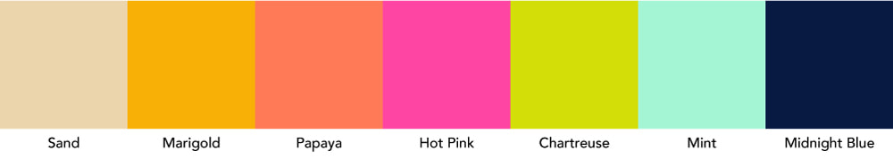 HERO PATTERNS Here are the 5 patterns I submitted to the HERO PATTERNS Sub-Collection which also contains handy and useful Solid Colours too! Check out the HERO PATTERNS Sub-Collection HERE!
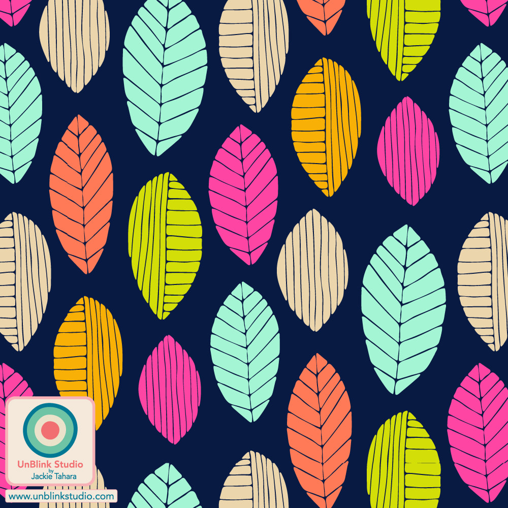
FLORALS Always one of my favourite themes, check out the designs I submitted to the FLORALS Sub-Collection! Check out the FLORALS Sub-Collection HERE!
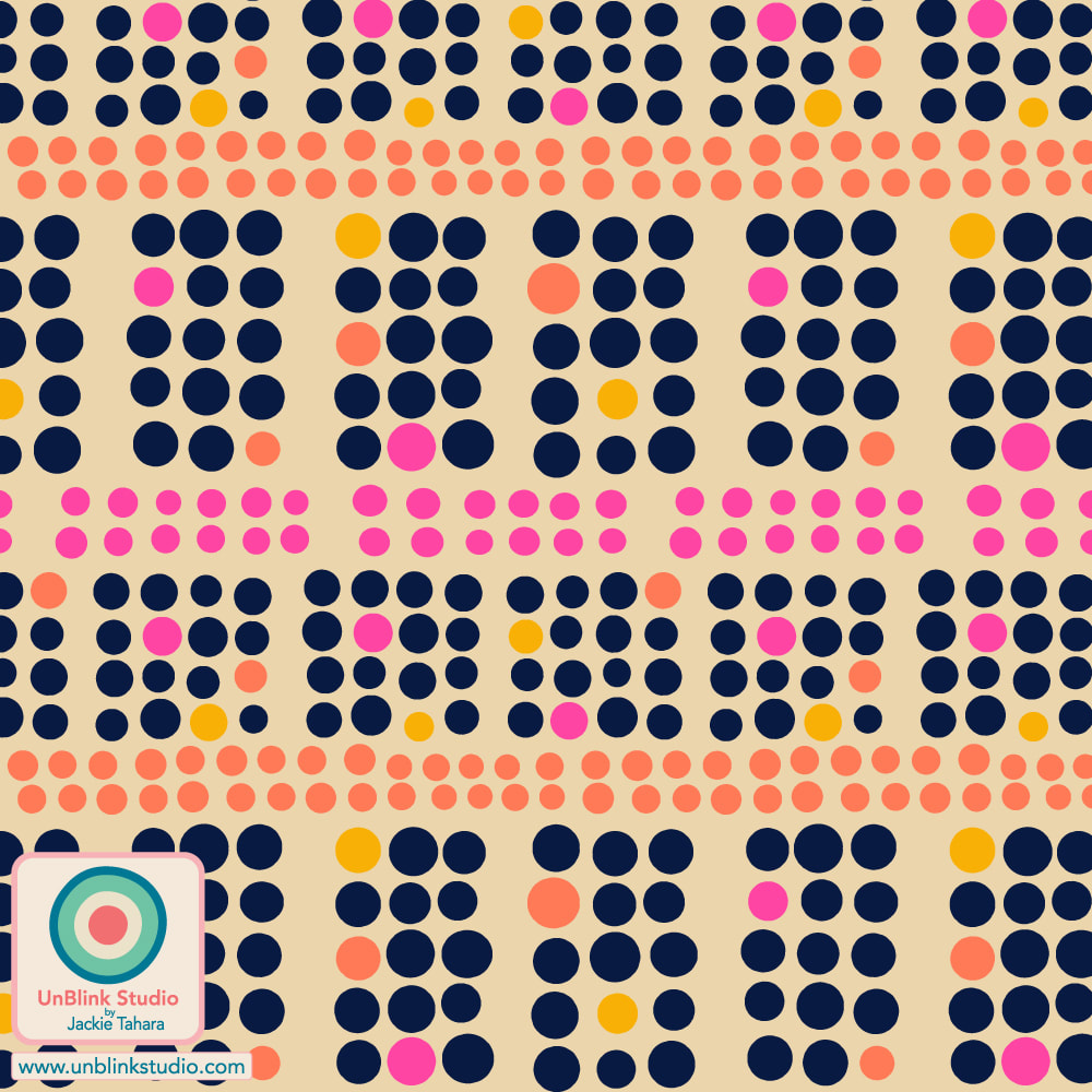
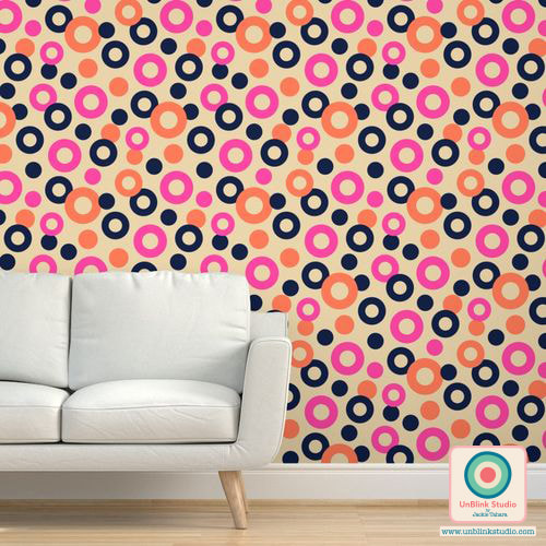
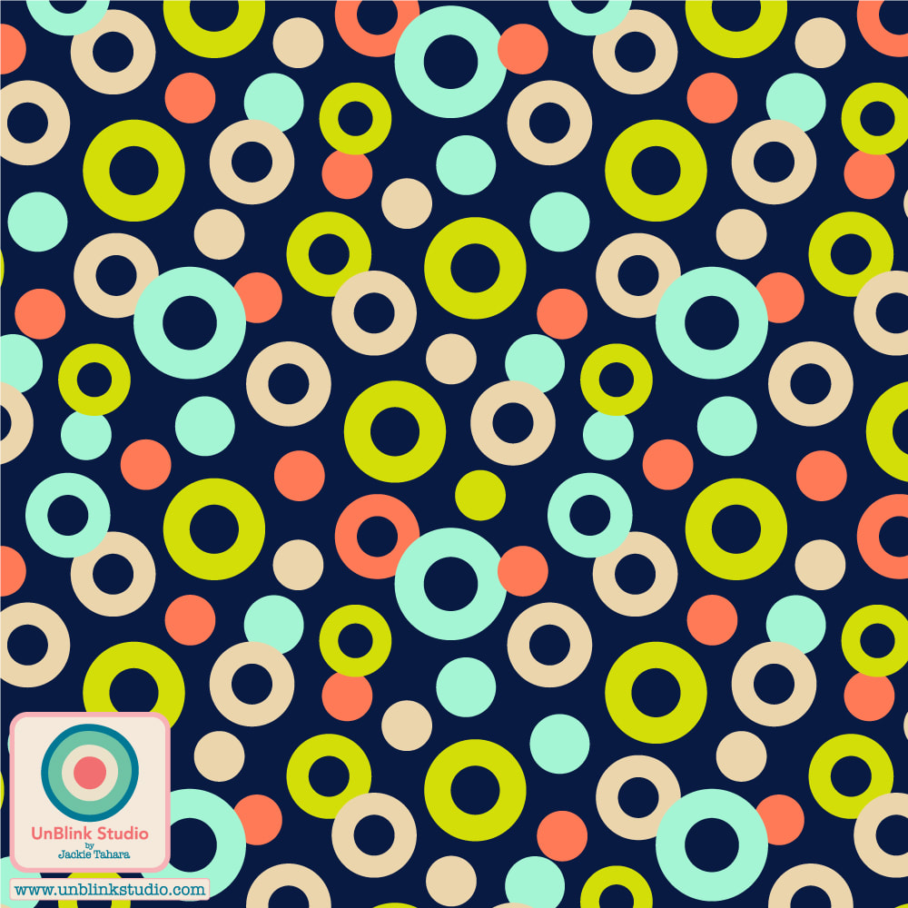
BASICS and PLAID The BASICS Sub-Collection includes Geometrics, Stripes, Chevrons, Dots, and the like. Have a look at the BASICS Sub-Collection HERE and the PLAID Sub-Collection HERE for some beautiful co-ordinating patterns!
I didn't submit designs to the BLENDERS and CHECKS Sub-Collections, but be sure to check them out too! The Spoonflower "Collectively Independent Spring 2022" Collection
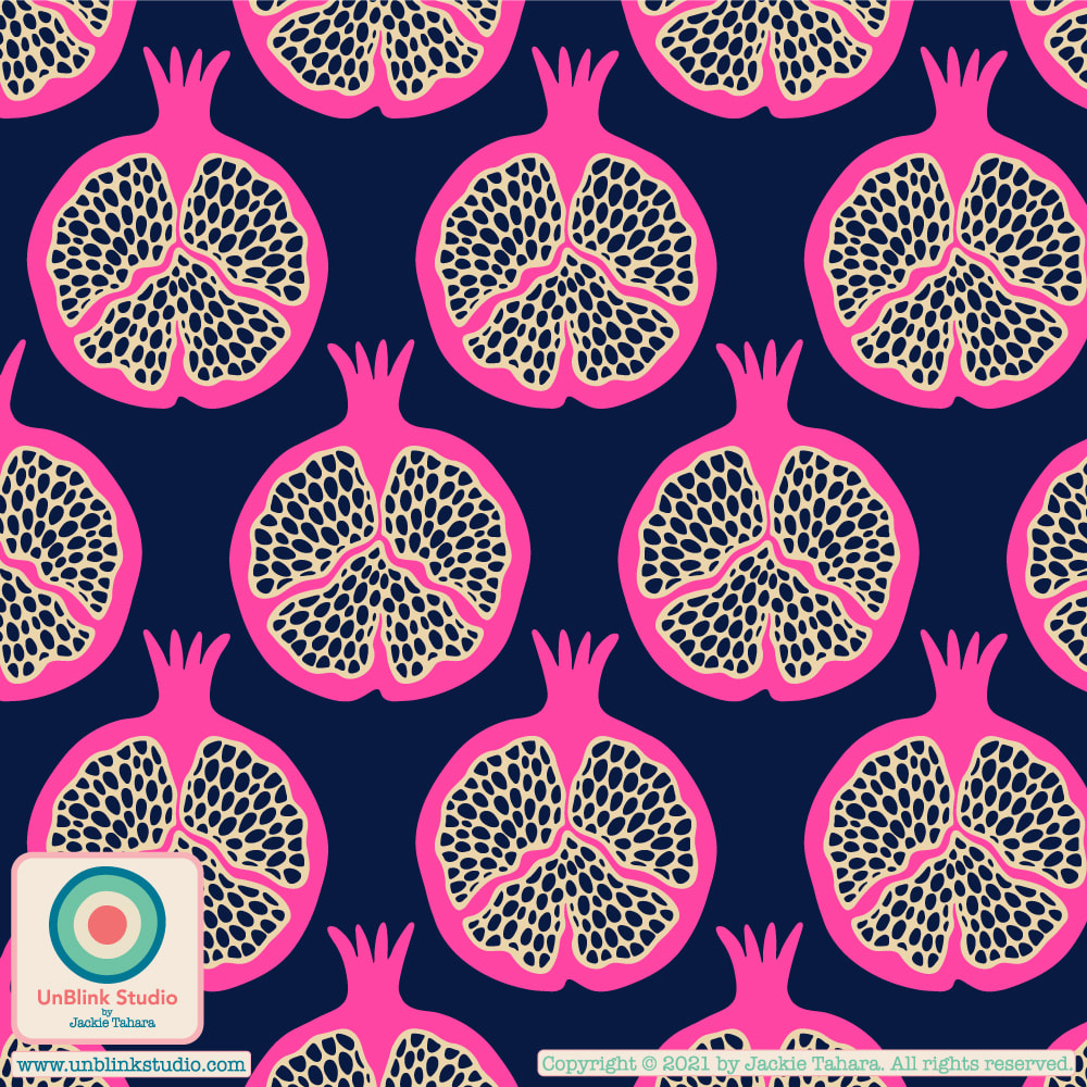
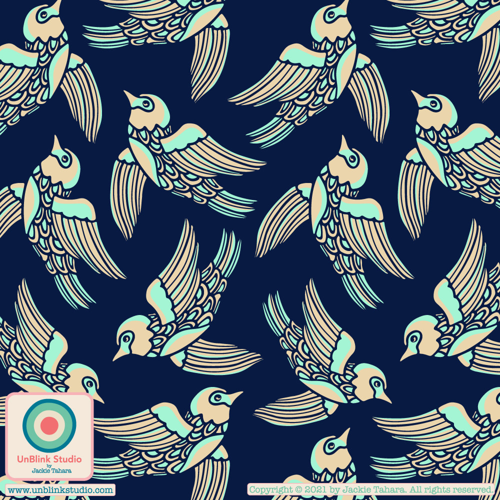
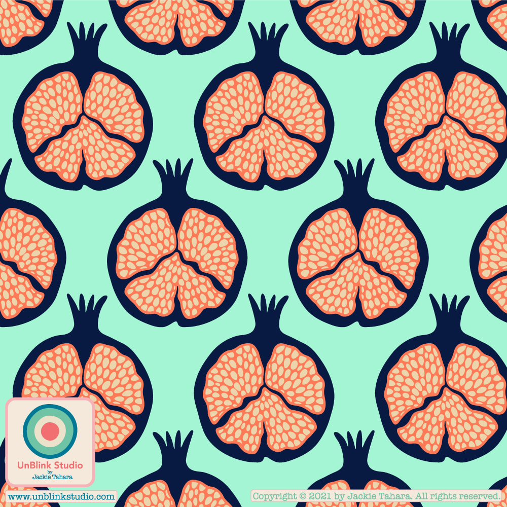
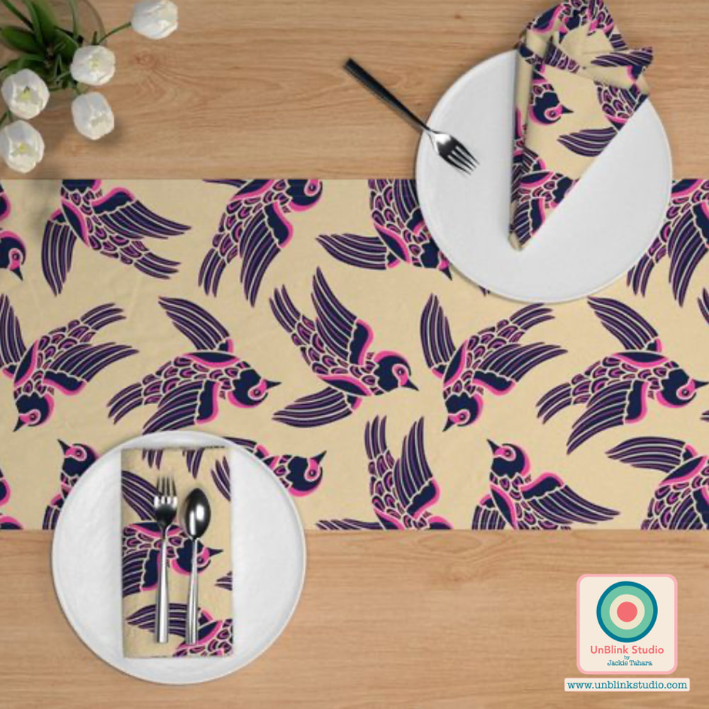
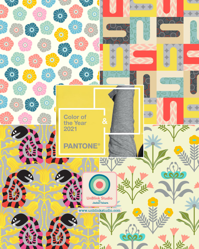
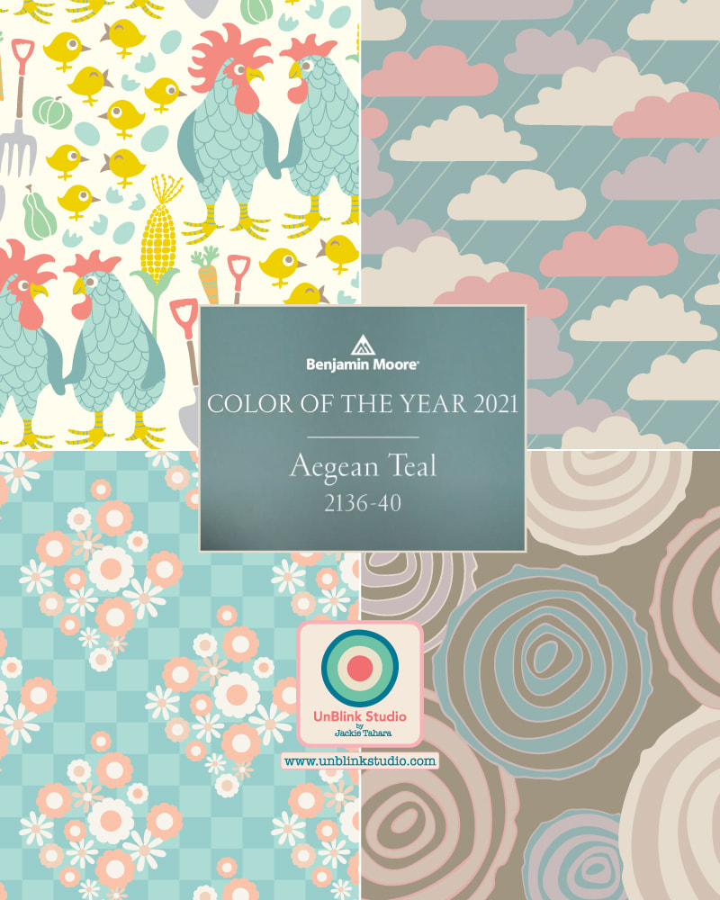
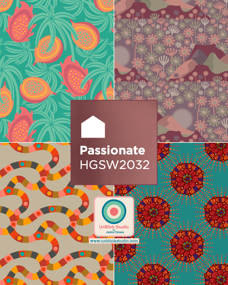
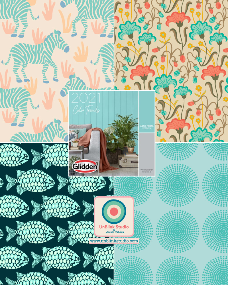
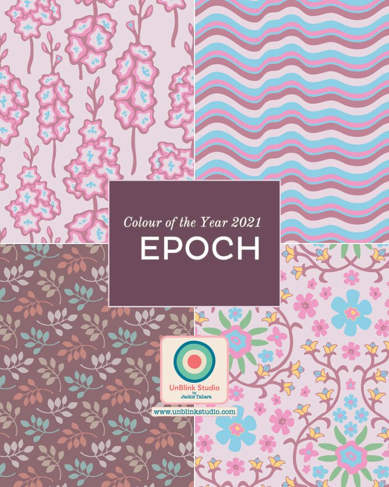
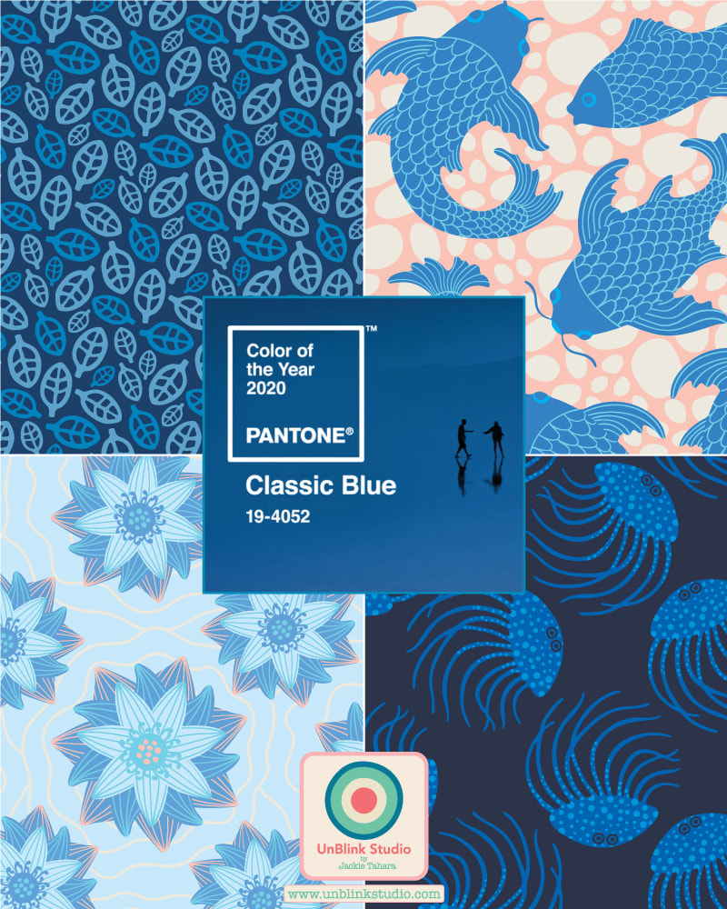
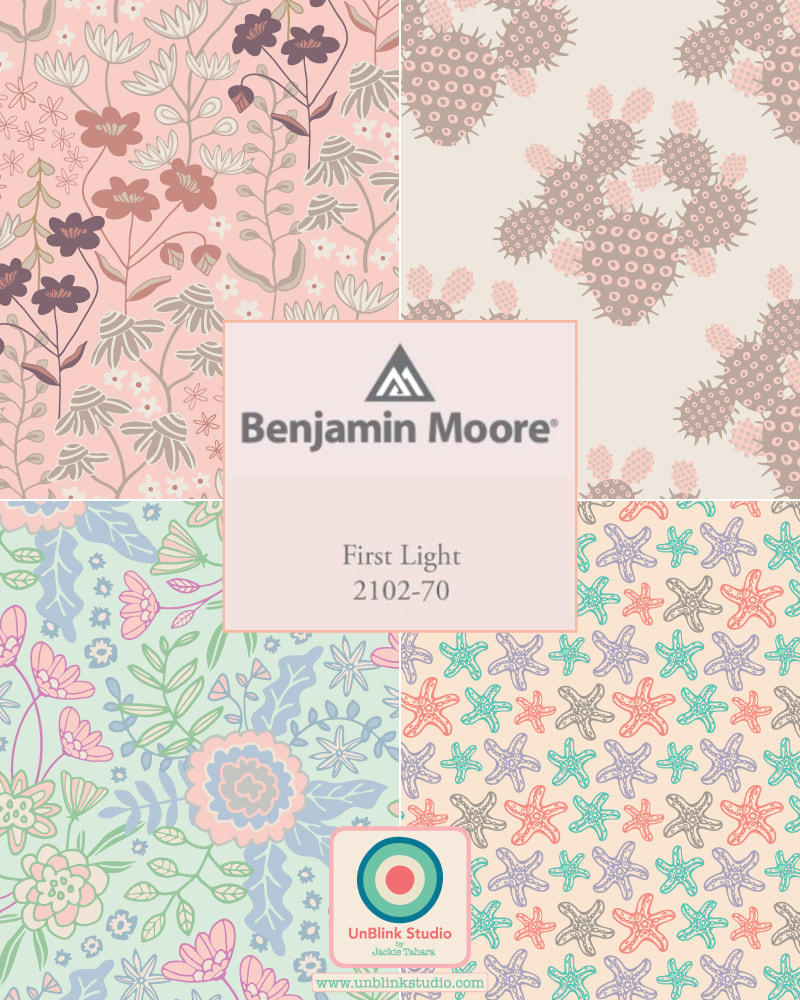
FAST FACTS: 1 Colour Palette 7 Colours 59 Designers 14 Countries 1079 Designs 6 Sub-Collections Be sure to check out #designerspr22 on Instagram for more! If you create something with any of the designs in this "Collectively Independent Spring 2022" Collection, please do tag me @unblinkstudio or send me a pic so I can see the results! Happy choosing and creating! It's 2021! And it's time to give you my overview of the 2021 Colors of the Year as chosen by various decor and paint companies, most notably Pantone. Whether or not you follow trends, I thought it would be fun (and maybe useful?) for you to see some of these all here in one place, with samples of how I've used them in my own pattern designs. Not surprisingly, most colours were chosen for their uplifting, comforting, calming, soothing, harmonious, optimistic and hopeful properties. If you're a designer looking for ideas and trends, or just someone wanting a 2021 re-fresh (don't we all?), see below. And scroll down to see summaries of how each company describes their 2021 color picks!
PANTONE: They say "Illuminating" ("warming and optimistic") and "Ultimate Gray" ("practical and rock solid") are "A marriage of color conveying a message of strength and hopefulness that is both enduring and uplifting".
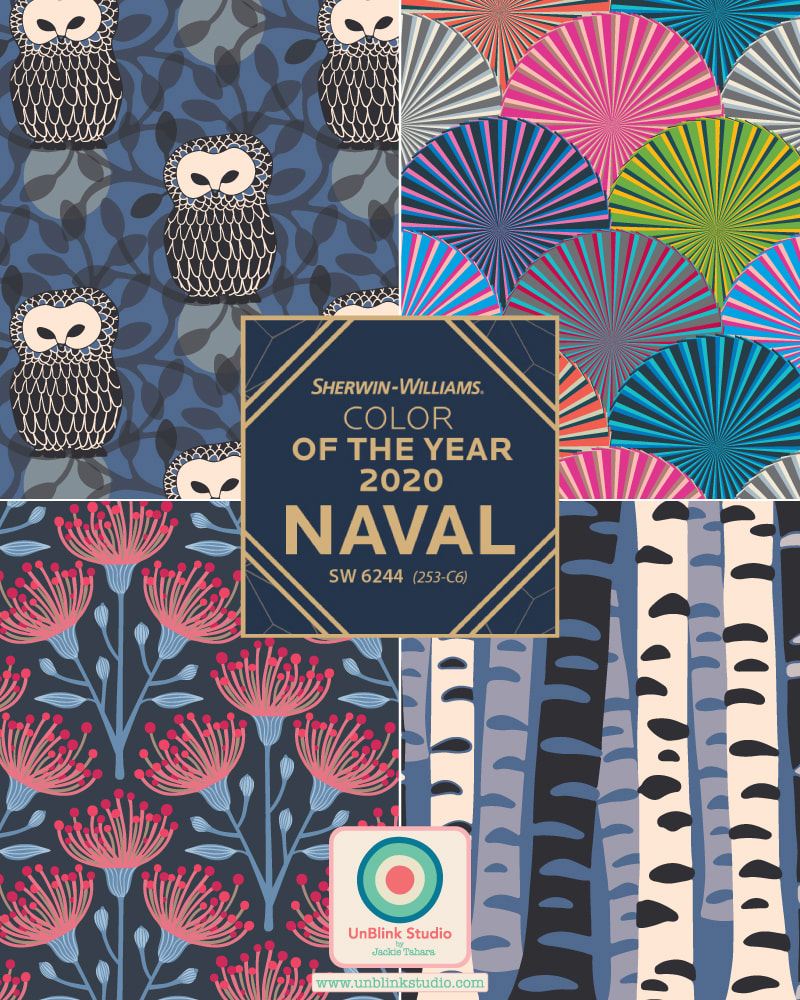
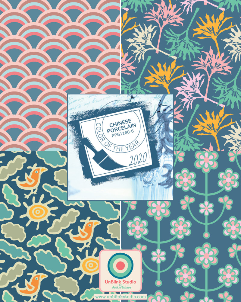
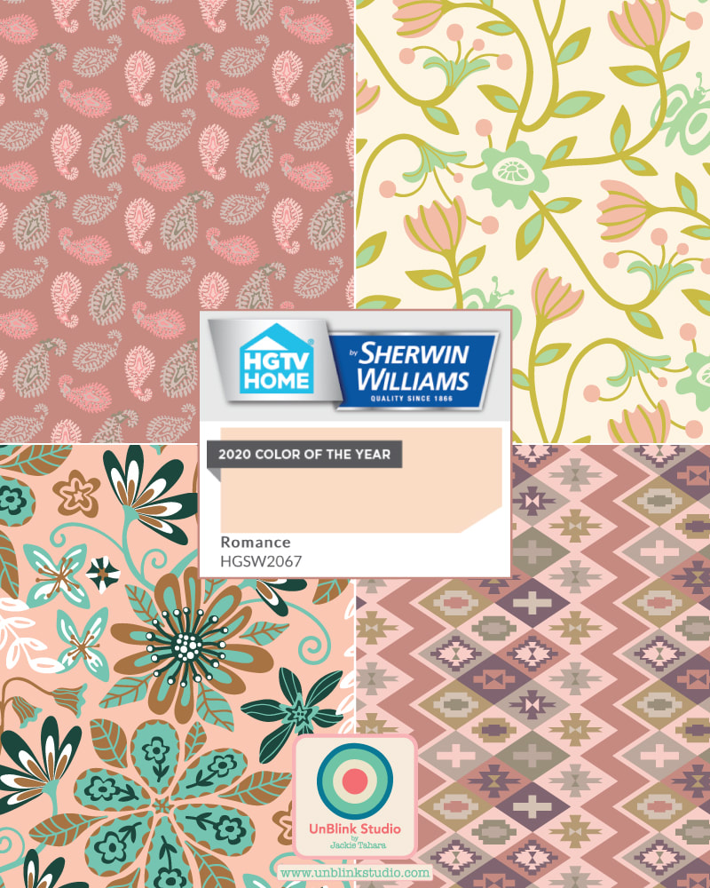
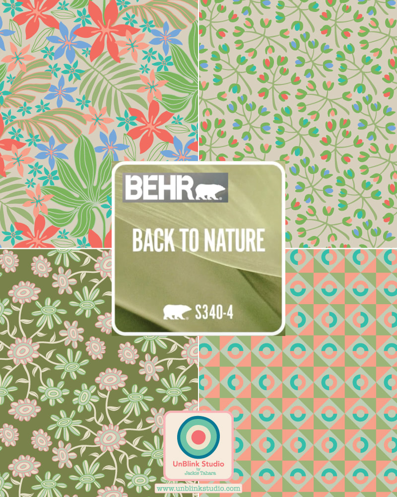
GLIDDEN PAINTS: They chose not a Color of the Year, but an ACCENT Color of the Year, "Aqua Fiesta", which they describe as: "Happy and muted, this beautiful color makes a sweet space that is not overly vibrant". BENJAMIN MOORE: They say, "Take a moment to reflect and reset. Intriguing, balanced and deeply soothing...Aegean Teal creates natural harmony". GRAHAM & BROWNE: This is how G&B describes "Epoch": "This rich, deep amethyst" is "associated with royalty as the cost of pigments were so expensive--the color has a calming effect on both the mind and nerves, and it can be uplifting and trigger creativity". HGTV by SHERWIN-WILLIAMS: They say, "Rich and empowering, Passionate is a bold red, that's steeped in history, merging modern design with traditional charm". SHERWIN-WILLIAMS: They say, "Tap into nature with a hue whose warmth and comfort breathe down-to-earth tranquility". And there you have it! If you have a favourite (or not?!), leave a comment here and let me know! My Entry for This Week's Spoonflower "Pine and Mint Throw Pillows" Design Challenge..."Sweet Pea"!3/6/2020 ...And now for something completely different...The idea for this week’s Spoonflower “Pine and Mint Throw Pillows” Design Challenge is to use just the two colours of Pine and Mint (plus black and white) to create a design suitable for throw pillows! Here is my entry called “Sweet Pea”! I originally designed this pattern design in other colours but thought pine and mint would work really well! If you would like to see all the entries, follow this Link to the Voting Page! ADDENDUM! This design won 66th out of 858 entries and as a result, it is immediately available for sale in my Spoonflower Shop on fabric, home decor, wallpaper and more! 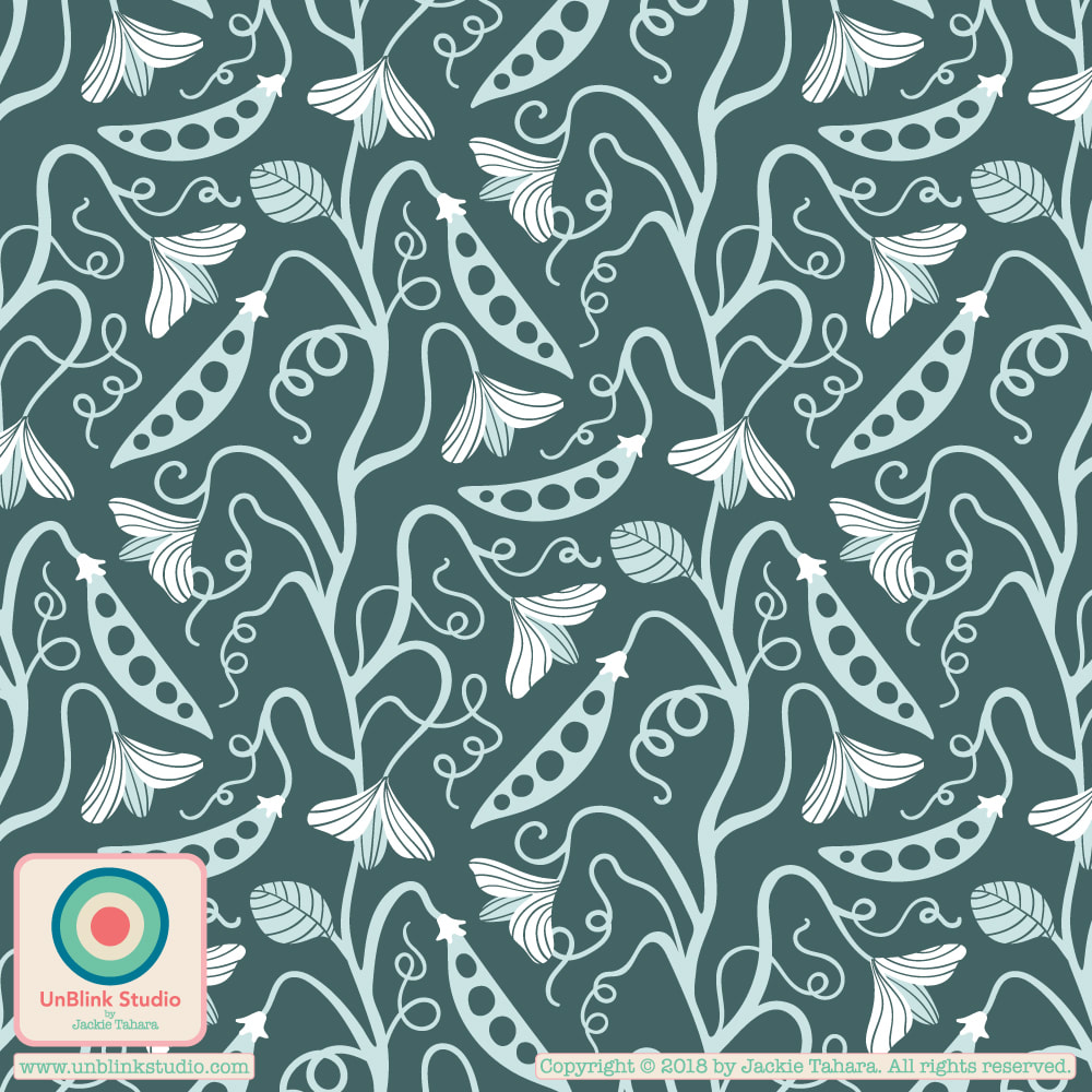 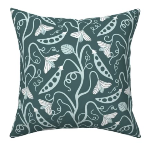 I couldn't resist! As you may have noticed, I can't get enough of the 2020 Pantone Color of the Year "Classic Blue"! I was also inspired by this week's Spoonflower "Classic Blue Limited Colour Palette" Design Challenge (see previous Blog post!), so I decided to re-colour (and revise) my "Palace Walls" Collection. Wondering what you think of Classic Blue? Have you been inspired to use it in your designs?! Or maybe you don't really like it...? All designs here are available to license! 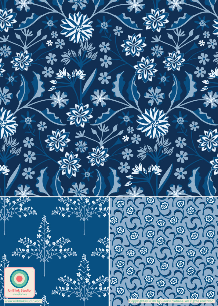 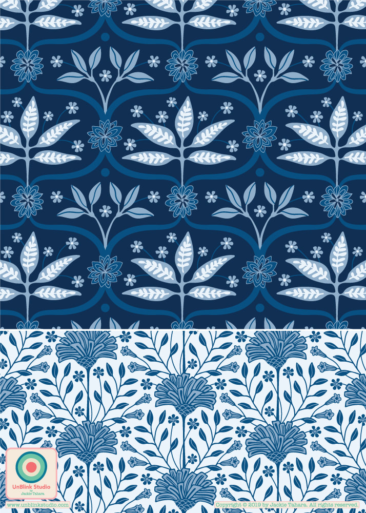 I love the limited colour palette design challenges put on by Spoonflower! This week’s “Classic Blue Limited Color Palette” Design Challenge includes the 2020 Pantone Color of the Year "Classic Blue" (which I really, really like!) and 3 other blue shades. I re-coloured my “Mahal” pattern design which was inspired by my travels in India using only the 4 gorgeous shades of blue, and may inspire me to re-colour more of the designs in my "Palace Walls" pattern collection! If you would like to see this week’s entries, be sure to check out the Voting Page! 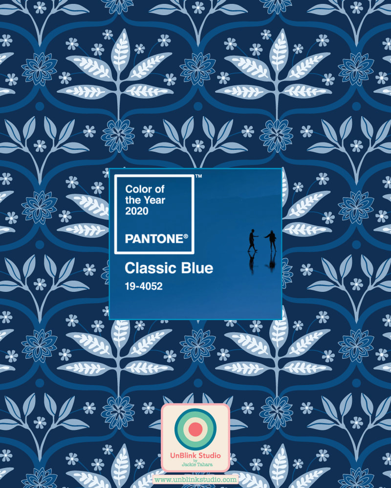 How fun is this?! Just used the Year of Colour app to create this visualization of the colours I've shared on IG this year (apparently larger bubbles mean I used those colours more). Love those reds, greens, blues, purples, turquoise, raspberry, deep yellow, pumpkin, lime, even a bit of Classic Blue (Pantone's 2020 Colour of the Year)! But I get carried away...HAPPY NEW YEAR to you all, have an art-filled and creative 2020! And you can check out my INSTAGRAM and see for yourself! 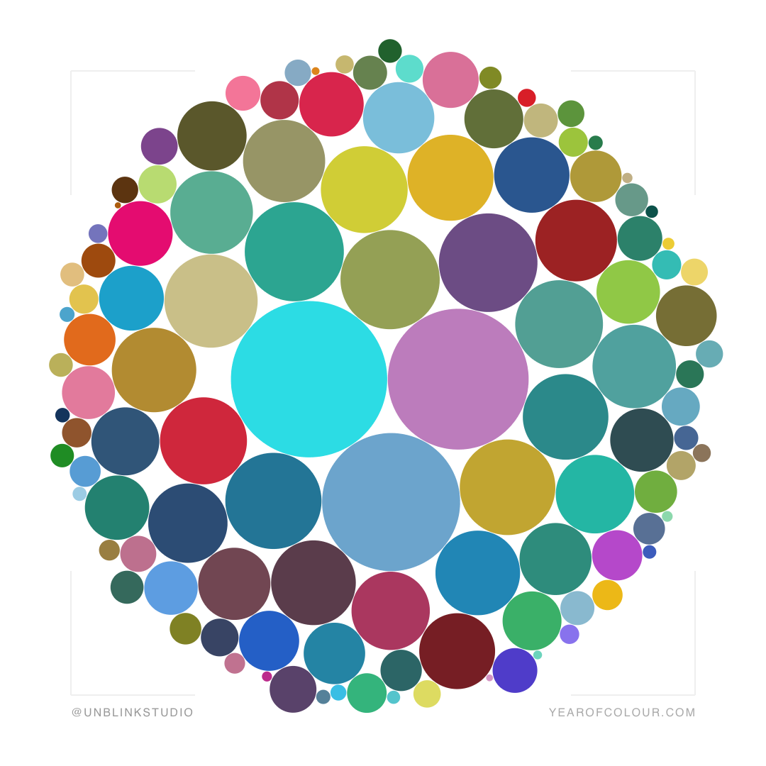 Pantone is not the only one to announce a Color of the Year (their "Classic Blue" is getting a lot of buzz though!) Many paint and wallpaper companies also make their trend predictions. I researched a bunch of them and it looks like blue, blush and green are the colours to watch in 2020. Then I couldn't resist raiding my pattern design archive to find matching designs for each colour! Enjoy! Do you have a favourite??! Pantone just announced its choice for Pantone Color of the Year 2020: CLASSIC BLUE! Here is how they describe it: "Instilling calm, confidence, and connection, this enduring blue hue highlights our desire for a dependable and stable foundation on which to build as we cross the threshold into a new era". I must admit a soft spot for blue and have designed many all-blue patterns and illustrations over the years. So I couldn't resist, I had to dig into my pattern archive and see what I could find! While I don't always get the choices for Color of the Year, this one I do like! I have many, many ideas now...stay tuned!  Bronze, Rose, Forest and Spearmint...the four colours in this week's Spoonflower "Limited Colour Palette" Design Challenge (I added optional white too!) Here is my entry, a 1970s inspired floral I call "Bohemia"! With thanks also to the MIID Live Hub for the retro-themed inspiration! Check out the tons of amazing eye candy designs and vote your faves (until July 16)...Link to the Voting Page!  |
AuthorJackie Tahara of UnBlink Studio Archives
July 2024
Categories
All
|


 RSS Feed
|
|
|
|
|
|
All images on this website are Copyright © Jackie Tahara. All rights reserved.
If sharing, pinning or blogging my images, please always credit me and link back to my website. Supporting artists is a good thing to do! Thank you!
If sharing, pinning or blogging my images, please always credit me and link back to my website. Supporting artists is a good thing to do! Thank you!