|
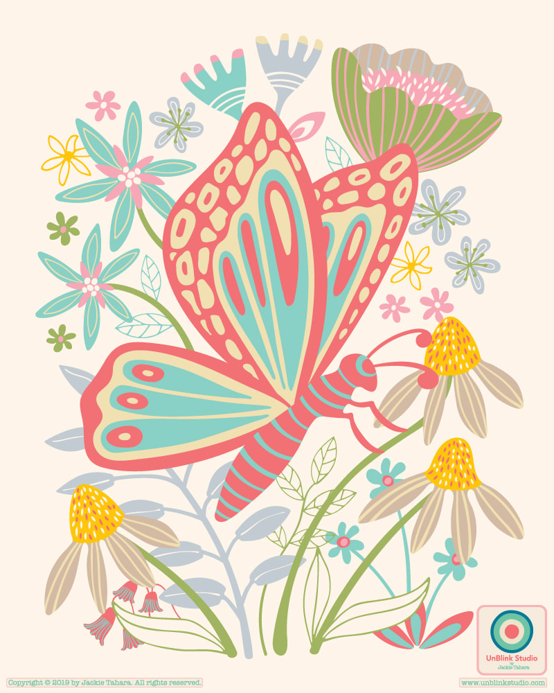
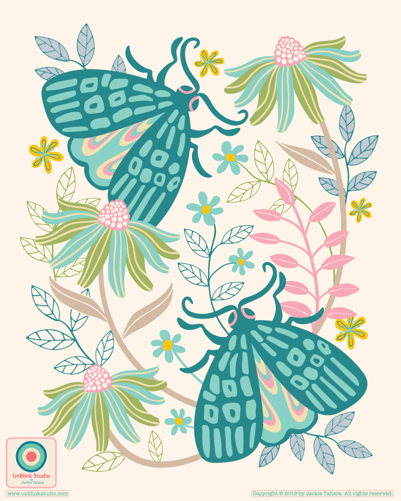
I just started a brand new pattern design course from Victoria Johnson Create Explore called "Create Collections" and have been developing colour palettes and drawing new motifs (butterflies, moths and florals so far!) and thinking about how different types of patterns co-ordinate to make a larger pattern collection. Sometimes it really helps to have someone guide you through their process which really makes you think more deeply about your own design process. So, I started with these two placement prints. I might adjust the colours a bit as I get more into the collection, so stay tuned for more to come! Repeats!
0 Comments
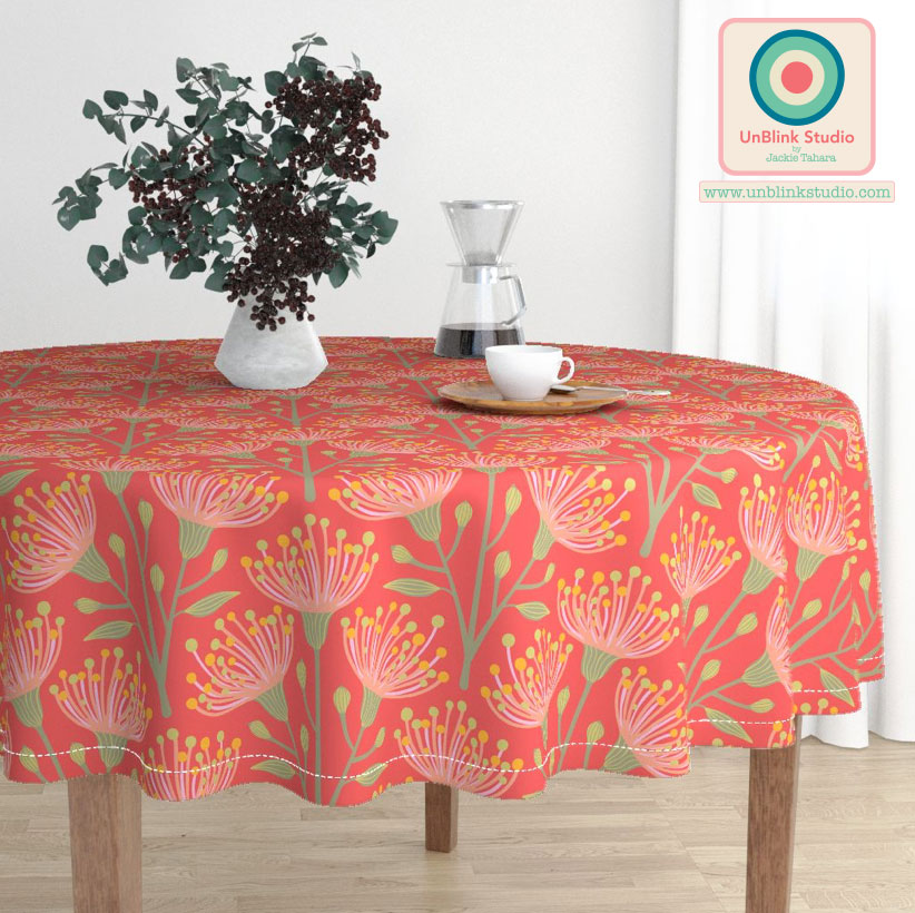
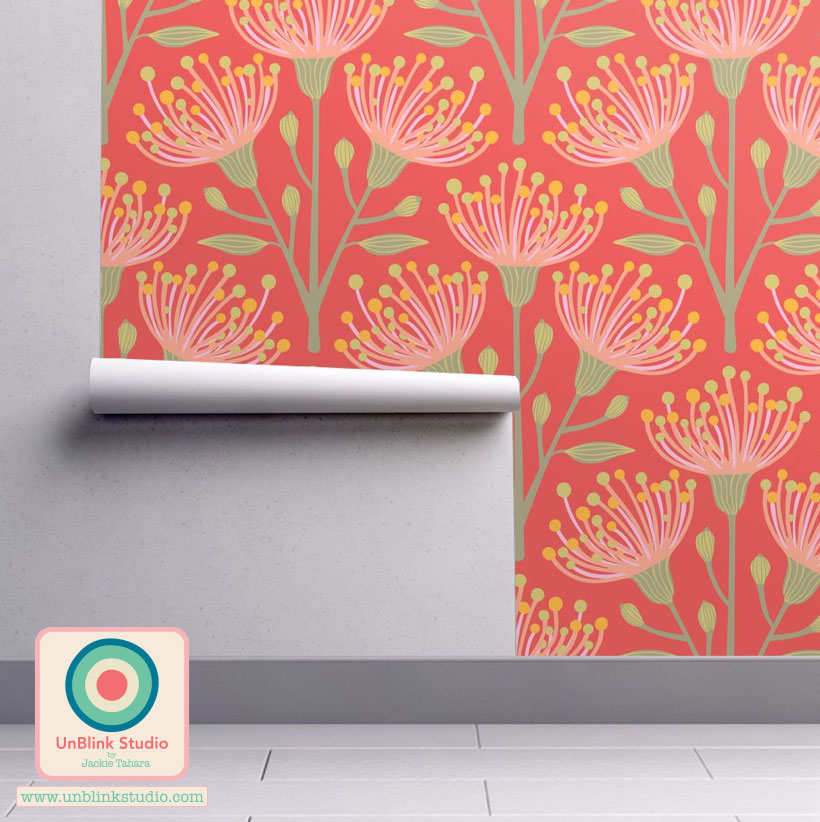
Big THANK YOU to everyone who voted in last week's Spoonflower "Australian Flora" Design Challenge! The RESULTS are just in and my "Eucalyptus" pattern design in this Orange colour palette (check out my Portfolio-Flora page to see two other palettes) squeaked into the Top Ten (I'm listed at #11, but thankfully there was a tie for #9) out of 602 eligible entries! So this design is now available for purchase at Spoonflower on many different fabrics, wallpaper and giftwrap. And see below...you can now buy it on wonderful home decor products at Roostery as well! Again, thank you for your votes! On to the next Design Challenge... 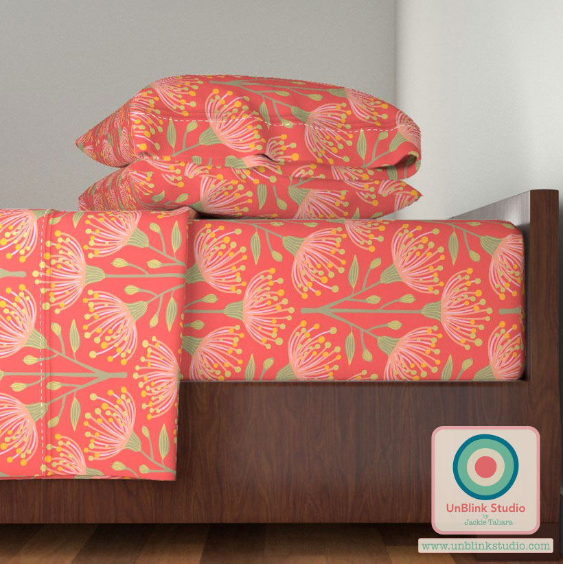
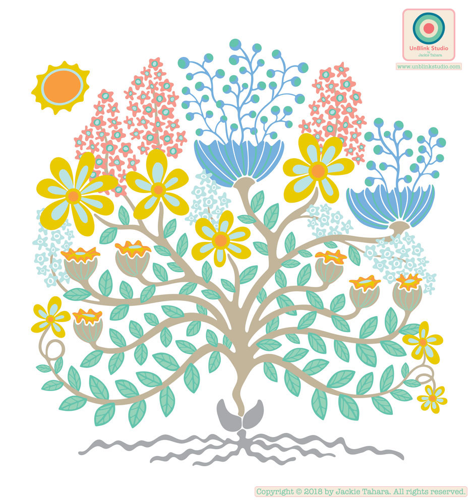
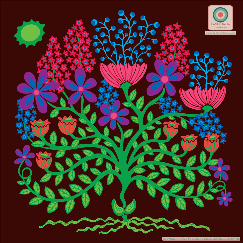
One of the things we talk alot about in The Colour Gang is, obviously, COLOUR: where and how to get inspiration for colour palettes, what colours are on-trend (or will be) and why, what colour palettes do we like to work with and are characteristic of our unique styles, and how different colour palettes can change the look of a design completely. So one of the things we love to do is try our pattern designs with different colours, for example (which do you like best?!)...
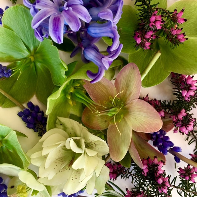
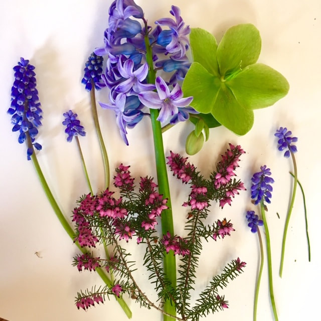
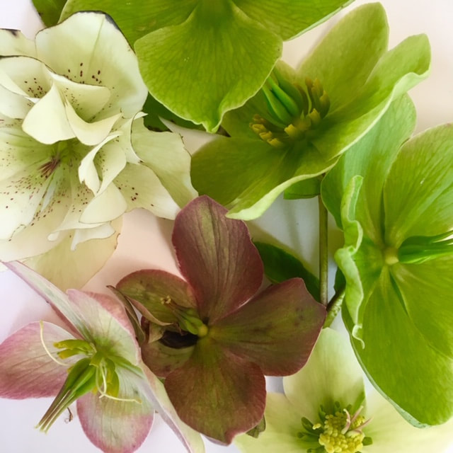
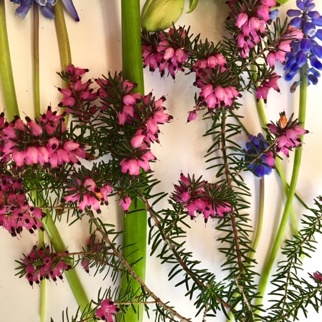
OH and I thought you might like to see some of the photos of flowers from my garden that inspired this collection!
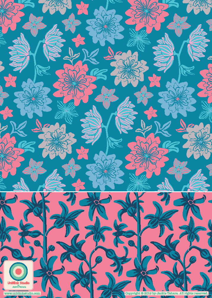
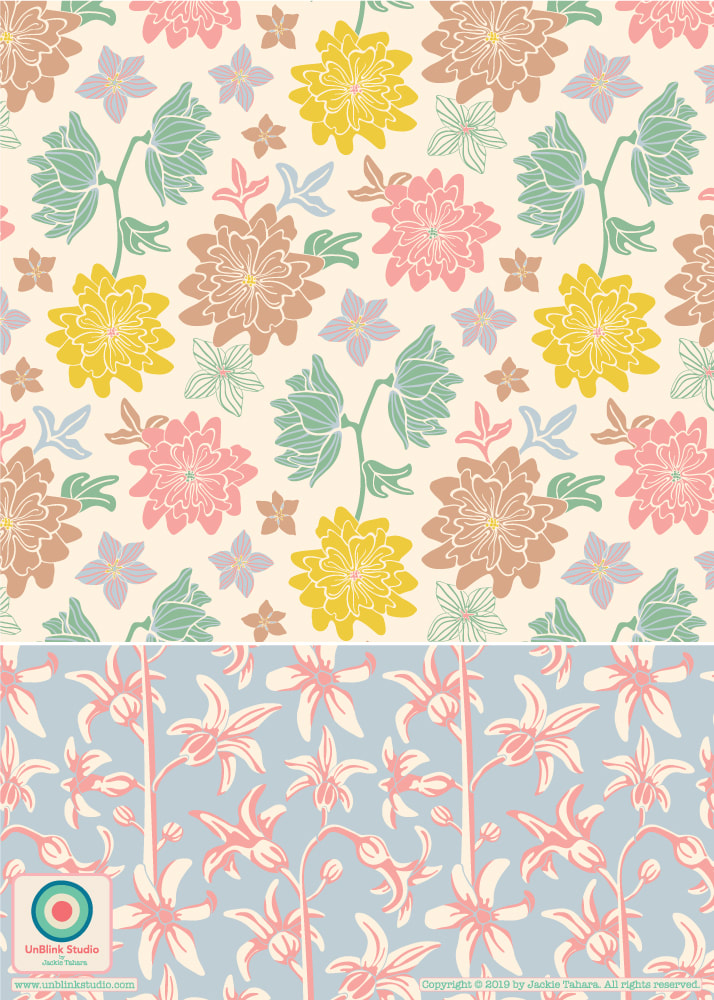
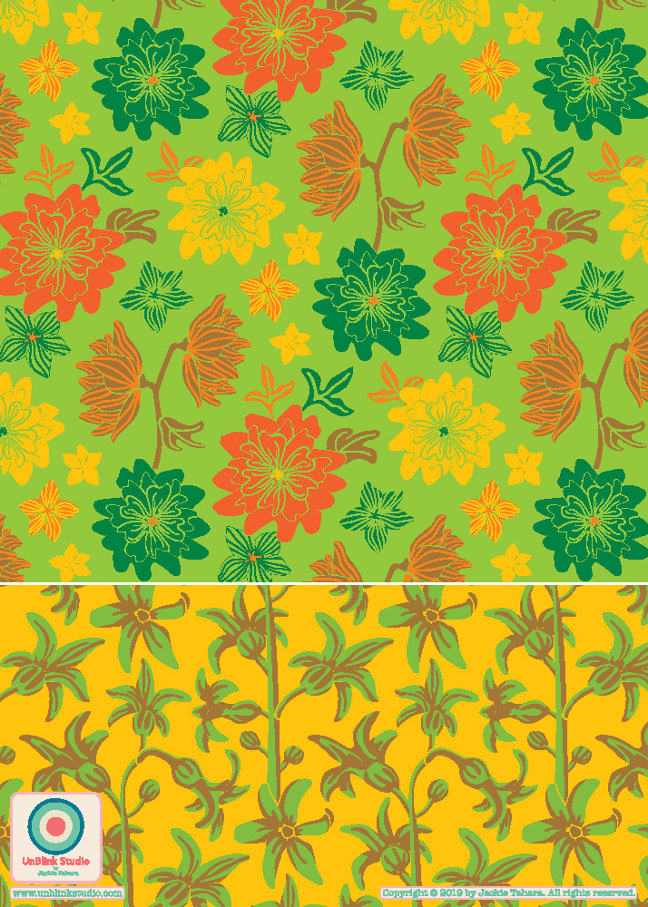
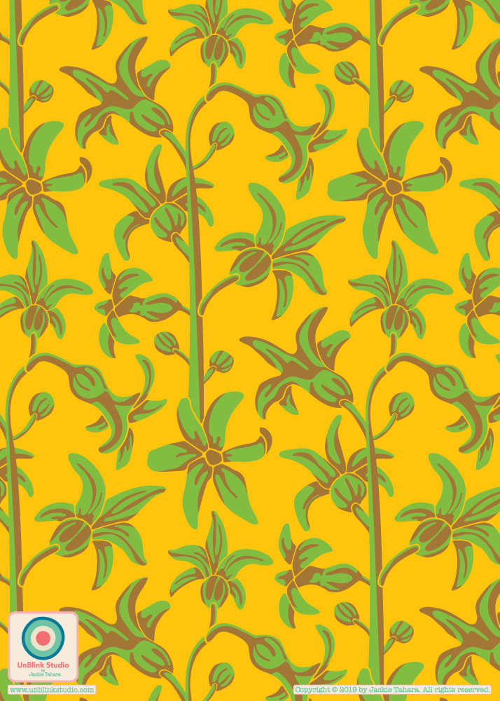
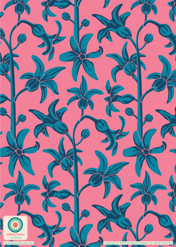
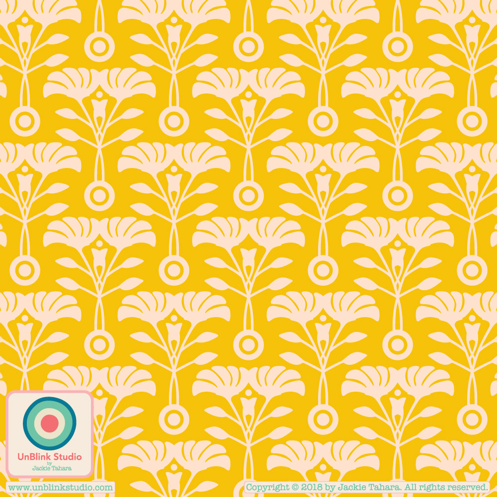
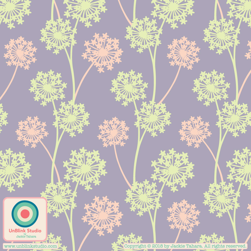
The last few weeks in The Colour Gang, a members-only online community, has been all about trends and colour! It has been great reading all the trend reports generously provided to Colour Gang members by WGSN and designing to them. Here is a sneak peek of a brand new pattern collection (just the beginnings!), which I designed with one of the trends in mind. Unfortunately, I can't share the reports, but be assured they are soooo inspiring! Which do you prefer: Yellow/Green or Pink/Blue??!
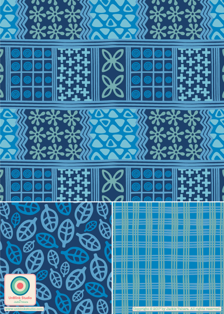
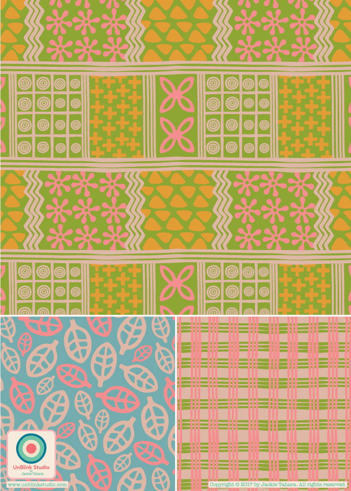
This months creative challenge in The Colour Gang is "Indigo"! So I couldn’t resist re-colouring my “Handprints” Collection in various shades of blue! Check out how different it looks in both the original colours (on the right, below) and in beautiful blue (on the left). I think blue is my fave, which do you prefer?
Hello! I just submitted this super colourful pattern design which I call "Summer of Love" (stay tuned for more in this collection!) to this week's Spoonflower "Maximalist" Design Challenge! No one was really sure what "maximalist" really meant, but this is my interpretation: lots and lots of crazy-bright coloured florals! If you have a minute, I would love your vote (and again, thanks to all of you who have voted for my designs in the past). Click here to link directly to the voting page! 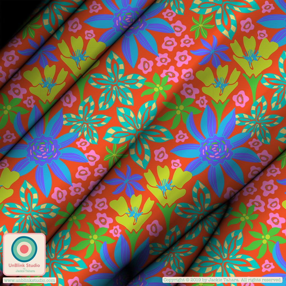 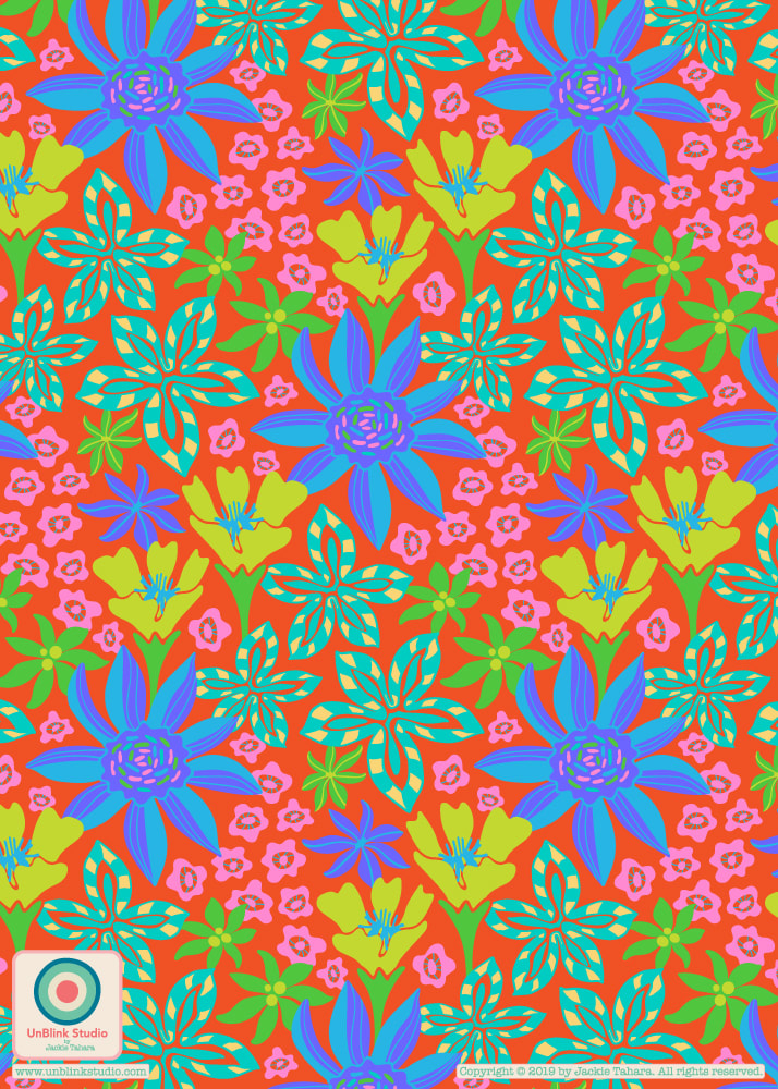 One thing that is great being a member of The Colour Gang is it makes you think about colour palettes and how re-colouring existing motifs can really revise an older pattern design into something fun and new! As an example, I recoloured my "Coastal Critters" motifs (originally designed as placement prints for round plates!) and used them to make some eye-catching, sea-themed repeat patterns. I did try to put all 3 creatures into a single design, but that just didn't work. I also tried using differently coloured creatures in a single design (I tried so many combos) but that didn't sit well either. Sometimes simpler is better. So I finally realized that making 3 separate designs, each with its own creature and monochromatic colour scheme (based on my Japan-inspired "Neon Nights" colour palette from a few posts ago), somehow worked the best, in my opinion! Now I love these! So here they are..."Blue Jellyfish", "Pink Squid" and "Green Octopus"! I hope they make you smile! 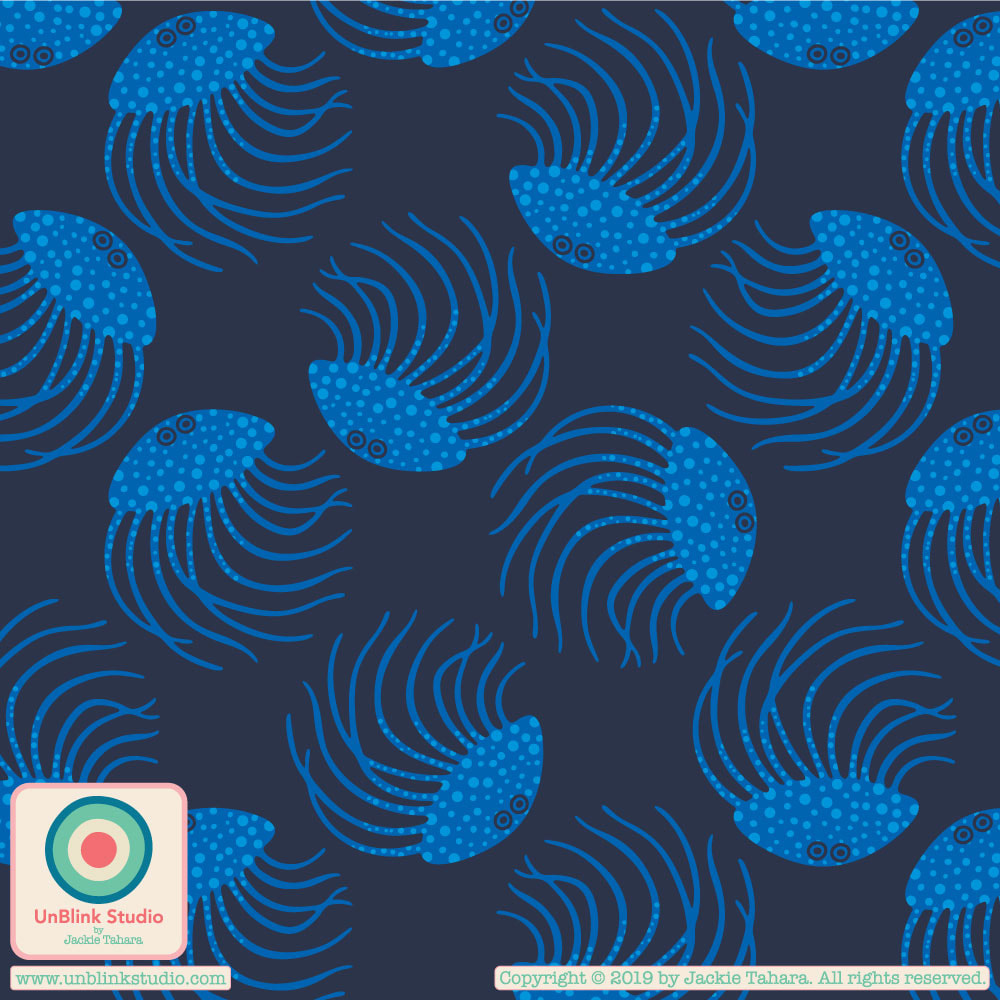 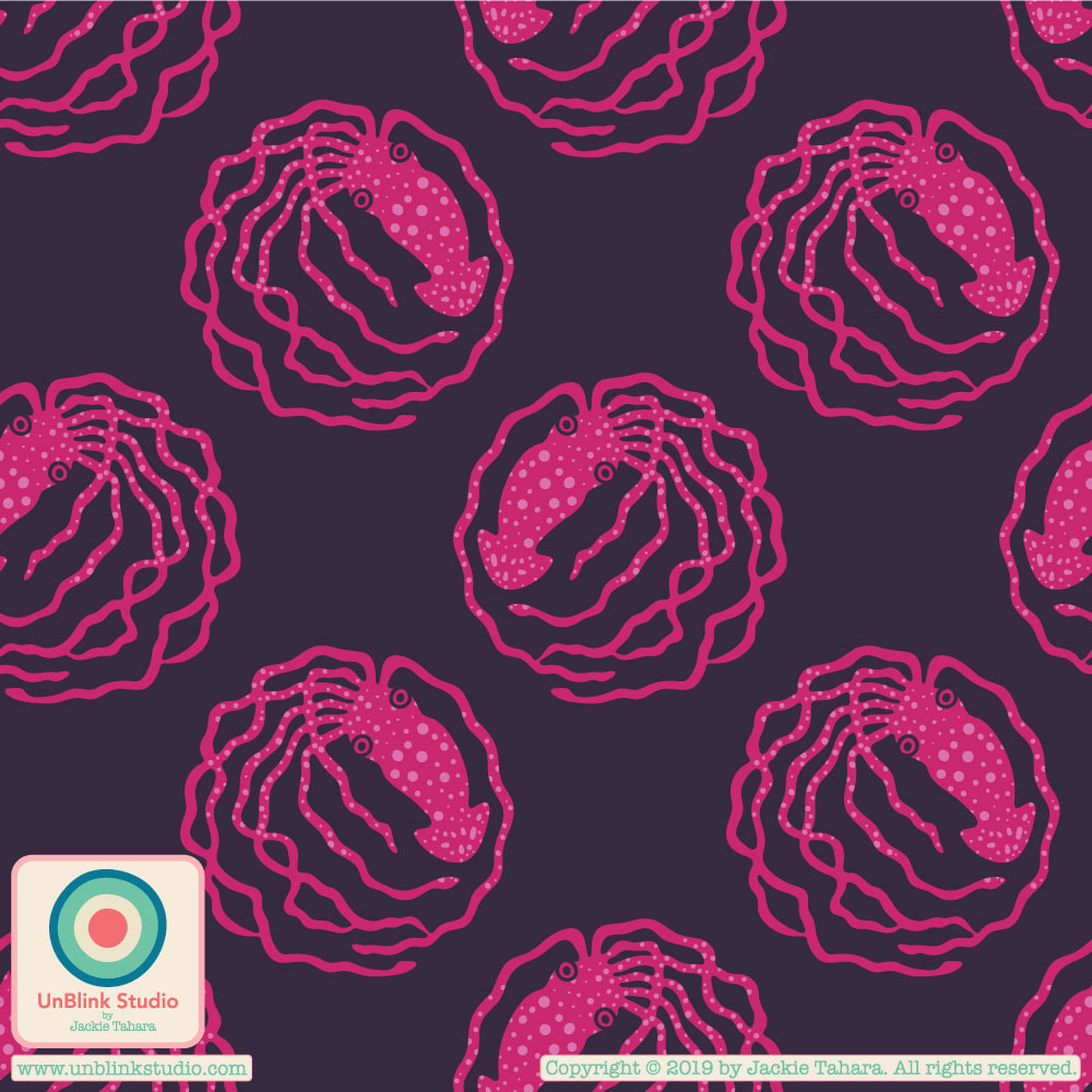 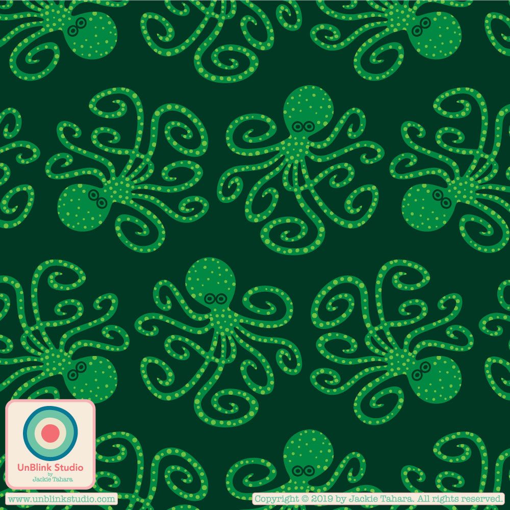
Check out my previous post for the brand new colour palettes I developed in the Colour Gang for this month's "Cultural Influences" theme, including one I am calling "Neon Nights". Here is the first re-colour of one of the two designs I originally created to submit to the Uppercase Magazine cover contest (it didn't get printed in the magazine, but my other submission did!) The first image is the original design, as submitted to Uppercase. The second one shows how the re-colour based on my "Neon Nights" colour palette really changes it! I love both, but would be very curious to know which you prefer?! As a designer, it is always hard to decide between going bright or more subtle, or a combo of both. Oh, and I think "Flower Burst" would be a great name for this one!
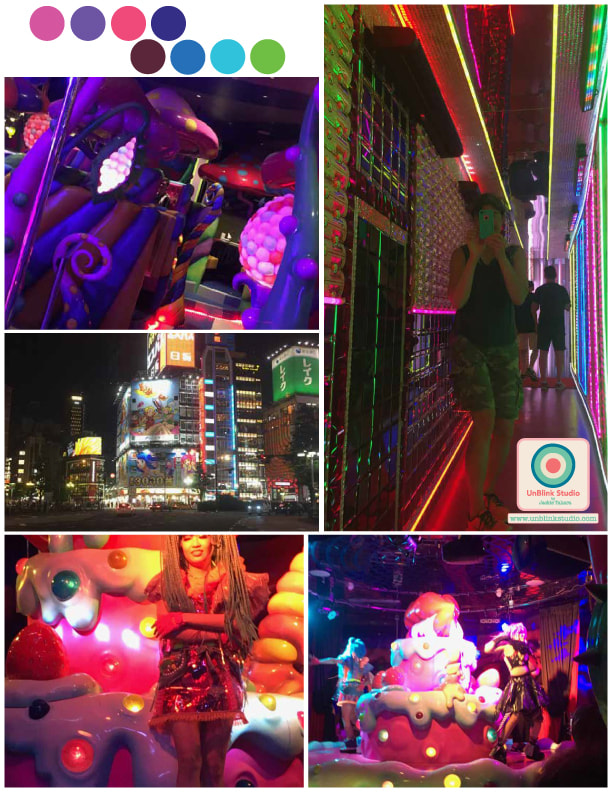
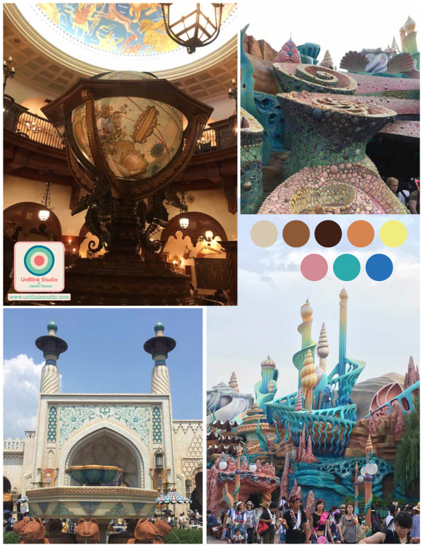
Ohhh, I'm going to like this month's theme in the Colour Gang--Cultural Influences! I love to travel, and was fortunate this summer to visit Japan, so I'm going with Japan for the first January Colour Challenge. Step 1: create a colour palette inspired by Japan! Using photos from our trip, I created two, deciding to forgo the more "traditional" images of Japan (kimonos, temples, gardens, etc.) and focusing on the less traditional. The first moodboard, "Neon Nights, is all about the "wacky" side of Tokyo/Osaka...neon lights, Robot Restaurant, Kawaii Monster Cafe (google it!) The second one, called "Warm Fantasy" has scenes from Tokyo DisneySea which my kids (and I) thought was beautiful, particularly the Arabian Coast area and Magellan's Restaurant (with Ariel's Playground in there too). Colours are amazing in Japan! Next step: some new pattern designs!
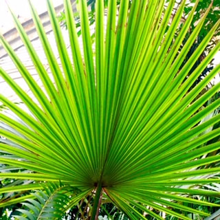
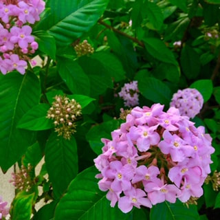
Kew Gardens in London was wonderfully inspiring for me. I took so many photos and managed to make some of the "specimens" I saw into this repeat pattern design (part of a new tropical-themed pattern design collection!) I've also included a few photos that inspired this pattern! One of Kew's purposes is plant conservation, and it is thought-provoking and alarming that some of the plants in the Palm and Temperate Houses here are the last of their kind and now extinct in the wild; in one case, there are two plants of a specific species growing at Kew and all specimens of this species that now exist in the world are clones of the two plants here. 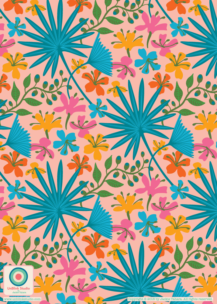
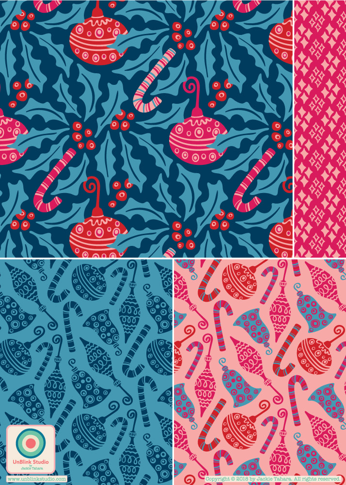
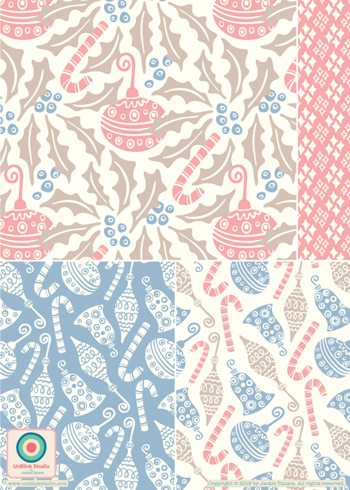
A couple of weeks ago in the Colour Gang, the creative challenge was to create a tropical-themed pattern using one of 3 (or all 3!) colour palettes given. The one I decided on was called "Midnight Forest"...featuring dark grounds, exotic forests and their inhabitants. So here is my brand new "Dream" pattern design...can you spot the "inhabitant"? 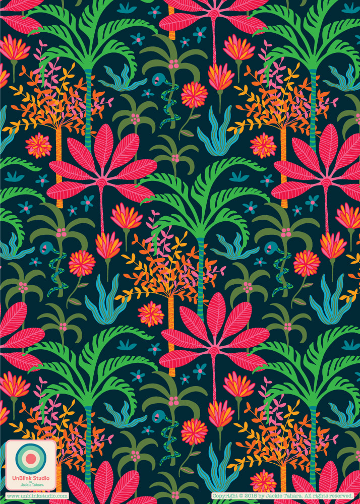 Just thought I would share the Christmas pattern collection I've been working on this past week in FolioFocus 2018 (alas, the last week of this super fun course!)...A festive bright colour palette and a more muted and delicate one. I know which I prefer, how about you?
This week's challenge in The Colour Gang was to design "generic" occasion designs for multiple uses. So here are 3 new designs, each with a simple (but fun!) colour palette. I really pictured them as packaging on those beautiful artisanal chocolate bars I see in markets and foodie shops! And make no mistake, "generic" doesn't mean boring and well...generic! Contact me if you are interested in licensing these (or other) designs! 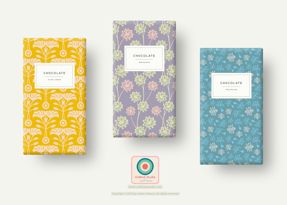
Couldn't resist adding more patterns to my "Holiday Sparkle" Collection, using the fun alternative colour palette in this week's Colour Gang creative challenge. So here is my re-coloured "Light It Up!" pattern and another fun colour way for my "Snowflakes" pattern! I see this on really, really fun holiday gift wrap and stationery, wine bottle bags, anything festive really! Follow me on IG at @unblinkstudio to see more of my most recent pattern designs! 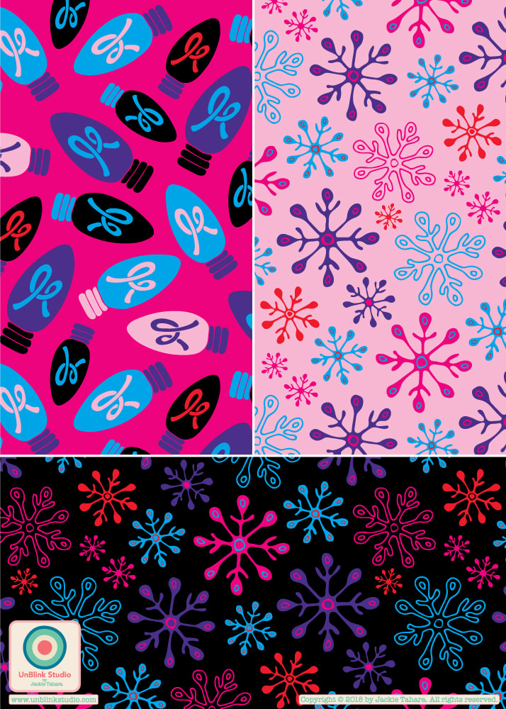 Just for fun today I stayed with the Colour Gang's monochrome colour palette challenge. I designed my Birds & Blossoms pattern and added a coordinate first, in black and white, but then decided to try it out in blue too! Then I decided to try the blue one with a lighter background! Which one do you like best?? I also might move away from the monochrome palettes and just go wild with colour too! Contact me to inquire about licensing my pattern designs! 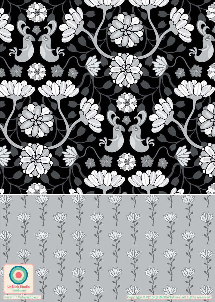 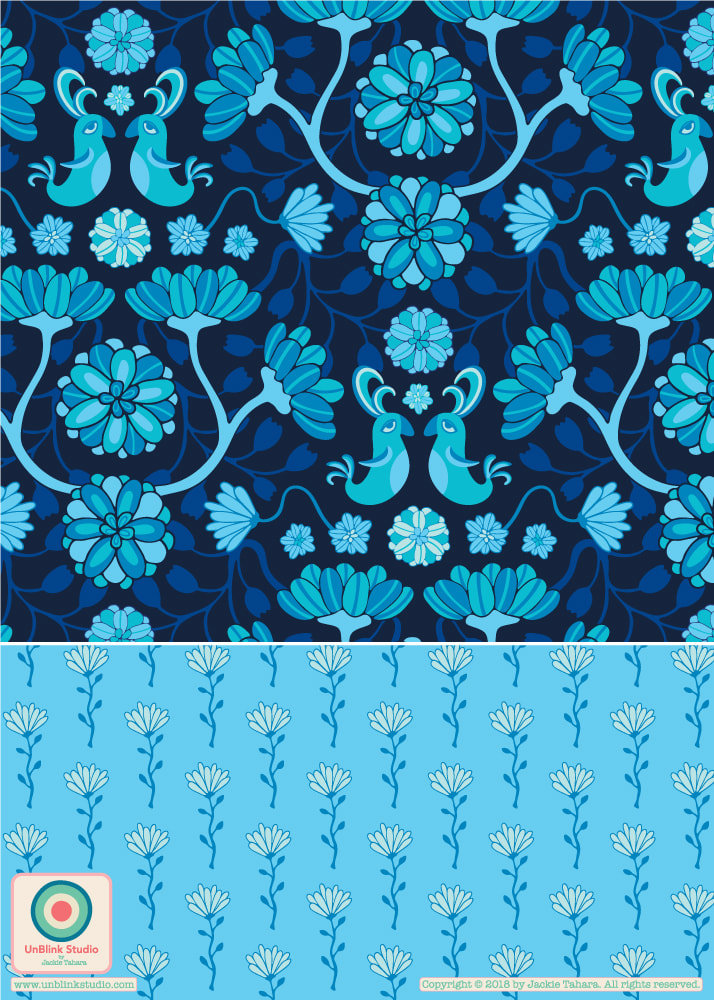 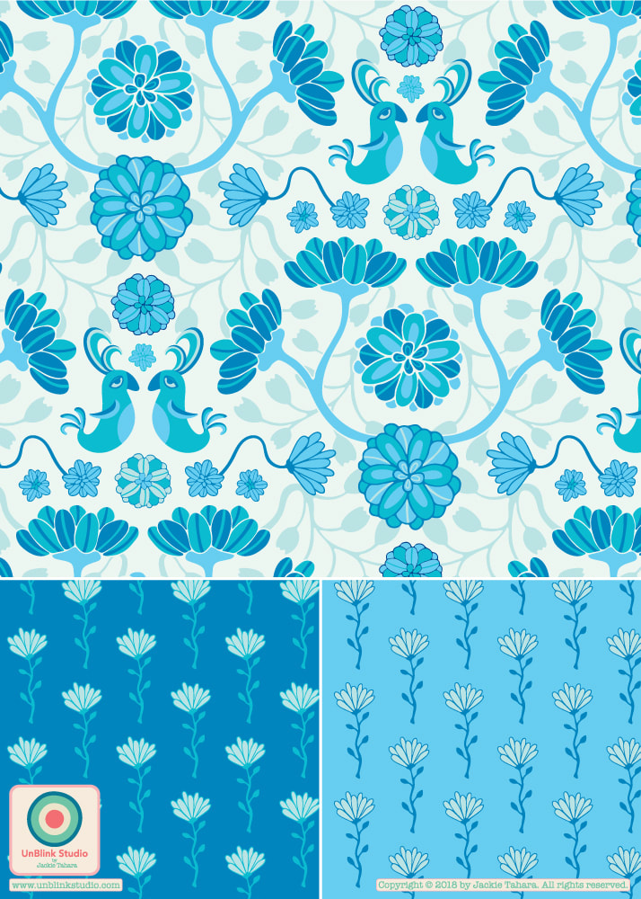 |
AuthorJackie Tahara of UnBlink Studio Archives
April 2024
Categories
All
|
 RSS Feed
|
|
|
|
|
|
All images on this website are Copyright © Jackie Tahara. All rights reserved.
If sharing, pinning or blogging my images, please always credit me and link back to my website. Supporting artists is a good thing to do! Thank you!
If sharing, pinning or blogging my images, please always credit me and link back to my website. Supporting artists is a good thing to do! Thank you!