|
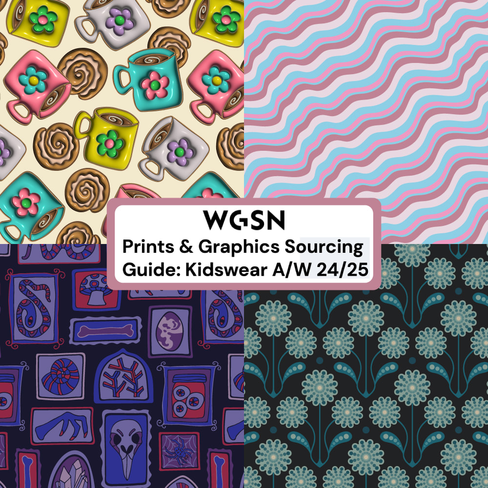
If you are a licensee or manufacturer who would like to know the latest in upcoming print trends for kidswear, the brand new "Prints & Graphics Sourcing Guide: Kidswear A/W 24/25" has just been released by WGSN, the world's leading consumer trend forecaster. This Guide includes several of my pattern designs in its identification of the key trends for Autumn/Winter 24/25 Kidswear!
Please NOTE: You must be a WGSN subscriber to access this Guide.
0 Comments
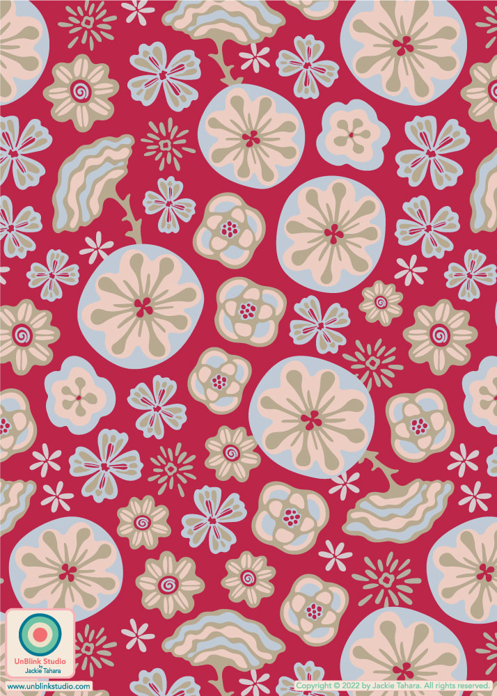
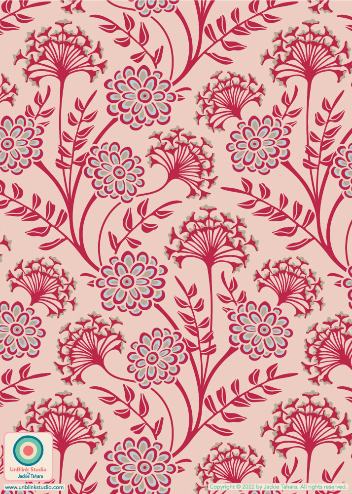
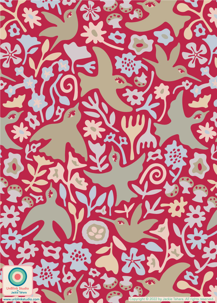
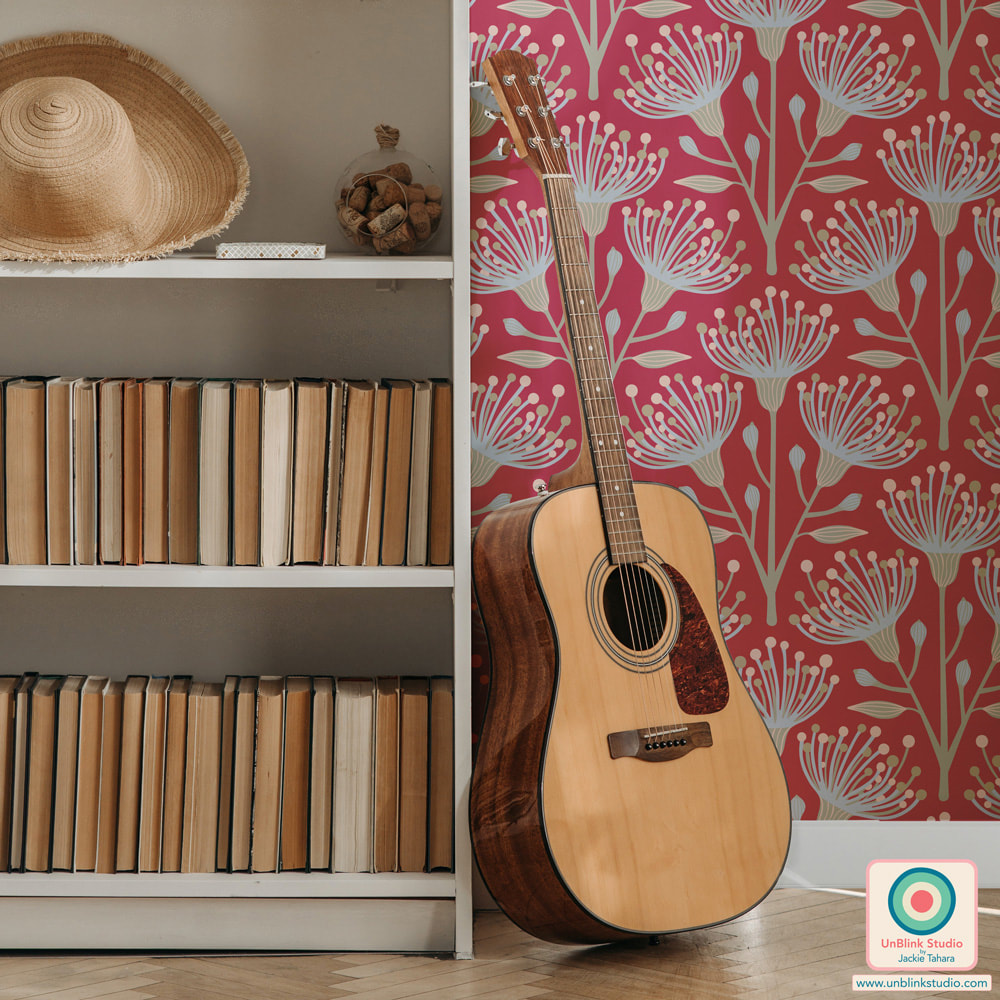
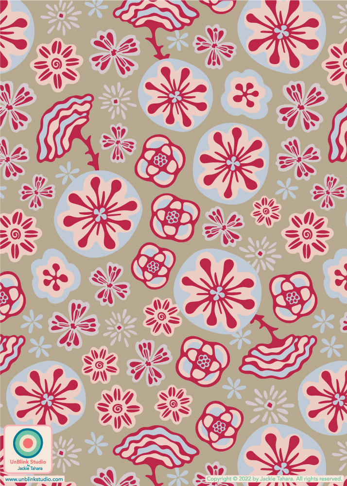
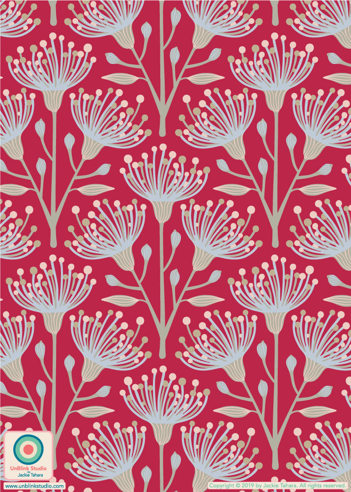
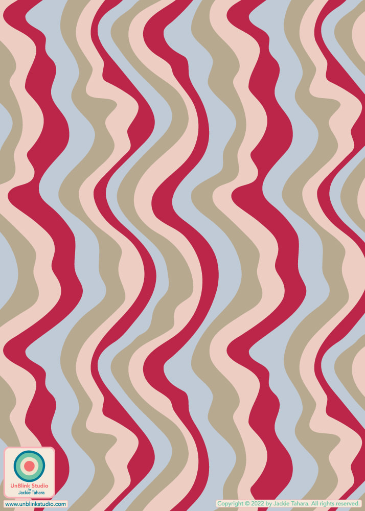
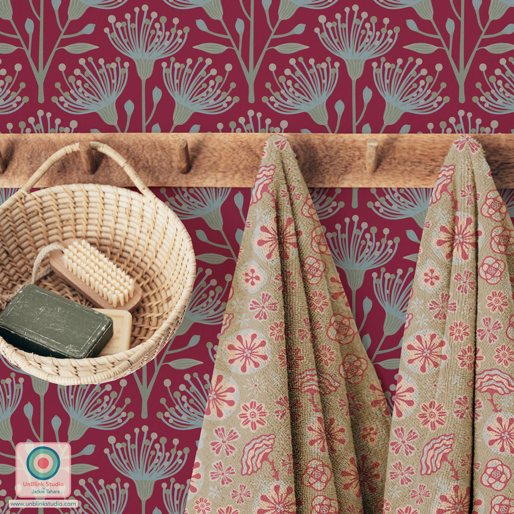
If you haven’t heard already, the 2023 Pantone Color of the Year is “Viva Magenta”, described as “a shade rooted in nature descending from the red family and expressive of a new signal of strength. Viva Magenta is brave and fearless, and a pulsating color whose exuberance promotes a joyous and optimistic celebration, writing a new narrative”. When Pantone announced their colour choice, I immediately started experimenting with this colour and the Pantone “Inspire” colour palette. See some of the results below, and check out more in my “Viva Magenta Collection”!
All of these pattern designs are now available in my Spoonflower Shop on Fabrics, Wallpaper and Home Decor! AND I entered my "Hana-Dark" Japanese-inspired design (first pic) in the Spoonflower "Viva Magenta" Design Challenge! I was a bit distracted over the holidays so I forgot to post about this Challenge earlier, but you can still vote until tomorrow January 3 2023! When I snap a pic that for some reason I just really like, it's often because there's just "something" about the captured colours. Picking out these colours is one of my favourite ways to come up with new colour palettes for pattern designs.
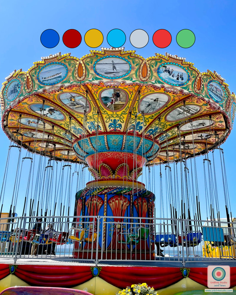
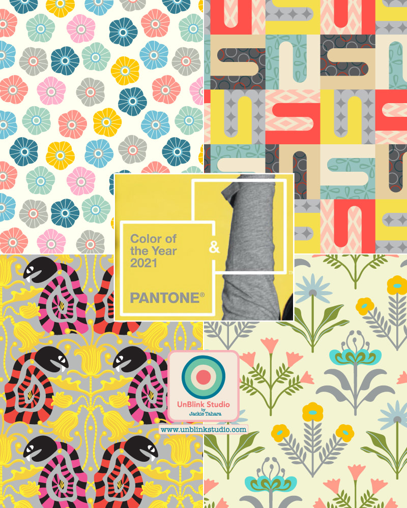
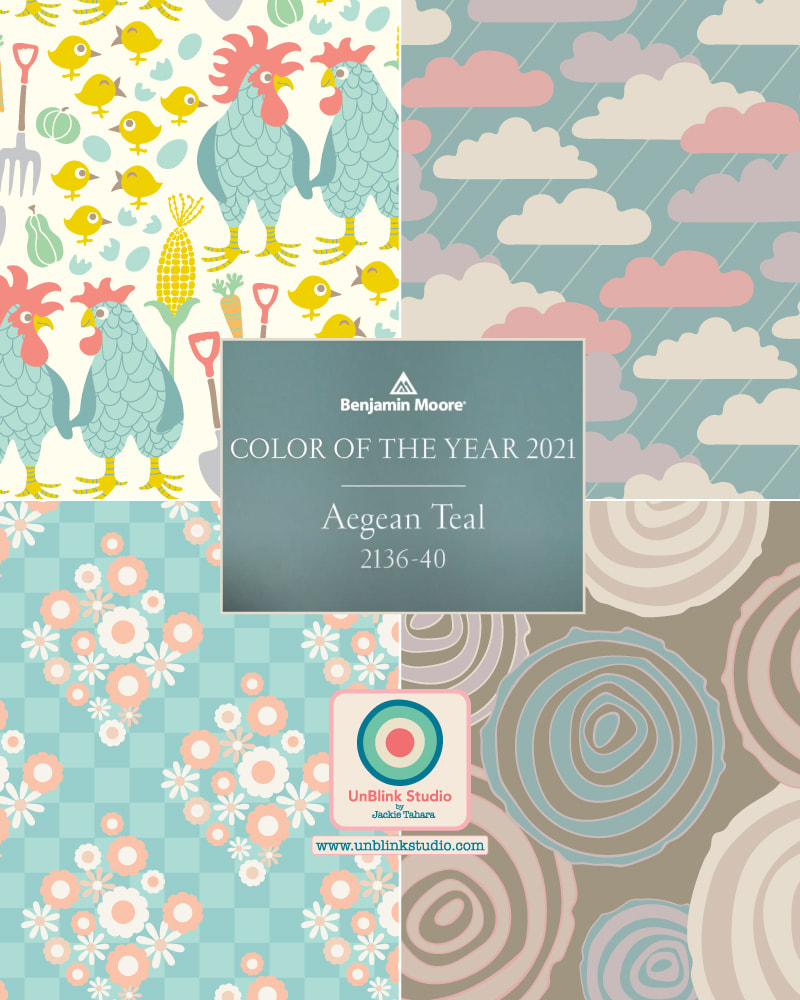
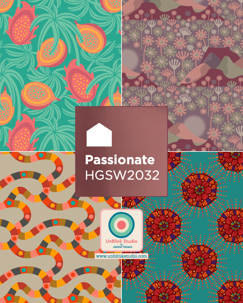
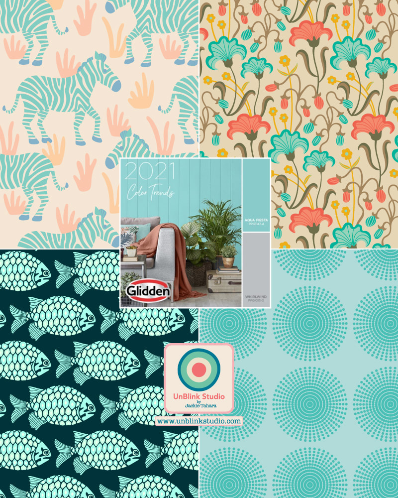
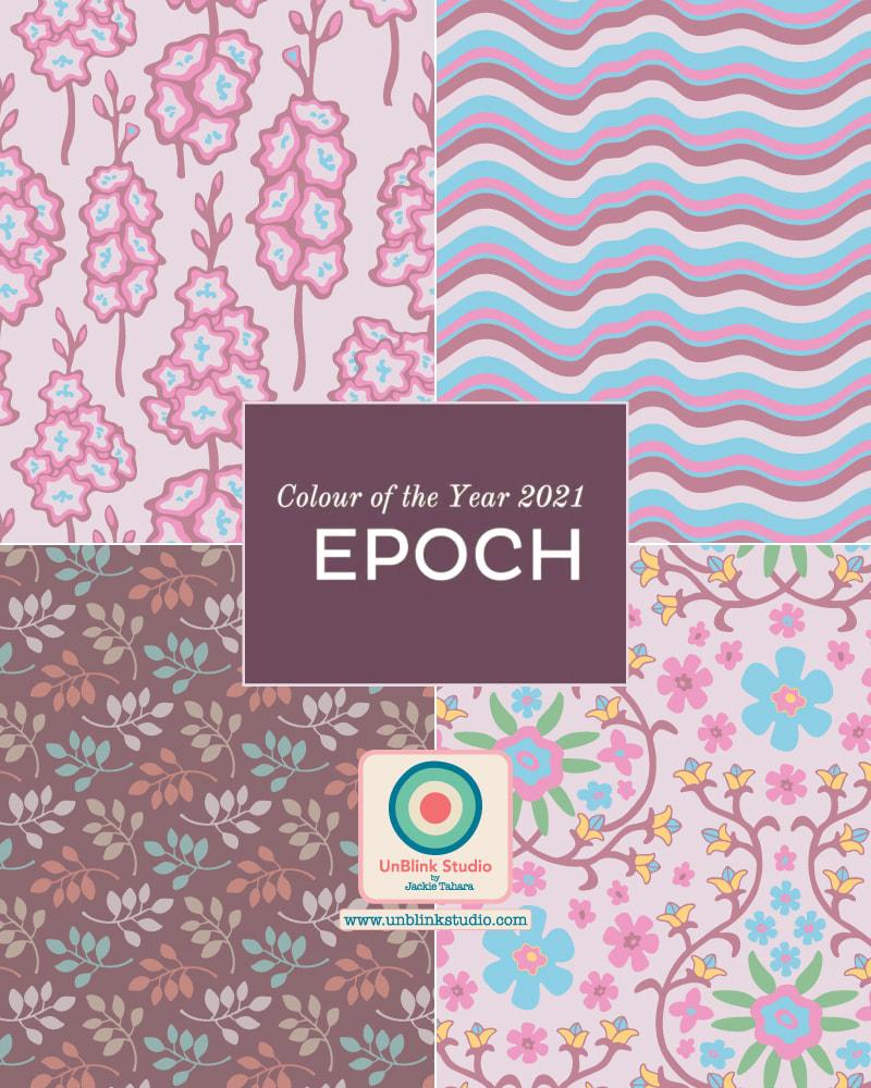
For example, here is a photo I took at the Santa Cruz Beach Boardwalk while on a coastal roadtrip to California in June, and I just really love this pic of a vintage-inspired ride. So I picked out some gorgeous colours to create a new palette...Expect to see these colours in a new design! How do you come up with new colour palettes? Do you use your photos too? It's 2021! And it's time to give you my overview of the 2021 Colors of the Year as chosen by various decor and paint companies, most notably Pantone. Whether or not you follow trends, I thought it would be fun (and maybe useful?) for you to see some of these all here in one place, with samples of how I've used them in my own pattern designs. Not surprisingly, most colours were chosen for their uplifting, comforting, calming, soothing, harmonious, optimistic and hopeful properties. If you're a designer looking for ideas and trends, or just someone wanting a 2021 re-fresh (don't we all?), see below. And scroll down to see summaries of how each company describes their 2021 color picks! PANTONE: They say "Illuminating" ("warming and optimistic") and "Ultimate Gray" ("practical and rock solid") are "A marriage of color conveying a message of strength and hopefulness that is both enduring and uplifting".
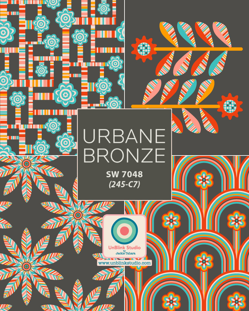
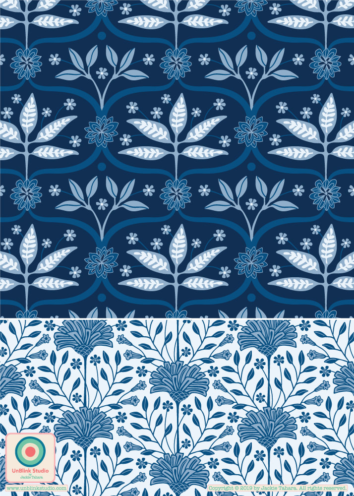
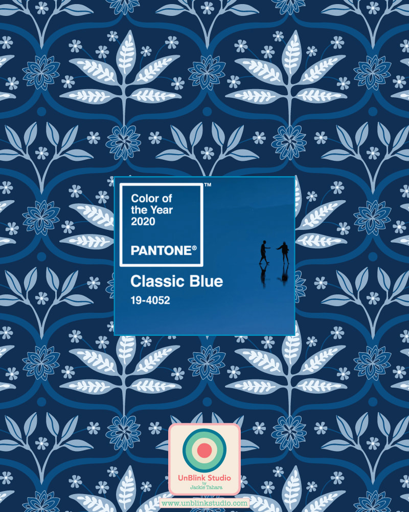
GLIDDEN PAINTS: They chose not a Color of the Year, but an ACCENT Color of the Year, "Aqua Fiesta", which they describe as: "Happy and muted, this beautiful color makes a sweet space that is not overly vibrant". BENJAMIN MOORE: They say, "Take a moment to reflect and reset. Intriguing, balanced and deeply soothing...Aegean Teal creates natural harmony". GRAHAM & BROWNE: This is how G&B describes "Epoch": "This rich, deep amethyst" is "associated with royalty as the cost of pigments were so expensive--the color has a calming effect on both the mind and nerves, and it can be uplifting and trigger creativity". HGTV by SHERWIN-WILLIAMS: They say, "Rich and empowering, Passionate is a bold red, that's steeped in history, merging modern design with traditional charm". SHERWIN-WILLIAMS: They say, "Tap into nature with a hue whose warmth and comfort breathe down-to-earth tranquility". And there you have it! If you have a favourite (or not?!), leave a comment here and let me know! I couldn't resist! As you may have noticed, I can't get enough of the 2020 Pantone Color of the Year "Classic Blue"! I was also inspired by this week's Spoonflower "Classic Blue Limited Colour Palette" Design Challenge (see previous Blog post!), so I decided to re-colour (and revise) my "Palace Walls" Collection. Wondering what you think of Classic Blue? Have you been inspired to use it in your designs?! Or maybe you don't really like it...? All designs here are available to license!
I love the limited colour palette design challenges put on by Spoonflower! This week’s “Classic Blue Limited Color Palette” Design Challenge includes the 2020 Pantone Color of the Year "Classic Blue" (which I really, really like!) and 3 other blue shades. I re-coloured my “Mahal” pattern design which was inspired by my travels in India using only the 4 gorgeous shades of blue, and may inspire me to re-colour more of the designs in my "Palace Walls" pattern collection! If you would like to see this week’s entries, be sure to check out the Voting Page!
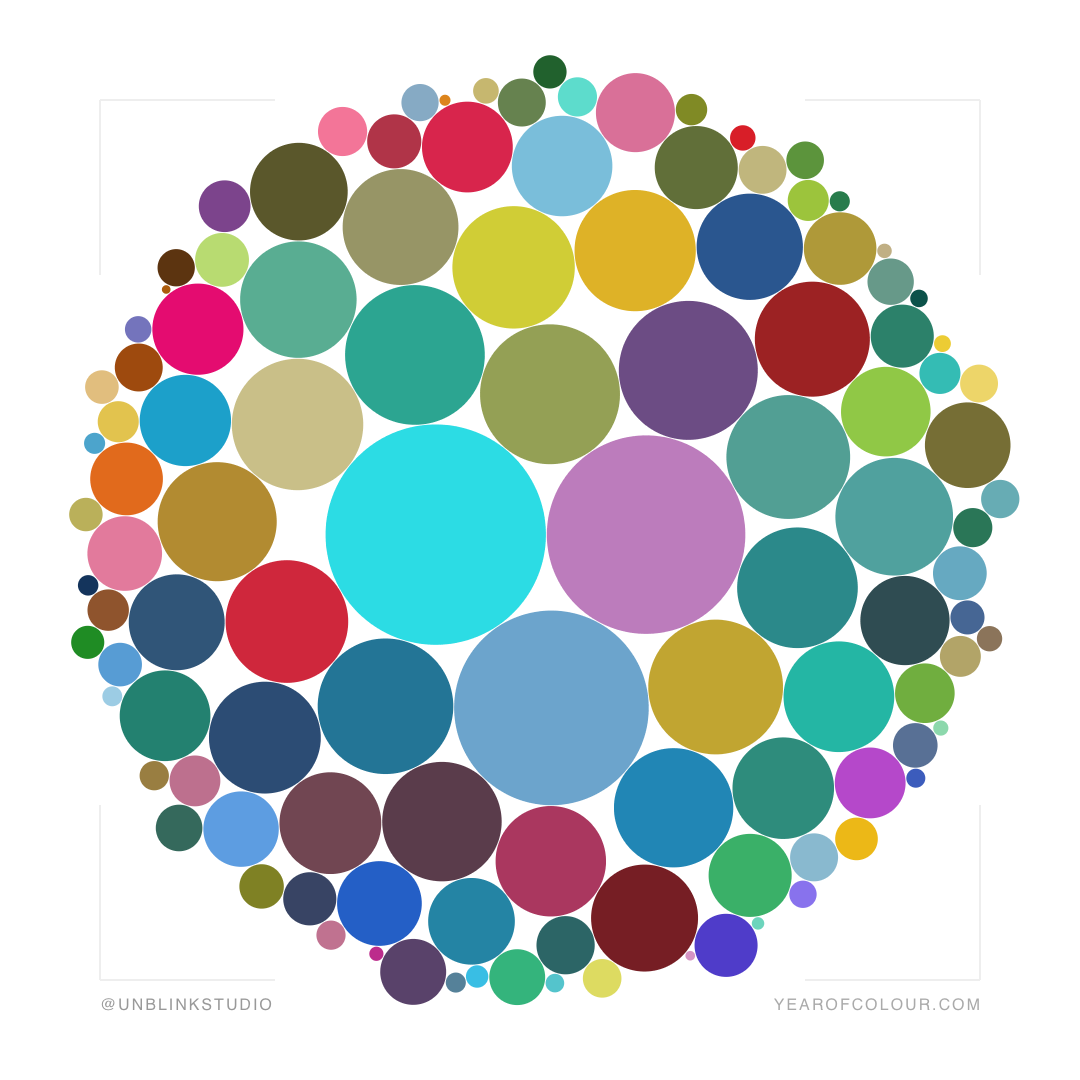
How fun is this?! Just used the Year of Colour app to create this visualization of the colours I've shared on IG this year (apparently larger bubbles mean I used those colours more). Love those reds, greens, blues, purples, turquoise, raspberry, deep yellow, pumpkin, lime, even a bit of Classic Blue (Pantone's 2020 Colour of the Year)! But I get carried away...HAPPY NEW YEAR to you all, have an art-filled and creative 2020! And you can check out my INSTAGRAM and see for yourself!
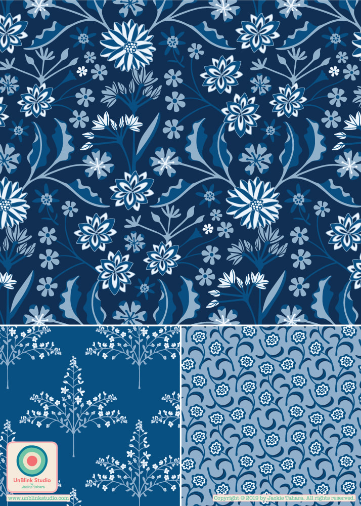
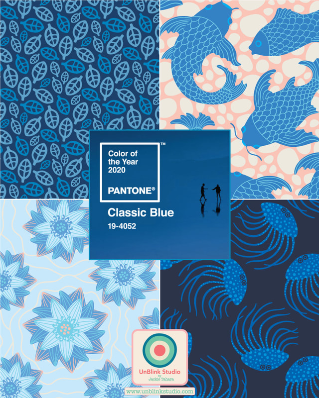
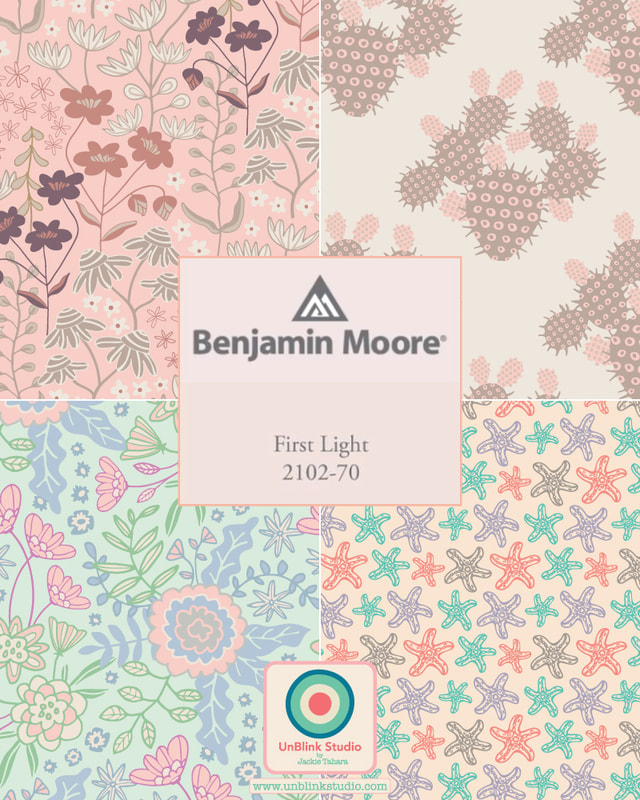
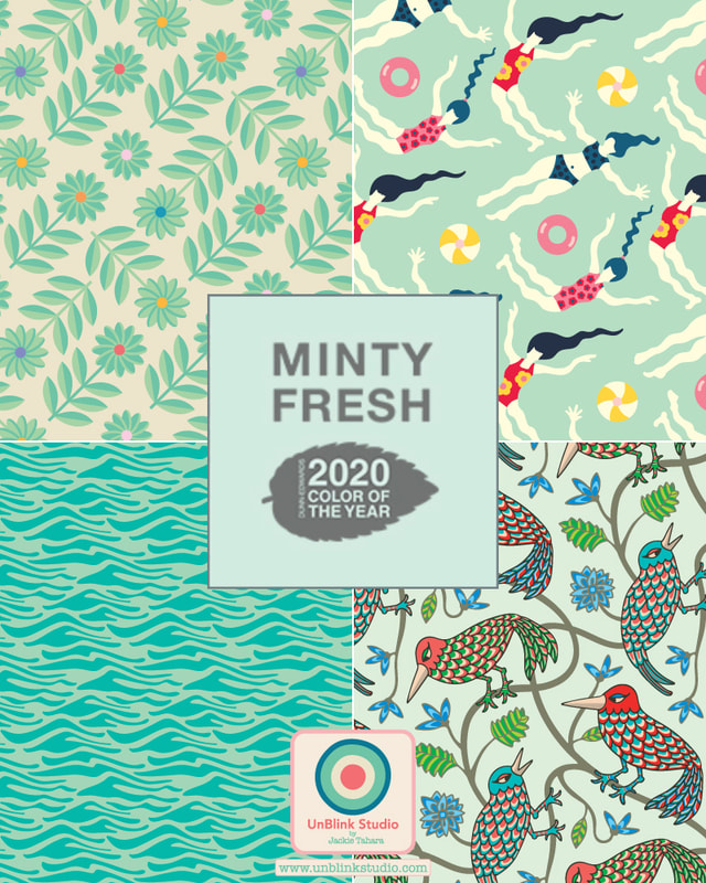
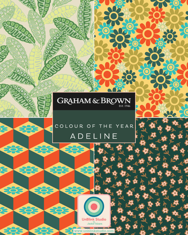
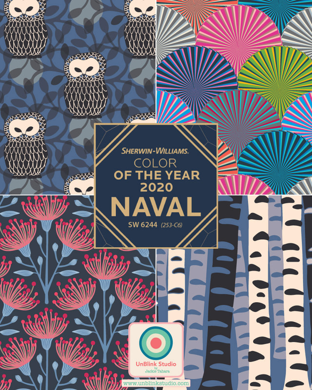
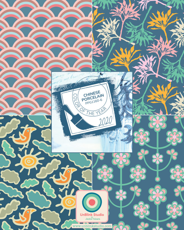
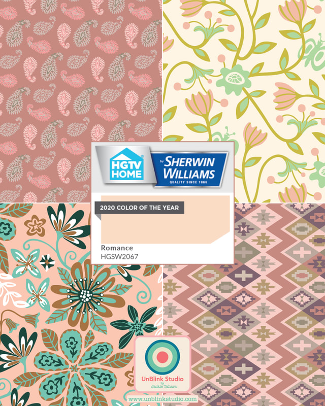
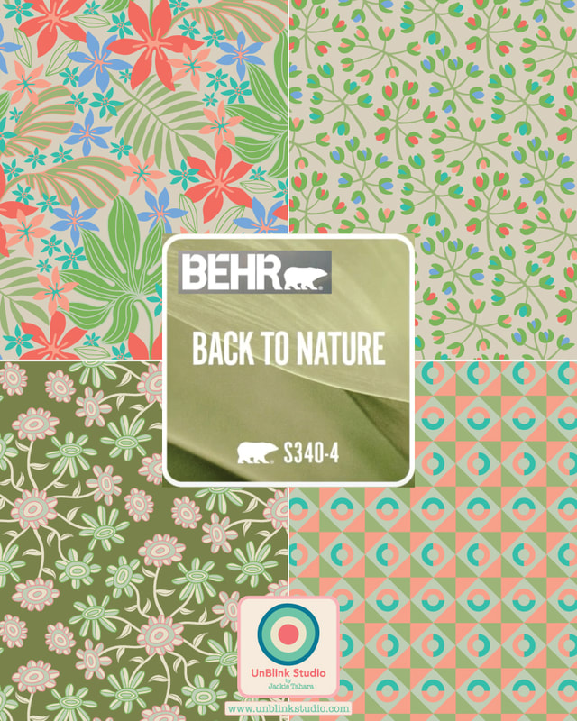
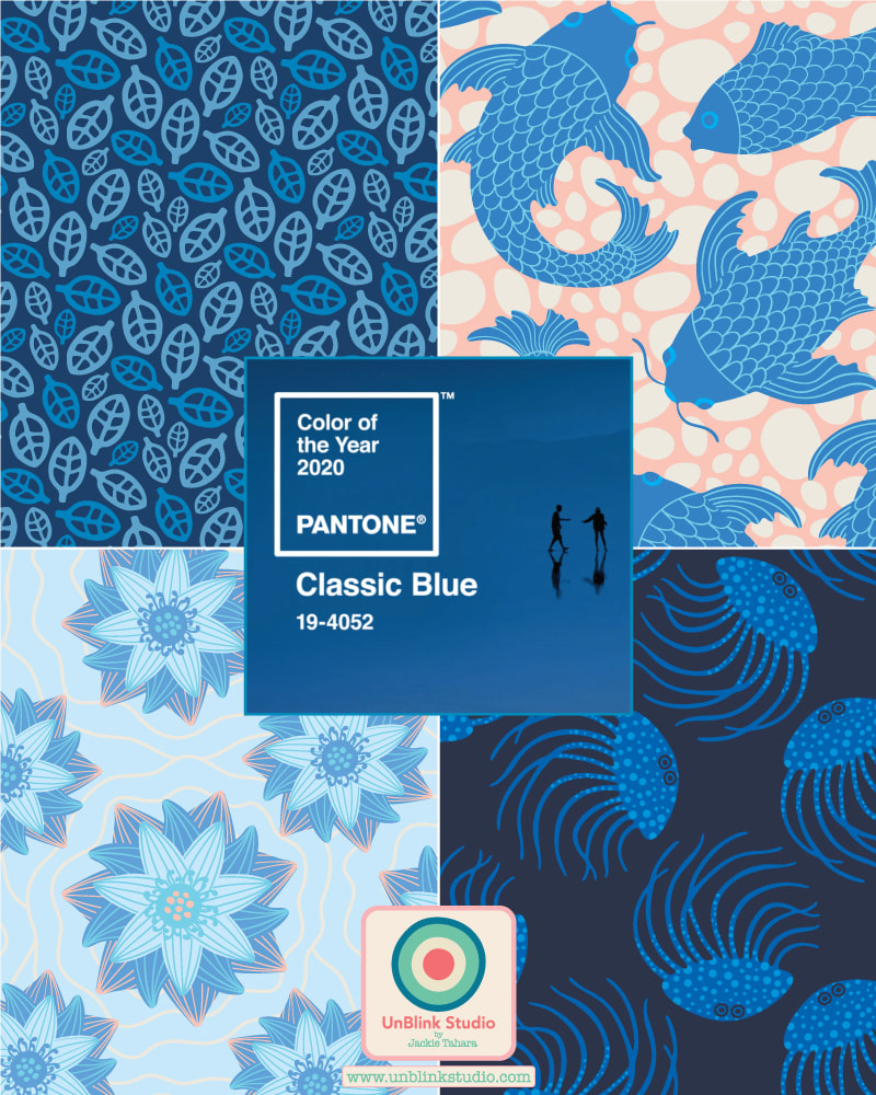
Pantone is not the only one to announce a Color of the Year (their "Classic Blue" is getting a lot of buzz though!) Many paint and wallpaper companies also make their trend predictions. I researched a bunch of them and it looks like blue, blush and green are the colours to watch in 2020. Then I couldn't resist raiding my pattern design archive to find matching designs for each colour! Enjoy! Do you have a favourite??!
Pantone just announced its choice for Pantone Color of the Year 2020: CLASSIC BLUE! Here is how they describe it: "Instilling calm, confidence, and connection, this enduring blue hue highlights our desire for a dependable and stable foundation on which to build as we cross the threshold into a new era". I must admit a soft spot for blue and have designed many all-blue patterns and illustrations over the years. So I couldn't resist, I had to dig into my pattern archive and see what I could find! While I don't always get the choices for Color of the Year, this one I do like! I have many, many ideas now...stay tuned!
|
AuthorJackie Tahara of UnBlink Studio Archives
July 2024
Categories
All
|
 RSS Feed