|
The current Spoonflower Design Challenge is “Textured and Tonal Wallpaper”. When I saw “textured” I immediately started thinking about ikat weavings (maybe because I have several beautiful Indonesian ikat textiles hanging in my house, not to mention stacks of batik fabrics, woven silks, Indian block prints, call me obsessed...ANYWAY...). So I created my “Diamond Ikat” to enter in the Challenge. And then it got me motivated to re-fresh my “Spice Islands” Collection in these new Exotic Colours (Hot Pink, Purple, Red, Blue, Dark Teal, Blush Sand)! Now the whole "Spice Islands" Collection is available in my Spoonflower Shop on Fabrics, Wallpaper and Home Decor, and in my Sweden-based Happywall Shop on Wallpaper. Selected designs from this Collection are also available in my Society6 Shop on Bed & Bath, Tech Accessories, Apparel and much more! . Although I entered the first “Diamond Ikat” colourway in the Spoonflower Challenge, I ended up falling down the colour rabbit hole AGAIN, so you can see it now comes in a BUNCH of different colourways! Public voting for this Challenge closes Tuesday April 23. Sorry for the late notice, but if you're in time you can link to the Voting Page HERE! 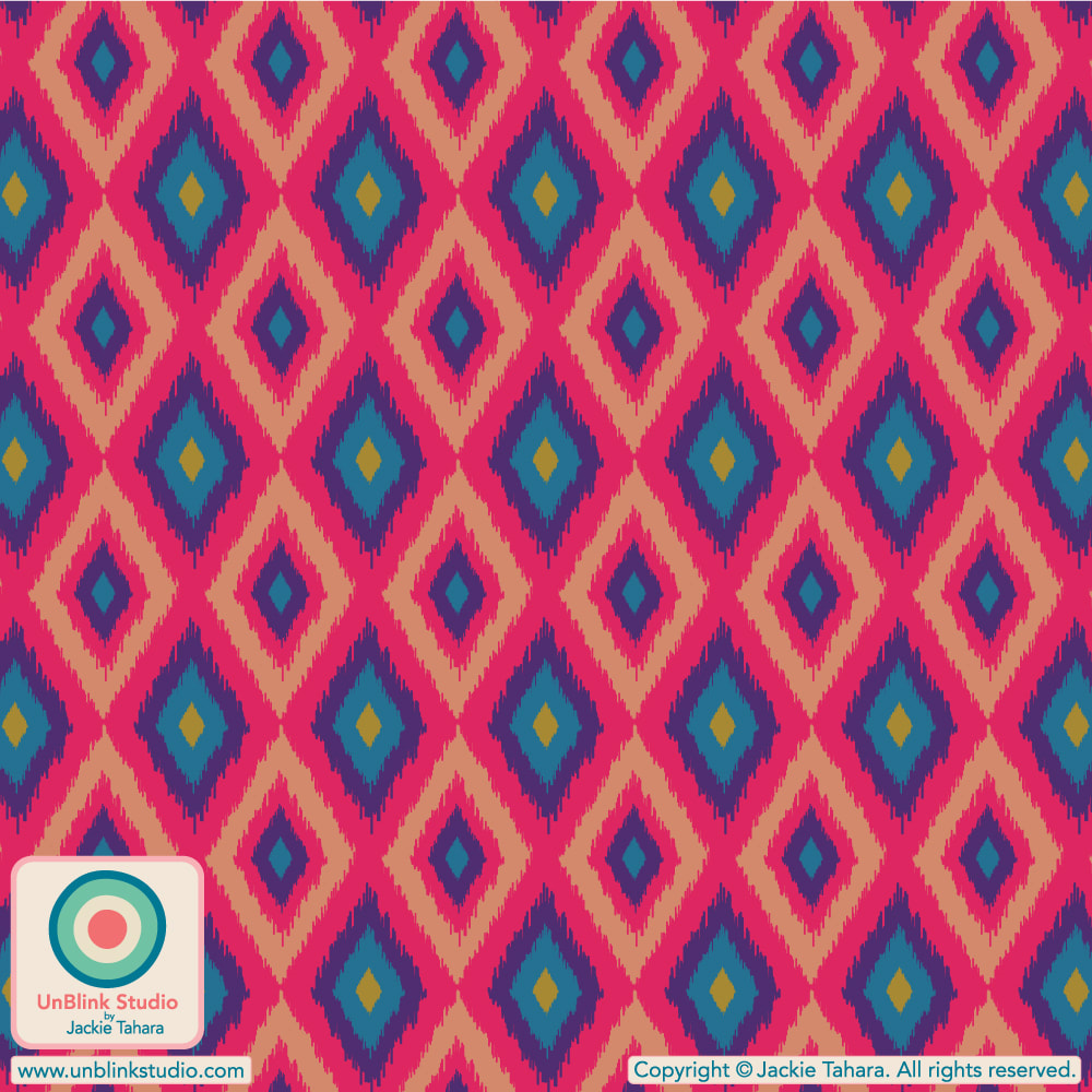 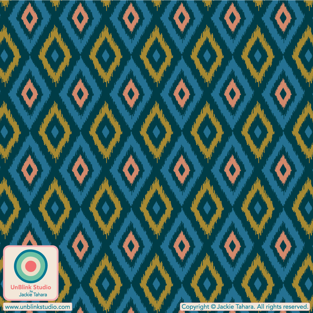 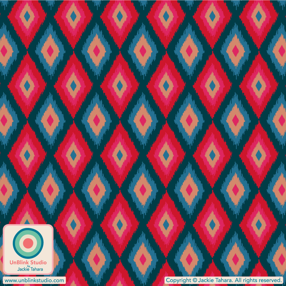 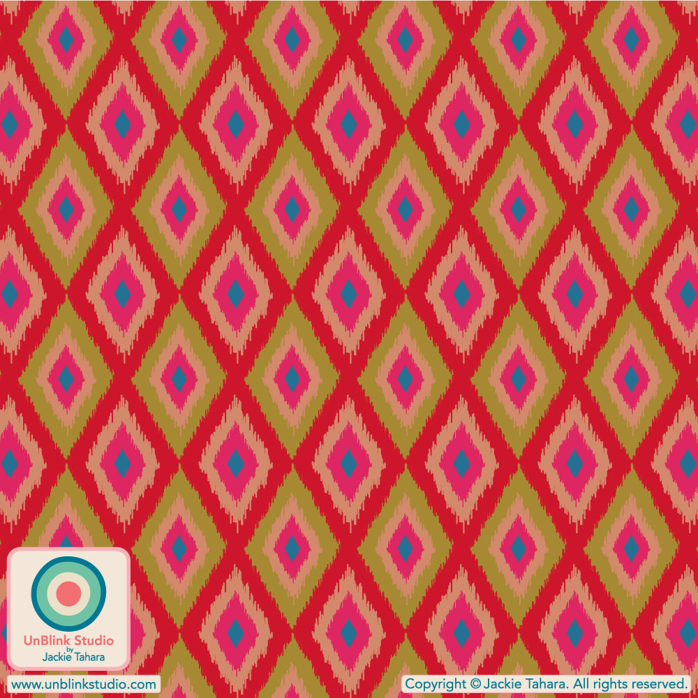
0 Comments
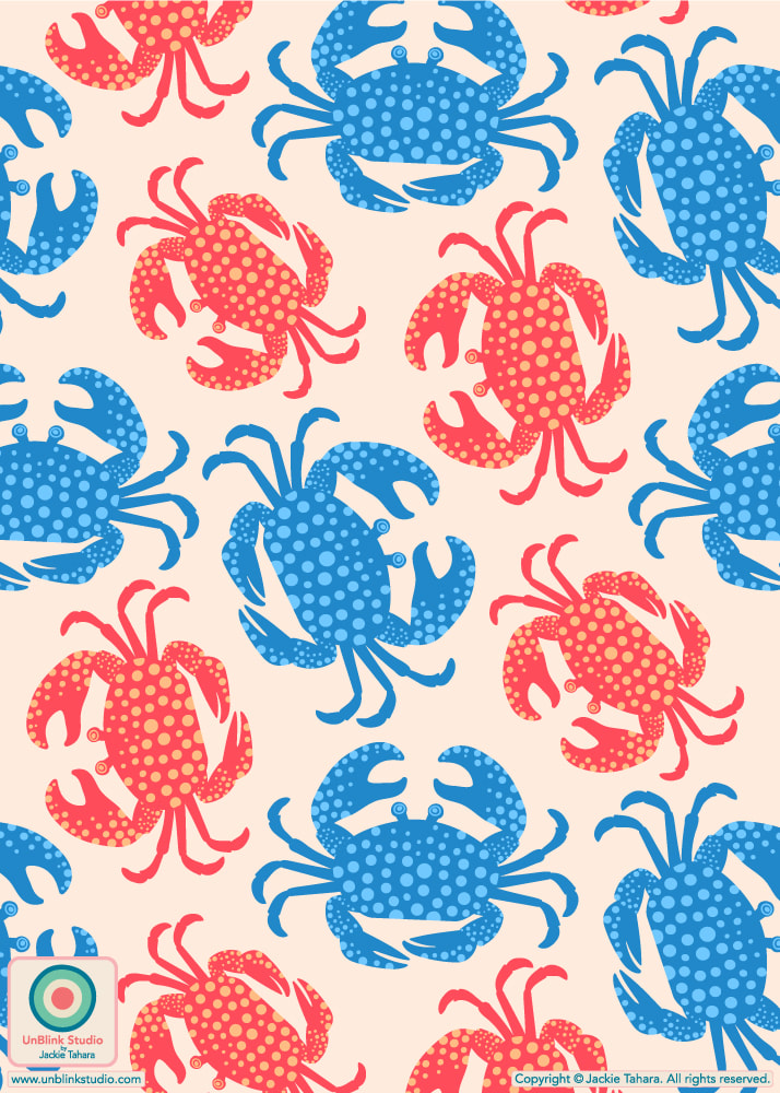
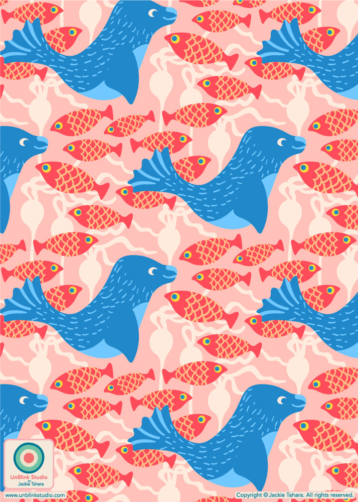
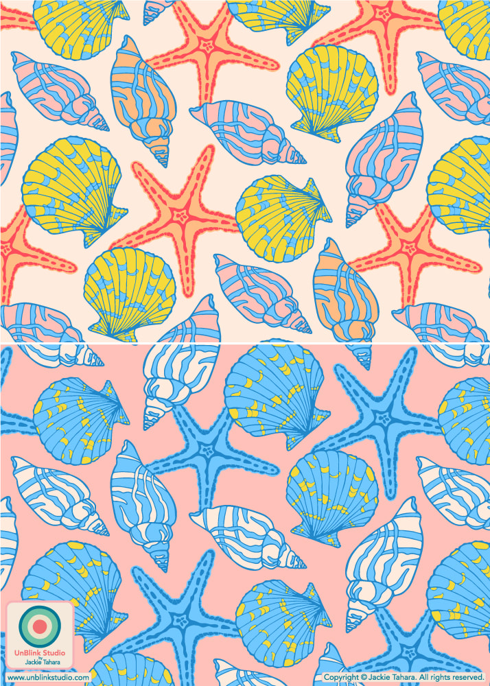
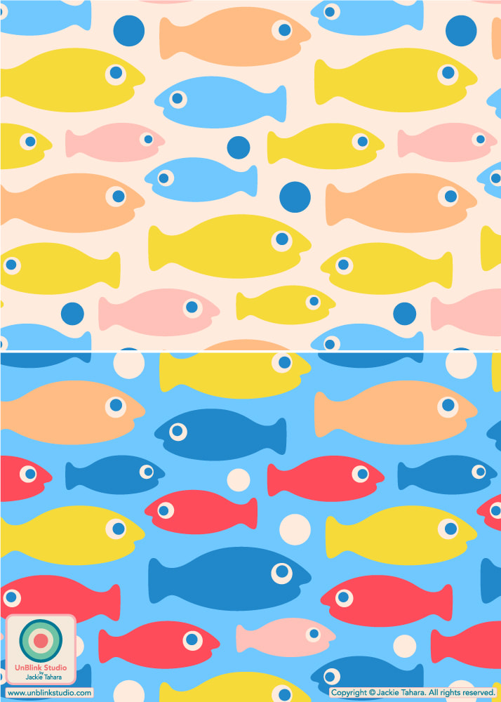
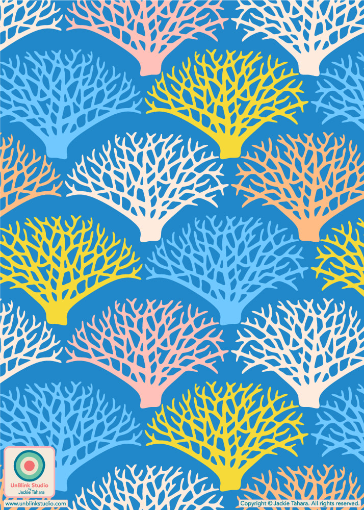
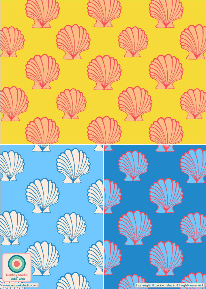
I DID IT! I managed to finish a new design to enter in the current Spoonflower “A Trip To The Beach” Design Challenge! I spent WAY too long revising my popular “Coastal Stories” Collection with brand new Seaside Colours because I was inspired by this theme, thus I nearly ran out of time to create a NEW design to enter. But I think these little “Shrimps” make a very nice addition to my (now re-coloured and expanded) “Coastal Stories” Collection! Public voting for this Challenge opens today Thursday March 14 and closes on Tuesday March 26. You can link to the Voting Page HERE. I would love your vote for this one just because I love these cute guys, and I bet they’d be tasty too! . See below for more print designs from my "Coastal Stories" Collection and you can check them all out in my Spoonflower Shop HERE. All are available on Fabrics, Wallpaper and Home Decor in several scales! 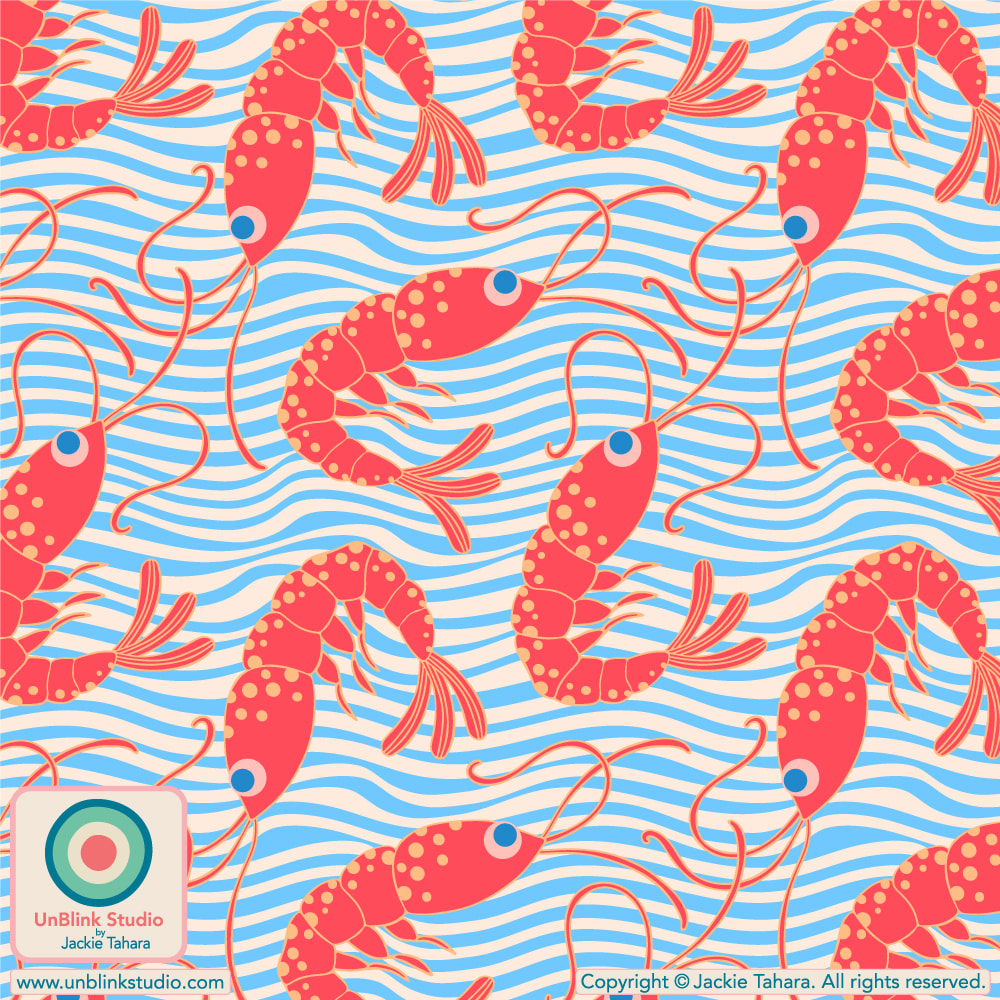 See below for more pattern designs from my "Coastal Stories" Collection! 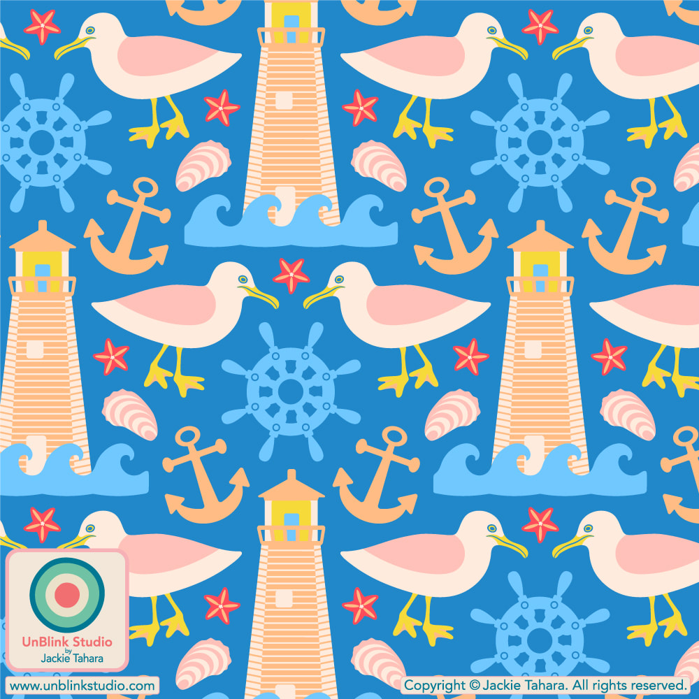
Because Summer is almost here, right?...NOT! I’ve entered my brand new “Tennis Rackets” design in this week’s Spoonflower “Court Sports” Design Challenge in Summery Purple and Pink (first pic below). Public voting closes on Tuesday January 30 and you can link to the Voting Page HERE! And of course, I couldn't resist trying it out in a gorgeous Coral Orange colourway too, see below! Click the images below to link directly to these designs in my Spoonflower Shop! . BTW: starting 2024, Spoonflower Challenges will run every TWO weeks, rather than weekly. 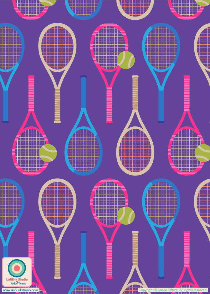 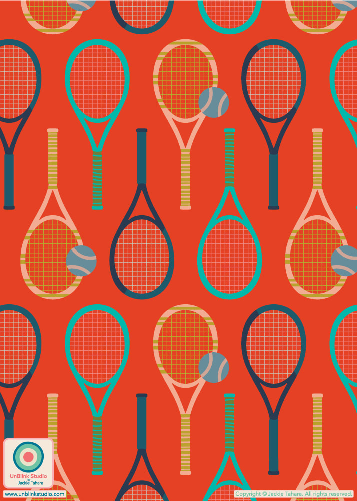 My entry for the Spoonflower “Pantone Color Of The Year 2024: Peach Fuzz” Design Challenge is my new “Ravenna” geometric tiled pattern. I entered the first one below, but both versions are now available in my Spoonflower Shop on Fabrics, Wallpaper and Home Decor in 3 sizes. This design was inspired by Italian mosaics, thus the name! Public voting closed Tuesday Jan 2 2024 (yes, 2024!!) Sorry for the late notice...I was preoccupied with the holidays! . If you’ve been following lately, you probably know I now have a Collection of print designs featuring Peach Fuzz in my Spoonflower Shop (now 69 in total!) If you’d like to see them all in one place, you can link directly to my Peach Fuzz Collection HERE. 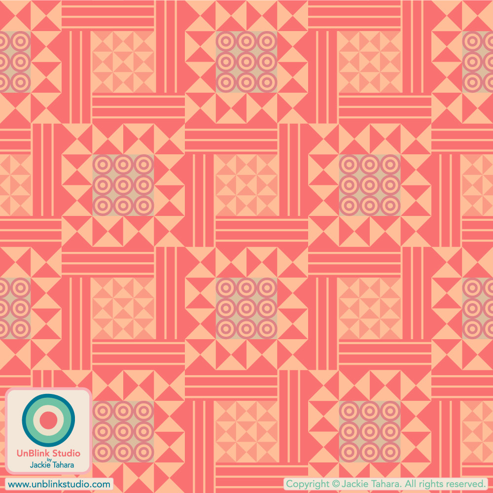 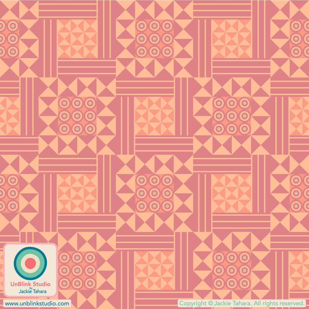 If you can’t go to the Tropics, let the Tropics come to you! I’ve entered my “Tiki Room” design in this week’s Spoonflower “Block Print-Inspired” Design Challenge! Link to the Voting Page HERE! Public voting closes next Tuesday Dec 19. . A bit about this design: my "Tiki Room" design isn't really new as I designed it several years ago but never knew what to do with it...until now! It was inspired by time spent living on the Big Island, Hawaii and by a made-in-Japan "funny face" tea set sourced at a thrift shop and given to me by my husband! I like giving my older designs that are just living on my hard-drive a new life with some "adjustments" and brand new colours! 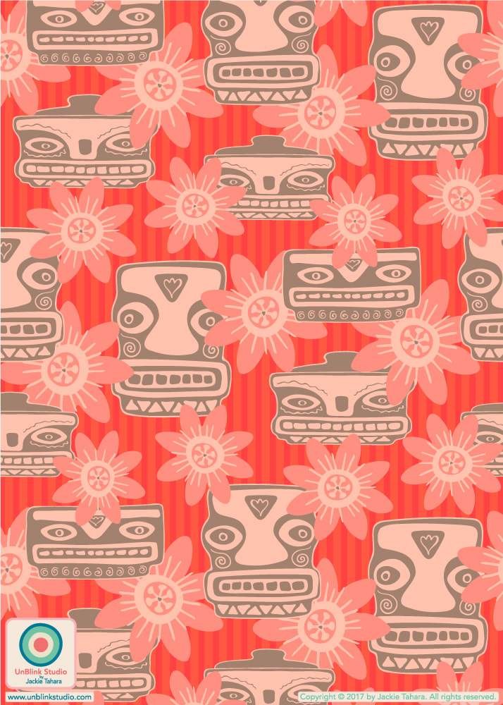
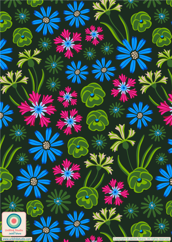
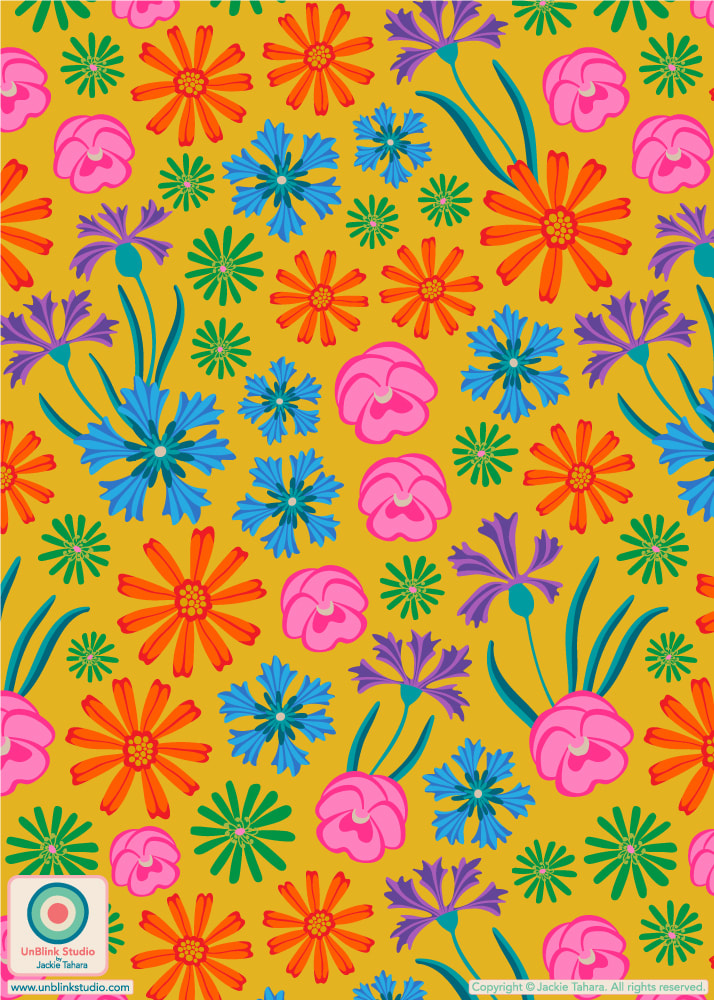
According to the art of Floriography, every flower has its own meaning. Most of us know red roses mean romantic love, but what about others? This week's Spoonflower "Floriography" Design Challenge had me researching this, and the result is my new "Floriography" floral print! According to my sources (ahem, Google) here are the meanings of the flowers I've included here: -Daisies mean "Attachment" -Bluebottles (or Bachelors Buttons or Cornflowers) mean "Riches" -Pansies mean “Messenger of Love" -Michalemas Daisies (or Asters) mean "Farewell". . I apologize for the late post, but Public Voting for this Challenge closed Dec 12. BUT you can SHOP this new design on Fabrics, Wallpaper and Home Decor in my Spoonflower Shop! I entered the first version on Dark Green in the Challenge, but I do love all the bright colours in the Yellow version too! Maybe one for Autumn and one for Summer? Click the IMAGES below to link directly to the Medium-Scale versions in my Spoonflower Shop!
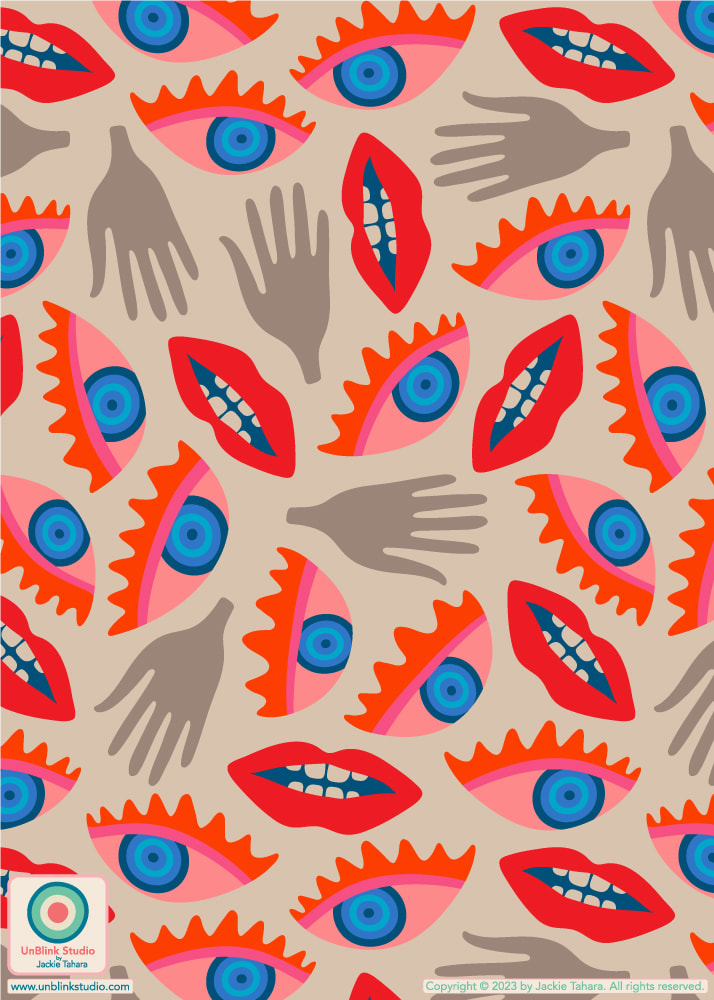
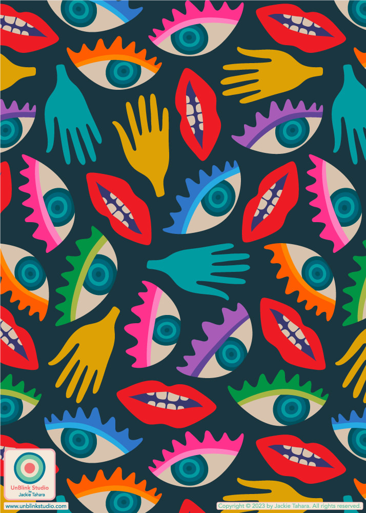
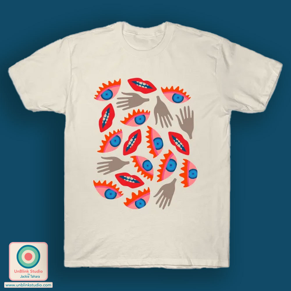
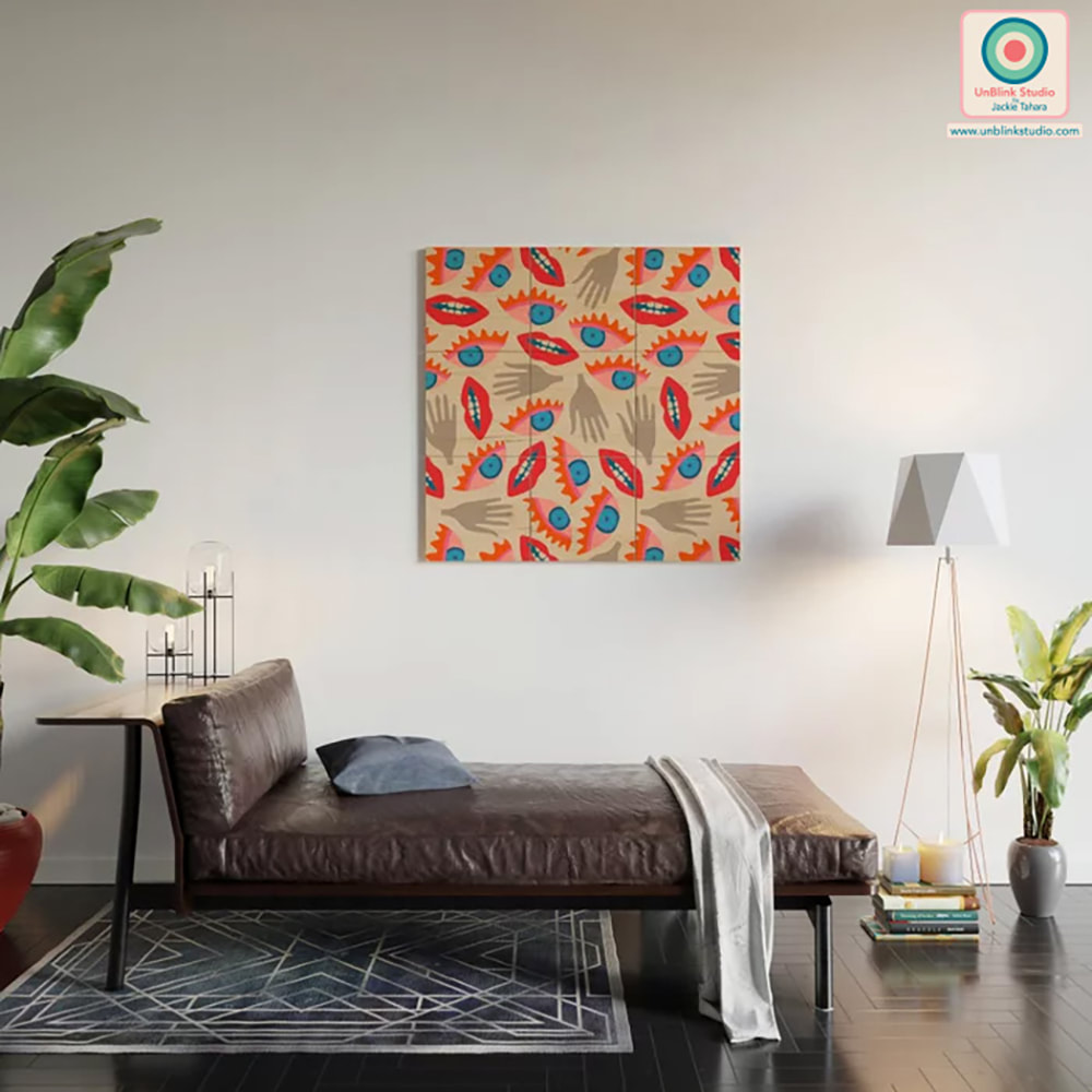
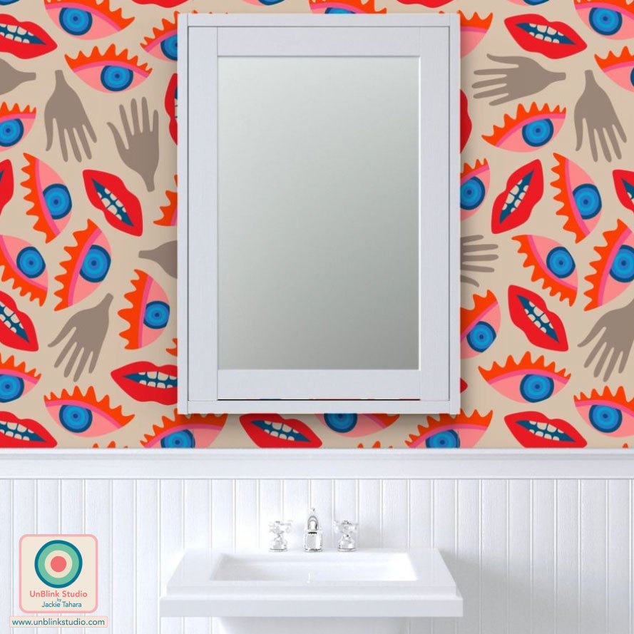
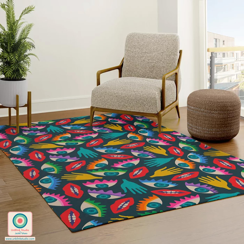
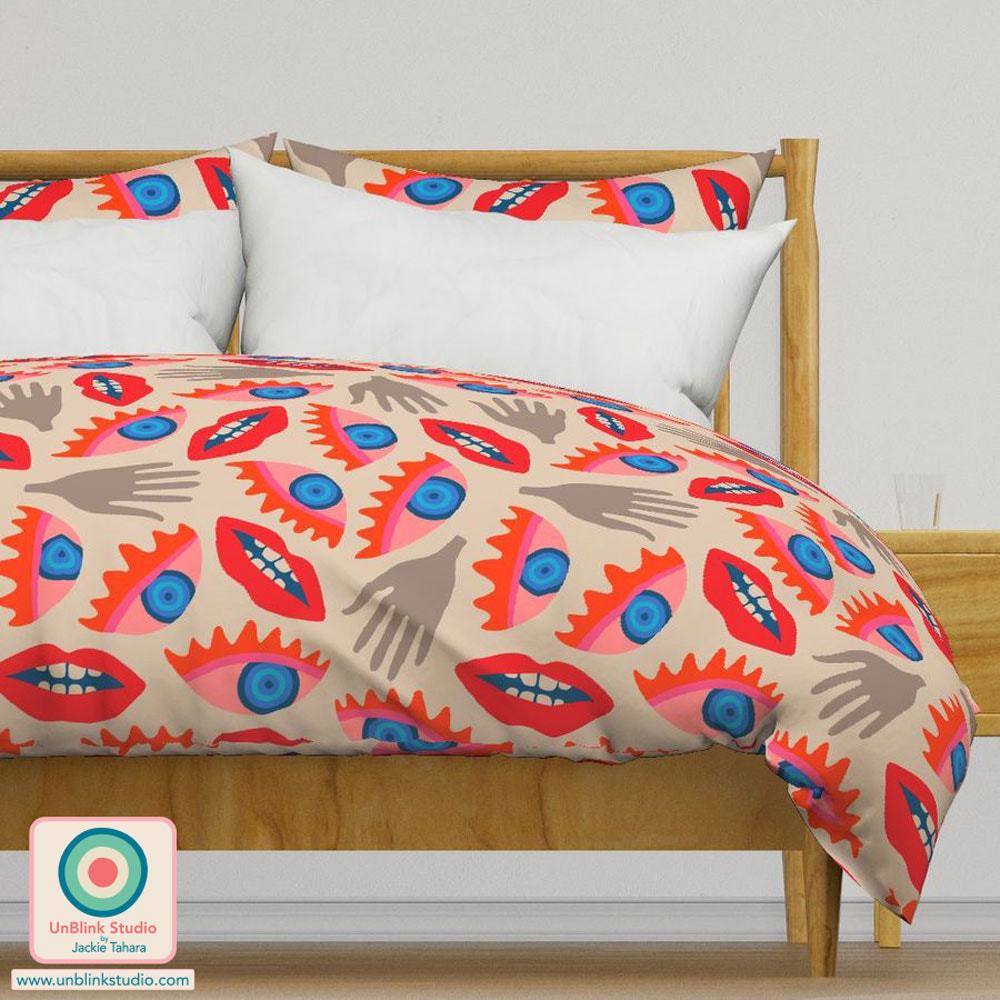
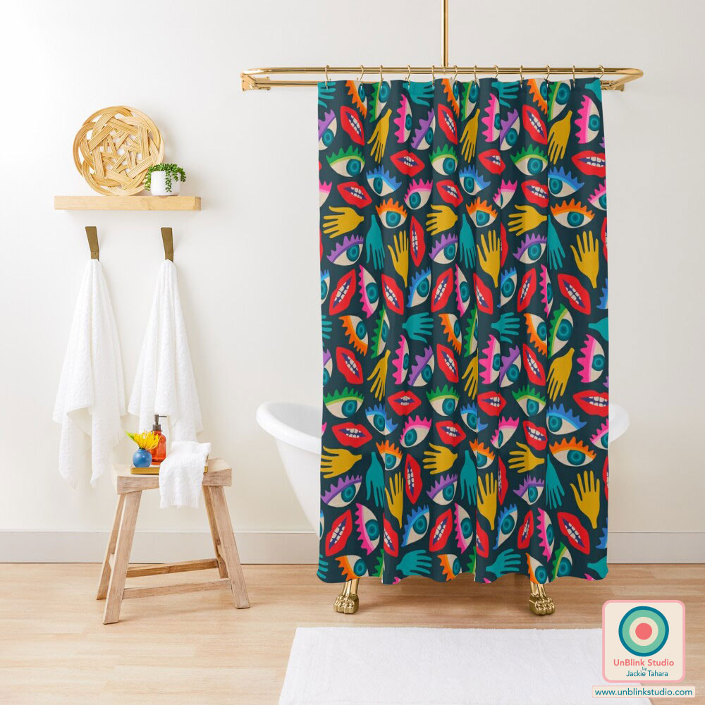
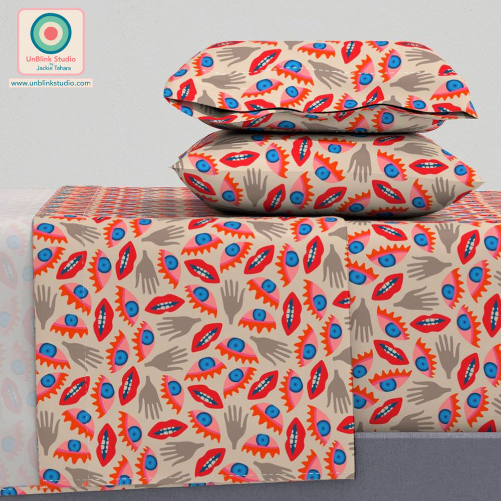
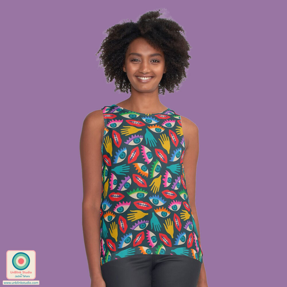
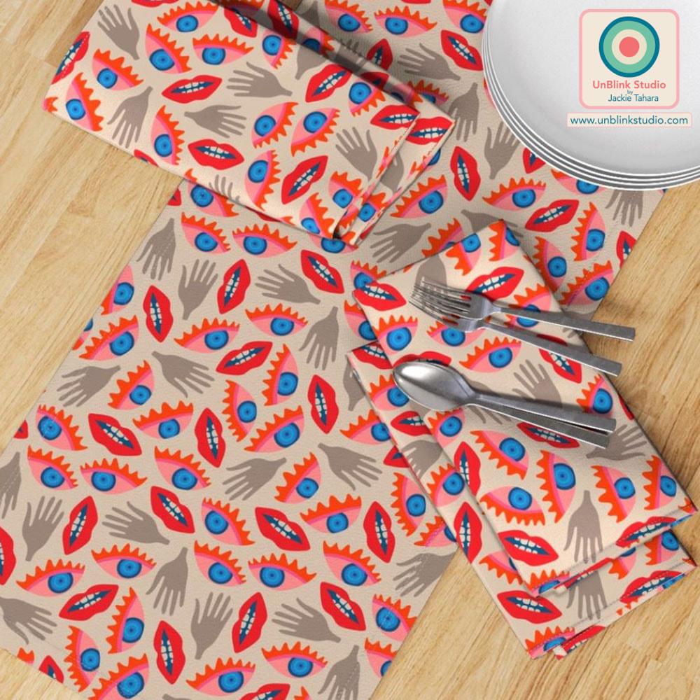
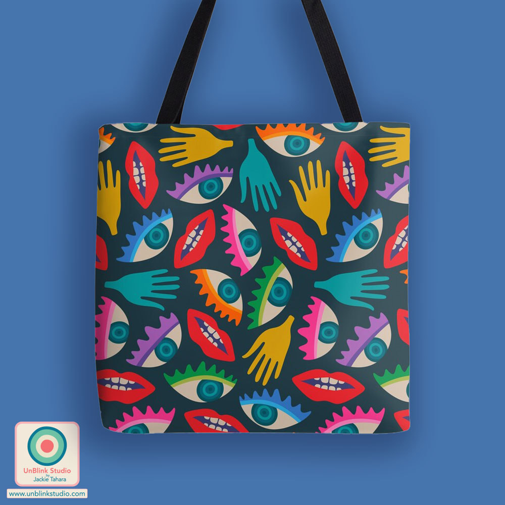
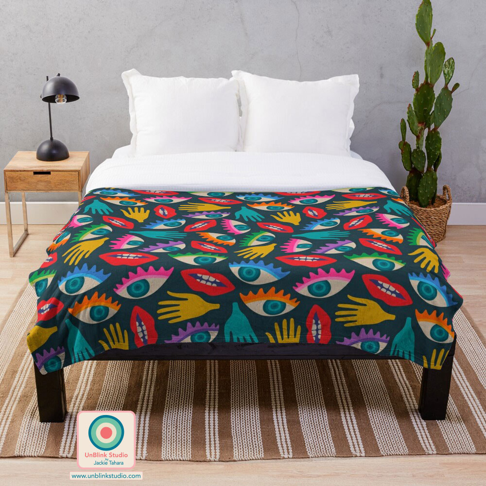
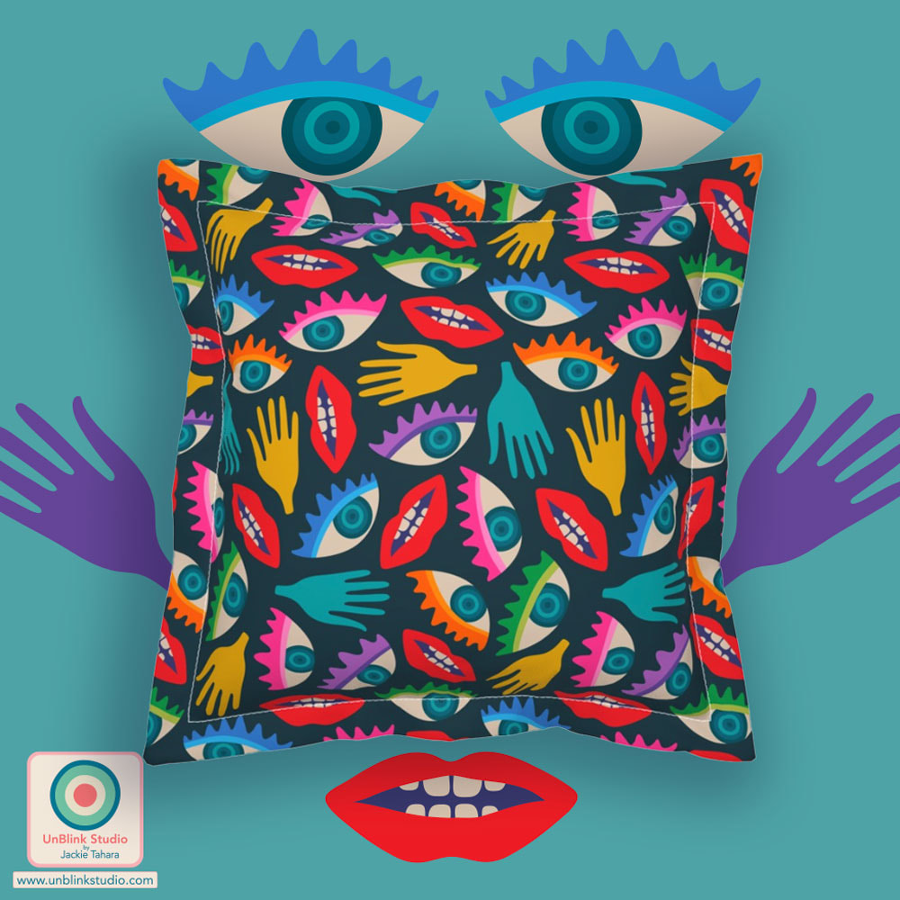
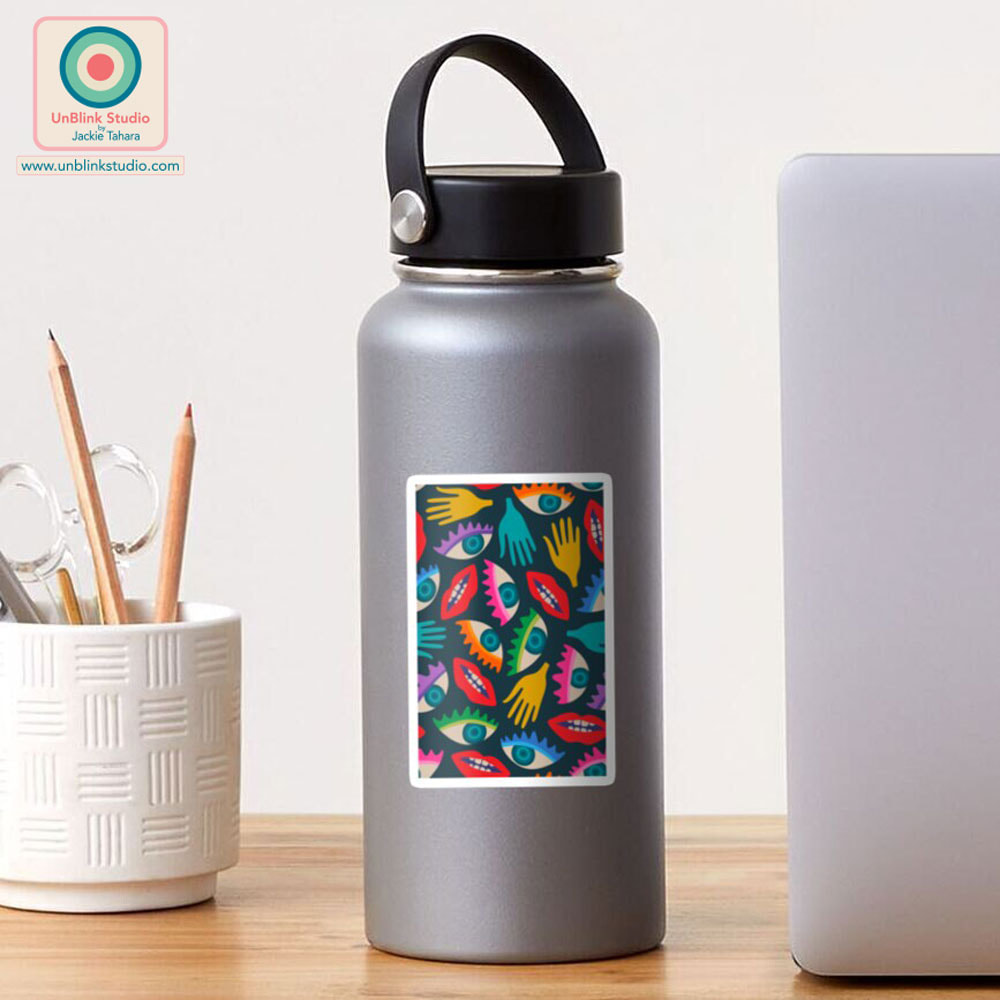
I'm playing catchup here since I've been away in Taiwan (it was an amazing trip, btw, and I'll try to write a post about it very soon!) BUT, getting back to catching up...While I was away, one of the Spoonflower Design Challenges was "Surrealist Wallpaper", and I did manage to enter my new "Disembodied" design (in the Retro Colours, below left) before I left for Taiwan. When I looked at surrealist art, I just seemed to notice the weird eyes, mouths and hands the most! Voting for this Challenge closed November 14, but this new design is now available in my Spoonflower, Redbubble, Society6 and TeePublic Shops in both Retro Colours and Rainbow Brights! Click the product images below to see these products in my Shops!
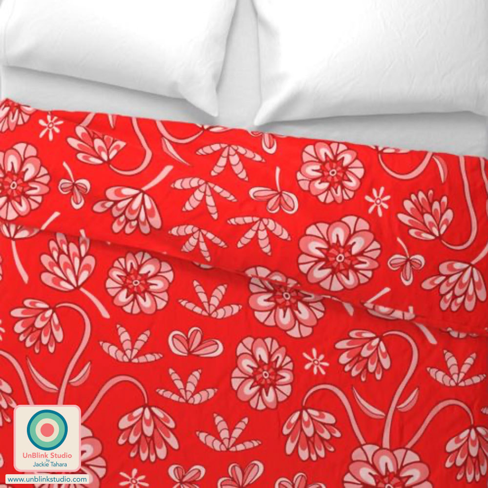
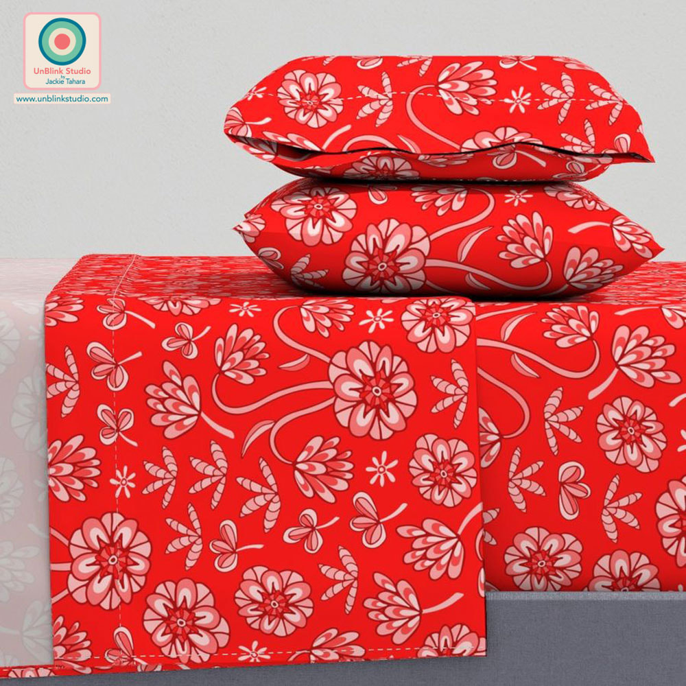
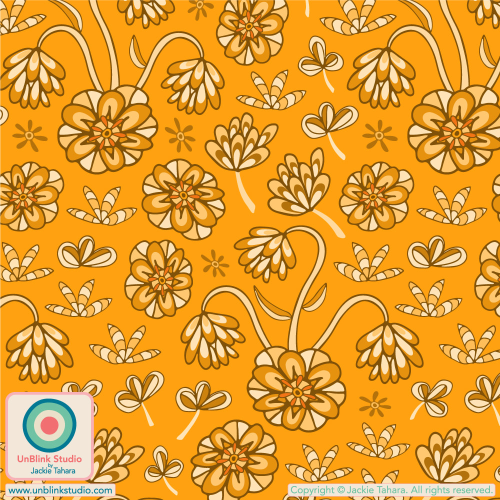
At first glance, the colours of my "Aubergine" design below might not seem like me, and if you thought that, you'd be right! That's because I entered this one in this week's Spoonflower "East Fork: Night Swim & Molasses" Design Challenge which required the use of that gorgeous teal ("Night Swim") and dark brown ("Molasses") to match East Fork Pottery's seasonal glaze colours (for use on matching table linens). Public voting for this Challenge opens Thursday Oct 26 (and closes Tuesday Oct 31) and you can link to the Voting Page HERE! If you'd like to SHOP these designs in my Spoonflower Shop, just click the images below to link to the Medium-Scale versions. They are also available in a Small- and Large-Scale version too on Fabrics, Wallpaper and Home Decor! 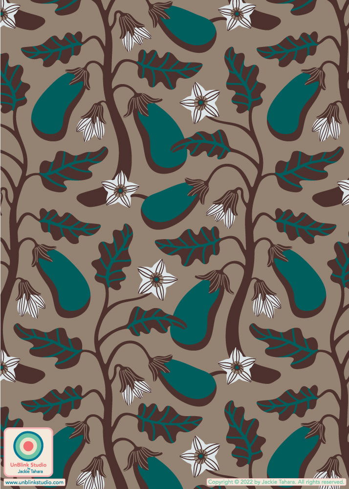 Although I do love the East Fork colourway, see below for the version in the original colours that you will probably think is more "me"! This repeat pattern is in turn based on an "Eggplant Seed Packet" illustration I created in 2022 to submit to the Uppercase Magazine "Seed Packet" comp for Issue #53 which was all about Gardening (scroll down to see it). Ultimately, it wasn't picked (although my "Peas Seed Packet" was!). Since then, I've had it in the back of my mind to create a fun repeat pattern design from that original illustration...And here it is! OH and I renamed it to "Aubergine" just because I like the sound of that better than "Eggplant" (which is what we call this veg here in Canada). 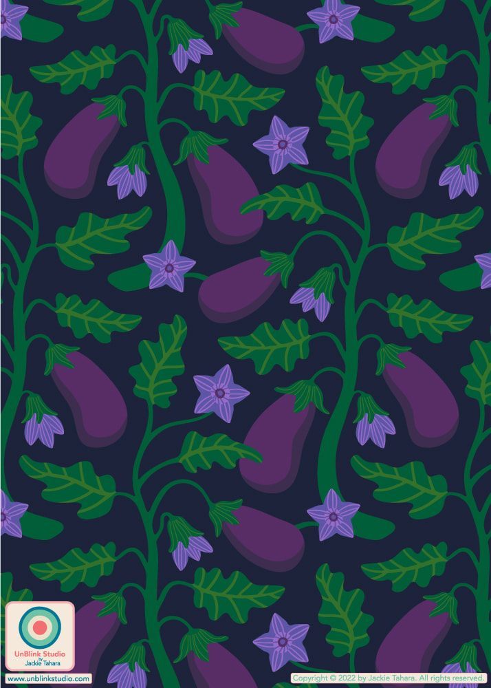 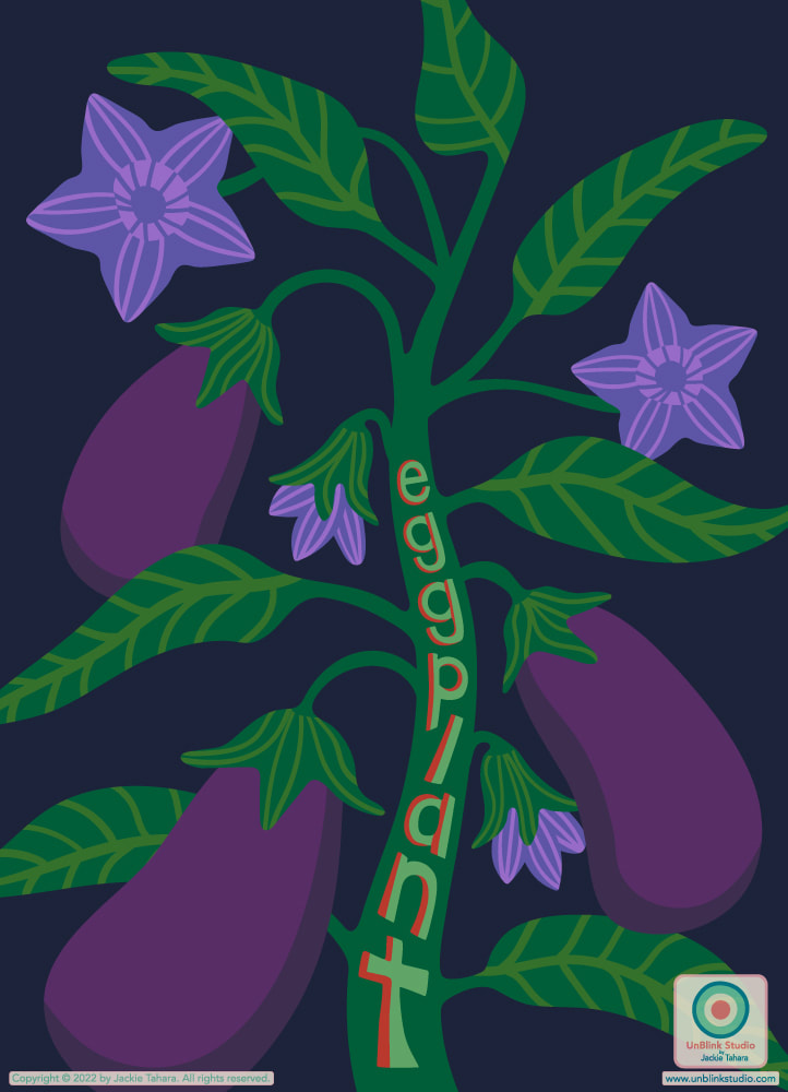 This week's Spoonflower Design Challenge is "Whimsigothic Wallpaper". So what is "whimsigothic" anyway, you might ask? I had the same question! Doing a bit of research, I discovered it is a mash-up of dark, ornate, mysterious Victorian Gothic design with bright unexpected colours and boho modern touches. So here is my take: I pictured an old stone castle with Gothic stained-glass windows, ornate velvet furniture in dark moody colours, fading tapestries and dusty chandeliers...Thus the name of this floral: "Castle Rose". BUT I also made sure to create the flowers and leaves in a semi-abstract way (look closely) in, what else? Fuchsia Pink! Public voting for this Challenge opens Thursday Sept 7 and closes next Tuesday Sept 12. You can link to the Voting Page HERE! And if you'd like to SHOP this design, click HERE to see the LARGE-Scale version. It also comes in a SMALL-Scale and MEDIUM-Scale version too!   I must say this week's Spoonflower "Vintage Sportswear" Design Challenge was a tough one! I mean, what do you think of when you think of 70s, 80s or 90s sportswear?! After trying and tossing a bunch of ideas, I ended up with my "Anemone" retro floral in bright 1970s colours (first pic)! I can see a pretty cool fleece jacket or ski suit in this (what do you think, my Nelson, BC ski buddies?) Public voting is open now and you can link to the Voting Page HERE! . I also want to thank the team at Make It In Design whose "Creative Tip Of The Week" posted on their Blog on August 25 about how to use Adobe Illustrator's Blend Tool inspired me to try something new! . Click the IMAGES below to link directly to the Medium-Scale versions of this design in TWO colourways in my Spoonflower Shop. They also come in Small- and Large-Scale versions too! 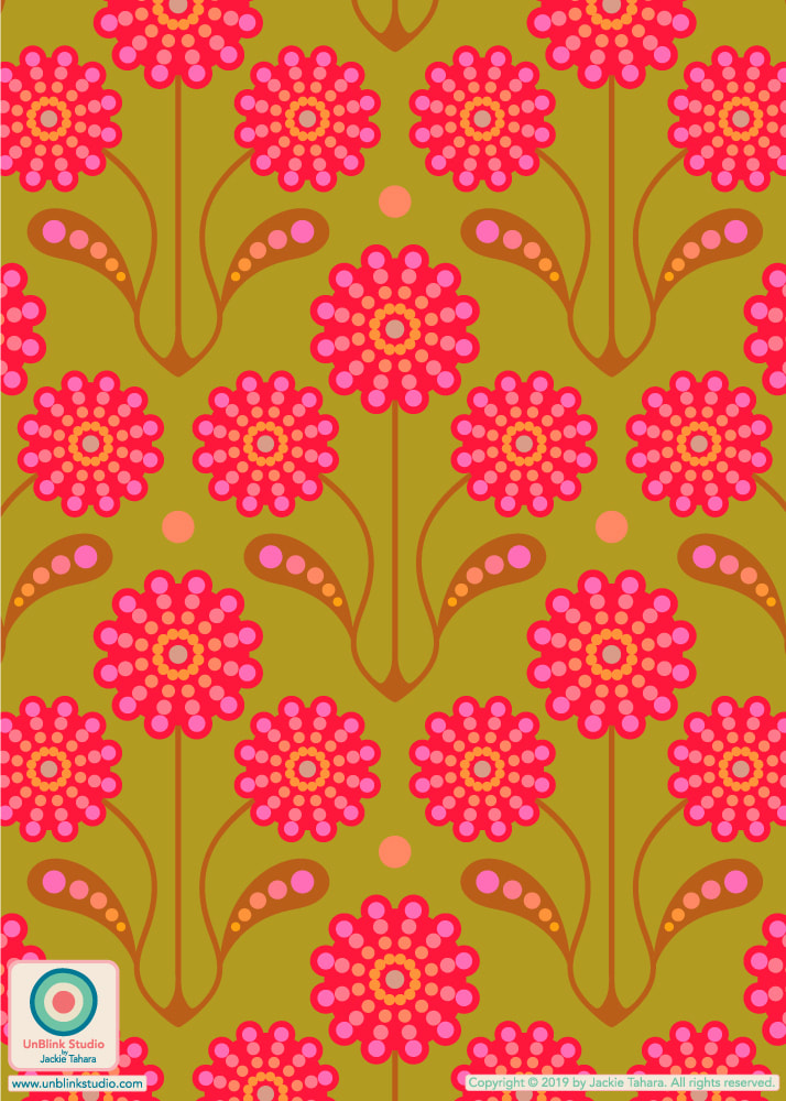 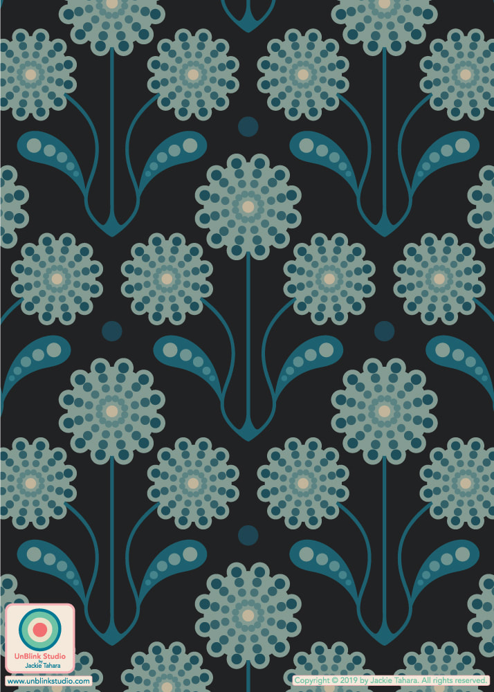 Here is my entry for the Spoonflower "Monochromatic Duvet Covers" Design Challenge, called "Abloom"! All the colours are shades and tints of the gorgeous Scarlet Red in the background, as required by the Challenge. It's now available in my Spoonflower Shop on Fabrics, Wallpaper and Home Decor in several scales from Small to Jumbo. AND of course, I had to try it out in a bunch of Other Colours too (if you look closely, some of them aren't strictly "monochromatic" as I felt the need to add in bits of other colours here and there!). Click the IMAGES below to link directly to the design in my Spoonflower Shop (Large-Scale versions)! Public voting for this Challenge is now closed...Whoops, I forgot to post this LAST week! But you can vote in THIS week's "Vintage Sportswear" Design Challenge at the Voting Page here! 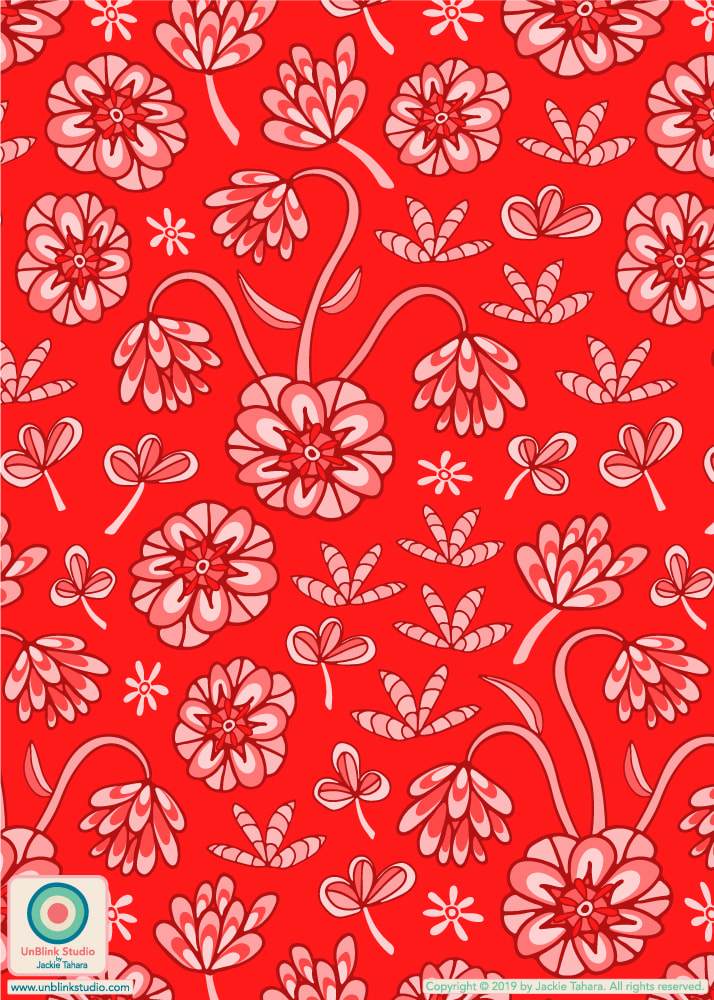
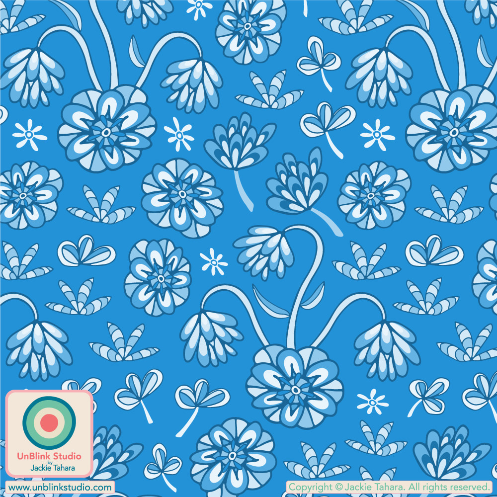
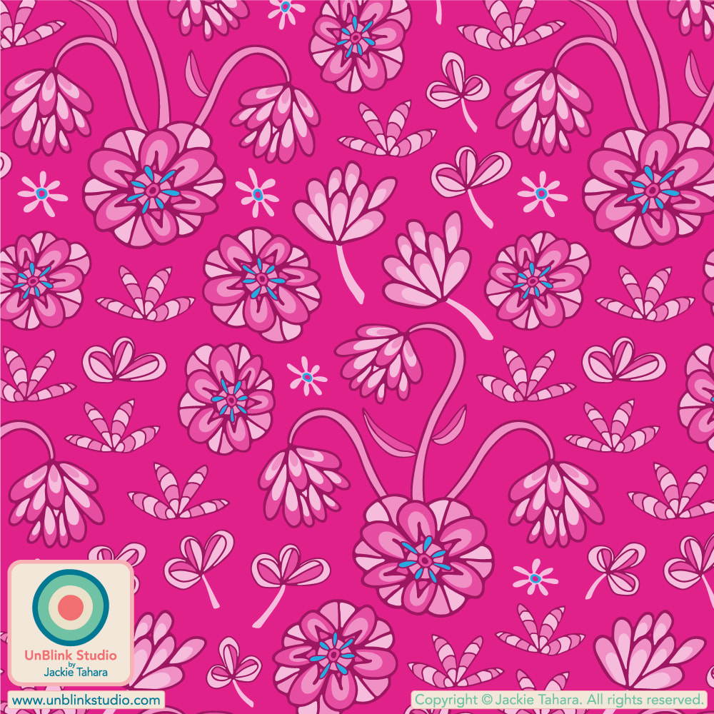
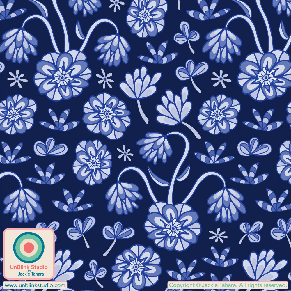
And now for MORE colours...In order: Mustard Yellow, Barbie Pink, Sky Blue and Cobalt Royal Blue! All colours are now available in my Spoonflower Shop!
So I must admit, I'm kinda in LOVE with Barbie colours right now! Pink, Blue, Purple...I guess that's no surprise! So, I named my new floral pattern design "Dream House" (get it?!) and entered it in this week's Spoonflower "Tween Spirit Bedding" Design Challenge! What tween (or teen or full-grown adult or elder) wouldn't like this (um, don't answer that)?! This gorgeous floral is now available in my Spoonflower Shop on Fabrics, Wallpaper and Home Decor in 3 sizes and a bunch of colourways. Click the IMAGES below to link directly to the Large-Scale versions in my Spoonflower Shop (but don't forget, they also come in a Small- and Medium-Scale version too if you prefer that!) . If you'd like to vote in this Challenge, public voting for is open until Tuesday August 22 and you can link to the Voting Page HERE!  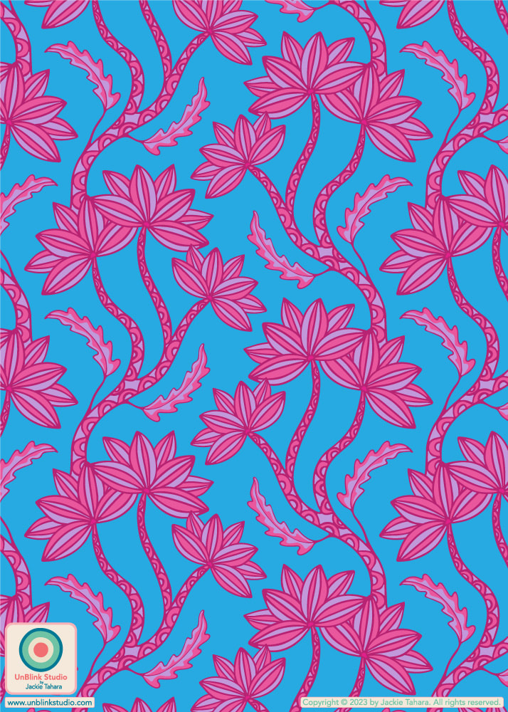 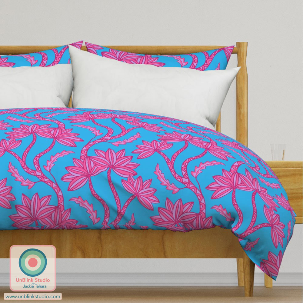 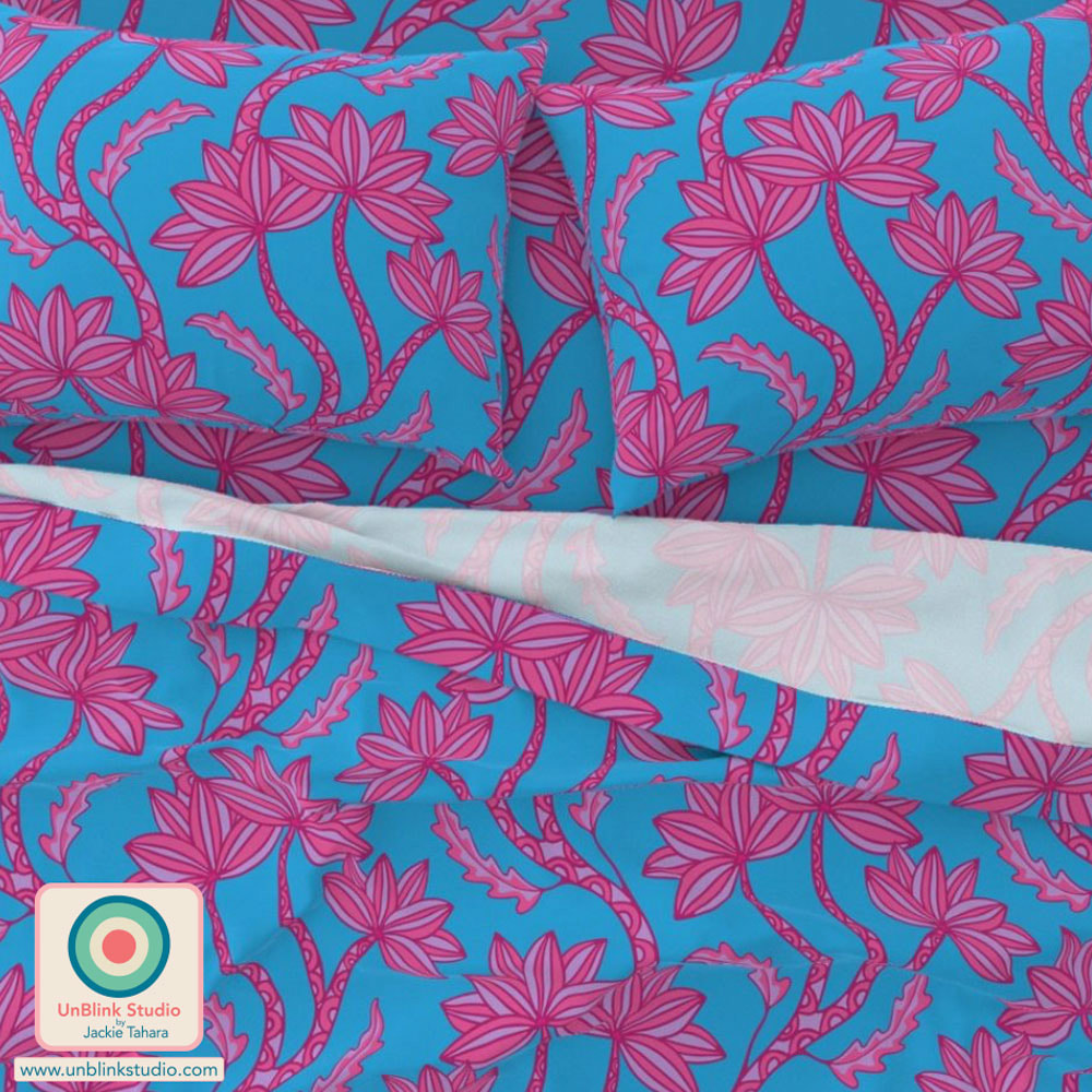 AND OF COURSE, I had to try it out in several other colourways. Scroll down to see them! They're all now available in my Spoonflower Shop on Fabrics, Wallpaper and Home Decor in 3 sizes! Click the IMAGES to link directly to the Large-Scale versions in my Shop! 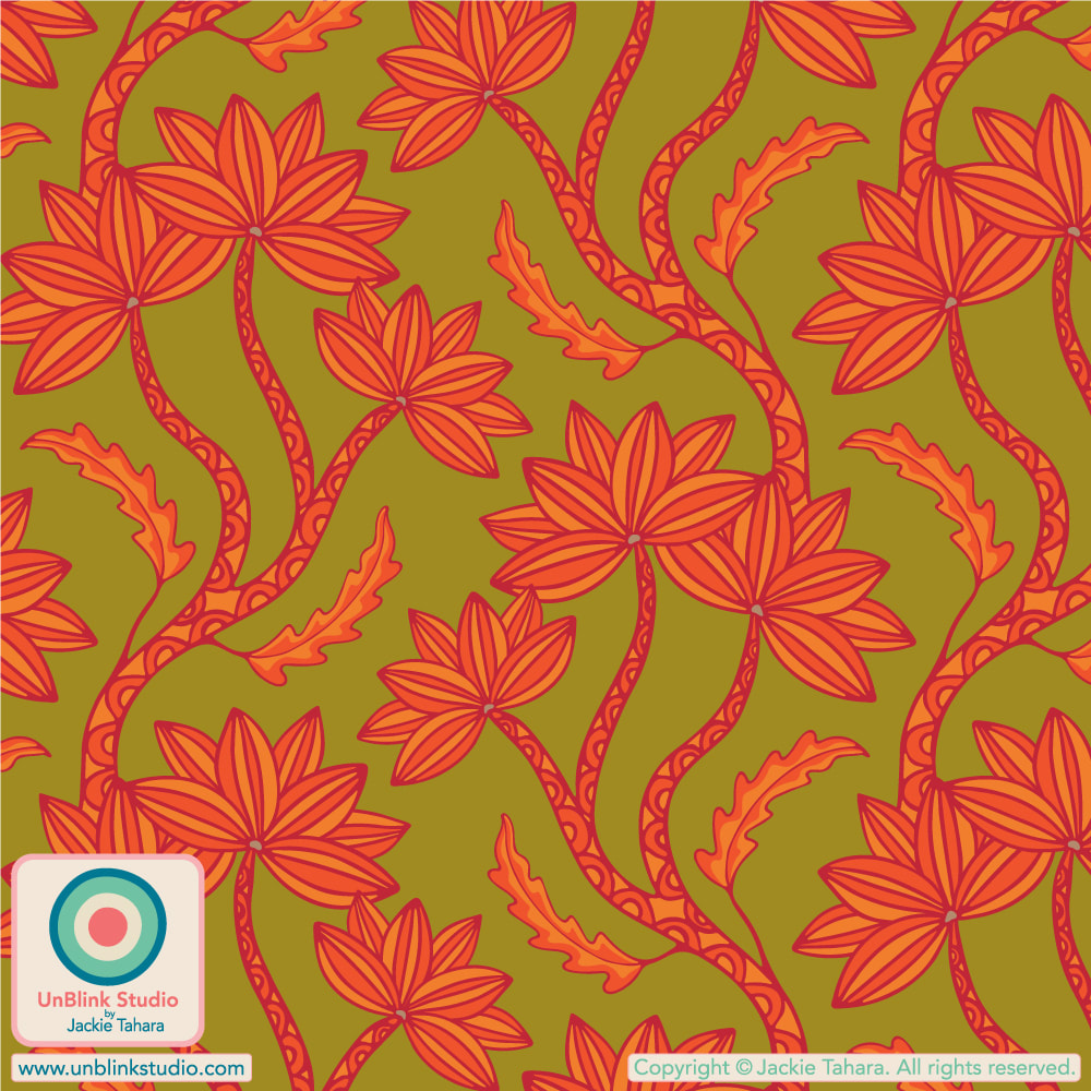 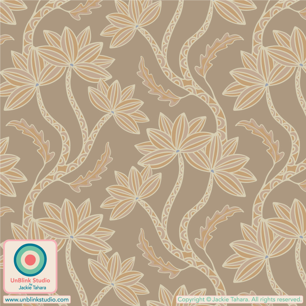 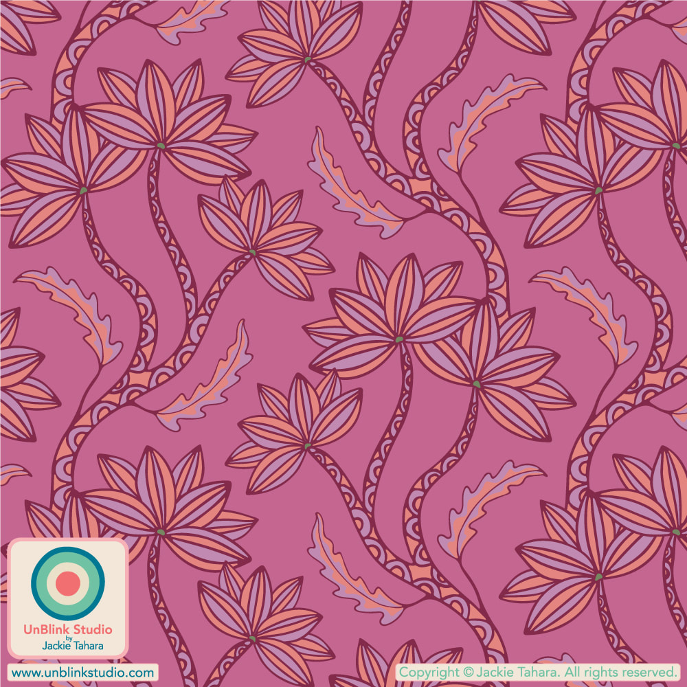 PHEW! I just returned from my vacation last weekend and had decided I wouldn't be able to enter a design in this week's limited colour palette "Pantone Meta Matter Bedding" Design Challenge (how many emails did I have?!) because entries closed on Tuesday August 8, but then I remembered my "Pinwheel" design that has been in my archive for awhile. I've always wanted to add it to my Spoonflower Shop but never quite got there. So this week's challenge gave me a good excuse to revise and recolour it. It did end up taking a full day to finish (as these things do), but I did manage to enter it on time! Public voting for this Challenge closes on Tuesday August 15! You can link to the Voting Page HERE! If you'd like to see this design in my Spoonflower Shop, just click the IMAGES below! Note this design is available in a Small-, Medium- and Large-Scale version; the images will link to the Large-Scale version in my Spoonflower Shop!   I’ve entered my “Lovely” design in this week’s Spoonflower “Cute, Cuter, Cutest Kids Sheets” Design Challenge! I entered the first Light Pink on Dark Pink version but it's also available in another (also Pink!) colour option too, see below! Can you guess which recently-released movie influenced the colour palette? You get ONE guess! Public voting closes tomorrow August 8 (sorry for the late notice, I've been on vaca)! You can check out all the entries at the Voting Page HERE. And if you'd like to channel your inner [insert answer to my question here], you can now purchase these designs in 3 sizes in my Spoonflower Shop on Fabrics, Wallpaper and Home Decor! 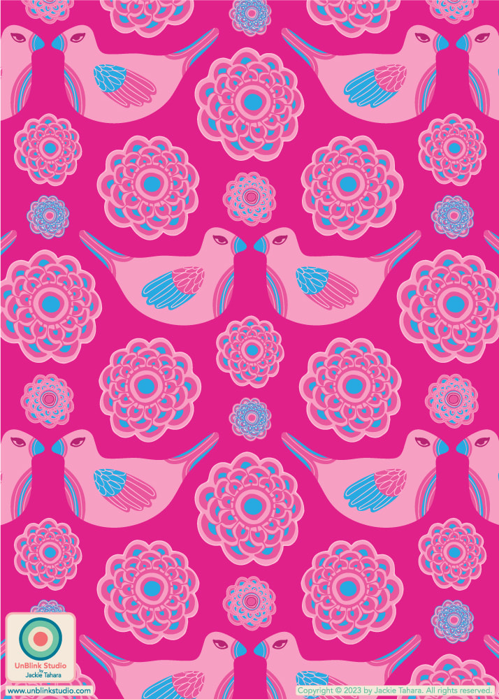 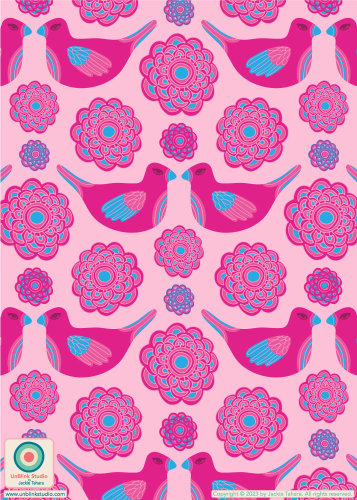 Answer to my question: Barbie (of course)!
I know I'm getting a bit ahead of myself, but I've managed miraculously to get a bit ahead of things here in the studio for next week's Spoonflower "The Skies Above Bedding" Design Challenge! So I've just entered my "Daydream In The Garden" design, it's very dreamy, happy and colourful! The idea was to re-create the feeling of gazing up into the Summer sky while daydreaming in the flower garden! Public voting for this Challenge opens Thursday July 27 and you can link to the Voting Page HERE! If you'd like to SHOP this design in my Spoonflower Shop on Fabrics, Wallpaper and Home Decor, it's now available in 3 sizes. Check out the Large-Scale version HERE which I think just might be best for bedding!   |
AuthorJackie Tahara of UnBlink Studio Archives
July 2024
Categories
All
|
 RSS Feed
|
|
|
|
|
|
All images on this website are Copyright © Jackie Tahara. All rights reserved.
If sharing, pinning or blogging my images, please always credit me and link back to my website. Supporting artists is a good thing to do! Thank you!
If sharing, pinning or blogging my images, please always credit me and link back to my website. Supporting artists is a good thing to do! Thank you!