|
My entry for the Spoonflower “Pantone Color Of The Year 2024: Peach Fuzz” Design Challenge is my new “Ravenna” geometric tiled pattern. I entered the first one below, but both versions are now available in my Spoonflower Shop on Fabrics, Wallpaper and Home Decor in 3 sizes. This design was inspired by Italian mosaics, thus the name! Public voting closed Tuesday Jan 2 2024 (yes, 2024!!) Sorry for the late notice...I was preoccupied with the holidays! . If you’ve been following lately, you probably know I now have a Collection of print designs featuring Peach Fuzz in my Spoonflower Shop (now 69 in total!) If you’d like to see them all in one place, you can link directly to my Peach Fuzz Collection HERE. 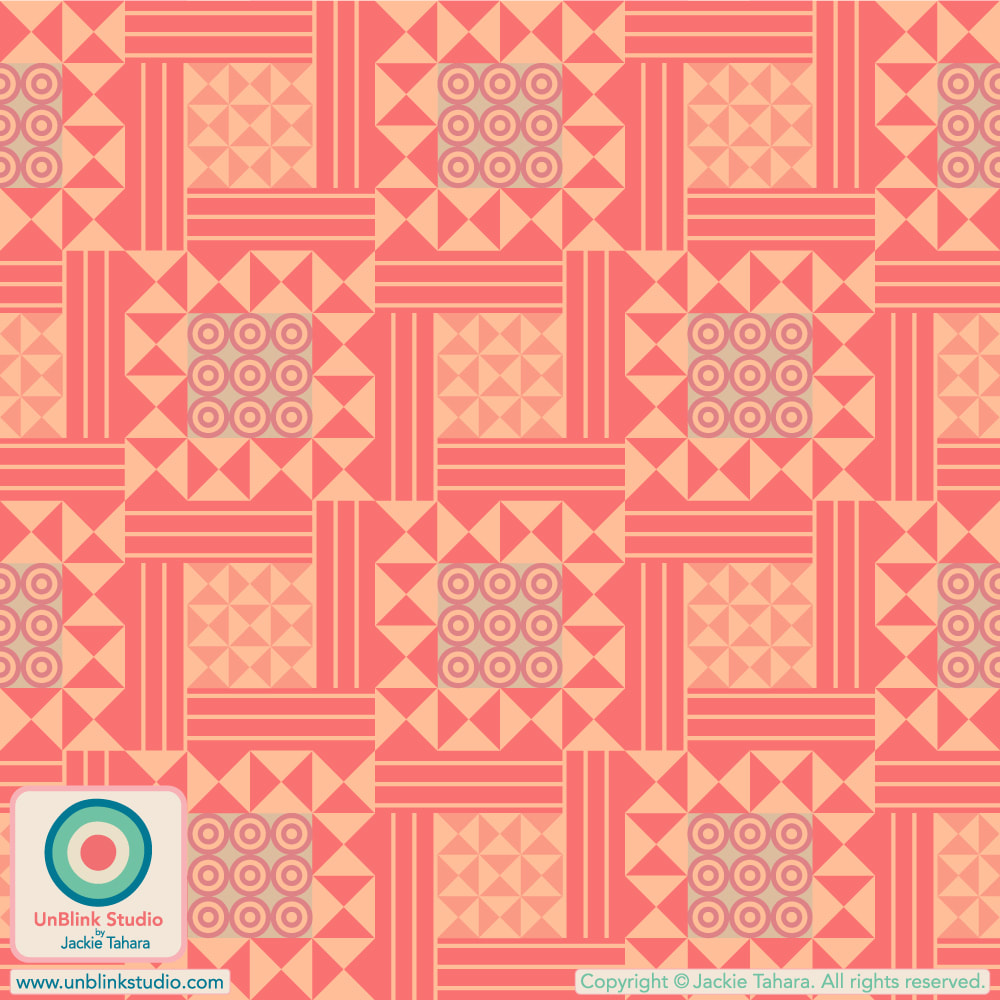 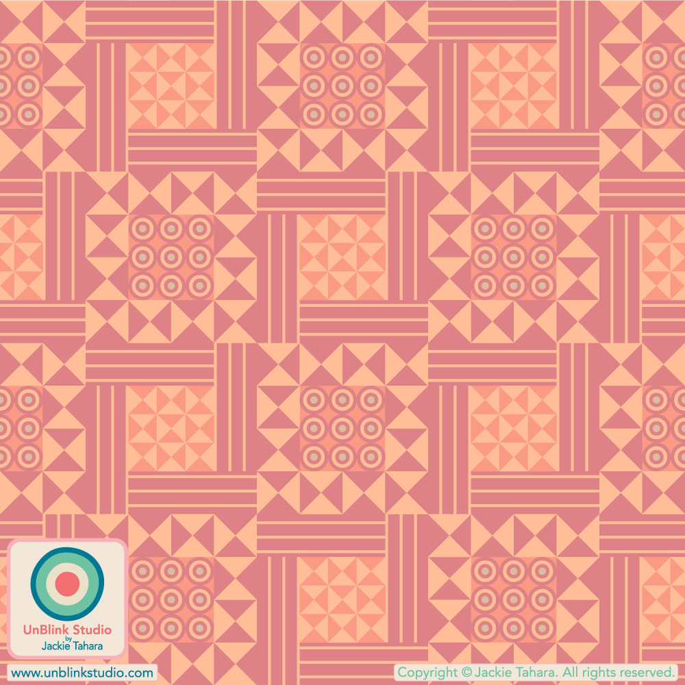
0 Comments
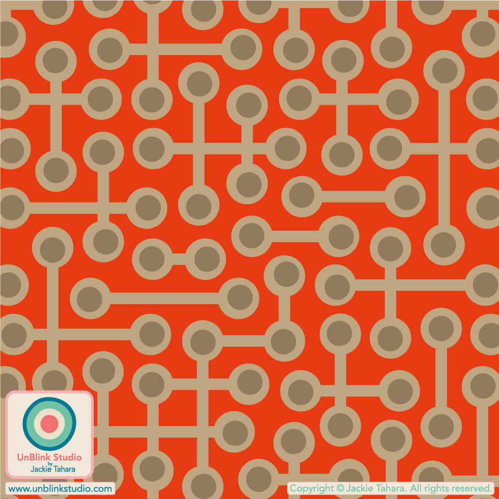
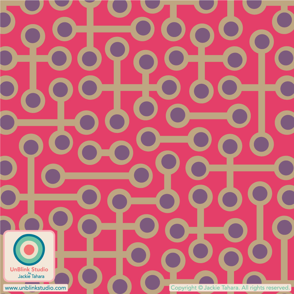
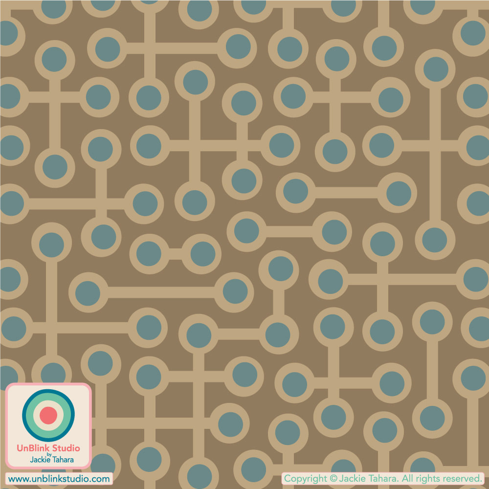
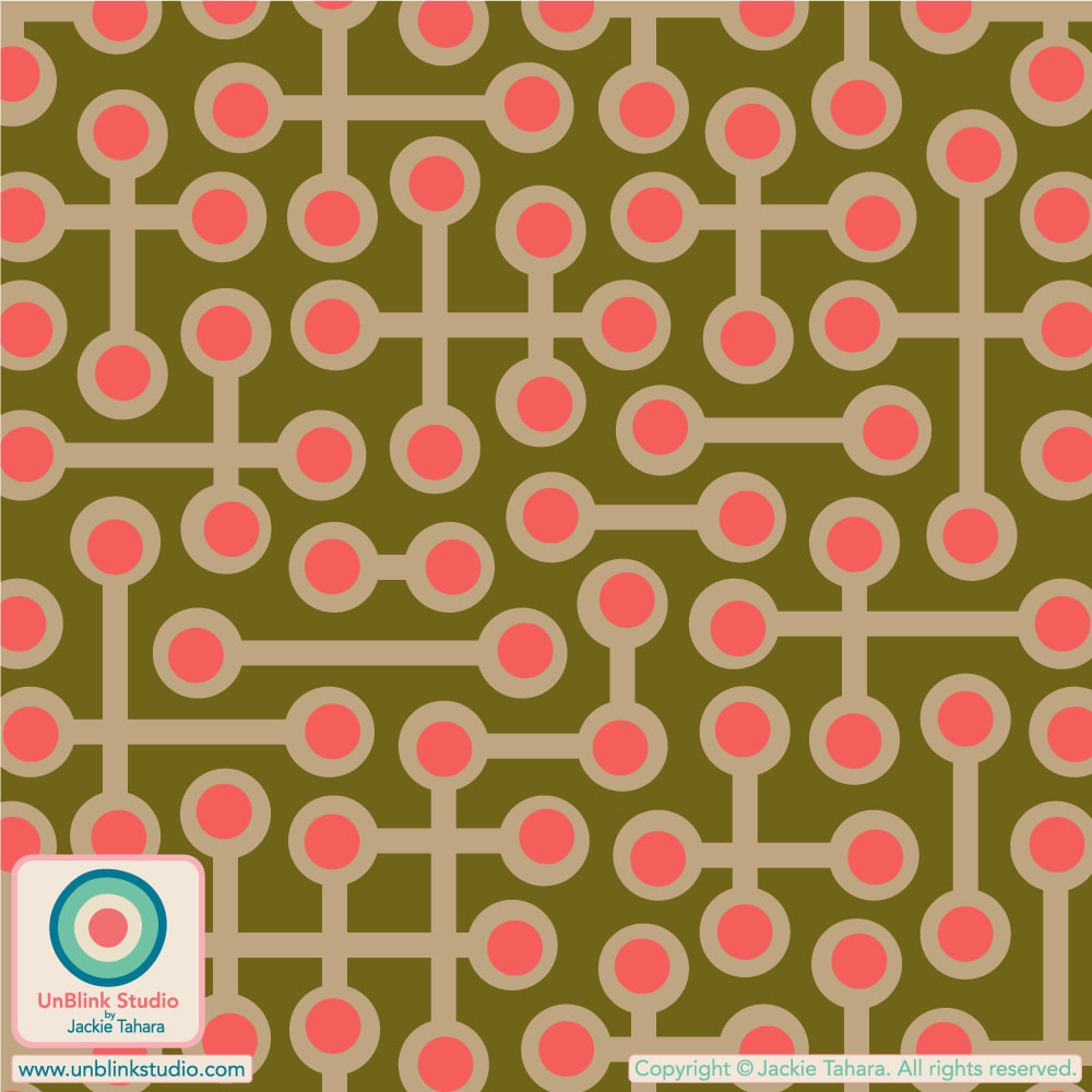
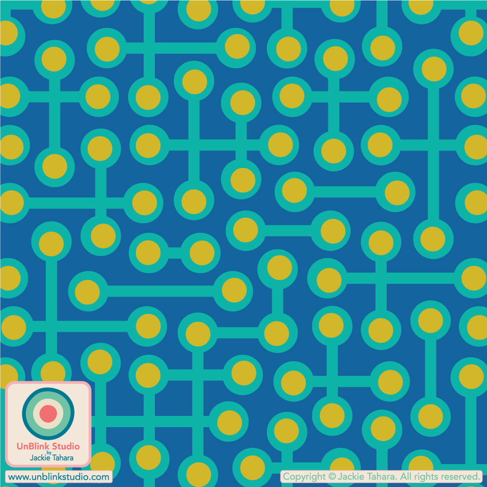
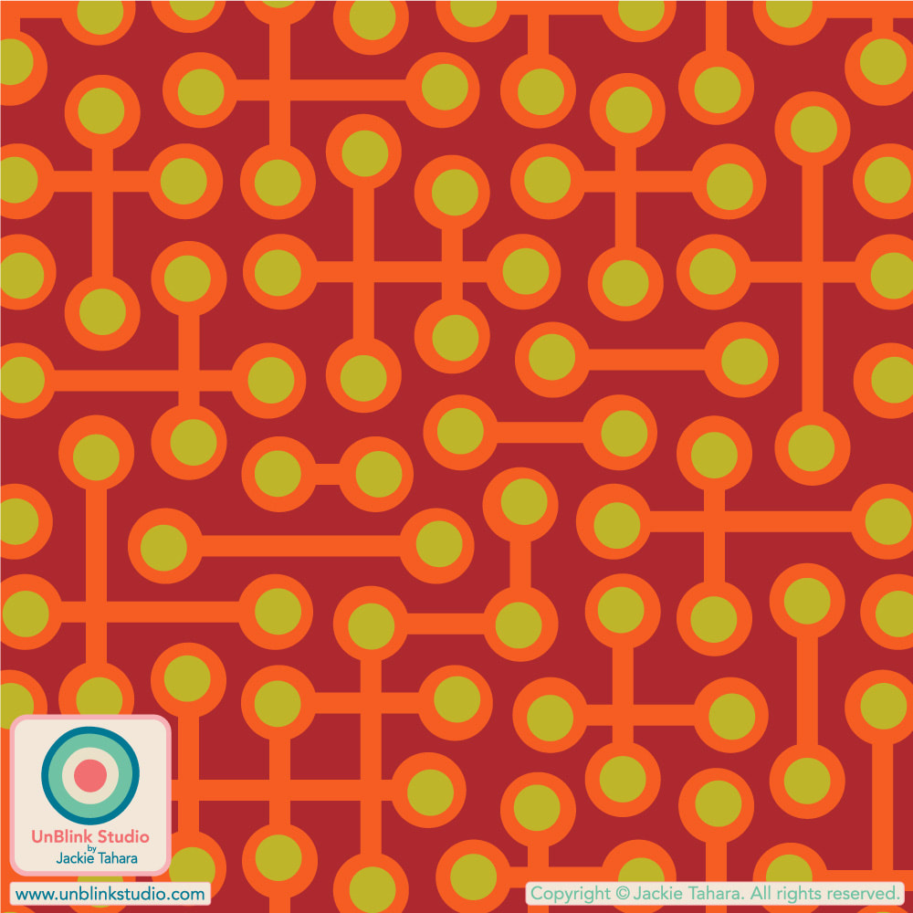
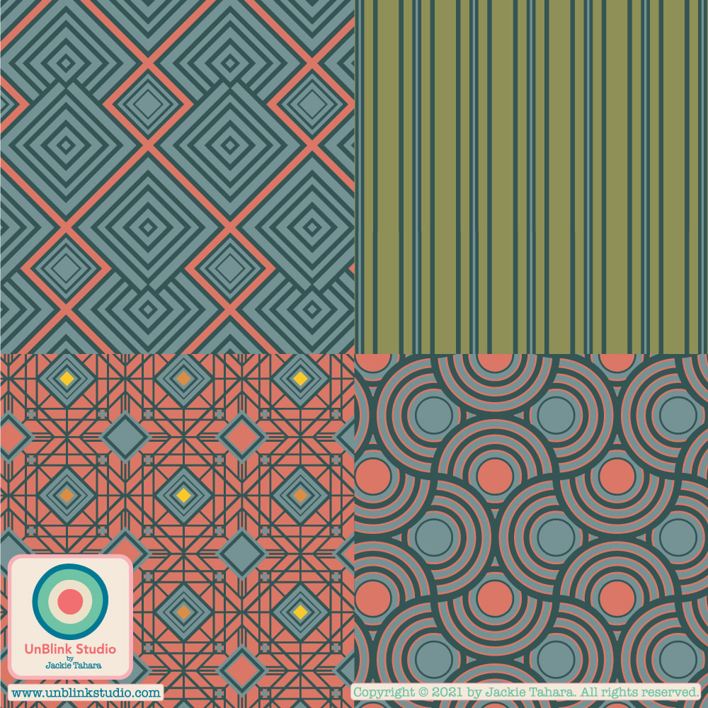
PHEW! I just returned from my vacation last weekend and had decided I wouldn't be able to enter a design in this week's limited colour palette "Pantone Meta Matter Bedding" Design Challenge (how many emails did I have?!) because entries closed on Tuesday August 8, but then I remembered my "Pinwheel" design that has been in my archive for awhile. I've always wanted to add it to my Spoonflower Shop but never quite got there. So this week's challenge gave me a good excuse to revise and recolour it. It did end up taking a full day to finish (as these things do), but I did manage to enter it on time! Public voting for this Challenge closes on Tuesday August 15! You can link to the Voting Page HERE! If you'd like to see this design in my Spoonflower Shop, just click the IMAGES below! Note this design is available in a Small-, Medium- and Large-Scale version; the images will link to the Large-Scale version in my Spoonflower Shop! 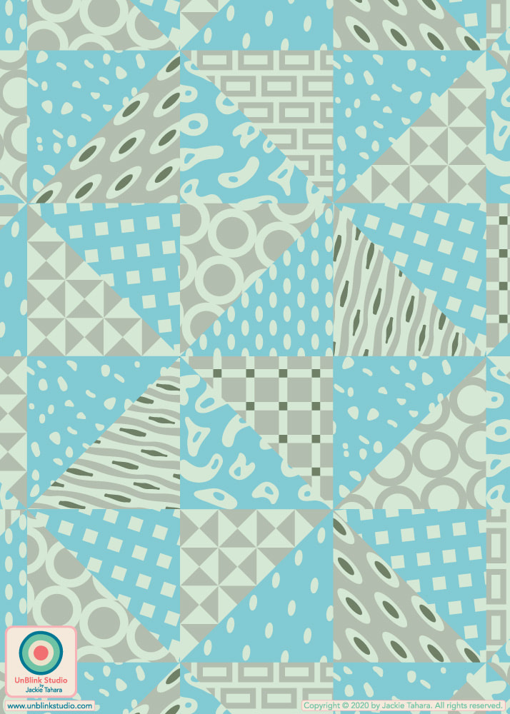 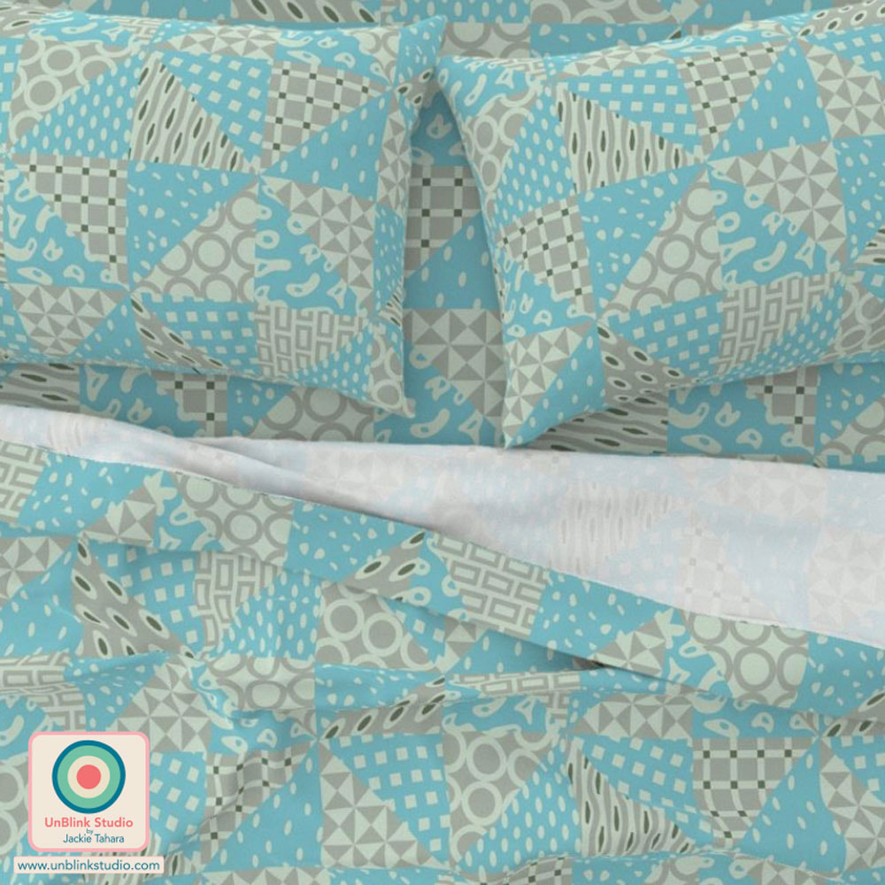 When you need to get your RETRO fix! Here is my abstract geometric "Circuits" pattern design in Coral Orange (on wallpaper) and Neutral Sand Brown (on cupboard and floor). I've entered the Coral Orange version in this week's Spoonflower "Non-Directional Wallpapers" Design Challenge, but you KNOW it comes in a bunch of other colourways too (see below)! Public voting for this Challenge is on now until next Tuesday July 4 (July!?) and you can link to the Voting Page HERE! I'd love your vote for this one! If you want to see all the colourways of this design now available in my Spoonflower Shop, it's easiest to see them all in one place in my "Abstract and Geometric Themes" Collection. Each one comes in 3 scales on Fabrics, Wallpaper and Home Decor! 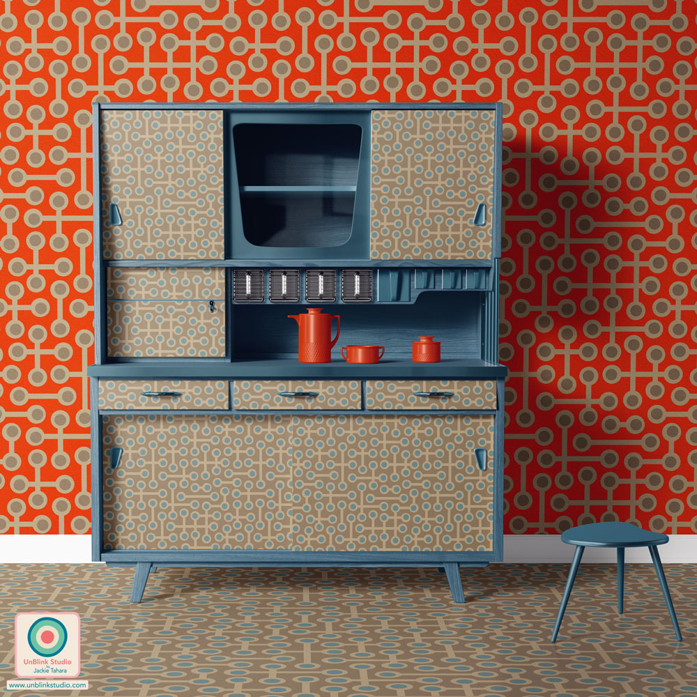
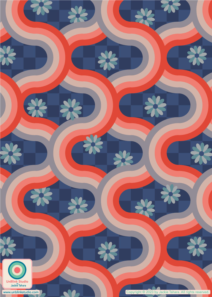
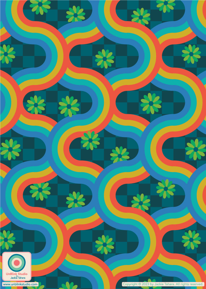
This week's Spoonflower Design Challenge is "Pattern Clash". The idea is to combine different types of patterns in one design for maximalist home decor or funky apparel fabric. So here is my brand new "Kyoto" pattern: it's a retro geometric on a checkerboard with florals. Pattern Clash, right?! Currently, it's available in TWO different colourways: Rust Red Blush Gray on Blue Checkerboard and Bright Rainbow Colours on Teal Checkerboard (see below), although I just might have to try this one out in some other colours! I did decide to enter the first version on the advice of many of you, thanks for letting me know your preferences! Voting for this Challenge opens Thursday May 11 and you can link to the Voting Page HERE. If you would like to see these designs in my Spoonflower Shop, just click on the IMAGES below. Each colourway is available in four sizes: Tiny-, Small-, Medium- and Large-Scale! 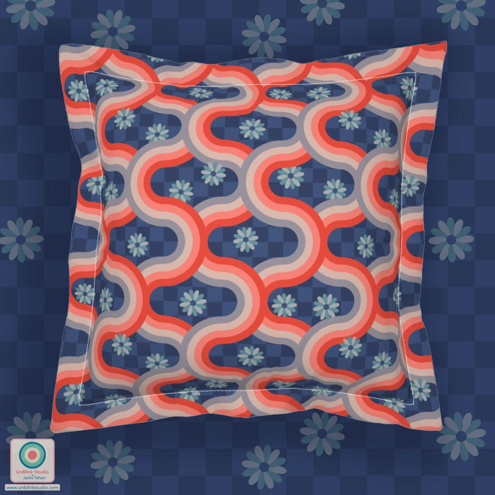
This week's Spoonflower Design Challenge is "Hidden Whimsy Wallpaper" and one of the examples they gave to explain the theme was "a traditional damask pattern created entirely of macaroni". So because I've really been thinking of geometric shapes lately, I decided to make a botanical pattern created entirely of geometric shapes! Here is my "Sunny Day" wallpaper. I'm not sure you can even imagine how fun this one was to create, and now I MUST do it in some other colours too! Public voting for this Challenge is open now until Tuesday March 7 and you can link to the Voting Page HERE! 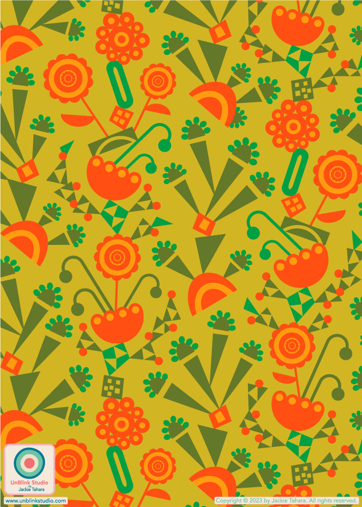
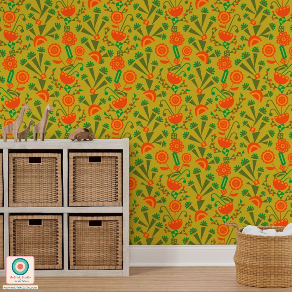
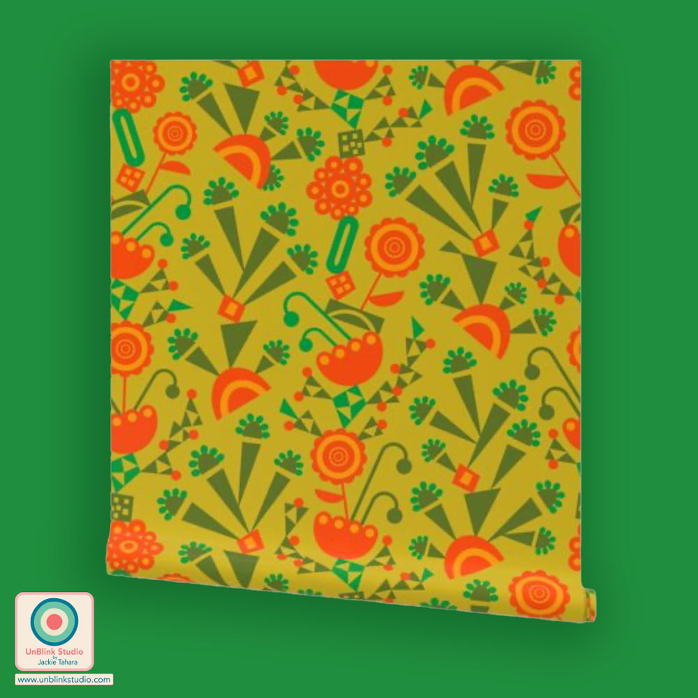
Here goes a long story...So this week's Spoonflower Design Challenge is "Mosses". I think I spent about 2 days trying to come up with ideas for this one (close-up botanicals? moss-covered rocks in Zen gardens? mossy hillsides? abstracted leaves? ETC). I sketched pages of leafy motifs, squinting at closeup pics of all kinds of different mosses. Pretty hard to do on a computer or leafing through my garden books. So I went out into my garden to have a look. But I just wasn't feeling it...I finally decided I liked the close-up spiky leaves of Haircap Moss and sketched those a bunch. Then I thought about how they look from above (check out #haircapmoss and you'll see what I mean), and then kept repeating those, simplifying, repeating, simplifying...Until I came up with this geometric which has very stylized spiky Haircap Moss leaves as seen from above! Just wanted to explain so you can see that something that looks rather "simple", can sometimes take FOREVER...At least the COLOUR choice was really QUICK! If you would like to vote, you can link to the Voting Page HERE. Public voting opens today and closes Tuesday Feb 21! AND if you'd like to see this design in my Spoonflower Shop, click the images below!  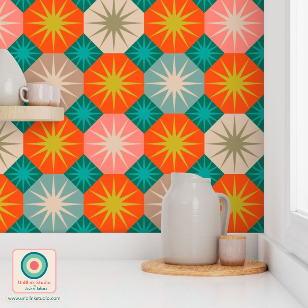
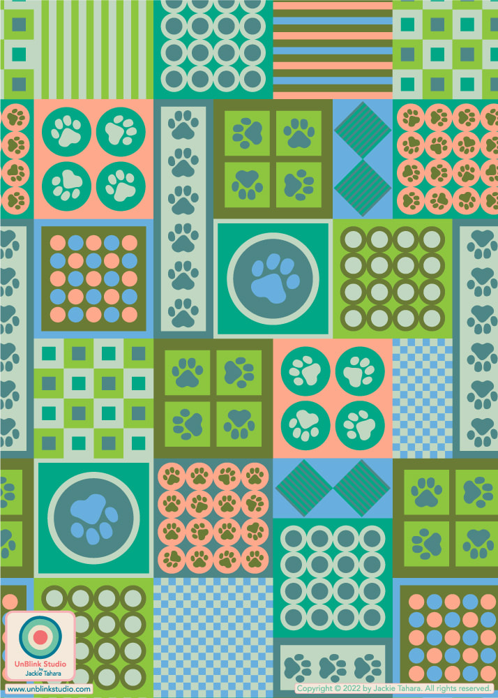
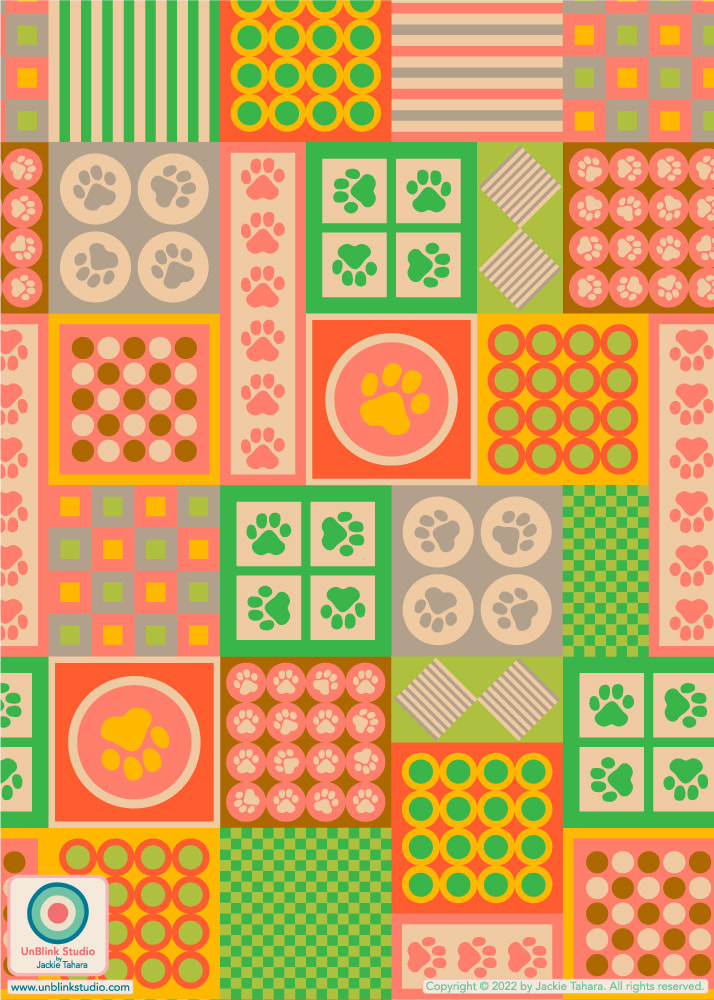
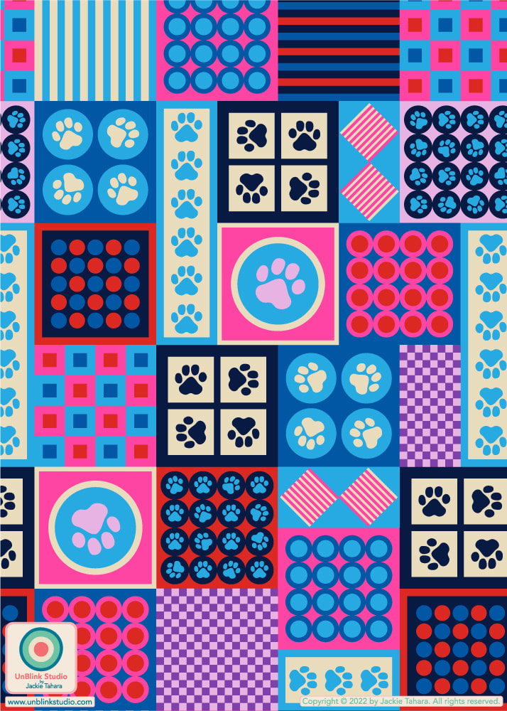
OF COURSE, I couldn't resist. I also added my "Haircap Moss" design to my Society6 Shop too so it is available on even more products, including Wall Art! Go directly to the Wall Art in my Society6 Shop by clicking the image below! 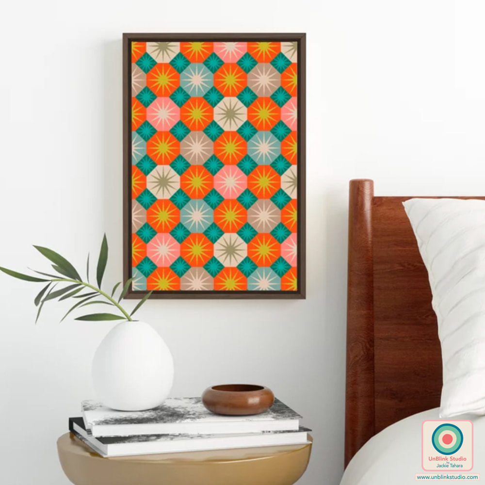 This week's Spoonflower Design Challenge is "Barkitecture", described as decorating spaces specifically for our animal companions. I wanted to do something "stylish", so I thought about creating a straight-up 1980s Postmodern-style design. But given the theme I decided I needed to incorporate some paw prints! So here is my alliteratively-named "Postmodern Pet Paw Prints" design in the original Retro colour palette that I entered in the Challenge (first pic below)! Voting for this Challenge opens today Thursday Oct 27 and closes next Tuesday Nov 1. Check out the Voting Page HERE (I would love your vote)! . And this "Postmodern Pet Paw Prints" design now comes in several colourways and 3 sizes in my Spoonflower Shop on Fabrics, Wallpaper and Home Decor! You can find them all in my "Pet Themes" Collection in my Spoonflower Shop. Scroll down to see the other colourways below! 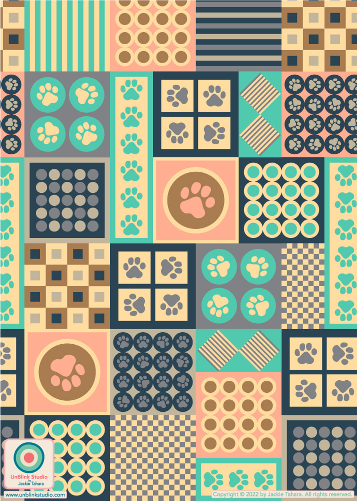 In Retro Gray Turquoise Blush Blue Brown
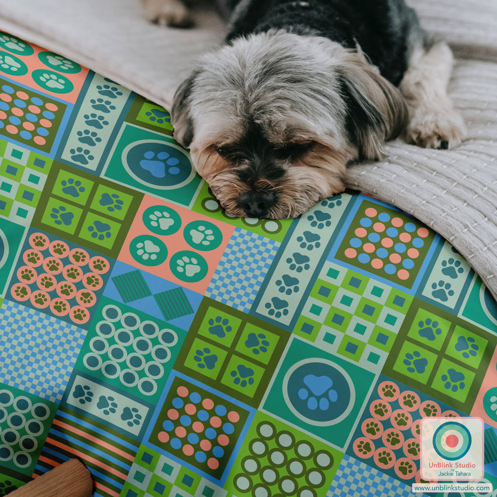 With thanks to @theindoorsyproject for this mockup.
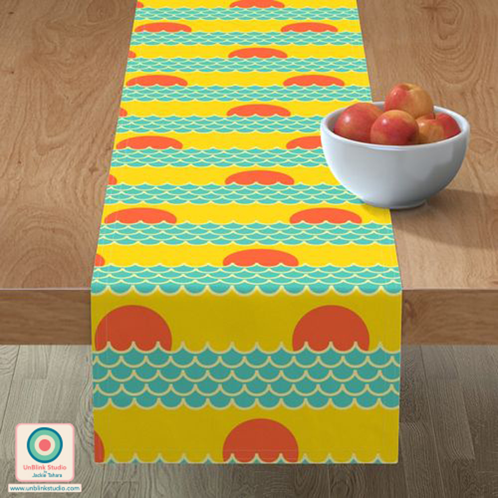
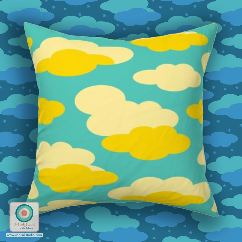
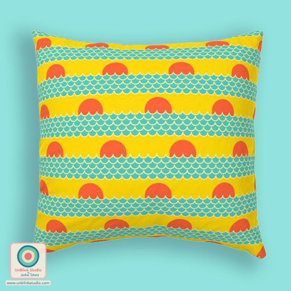
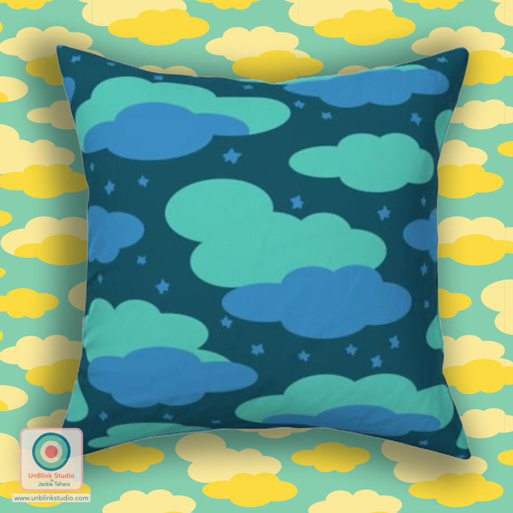
Is this Bold? Is this Minimalist? I hope so because I've entered my "Ocean Sunrise" design in this week's Spoonflower "Bold Minimalism" Design Challenge! You could also ask: Is it a Dot? Is it a Stripe? Yes! I also designed this to co-ordinate with my "Daydreams" and "Night Dreams" designs too (see below)! I could really see all 3 of these as a collection of fun pillows! These are all now available in my Spoonflower Shop on Fabrics, Wallpaper and Home Decor in 3 sizes! You can also link to the Voting Page and check out all the entries! Click the images below to see these designs in my Spoonflower Shop! 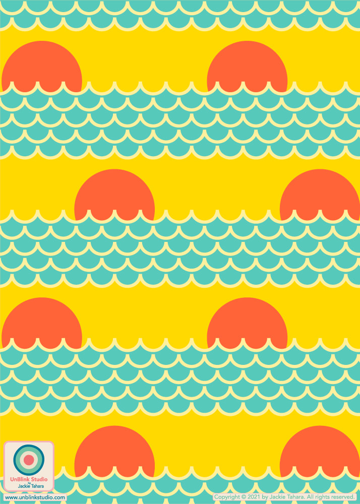
These would be a FUN collection of pillows! From left: Daydream, Ocean Sunrise, Night Dreams. All available in my Spoonflower Shop!
This week's Spoonflower Design Challenge is "Petal Solids Coordinates: In Bloom". Spoonflower has asked for designs that use 1, 2 or 3 of the requested colours which this week are "Coral", "Grass" and "Peony" (these limited colour palette challenges are amongst my favourites to enter)! Designers can use additional colours, but SF recommends not more than 4 colors total (not including Black and White) to ensure the designs coordinate well with their Petal Signature Cotton Solids. I initially was pretty happy to see this week's 3 bright colours (it made me think of jelly beans for some reason)...UNTIL I tried to design with all 3 colours together. For some reason, it just wasn't working! So I decided to Divide and Conquer: I paired each colour with another colour to create 3 separate colourways of my "Jelly Beans" design, trying to make sure all 3 would Mix & Match too. And here they are: 1. CORAL on Purple 2. GRASS on Citron Yellow 3. PEONY on Blue Which one would you have entered? After going back and forth a bunch of times, I decided on #1: Coral on Purple. I just love the "neon-ness" of it! Aside from co-ordinating with the cotton fabrics, it sure would make some crazy wallpaper! Voting opens today Thursday April 14! You can check out all the entries and vote at the Voting Page AND you can also check out my Spoonflower Shop too! All these colourways and more are available in my Spoonflower Shop on Fabrics, Wallpaper and Home Decor in 3 sizes! 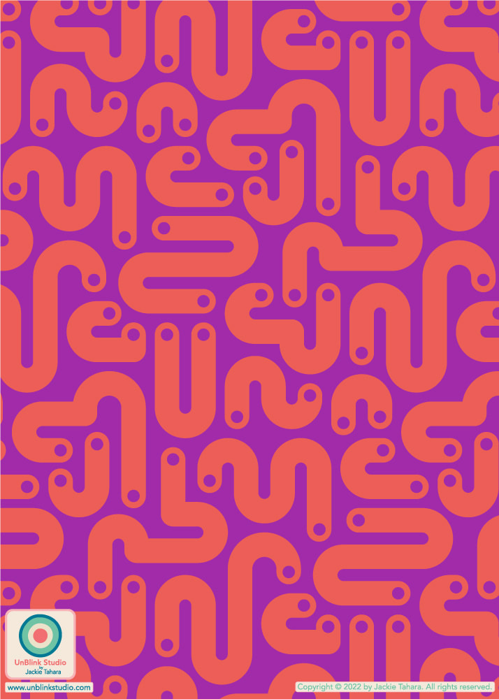
Here is my entry for this week's Spoonflower "Neutral Geometric Wallpaper" Design Challenge (voting closes Tuesday Aug 24 2021)! And yes, this is about as "neutral" as I get...After all, there is beige, cream and navy in there! Navy is a neutral, right?! This "Sunrise" design is now available in my Spoonflower Shop in 3 sizes AND in 2 completely different colourways (check both out below) on fabric, wallpaper and home decor! BTW: I saw this Art Deco-inspired mockup from @creatsyofficial and thought it would be the perfect match for this design! Click the images below to shop these designs in my Spoonflower Shop! 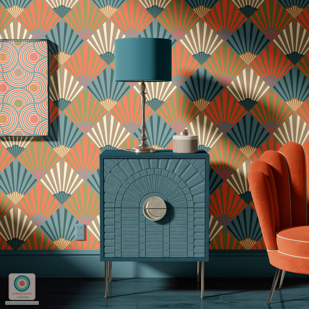
Celebrate Your Grads! New Art Deco-Inspired Backgrounds Pack Now Available in the PicCollage App!4/19/2021 Is someone you know about to graduate, looking forward to the next exciting phase of their lives?! Maybe it's your child, your friend, your sibling, or maybe your parent!? Be sure to send them off with a BIG CONGRATULATIONS for all their hard work and success and resilience in the face of the hardships created this past year by the pandemic. One suggestion: create a grad photo collage for them using my new "CLASSIC CELEBRATIONS" Background Pack now available in the PicCollage app! This brand new collection features 12 Art Deco-inspired patterns in cool and classic colours! See below for a preview of all the patterns in this new Background Pack! 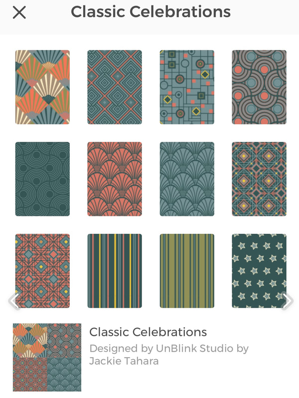
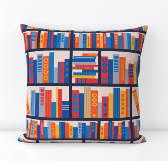
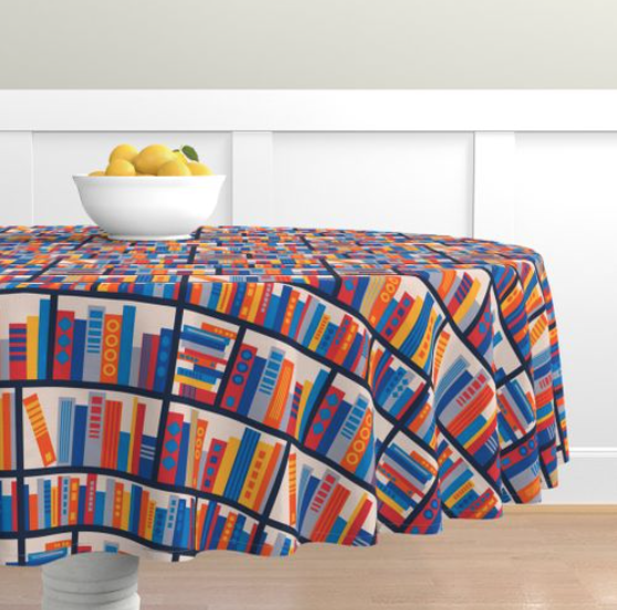
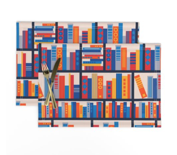
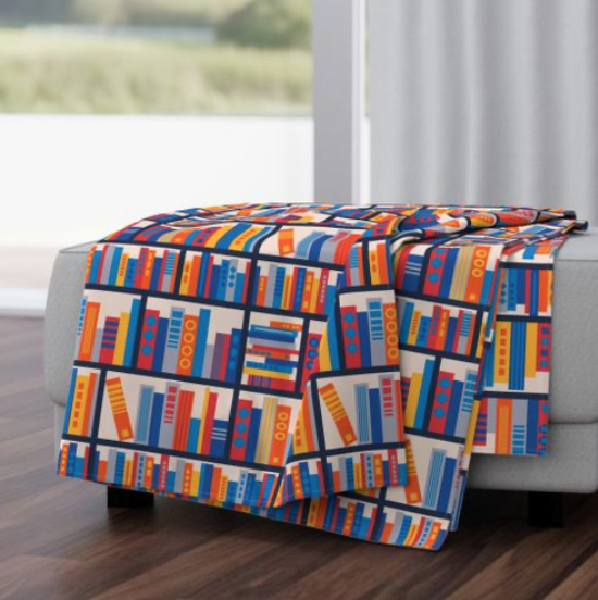
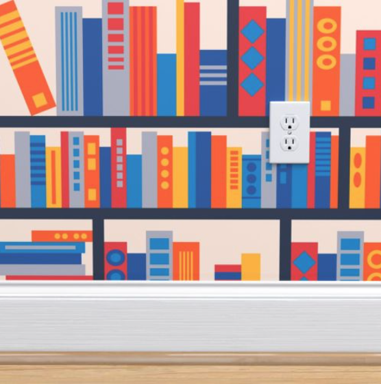
Some of the ideas I've been playing with for a new collection I've been working on recently: unique colour combos, mix & match patchwork and pure abstraction and geometry! Although I'm working on another project (more about that soon!) that includes this new "Capri" pattern design, I thought it would also be perfect to enter in this week's Spoonflower "Create Room" Design Challenge which says: "The pattern you create should not only provide visual joy, but should inspire both you and others to create more", to use as a wallpaper backdrop in a DreamBox, an all-in-one craft room that folds away into a beautiful armoire, designed by Create Room. What do you think, does this design fit the challenge? In any event, I think it makes for a pretty cool bathroom! Check out the Voting Page! 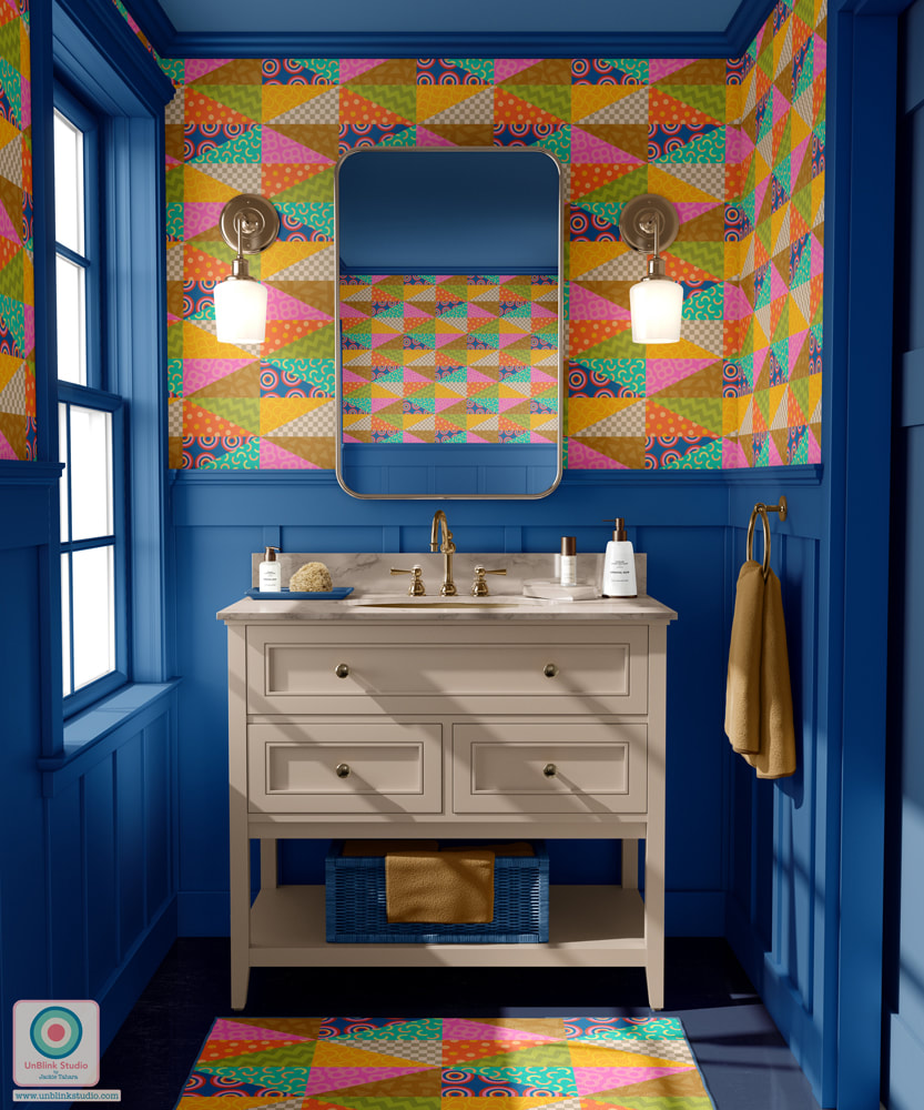 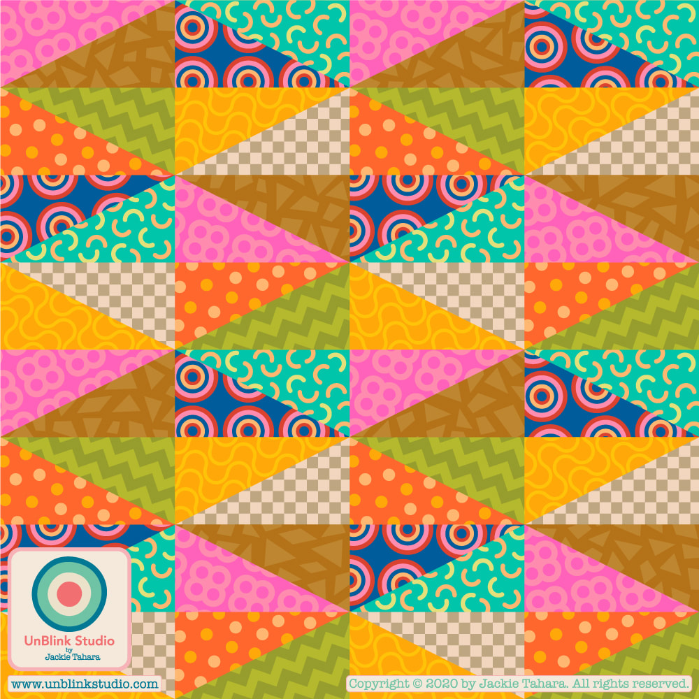 I entered my “Book Stacks” design in this week’s Spoonflower “Cozy Reading” Design Challenge. When I started this design the shelves made me think of Dutch abstract artist Mondrian so I decided to channel his famous colours (plus a few others just because!) What do you think, does this remind you of Mondrian’s art?! Check out all the designs at the Voting Page! ...And don’t forget...Spoonflower is still offering FREE STANDARD SHIPPING on everything worldwide until Friday Oct 30 2020!! I have over 300 designs in my Spoonflower Shop, so I invite you to check them out! 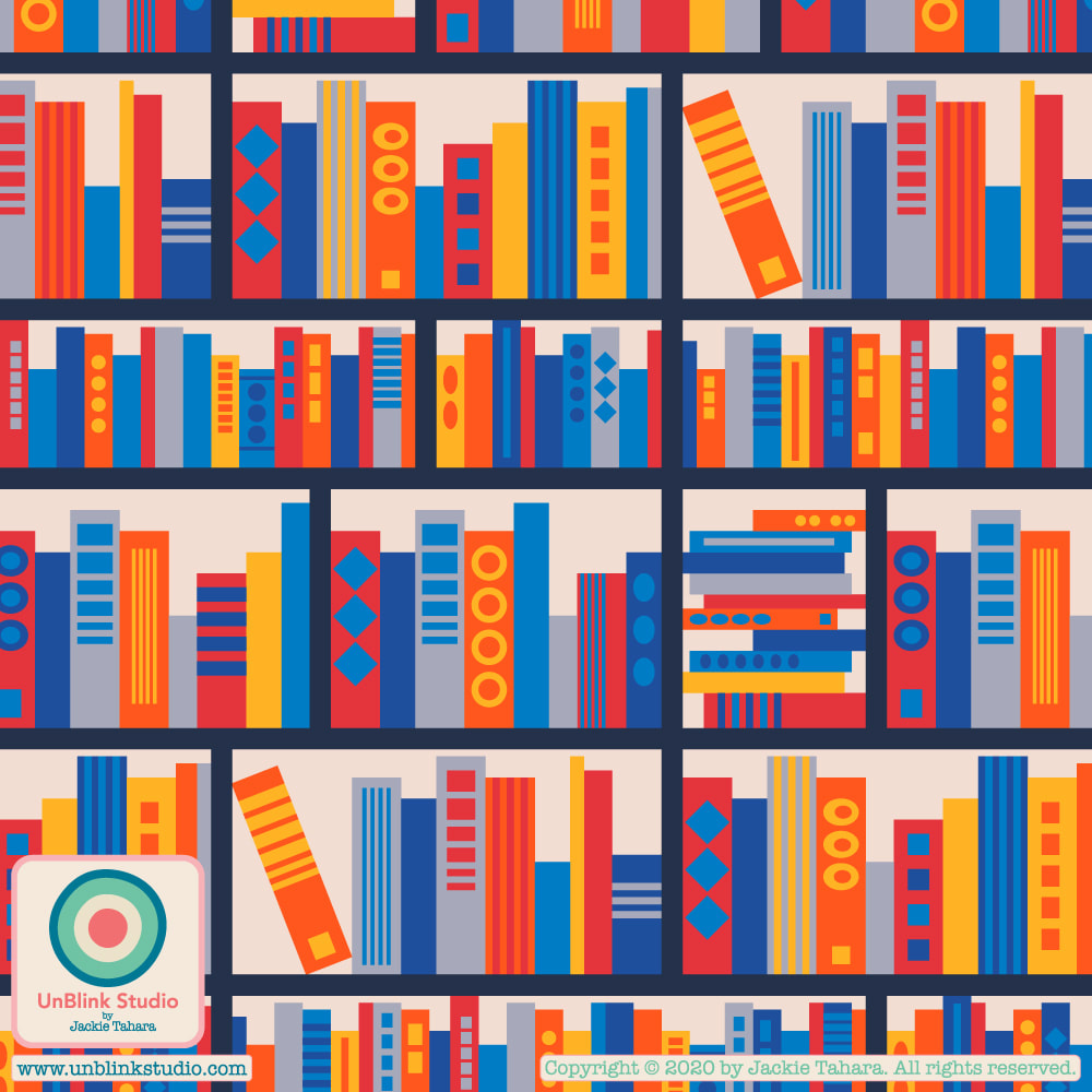
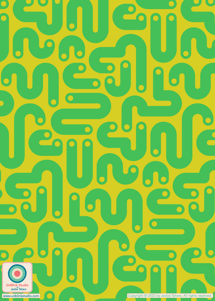
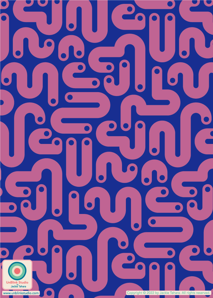
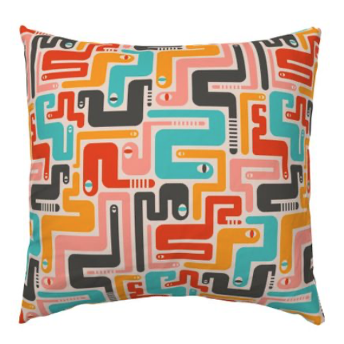
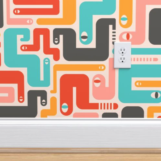
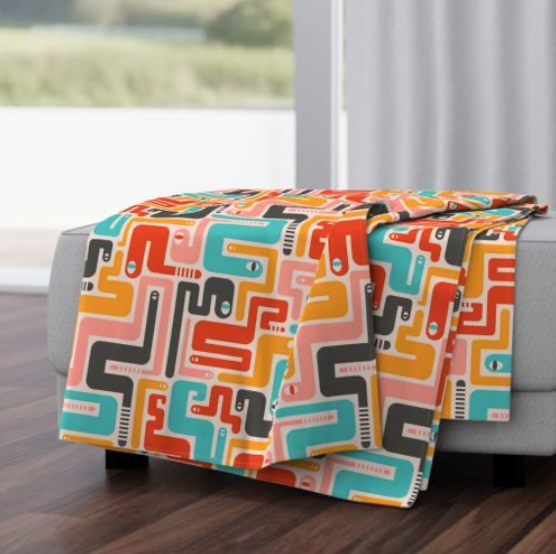
I wasn't going to enter a design in this week's Spoonflower "ABCs of...Tea Towel" Design Challenge, but then I changed my mind when I came up with the idea for this "Geometric ABCs" design. It was a bit of a rush but I managed to finish it on time! I think it will make a great art print too...If you would like to see all the entries for this week's challenge, and maybe stock up on Christmas presents (!) you can link to the Voting Page and to my Spoonflower Shop too! Voting ends Oct 6 at 3:00 EDT! ADDENDUM: My Geometric ABCs came in 27th out of 437 entries! Thanks to all who voted! 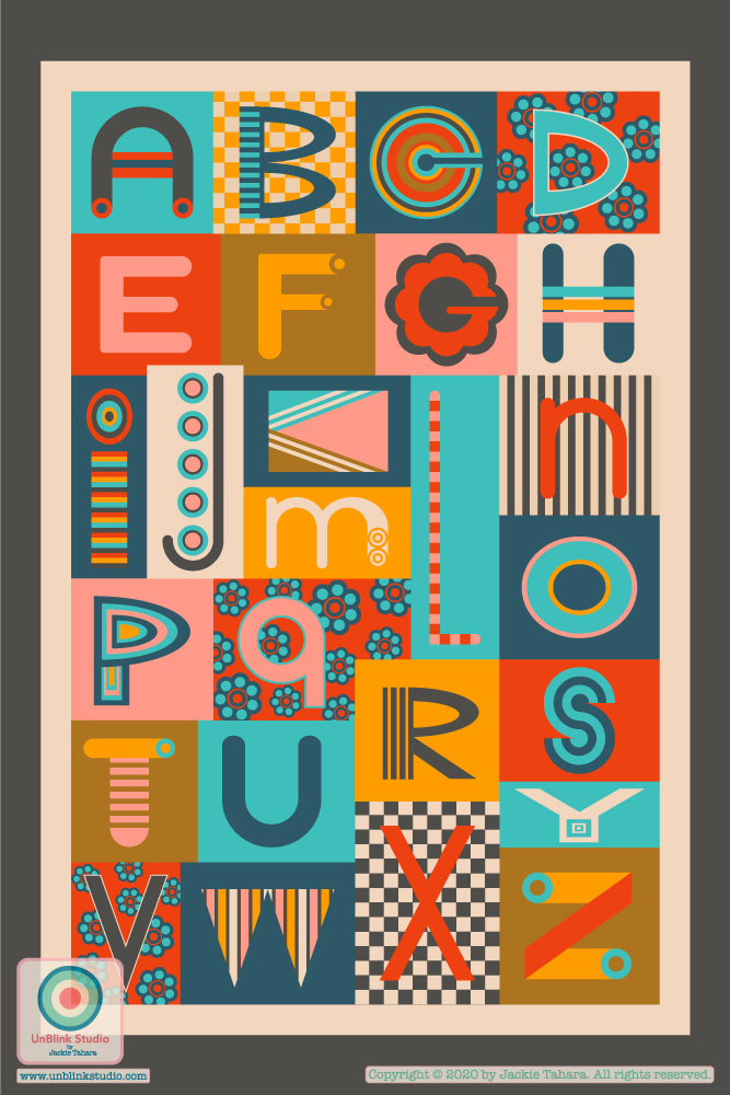 I’ve just entered my new “Retro Rattlers” design in this week’s Spoonflower “Brightly-Colored Reptiles” Design Challenge! This is something a little different for me...OR is it? What do you think, does this design still look like my work? I’m very curious to hear what you think. I am very much liking this graphic “look” and I find my work is always a bit of a tug-of-war between clean, graphic shapes and a more hand-drawn style. Not sure if others see that too?? See it below with a coordinating design I think emulates a closeup view of snakeskin! Check out the Voting Page to see all the colourful entries! And I've just added this design to Throw Pillows in my New Shop...Check them out! 
|
AuthorJackie Tahara of UnBlink Studio Archives
July 2024
Categories
All
|

 RSS Feed
|
|
|
|
|
|
All images on this website are Copyright © Jackie Tahara. All rights reserved.
If sharing, pinning or blogging my images, please always credit me and link back to my website. Supporting artists is a good thing to do! Thank you!
If sharing, pinning or blogging my images, please always credit me and link back to my website. Supporting artists is a good thing to do! Thank you!