|
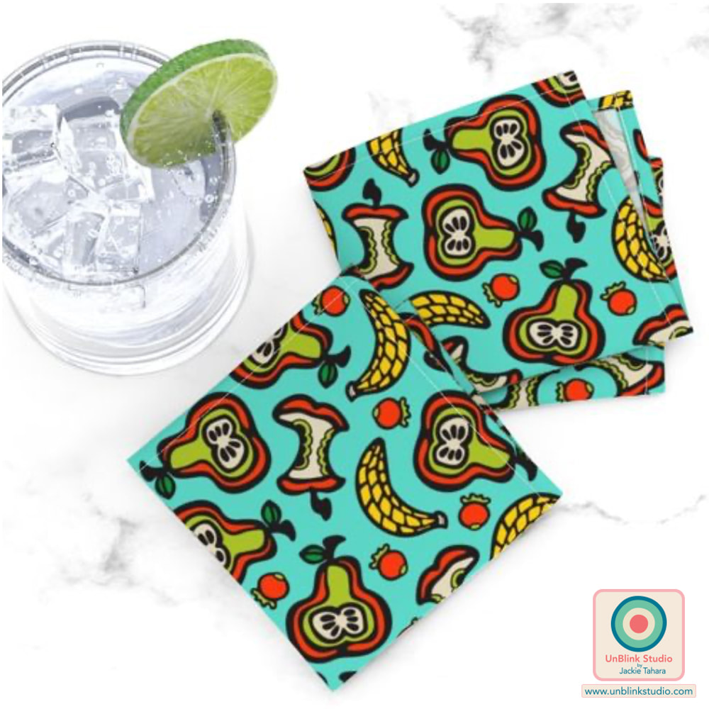
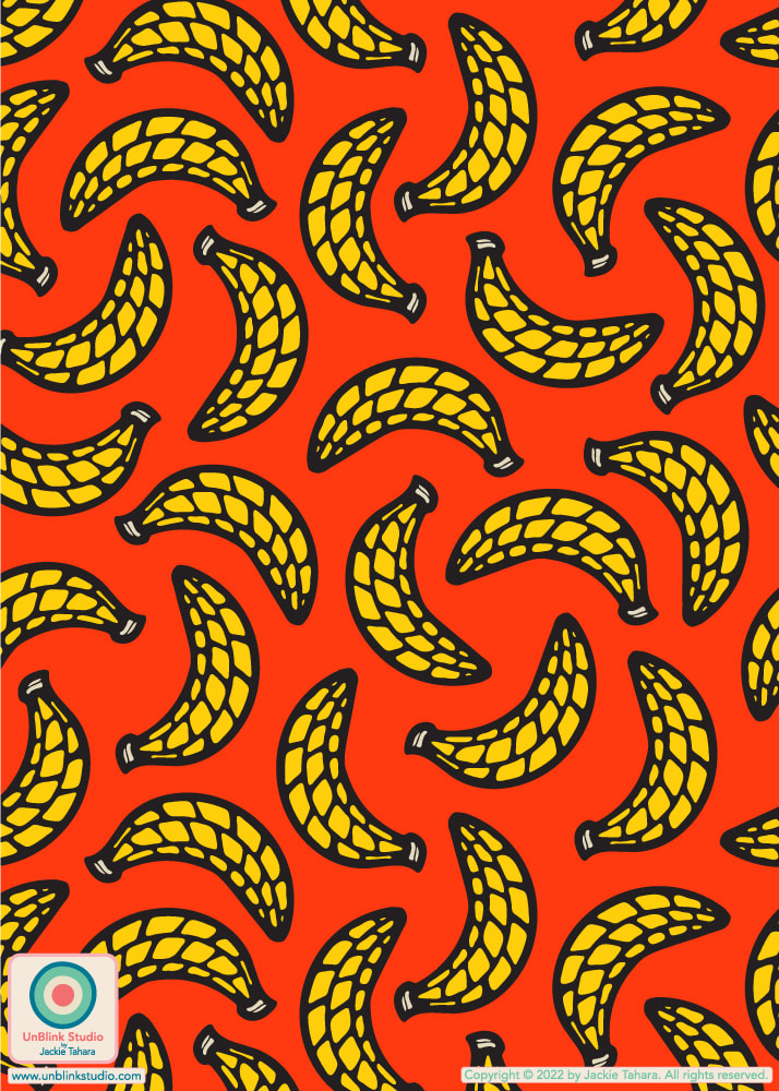
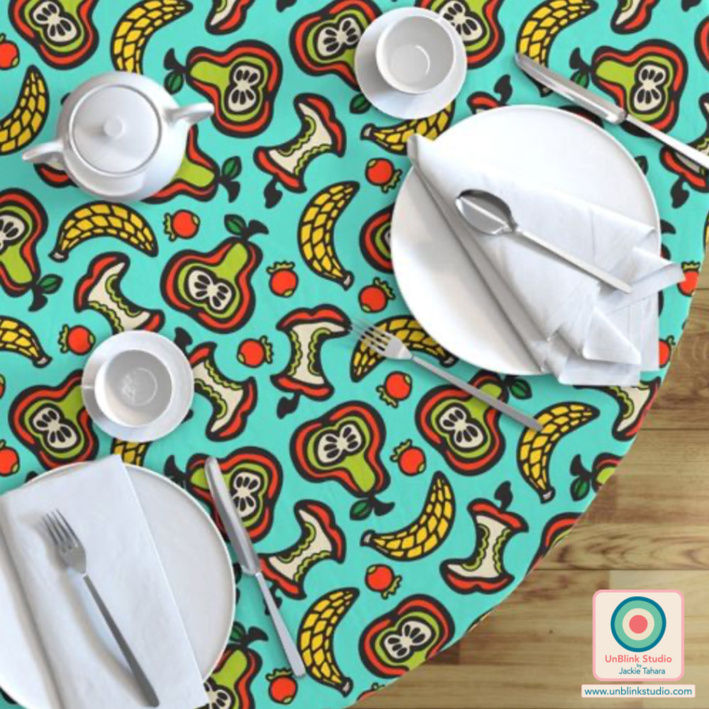
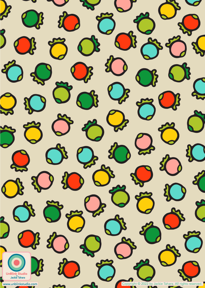
A DITSY print is a tiny-scale overall pattern that has a tossed or non-directional layout. I don't know about you, but when I think of ditsy prints I usually picture sweet little scattered flowers (ditsy prints don't have to be floral, btw) in pretty colours...For this week's Spoonflower "Delicious Ditsy" Design Challenge, I entered my new "Tutti Frutti" design! And I must say, a typical ditsy print, this is NOT!! Love it as cocktail napkins or as a tablecloth (see below), but wouldn't it make a FUN APRON?! Voting opens Thurs Nov 17 and you can link to the Voting Page HERE! . AND I couldn't resist...I had to make those Bananas and Berries into their own designs too! So scroll down to see my new "Banana-rama" and "Polka Berries" designs. All 3 coordinate together into my "Fruit-Tastic" Collection, and you can get them on Fabrics, Wallpaper and Home Decor in 3 sizes in my Spoonflower Shop! See the FRUIT-TASTIC COLLECTION in my Spoonflower Shop! 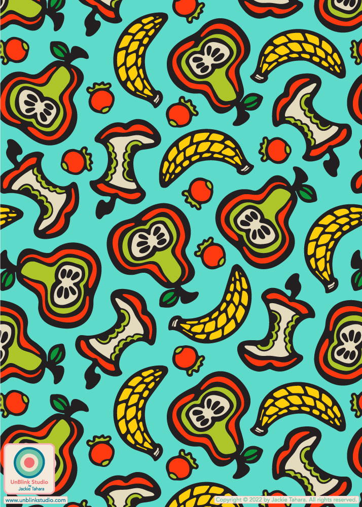
"Banana-rama" (above left) and "Polka Berries" (above right) are part of my
FRUIT-TASTIC COLLECTION!
0 Comments
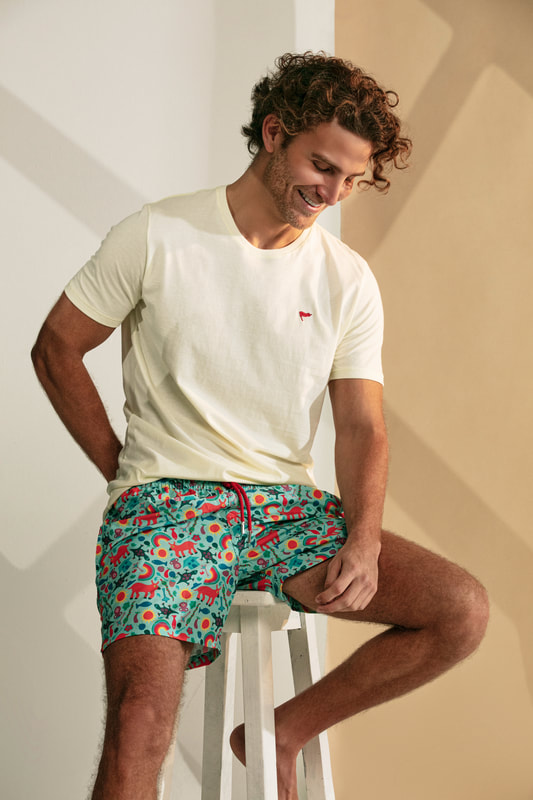
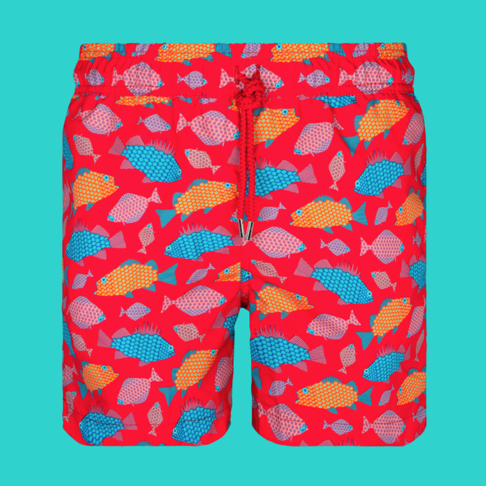
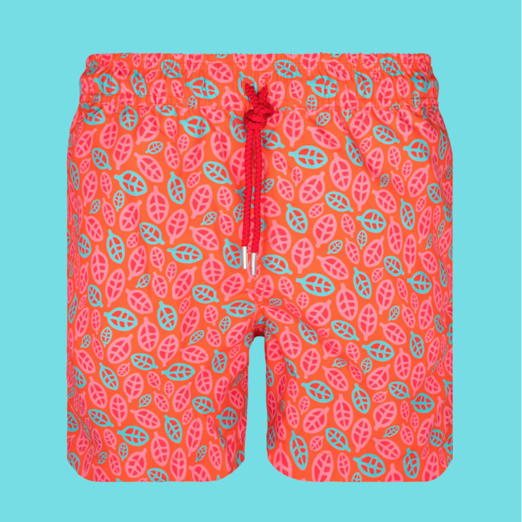
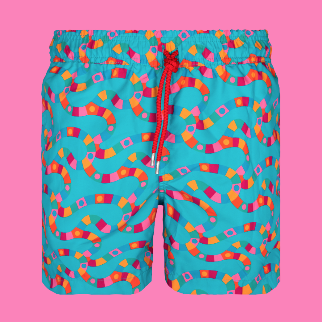
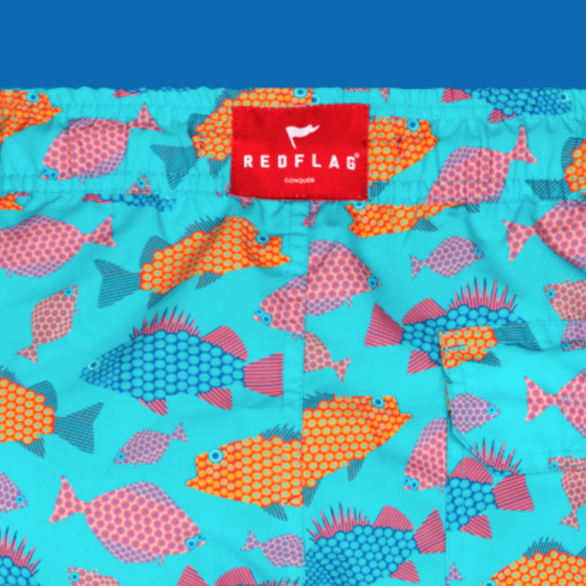
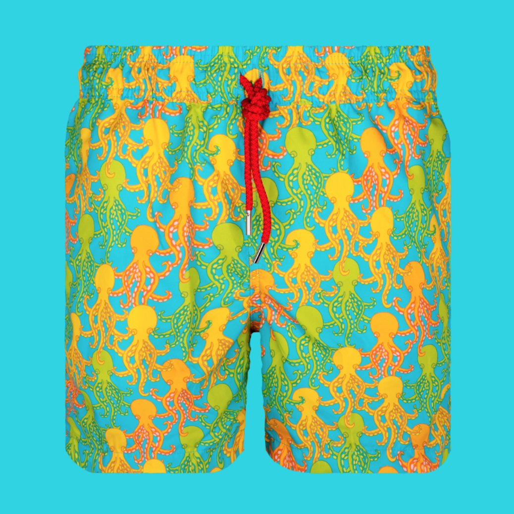
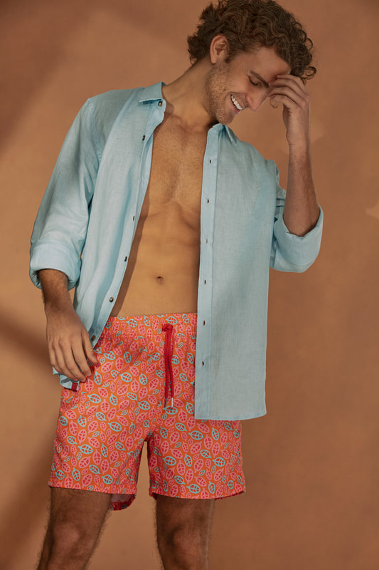
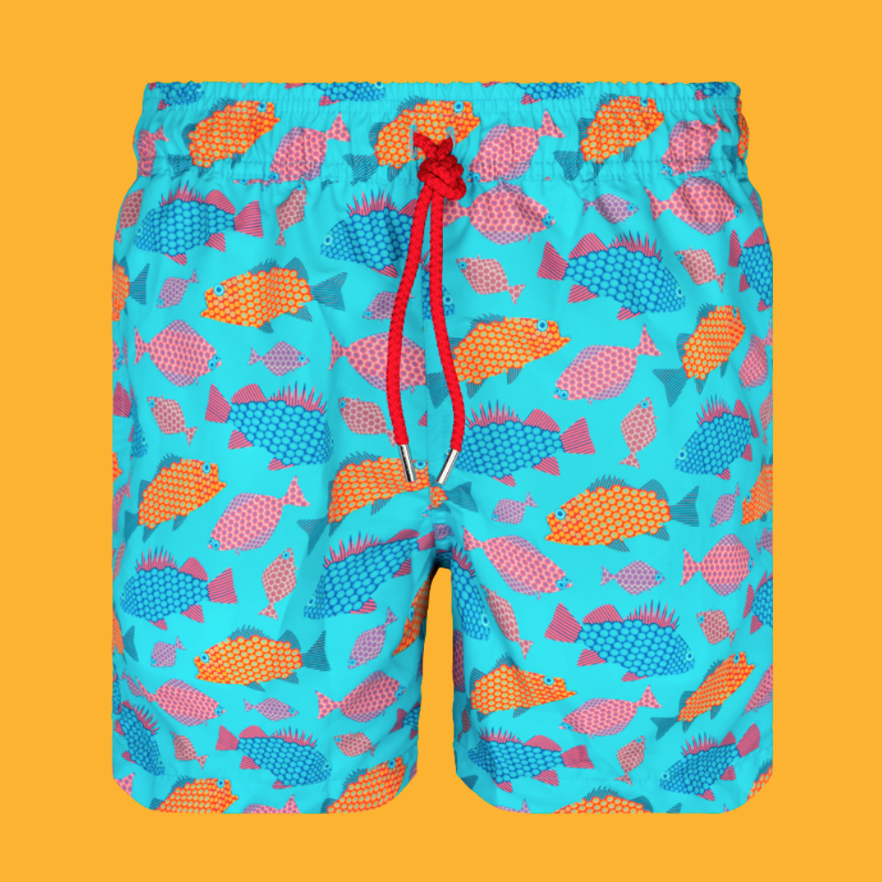
When I snap a pic that for some reason I just really like, it's often because there's just "something" about the captured colours. Picking out these colours is one of my favourite ways to come up with new colour palettes for pattern designs. For example, here is a photo I took at the Santa Cruz Beach Boardwalk while on a coastal roadtrip to California in June, and I just really love this pic of a vintage-inspired ride. So I picked out some gorgeous colours to create a new palette...Expect to see these colours in a new design! How do you come up with new colour palettes? Do you use your photos too? 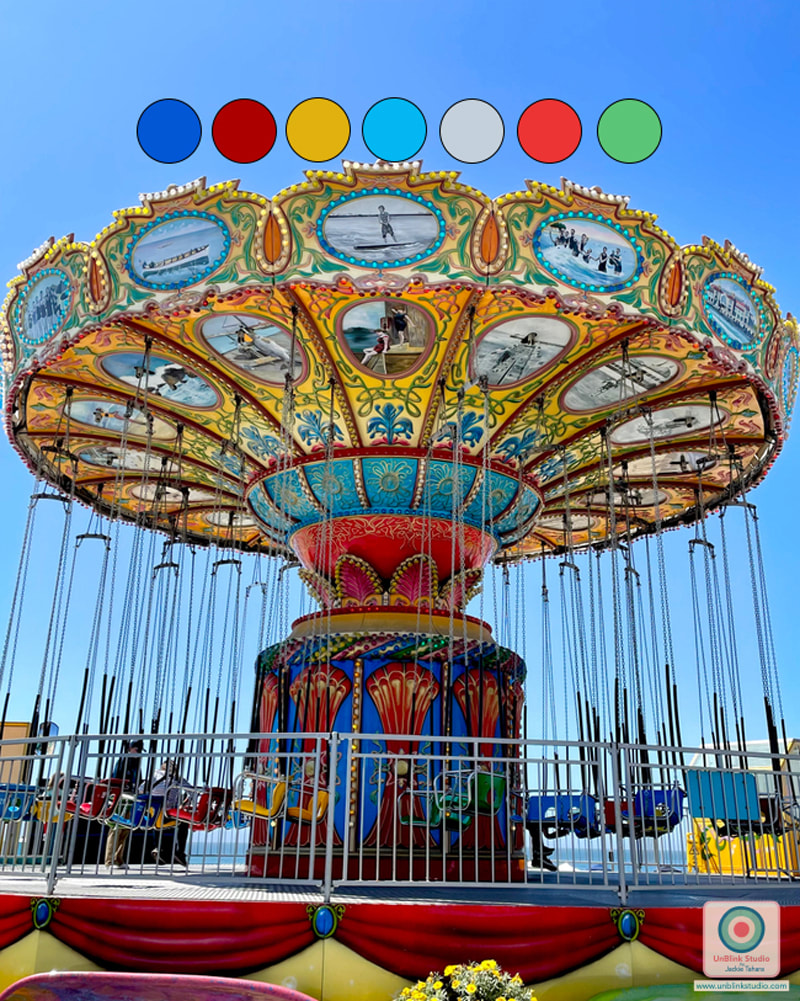 Be sure to check out my newest collaboration with Colombia-based REDFLAG SWIMWEAR! Several of my print designs have been included in their newest Collection of swimwear for Adults, Juniors and Kids! I am especially happy they chose some of my most fun and colourful designs! Check out the REDFLAG SWIMWEAR Shop!
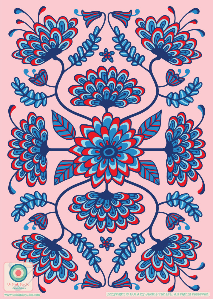
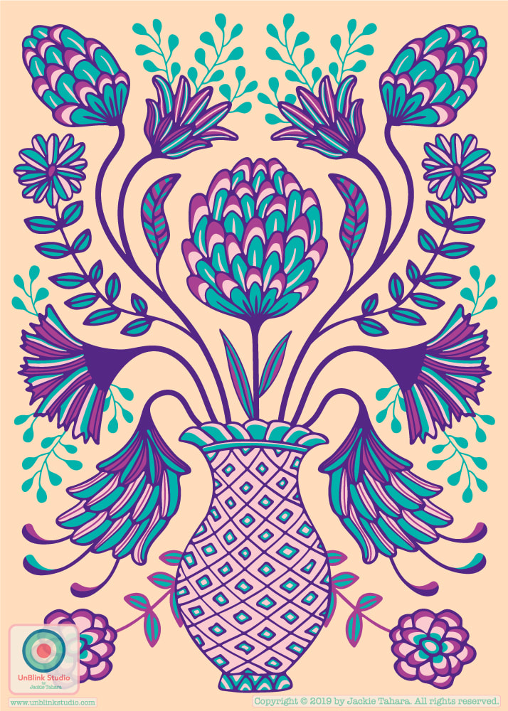
I've been slowly but surely working on a series of folk-inspired greeting card layouts the last few days, in response to a creative brief from the Make It In Design Live Hub community that I belong to! Here are the first 2 designs (of, hopefully, 4) in the series. I am curious...which one do you like better and why? Colours? Layouts? I'm going to get started on #3 ASAP!
When we were in Sayulita, Mexico for our family holiday this summer we went to a little surf spot called La Lancha (not that I surf, really I just try to stand up on the board)! So in memory of this wonderful place, here is my new tropical pattern featuring nice, gentle La Lancha waves, with some other designs in this growing pattern collection! These pattern designs are available to license, just contact me to inquire! 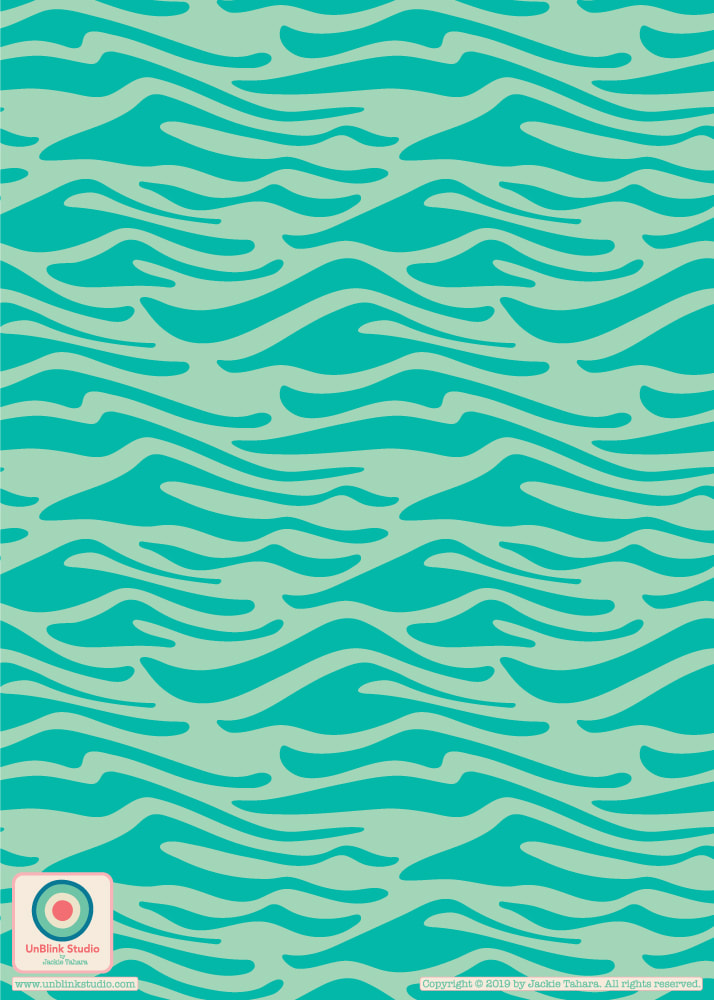
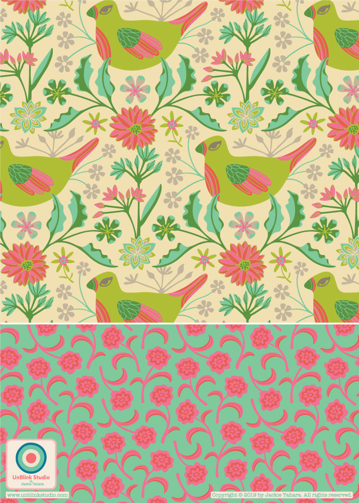
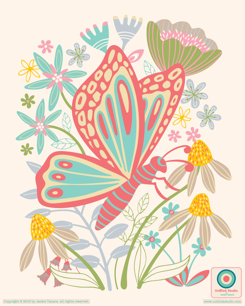
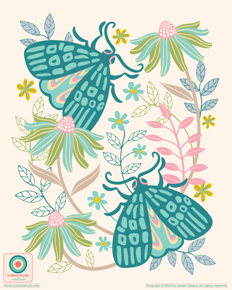
After taking the Create Collections course from Victoria Johnson Create Explore and creating my "Bugology" Collection (check out the #createcollections hashtag on IG for more designs created during this class!), I couldn't resist designing another collection on the theme of "birds, butterflies and blooms"! So here is my "Palace Walls" Collection partially inspired by all the gorgeous colours and patterned textiles I've seen on several trips to India!
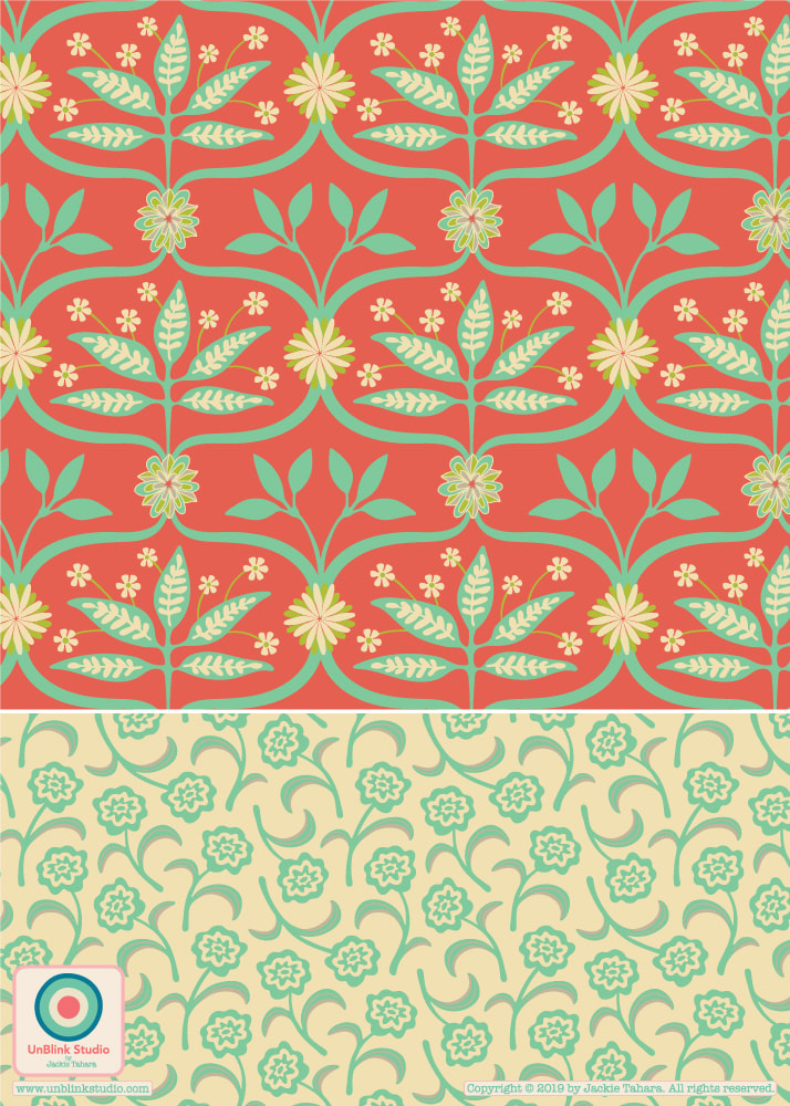
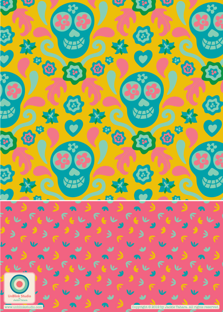
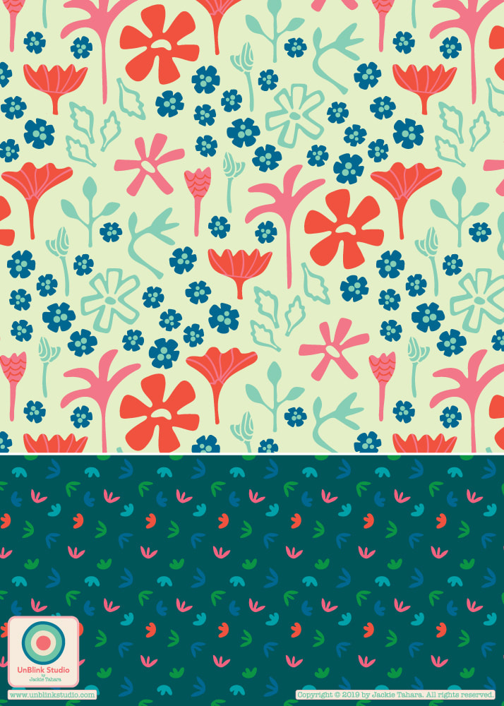
Sometimes I have patterns that I love but feel the need to "revisit" by either changing some of the layouts of the motifs or maybe, just going wild with a re-colour! My folk-inspired "El Campo" Collection is a wonderful example of this! I re-arranged the motifs in two of the patterns and gave it a completely new, bright and happy colour palette. I would love to know what you think of this collection now!
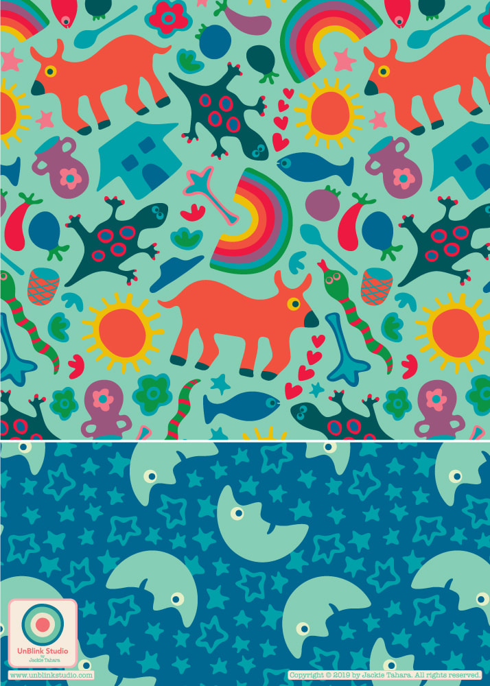
I NEED MORE VOTES! I thought I would post this gentle reminder that my "Butterfly Garden" and "Rainbow Floral" wall mural designs have been shortlisted in the Wallsauce Design Competition, and the winner will now be determined by Public Vote. Voting CLOSES May 31 at Midnight (UK time), so it's down to the last few days! The prize is a licensing agreement with Wallsauce! If you could take a quick moment to vote for my designs, that would be lovely! All you need to do is go to this Blog Post and enter my name "Jackie Tahara" in the comments and remember to Send Comment! That's it! THANKS to all who have voted for me already, very much appreciated! 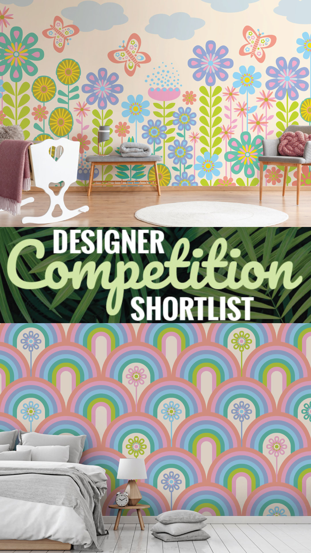 I just started a brand new pattern design course from Victoria Johnson Create Explore called "Create Collections" and have been developing colour palettes and drawing new motifs (butterflies, moths and florals so far!) and thinking about how different types of patterns co-ordinate to make a larger pattern collection. Sometimes it really helps to have someone guide you through their process which really makes you think more deeply about your own design process. So, I started with these two placement prints. I might adjust the colours a bit as I get more into the collection, so stay tuned for more to come! Repeats!
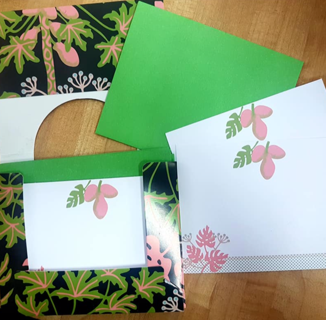
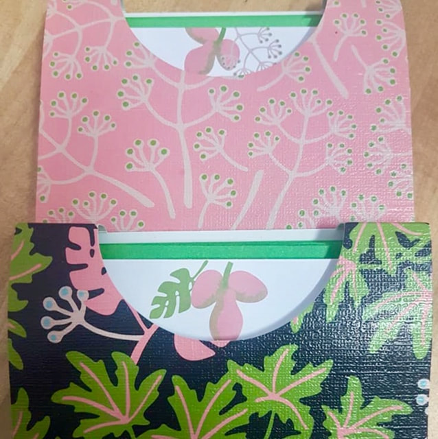
I just love seeing my designs on beautiful products! Here are some snaps of my newest stationery collection just released from Palphot Marketing! This set features my "Tropicana" Collection. I think that pink, bright green and blue is gorgeous!
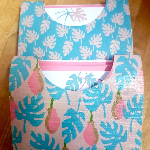
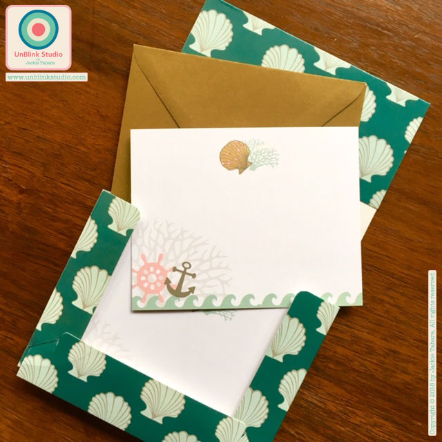
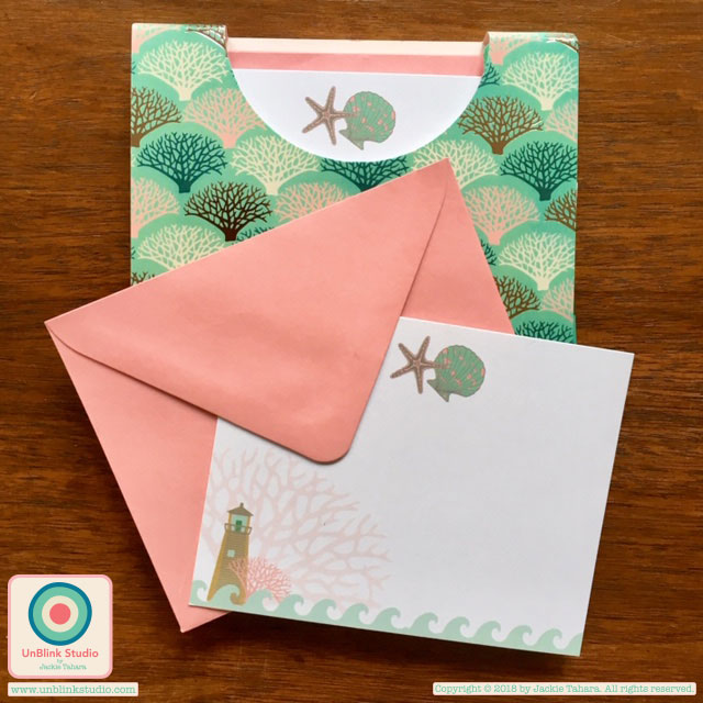 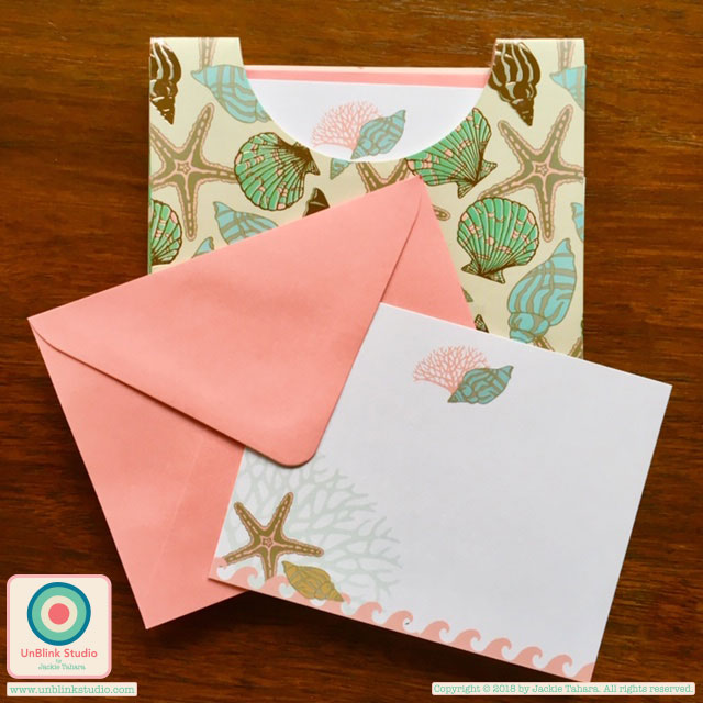 Just out from Palphot Marketing is a brand new range of stationery sets featuring my "Coastal Stories" pattern design collection. Each set comes with 10 notelets and envelopes in a nice little package with shiny metallic details! I just received my samples and I love them! There are 4 different sets to choose from!
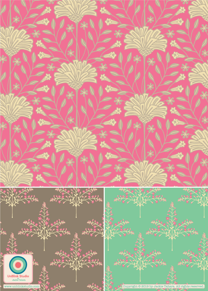
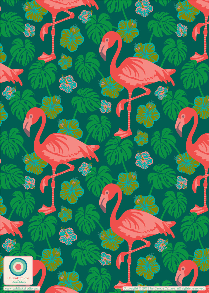 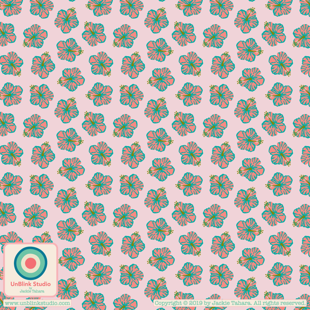 Here is the start of a new pattern design collection that I am going to call "Celestun" because it was influenced by the trip I took a couple years ago to Merida in the Yucatan, Mexico. Nearby is the Celestun Biosphere Reserve where flocks of wild pink flamingos feed on shrimps that live in mangrove forests along the Ria Celestun.
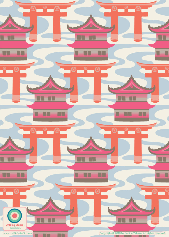
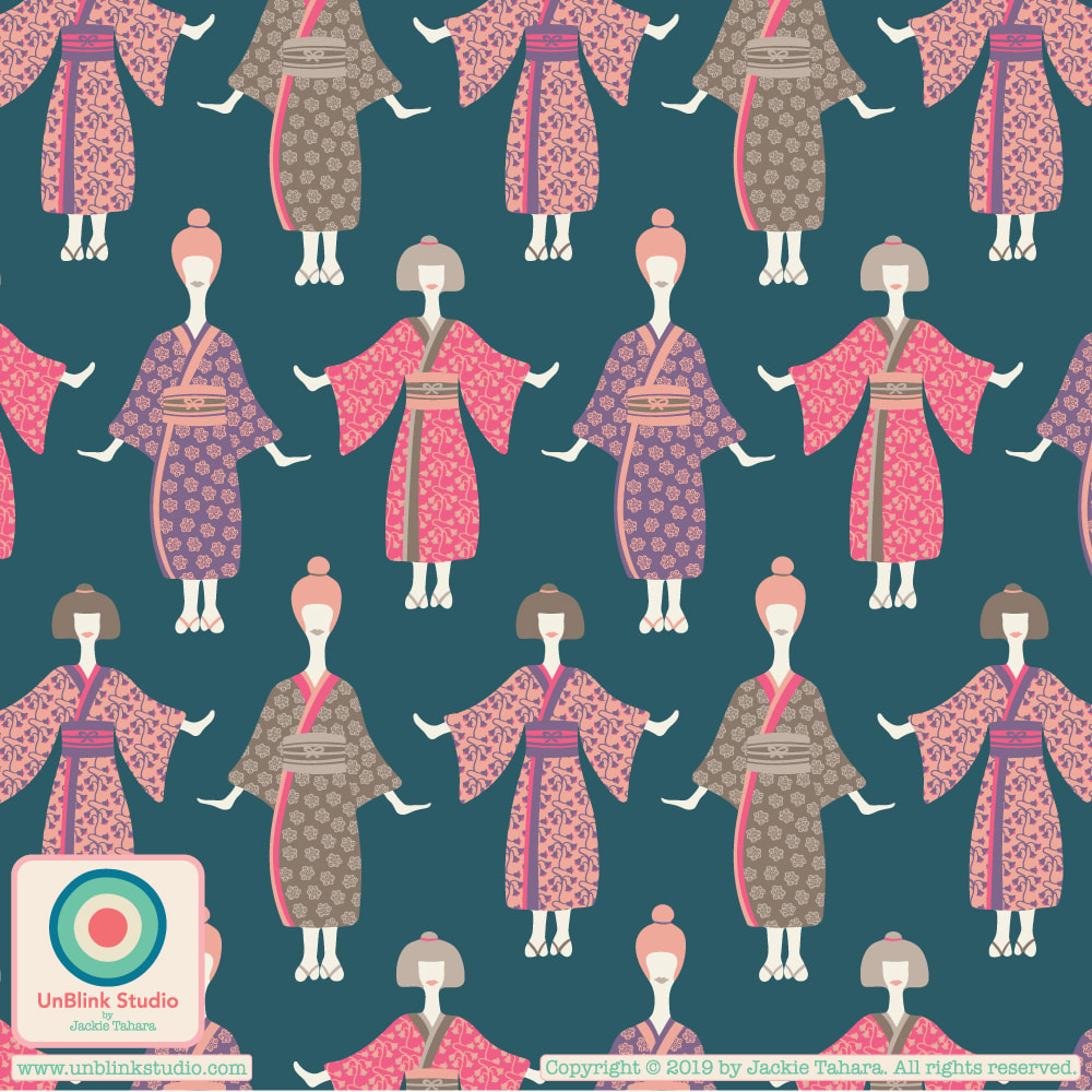
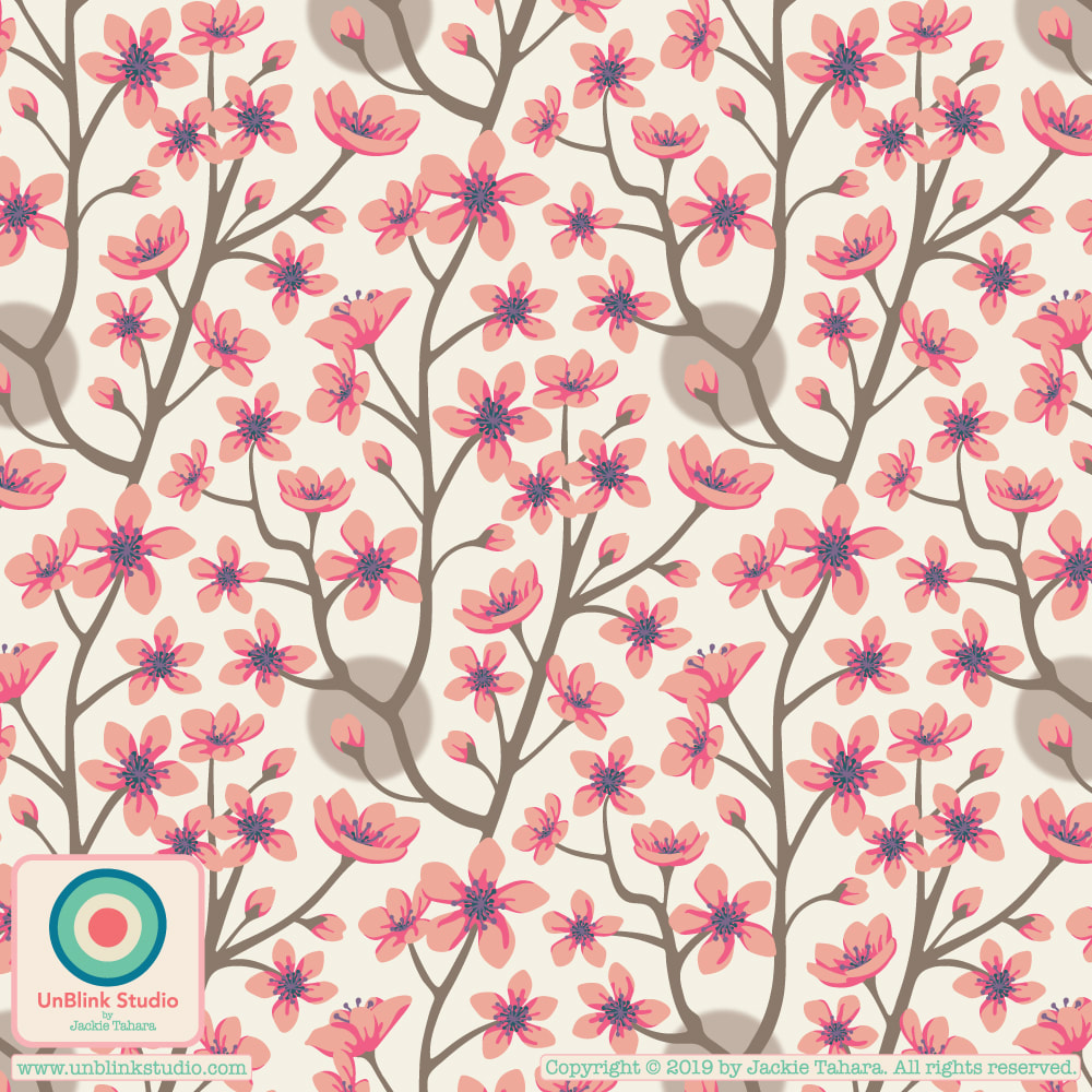
Thought I would share one of my latest pattern designs today! This month's theme in The Colour Gang, as I've mentioned in previous posts, is travel inspiration and I chose Japan as my inspiration (since I was fortunate to have visited there last summer!) So here is my "Edo" design named for the name of the ancient Japanese capital where Tokyo now stands. The temples, castles and torii gates are amazing and are part of everyday life all over Japan. I MUST go back! Although I posted them in previous posts, here also are the other two designs in this collection, "Kimono Ladies" and "Cherry Blossoms".
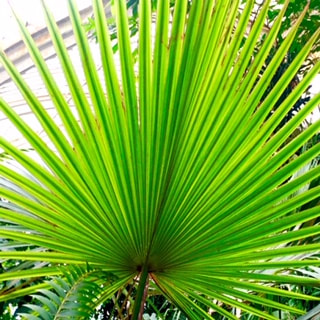
Kew Gardens in London was wonderfully inspiring for me. I took so many photos and managed to make some of the "specimens" I saw into this repeat pattern design (part of a new tropical-themed pattern design collection!) I've also included a few photos that inspired this pattern! One of Kew's purposes is plant conservation, and it is thought-provoking and alarming that some of the plants in the Palm and Temperate Houses here are the last of their kind and now extinct in the wild; in one case, there are two plants of a specific species growing at Kew and all specimens of this species that now exist in the world are clones of the two plants here. 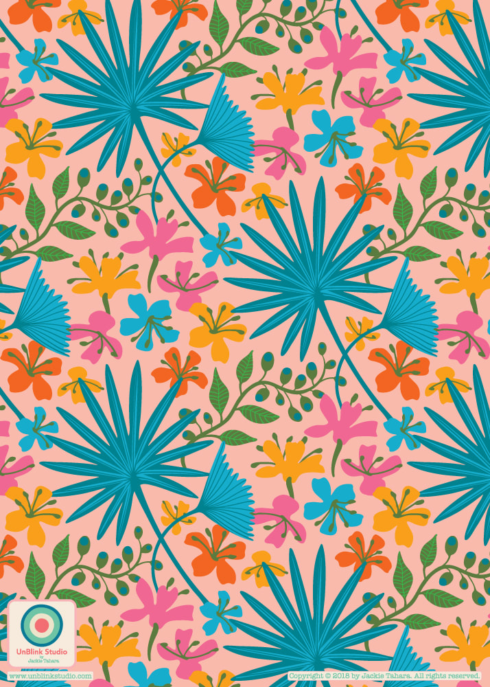
Thought I would keep going with the blue palette this week in The Colour Gang...so I added this new "Koi" pattern design to go with my "Lotus Pond" and "Enlightened" pattern designs. The second image here puts them all together! Hope this collection makes you feel calm and peaceful! 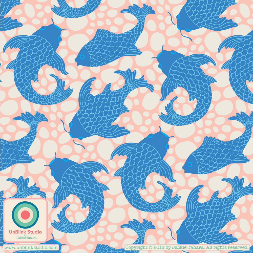 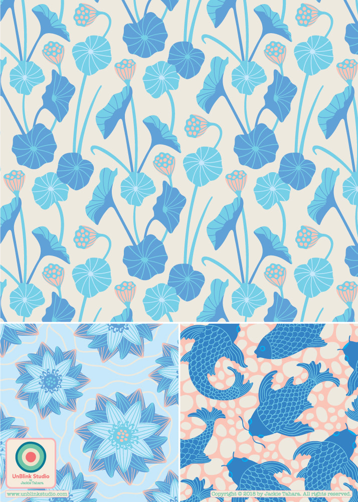 |
AuthorJackie Tahara of UnBlink Studio Archives
July 2024
Categories
All
|


 RSS Feed
|
|
|
|
|
|
All images on this website are Copyright © Jackie Tahara. All rights reserved.
If sharing, pinning or blogging my images, please always credit me and link back to my website. Supporting artists is a good thing to do! Thank you!
If sharing, pinning or blogging my images, please always credit me and link back to my website. Supporting artists is a good thing to do! Thank you!