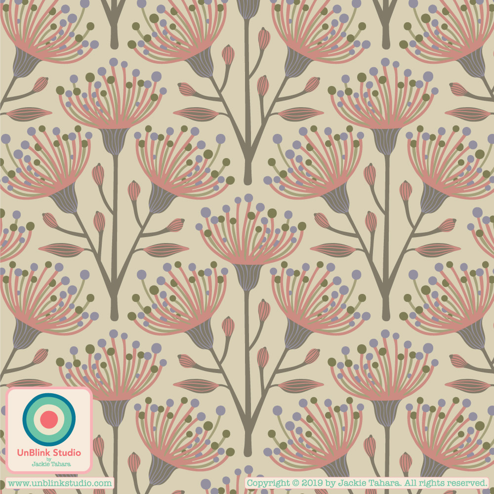
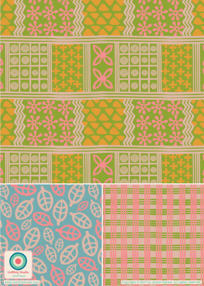
Something Different For Me...This Week's Spoonflower Design Challenge is "Abstract Minimalism"!5/18/2019 This week's Spoonflower Design Challenge is "Abstract Minimalism". So taking Morse Code as my starting point, I designed this new pattern design which I call "Secret Message". I really put a lot of thought to the colour palette and like how it really references mid-century modern design...If you want to see the entries and vote, here is a link to this week's Spoonflower Voting Page! 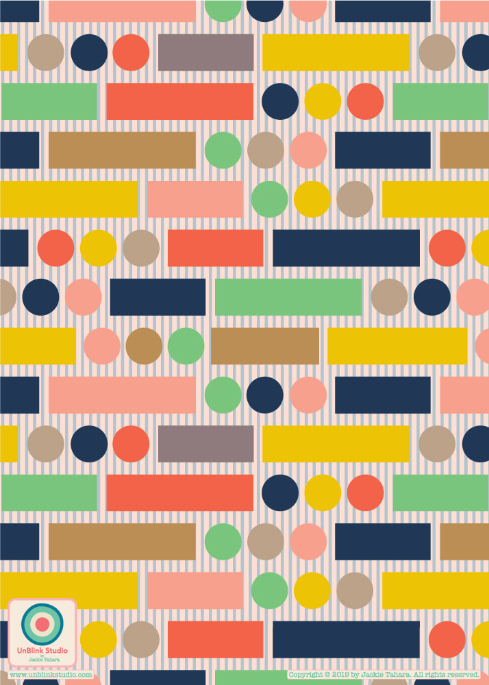
0 Comments
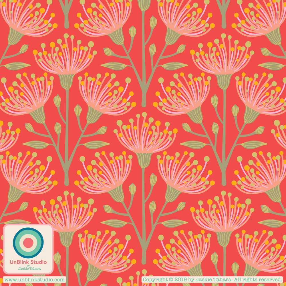
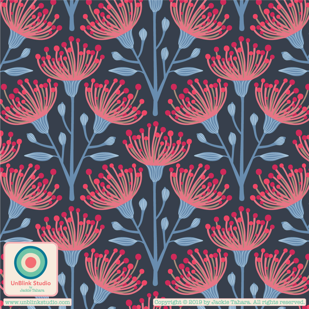
I just submitted my “Summer Folk Fest” design to this week’s Spoonflower “Small-Scale Summer” Design Challenge! Rather than thinking of the beach, I was inspired by all those summer music festivals I’ve been to: psychedelic tie-dye, flowers and...peace symbols! Head to the Voting Page to see all the entries and vote if you like! Voting ends May 7 3:00 EDT. 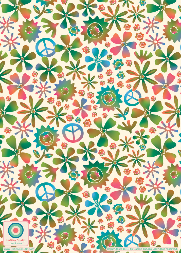 Big THANK YOU to everyone who voted in last week's Spoonflower "Australian Flora" Design Challenge! The RESULTS are just in and my "Eucalyptus" pattern design in this Orange colour palette (check out my Portfolio-Flora page to see two other palettes) squeaked into the Top Ten (I'm listed at #11, but thankfully there was a tie for #9) out of 602 eligible entries! So this design is now available for purchase at Spoonflower on many different fabrics, wallpaper and giftwrap. And see below...you can now buy it on wonderful home decor products at Roostery as well! Again, thank you for your votes! On to the next Design Challenge... 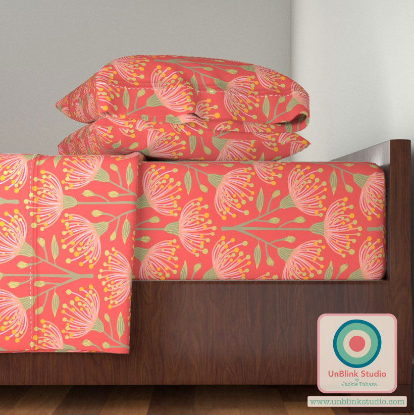
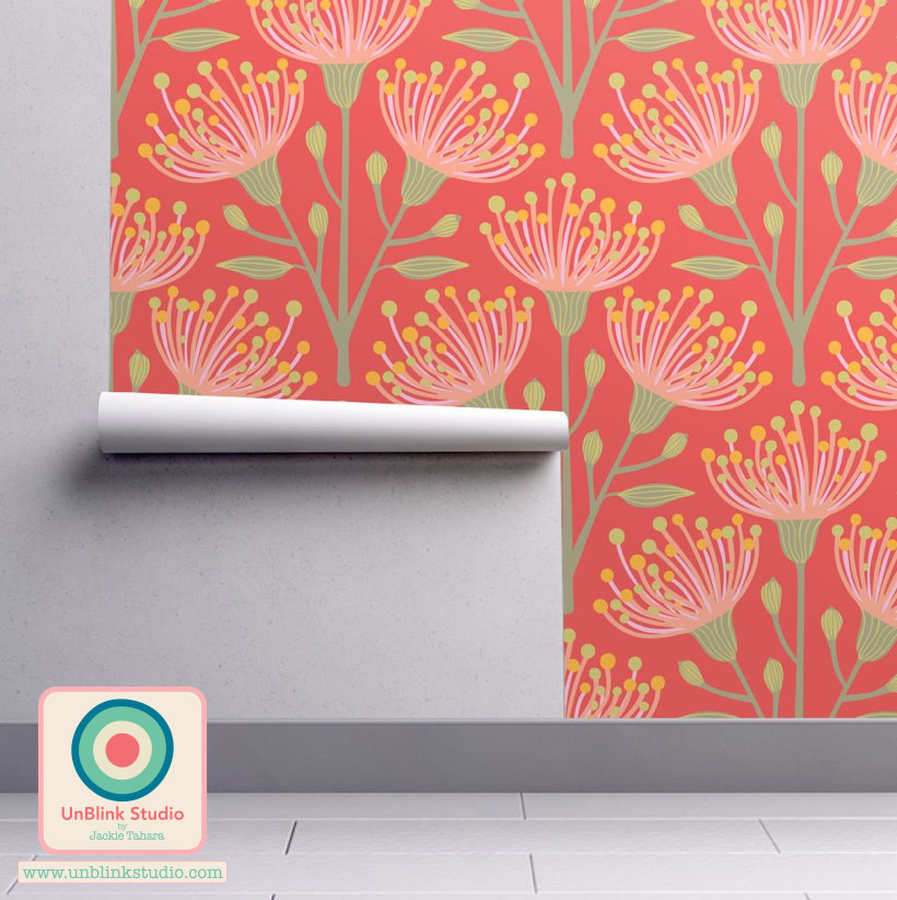
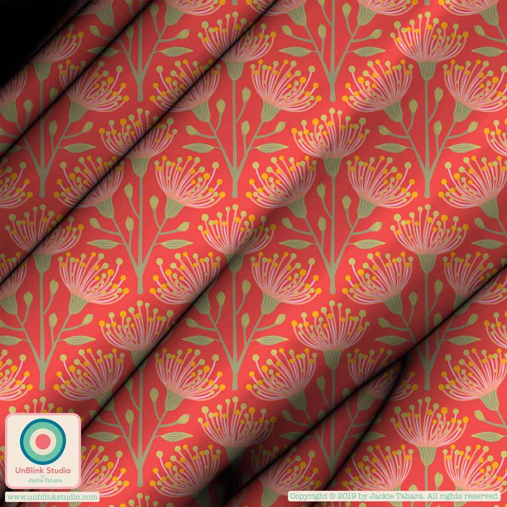
This week's Spoonflower Design Challenge is "Australian Flora". Being Canadian, I wasn't that familiar with Aussie flowers (although I did visit there and stayed for quite awhile many years ago), but when I did some research of Aussie plants, I just loved the flowers of the eucalyptus. So I designed my stylized "Eucalyptus" pattern and tried it out in several different colour ways. I love all the colours, but finally decided to enter the orange/pink/green one into the challenge. Did I choose the right one? What do you think? Check out the Voting Page to see all the other designs and vote your faves! Voting ends April 23 at 3:00 EDT.
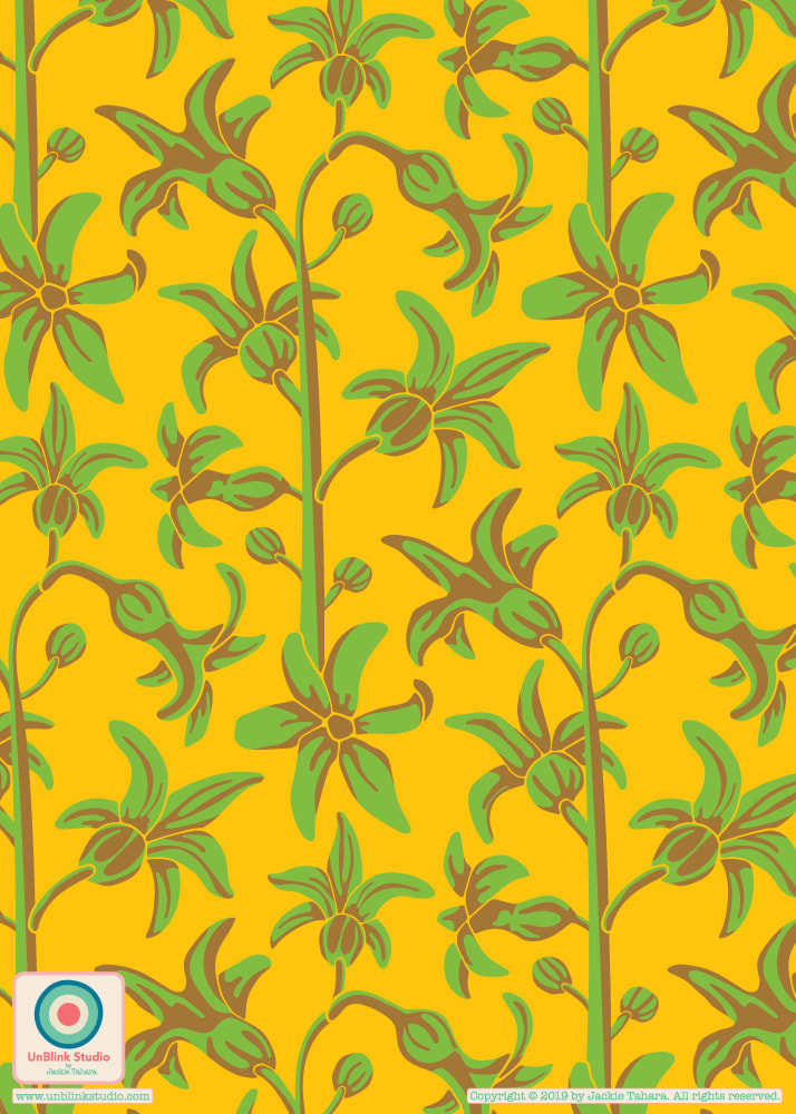
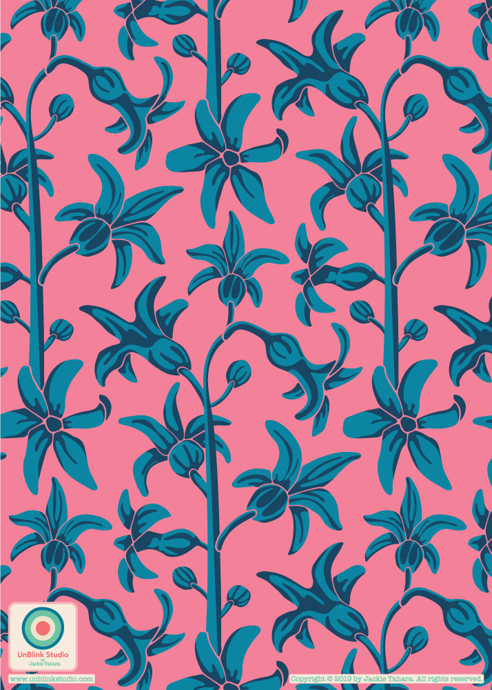
I use this pattern, called "Sunny With Cloudy Periods" as my phone’s wallpaper because it’s so happy and always makes me smile. Its now available on fabric, gift wrap and wallpaper (how fun would this be in a kids room?!) at Spoonflower and on home decor items at Roostery Home AND I just entered it in this week’s Spoonflower “April Showers” Design Challenge! Check out the entries on the Voting Page (voting ends April 16). 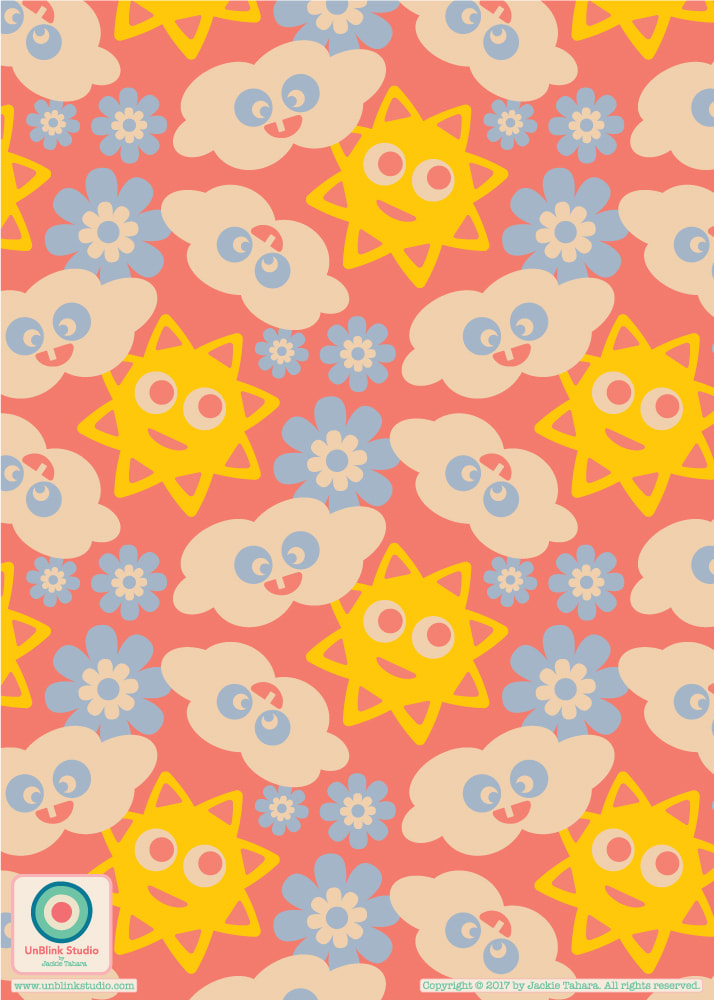 I just entered my "Butterfly Breeze" design in this week's Spoonflower "Pollinators" Design Challenge...Although not as effective as bees, butterflies are still very good pollinators! Check out the Voting Page to see all the amazing entries! 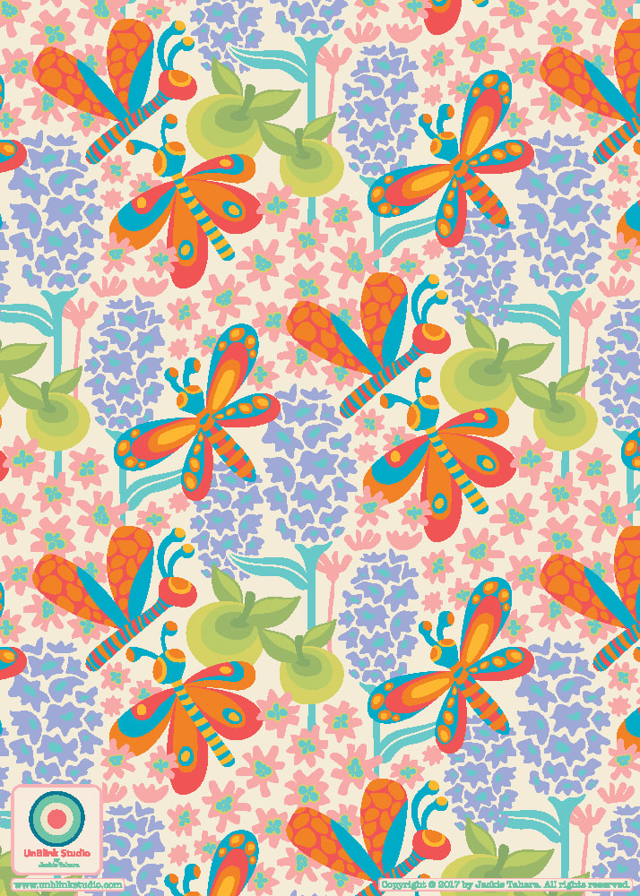 The last few weeks in The Colour Gang, a members-only online community, has been all about trends and colour! It has been great reading all the trend reports generously provided to Colour Gang members by WGSN and designing to them. Here is a sneak peek of a brand new pattern collection (just the beginnings!), which I designed with one of the trends in mind. Unfortunately, I can't share the reports, but be assured they are soooo inspiring! Which do you prefer: Yellow/Green or Pink/Blue??!
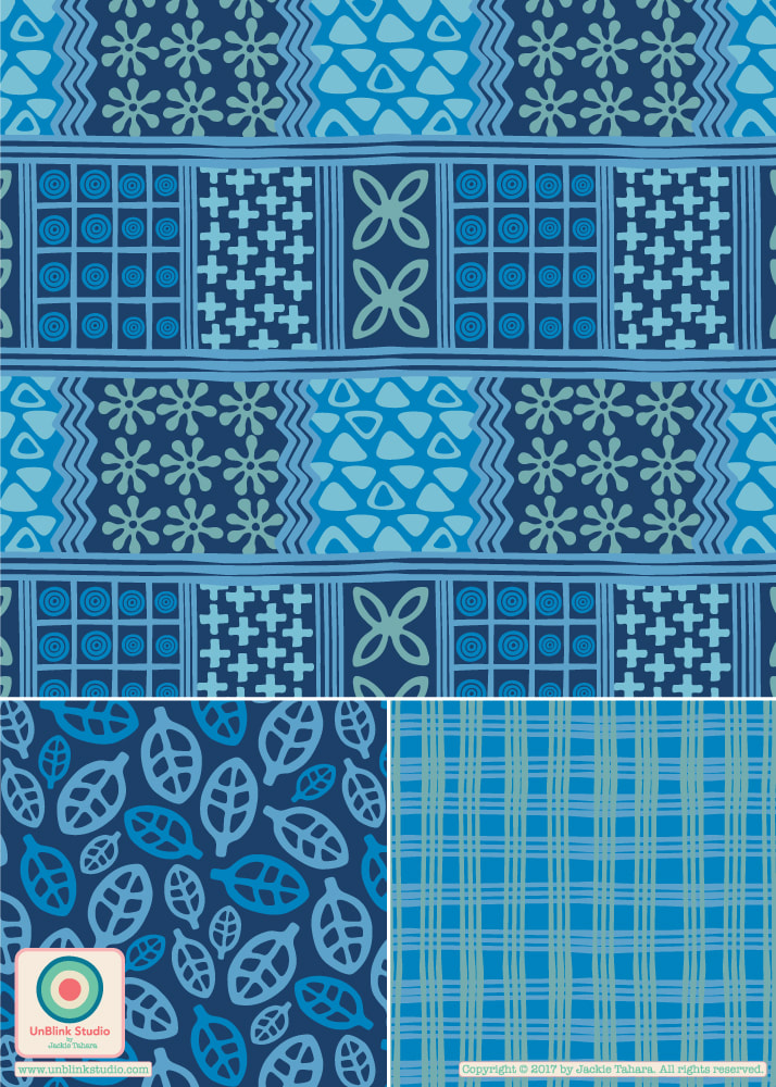
This months creative challenge in The Colour Gang is "Indigo"! So I couldn’t resist re-colouring my “Handprints” Collection in various shades of blue! Check out how different it looks in both the original colours (on the right, below) and in beautiful blue (on the left). I think blue is my fave, which do you prefer?
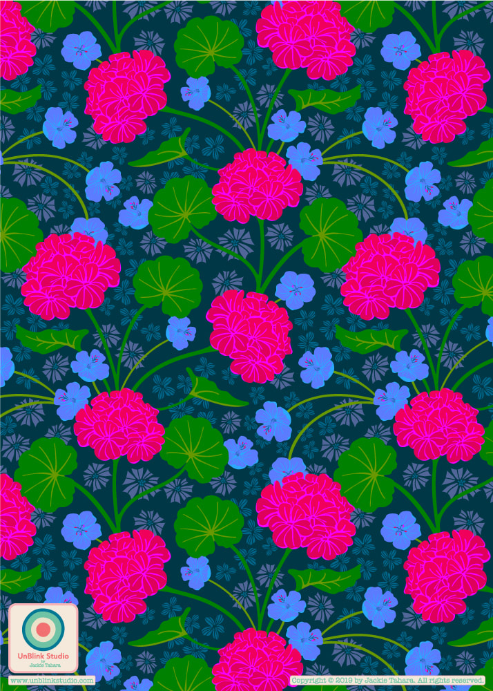
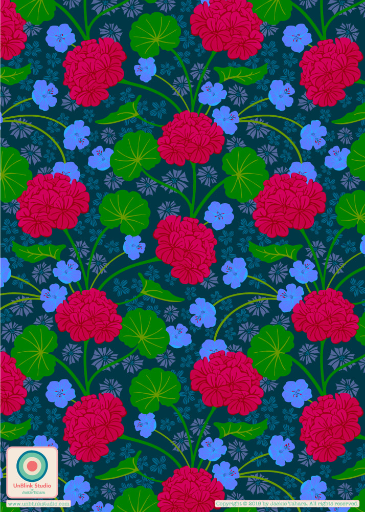
I have just entered my "Seashells By the Seashore" pattern design in this week's Spoonflower "Nautical" Challenge! Would love your vote on this one (you can vote for as many designs as you like!) Here is a link to the Voting Page (voting ends April 2 3pm EDT). And here's a votingh hint: If you scroll on the voting page until all the images are loaded, you can do a page search for "unblink" to save time! 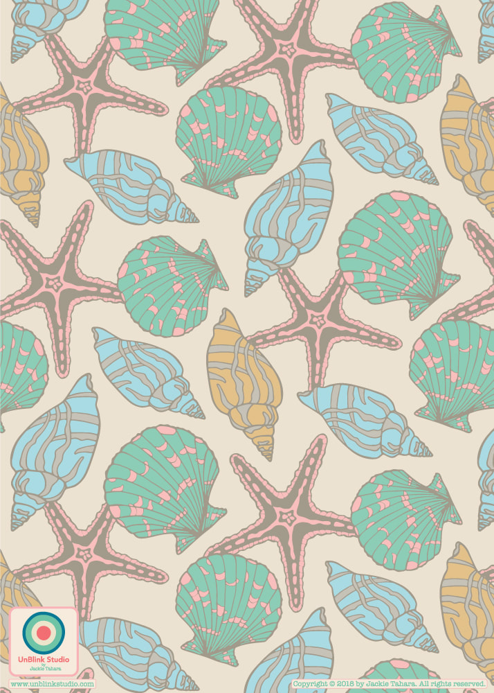 Hello! I just submitted this super colourful pattern design which I call "Summer of Love" (stay tuned for more in this collection!) to this week's Spoonflower "Maximalist" Design Challenge! No one was really sure what "maximalist" really meant, but this is my interpretation: lots and lots of crazy-bright coloured florals! If you have a minute, I would love your vote (and again, thanks to all of you who have voted for my designs in the past). Click here to link directly to the voting page!   Here on Vancouver Island which is usually milder than the rest of Canada, we've had an "unusually" long winter. February 2019 was the coldest on record apparently and we actually had lots of snow (I know, I know, it's nothing compared to our Eastern provinces but everything is relative, right?)! But today it is finally feeling like the cold snap is ending. So to celebrate, I am posting one of my newest surface pattern designs. I call it "Fruitastical" and it features some ripe fruits you probably won't see anywhere because they are a bit fantastical, but it does make me think of Spring! 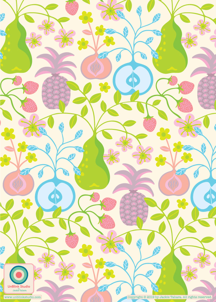 I decided to turn my "Geraniums" journal cover design (see my Feb 15 post) into this botanical repeat pattern. To me it looks a bit Art Nouveau which pleases me since I'm a big fan of William Morris. Funny enough, when I did the repeat with the blooms in the original Hot Pink, something was urging me to try it in Deep Red. So I did. And you know what? Although I love the Hot Pink on the journal cover design, I think I prefer the Deep Red in the repeat pattern. It really makes me think of statement wallpaper or big velvet couches...So I decided to enter the Deep Red one in next week's "Moody Florals" Design Challenge on Spoonflower. Voting is now open until March 5 2019 3:00 EST. VOTING TIP: There are over 800 designs to choose from, so to make it easy to find mine you can do a Page Search on the voting page. Just make sure ALL the images have loaded (by scrolling all the way to the bottom), then do a Page Search (Ctl+F on PC, Cmd+F on Mac) and search my studio name, unblink.
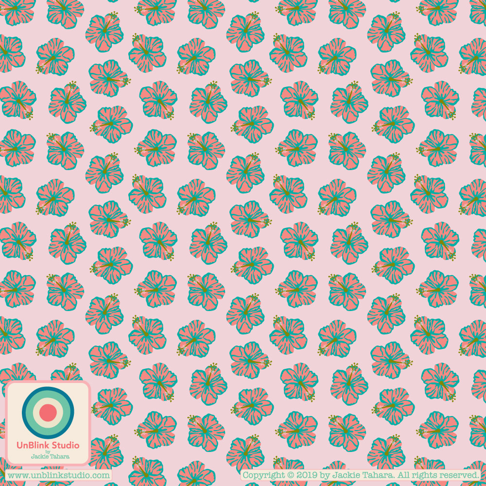
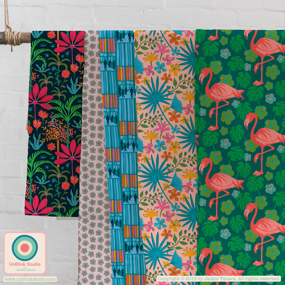
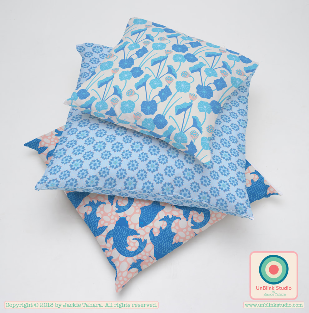
I've been playing with my newest pattern designs the last few days, and visualizing them on pillows and fabrics! I think my Far East Collection would look gorgeous on a set of pillows; my Fanciful Collection would be great for quilters or girl's dresses; my newest tropical patterns, including my Botanical Gardens Collection, Celestun and Hibiscus, would cheer up any wardrobe or interior space, and I think my Koyasan Collection would be so calming in any room! What do you think?! Can you envision these designs on other products? Let me know! 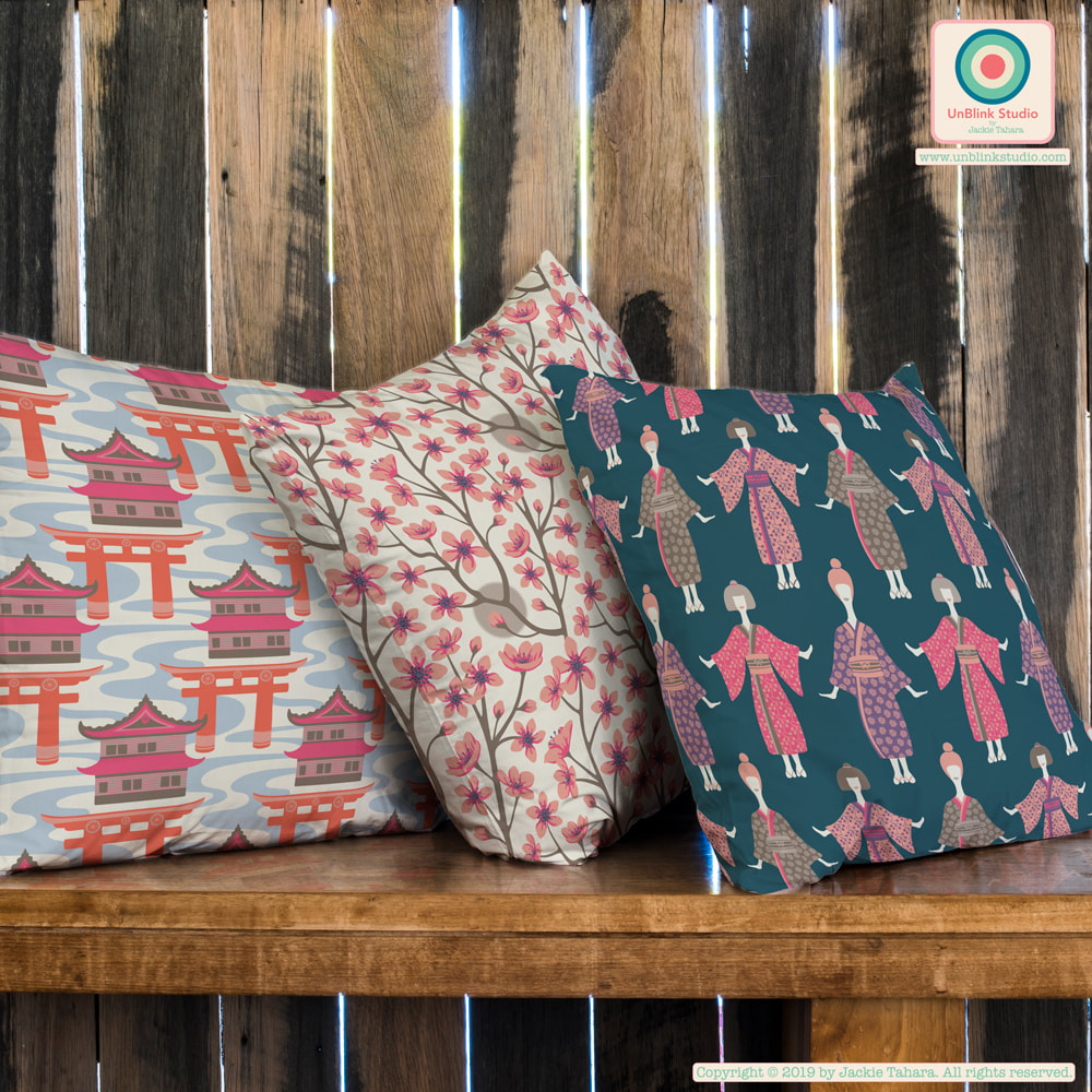 
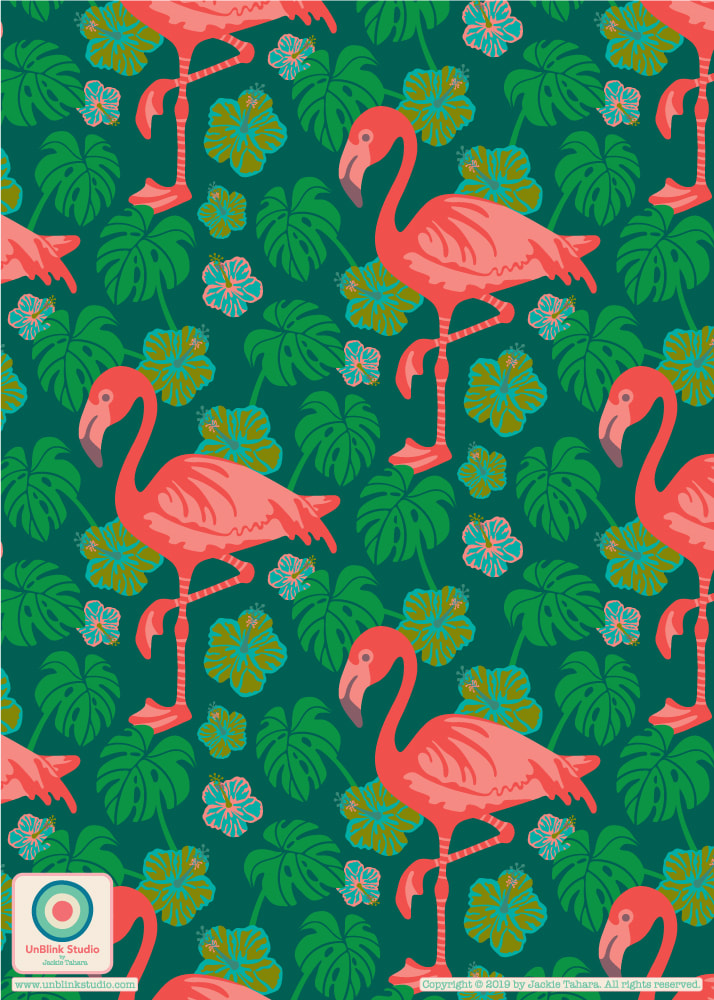  Here is the start of a new pattern design collection that I am going to call "Celestun" because it was influenced by the trip I took a couple years ago to Merida in the Yucatan, Mexico. Nearby is the Celestun Biosphere Reserve where flocks of wild pink flamingos feed on shrimps that live in mangrove forests along the Ria Celestun.
Still Thinking About Japan...Two New Co-ordinating Patterns: "Kimono Ladies" and "Cherry Blossoms"1/14/2019 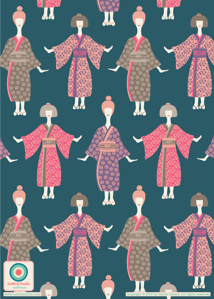
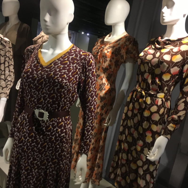
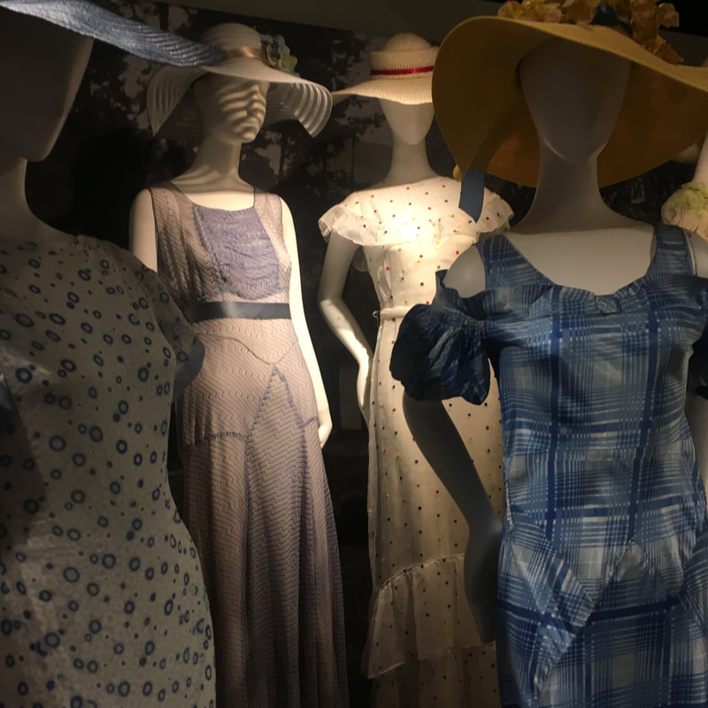
I think I tried a gazillion different colour combos for this one. All I knew is I liked the colour of the blue background and that I wanted some neutral-y colours too. I tried to use the Japan moodboards I had created last week (see my earlier post!), but it just didn't work for me! So here is a brand new colour palette for this one! And I guess it was influenced by 2 trips I took recently: one to London where I saw all the dressed mannequins in a show of 1930's fashion at the Textile & Fashion Museum and my summer trip to Japan! Let me know what you think of the colour palette AND whether you think it is a little "weird" looking! I also included a couple photos of the mannequins too. AND I had to add another Japan-inspired pattern to coordinate with this one...Cherry Blossoms, of course! 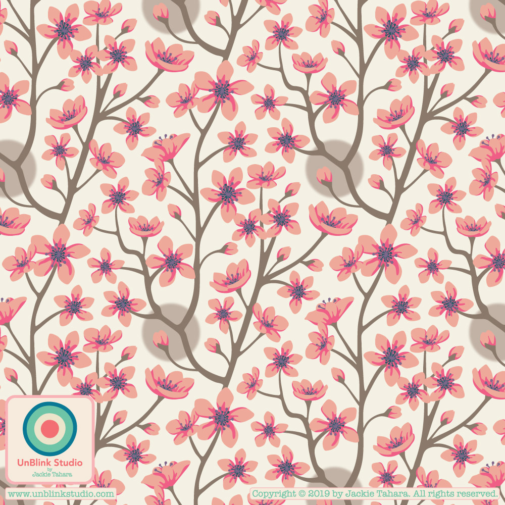 |
AuthorJackie Tahara of UnBlink Studio Archives
April 2024
Categories
All
|
 RSS Feed
|
|
|
|
|
|
All images on this website are Copyright © Jackie Tahara. All rights reserved.
If sharing, pinning or blogging my images, please always credit me and link back to my website. Supporting artists is a good thing to do! Thank you!
If sharing, pinning or blogging my images, please always credit me and link back to my website. Supporting artists is a good thing to do! Thank you!