|
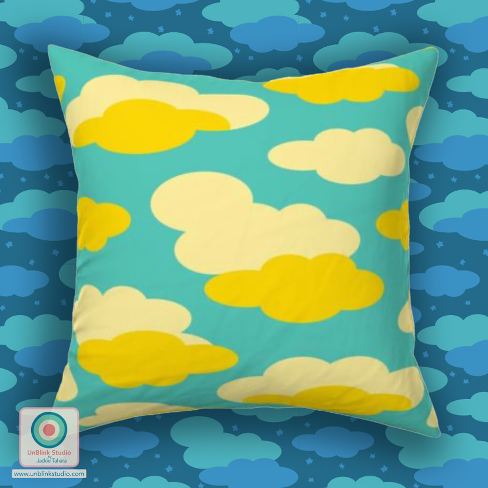
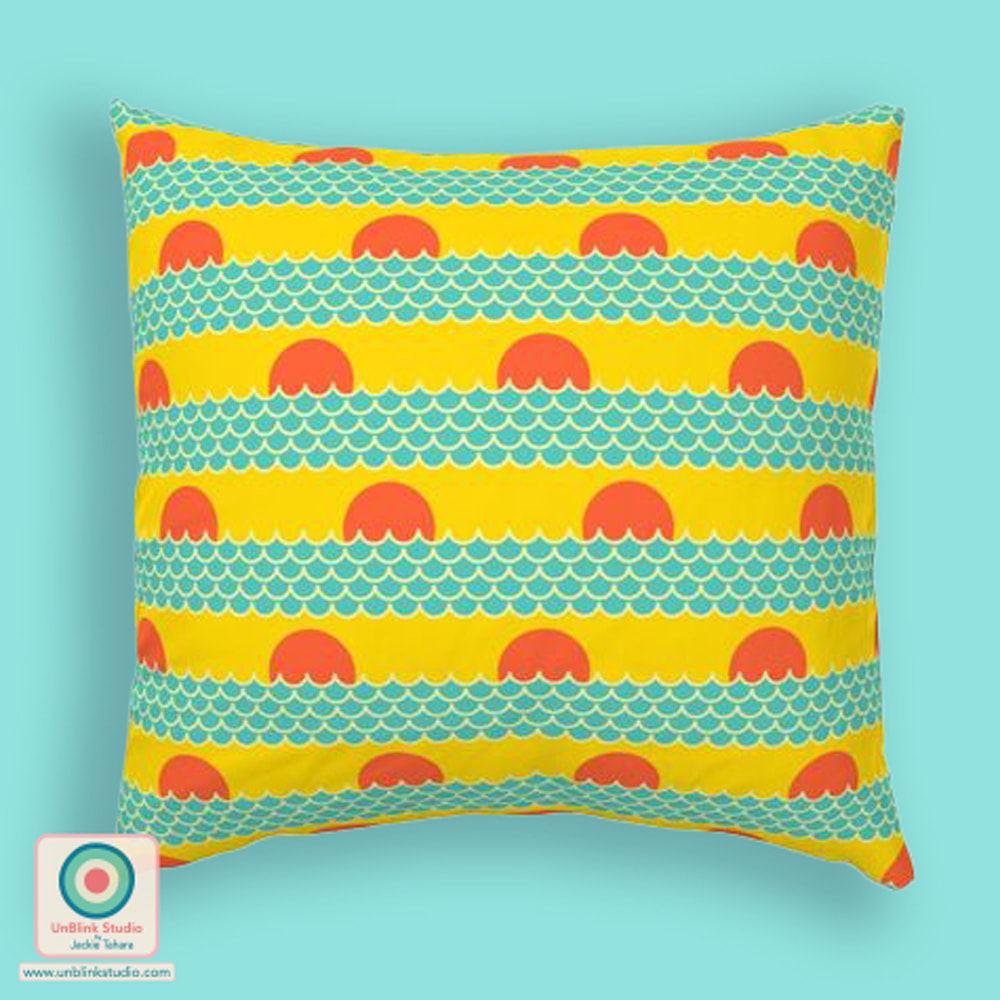
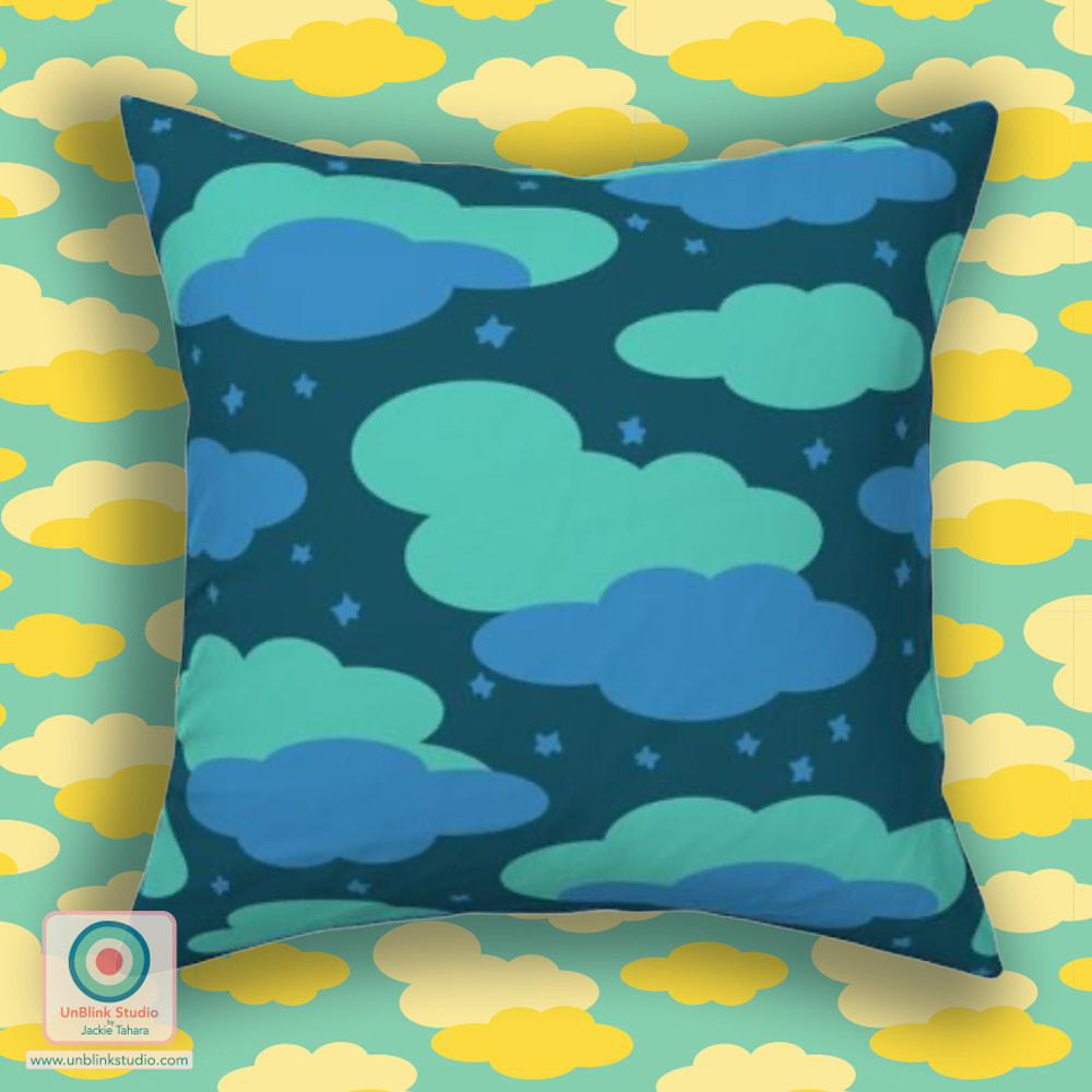
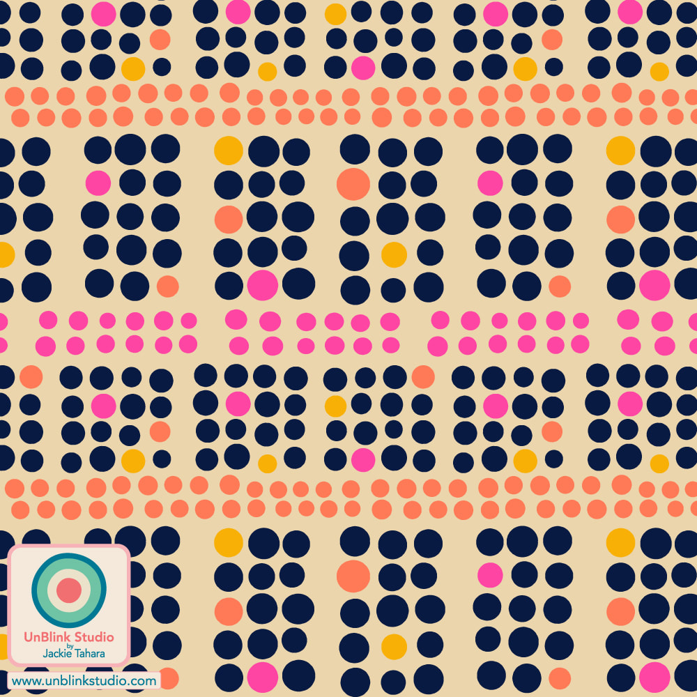
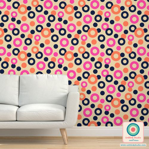
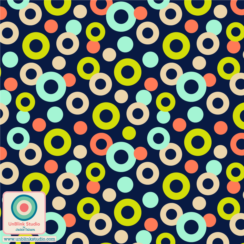
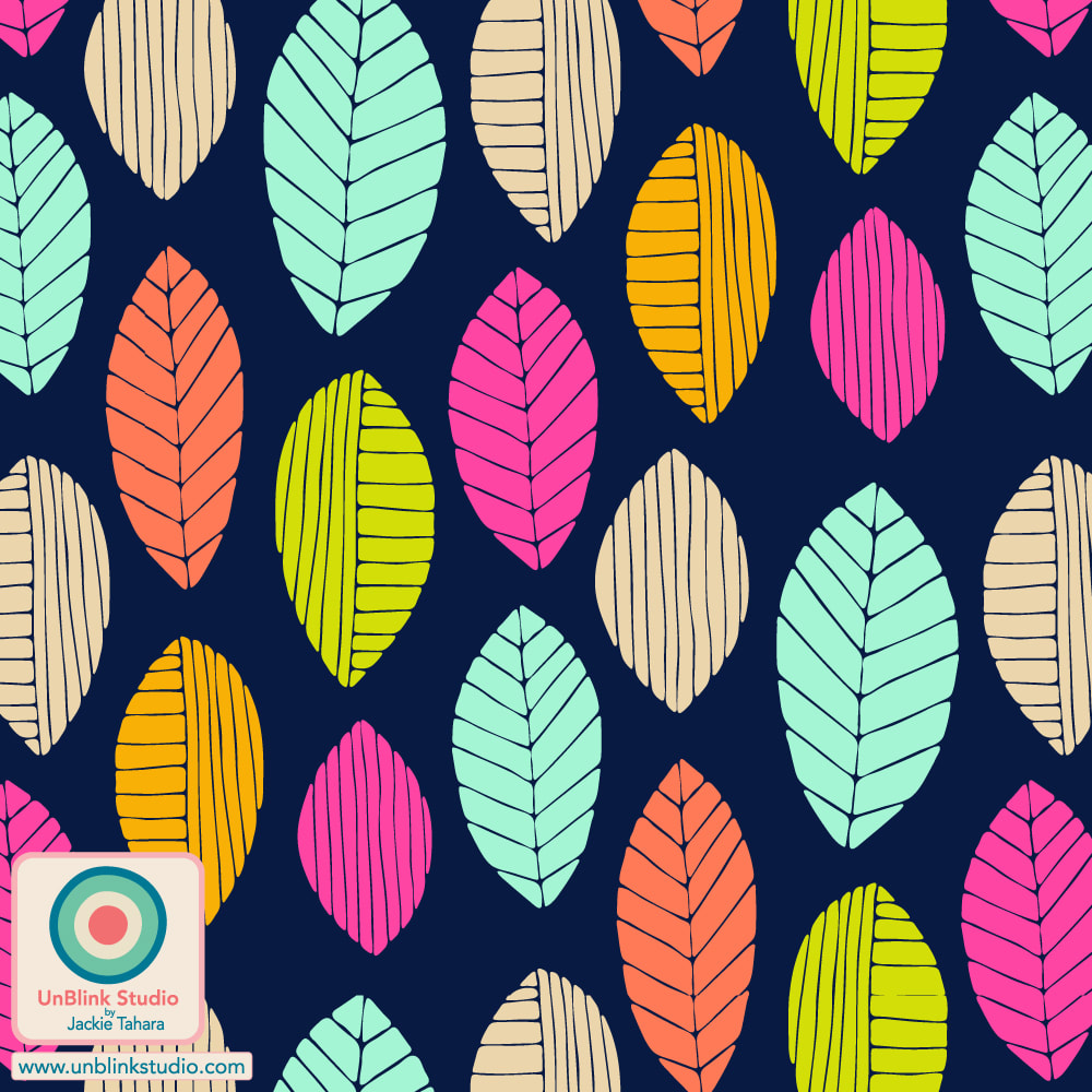
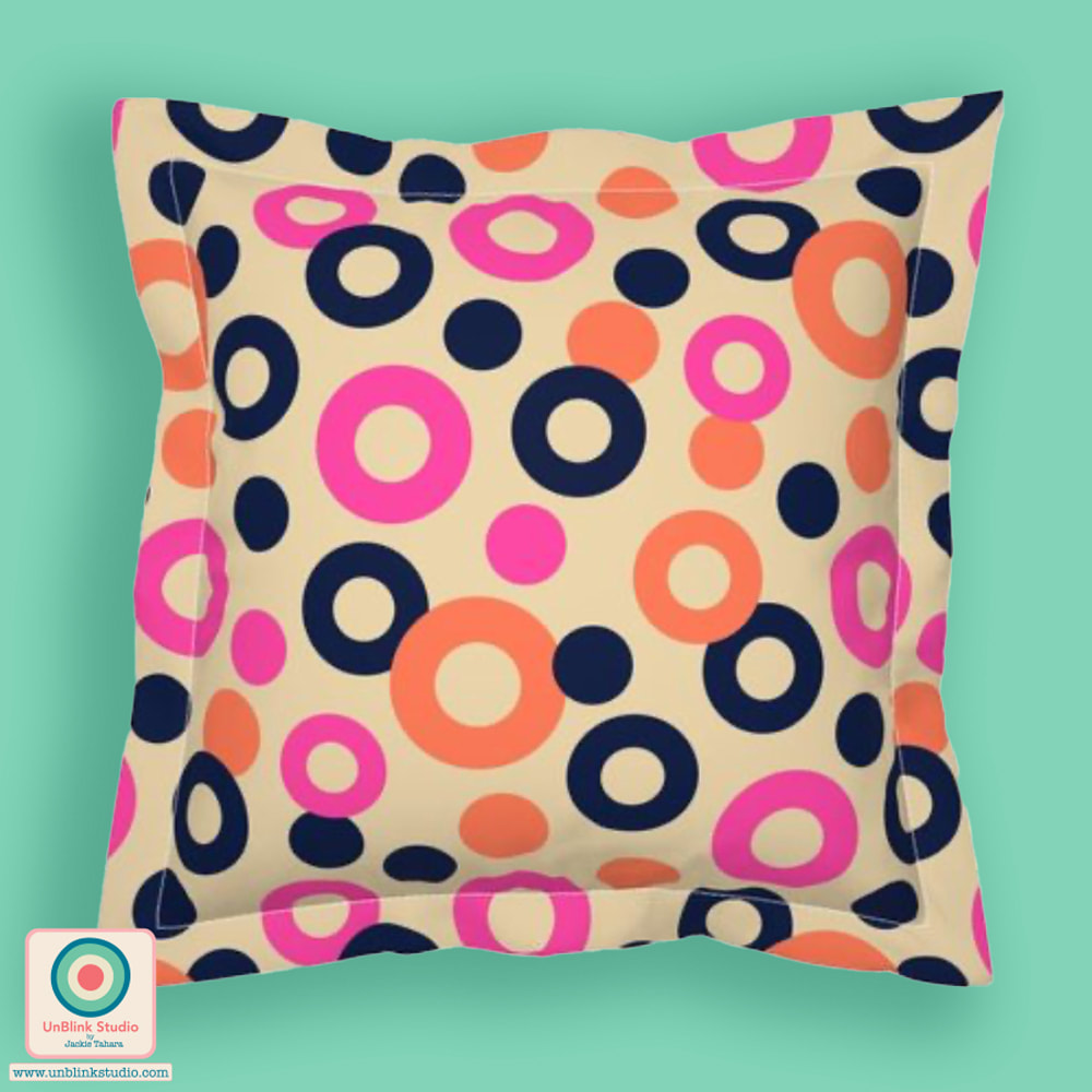
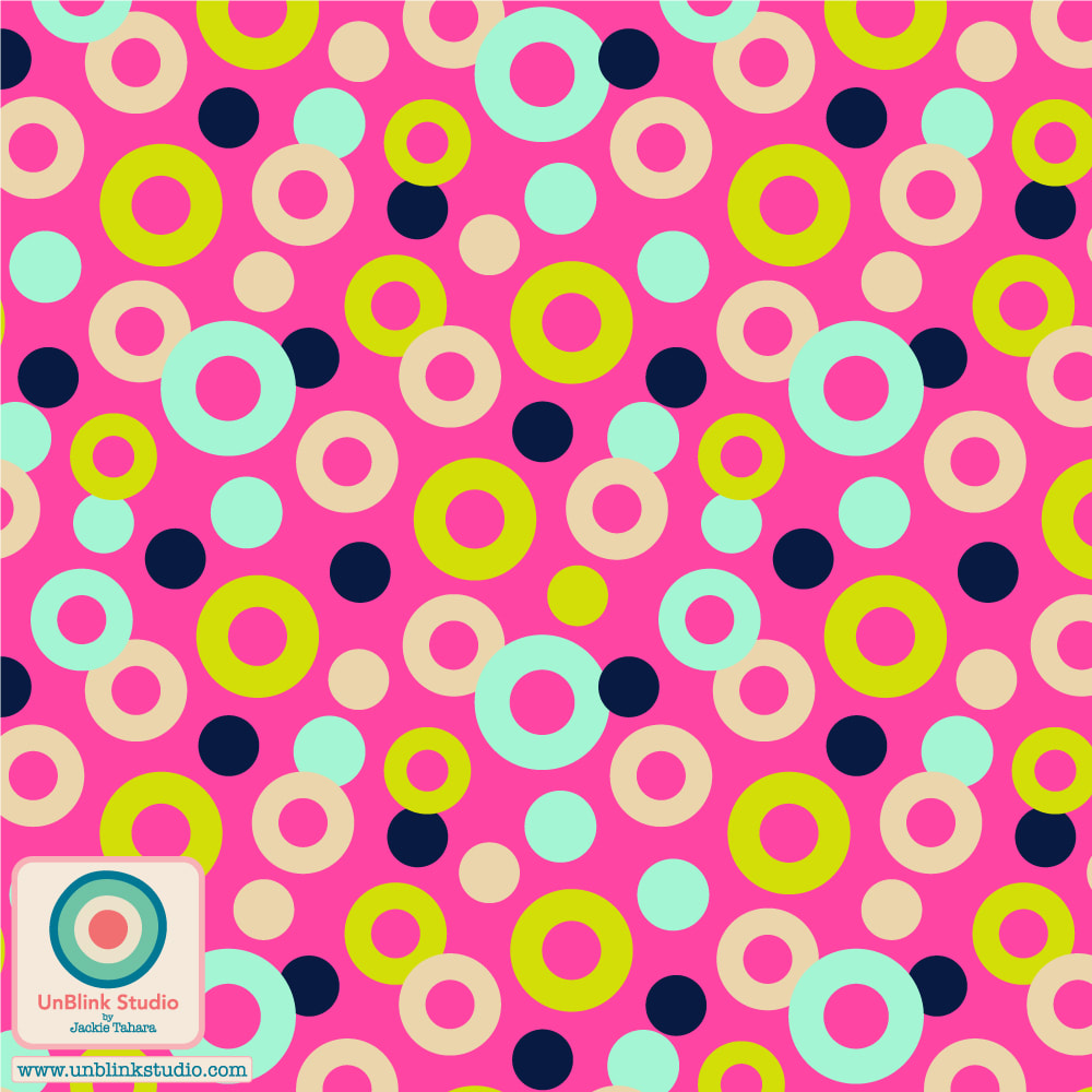
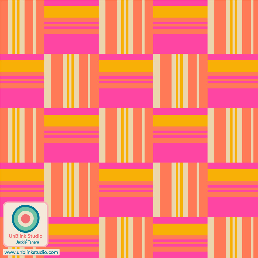
Is this Bold? Is this Minimalist? I hope so because I've entered my "Ocean Sunrise" design in this week's Spoonflower "Bold Minimalism" Design Challenge! You could also ask: Is it a Dot? Is it a Stripe? Yes! I also designed this to co-ordinate with my "Daydreams" and "Night Dreams" designs too (see below)! I could really see all 3 of these as a collection of fun pillows! These are all now available in my Spoonflower Shop on Fabrics, Wallpaper and Home Decor in 3 sizes! You can also link to the Voting Page and check out all the entries! Click the images below to see these designs in my Spoonflower Shop! 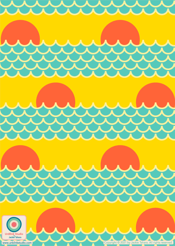
These would be a FUN collection of pillows! From left: Daydream, Ocean Sunrise, Night Dreams. All available in my Spoonflower Shop!
0 Comments
I've entered my "Happy Harvest" design in this week's Spoonflower "Petal Solids Coordinates: Optimism" Design Challenge! The idea behind this Challenge was to use at least 1 of the 3 given colours of Watermelon, Marigold and Lemon Lime, to create designs to coordinate with Spoonflower's Petal Signature Cotton Solids fabrics. Link to my Spoonflower Shop HERE. And if you like, check out the Voting Page HERE! BTW: Both my "Happy Harvest" and "Shrooms" designs come in a few other colourways too! Scroll down to see them. All are available for sale in my Spoonflower Shop! You can click the images below to go directly to that design in my Spoonflower Shop! 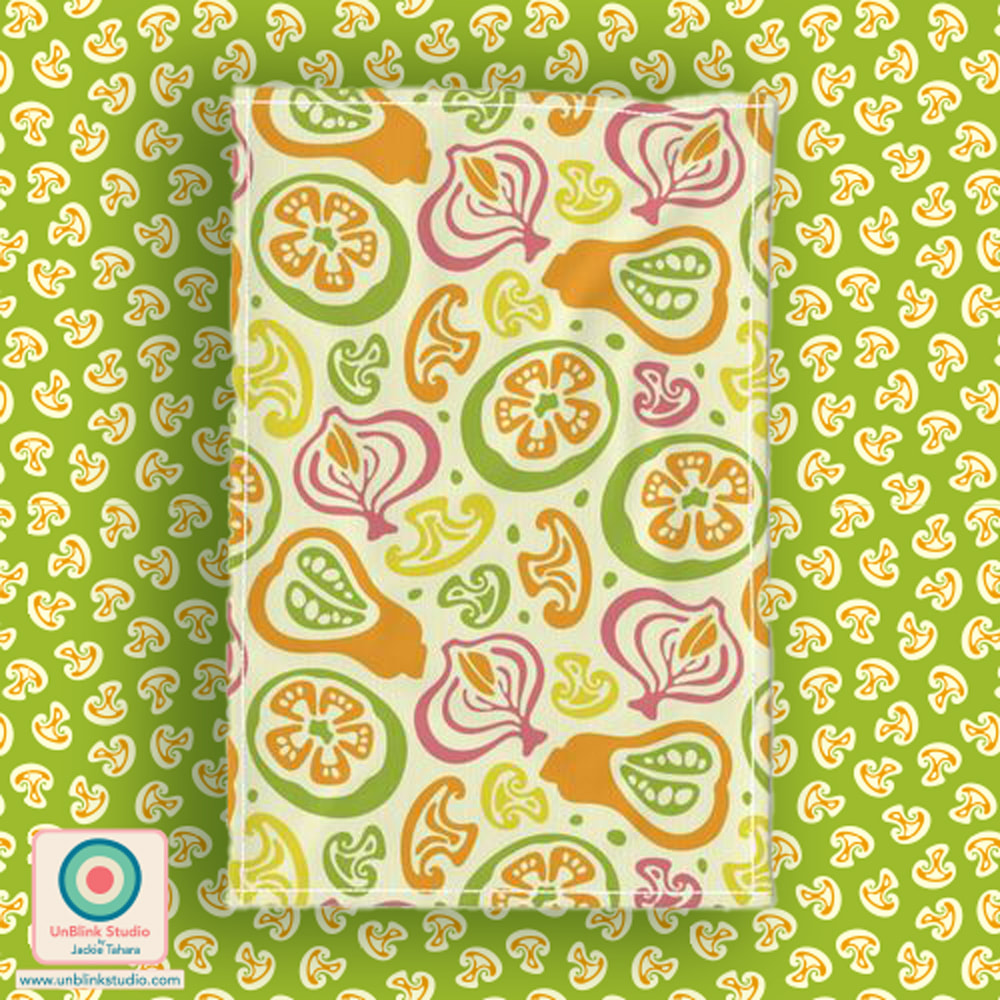
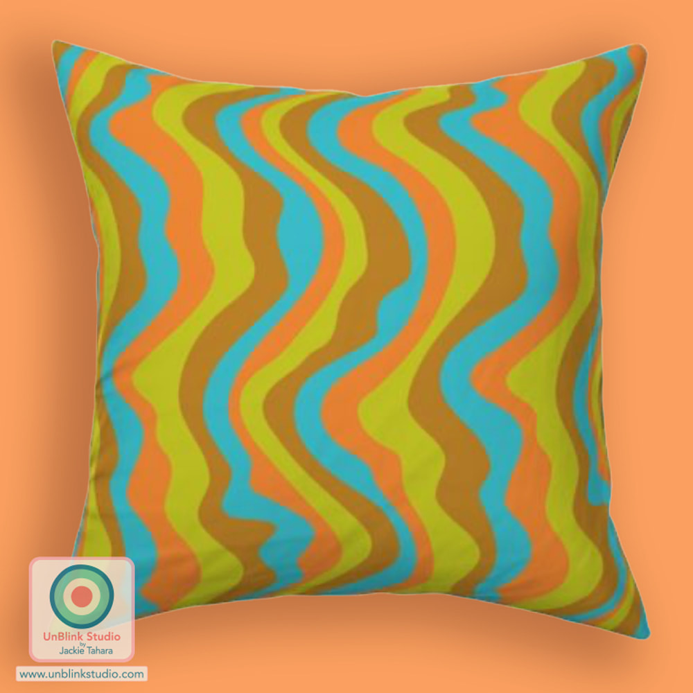
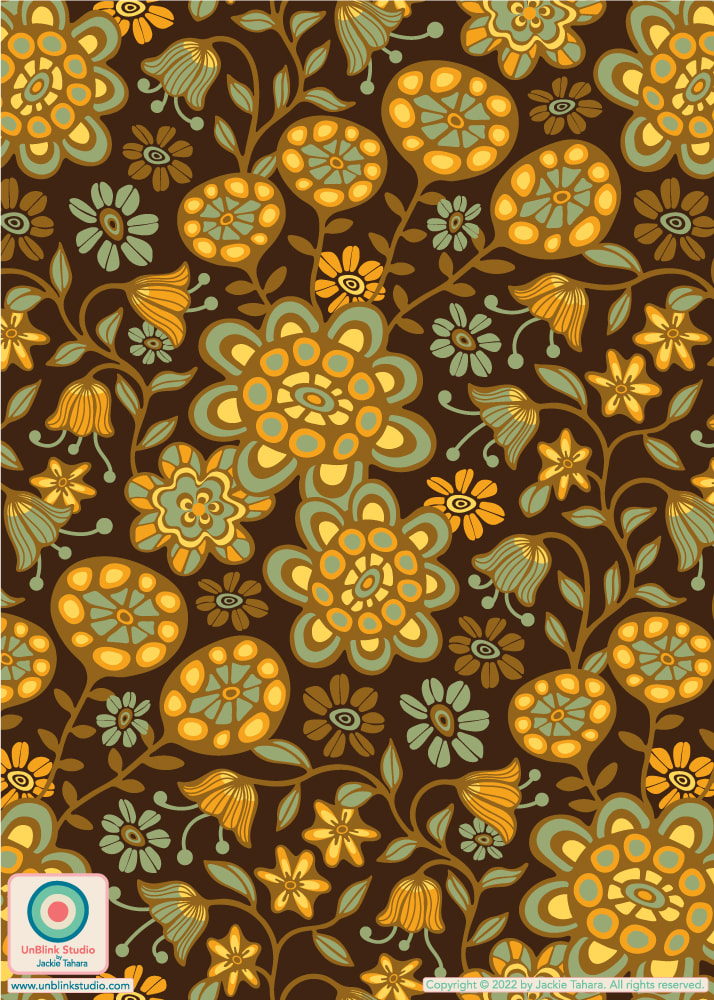
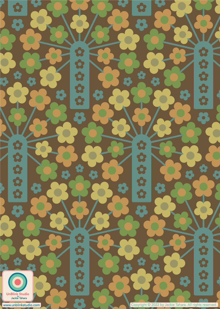
This week's Spoonflower Design Challenge is "Vintage Nostalgia Wallpaper" so I decided to enter my "Orangerie" design in this Avocado Green and Burnt Orange colourway. Although I've created this design in a bunch of other colourways, I have a sentimental attachment to this one because I grew up in a house with a kitchen in these colours! We even had Avocado Green appliances and wall-to-wall carpeting in various shades of Avocado Green (if I knew then what I know now, I would have taken pics of that carpet)! But then my parents renovated the kitchen, and to me it ended up being much less interesting (they also repainted the garage door and window shutters from Bright Turquoise to Dark Brown, and although I do like a good Brown, I never forgave them)! If you would like to Vote, you can link to the Voting Page HERE (and I would greatly appreciate your vote for this one!) . With thanks to @theindoorsyproject for this mock-up! 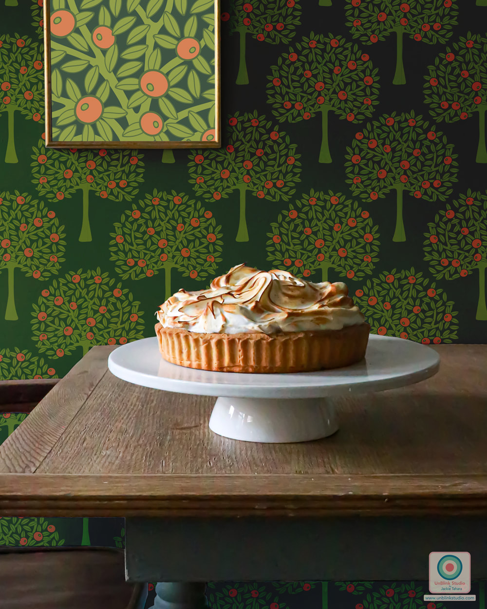 I've entered my "Good Vibrations" design in this week's Spoonflower "Reworked Classics" Design Challenge! The idea behind this Challenge was to reimagine classic patterns, such as dots, checkers, plaids and...STRIPES! And of course, this design really needed some Groovy Retro Colours! Find this one (together with LOTS of other colourways) in my "Good Vibrations" Collection in my Spoonflower Shop. I had to make a new Collection because I went down the colour rabbit hole AGAIN and added it in LOTS of different colourways (and sizes)! If you would like to VOTE in this Challenge, click HERE! 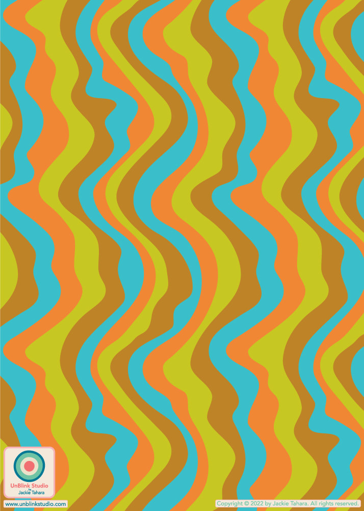
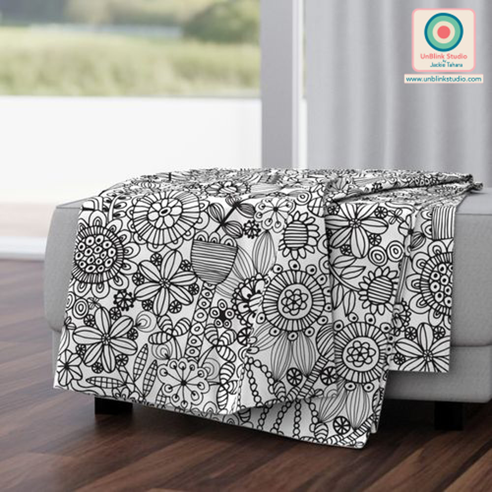
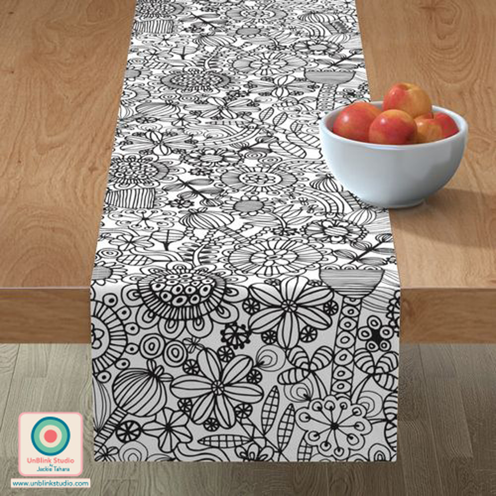
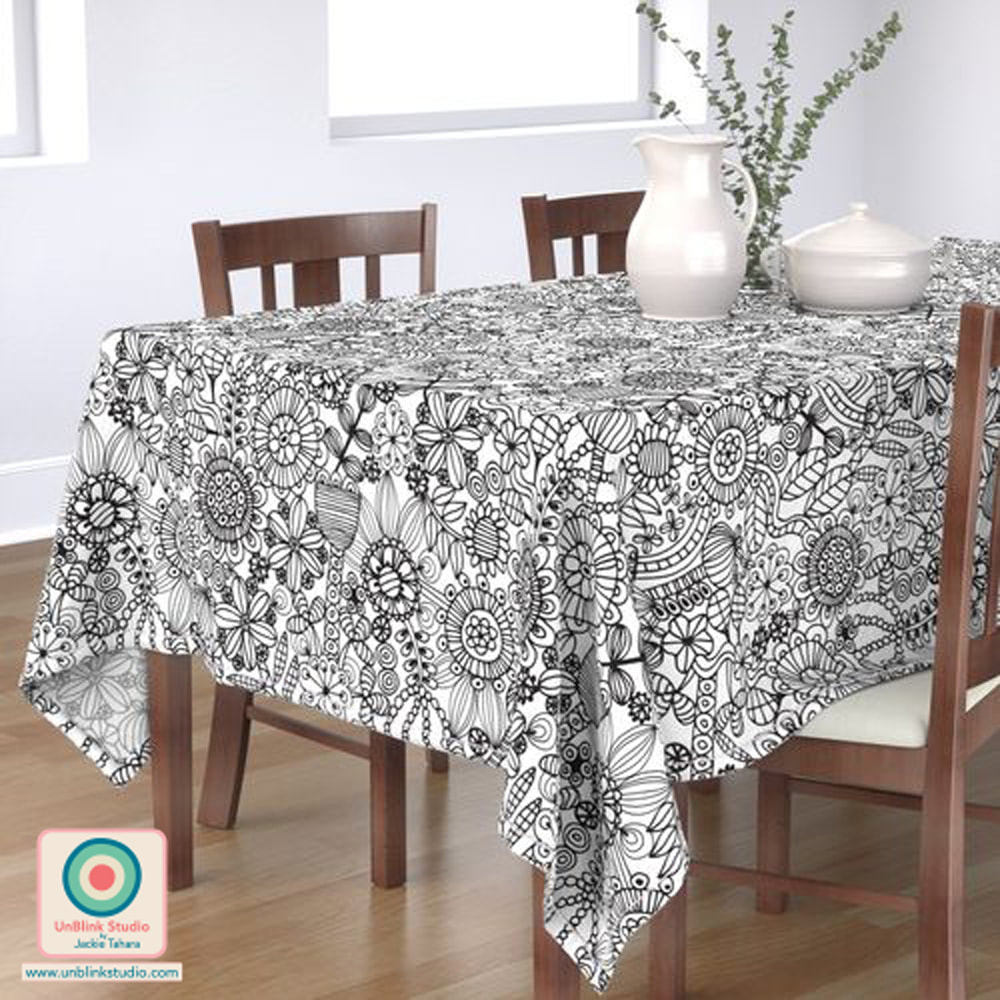
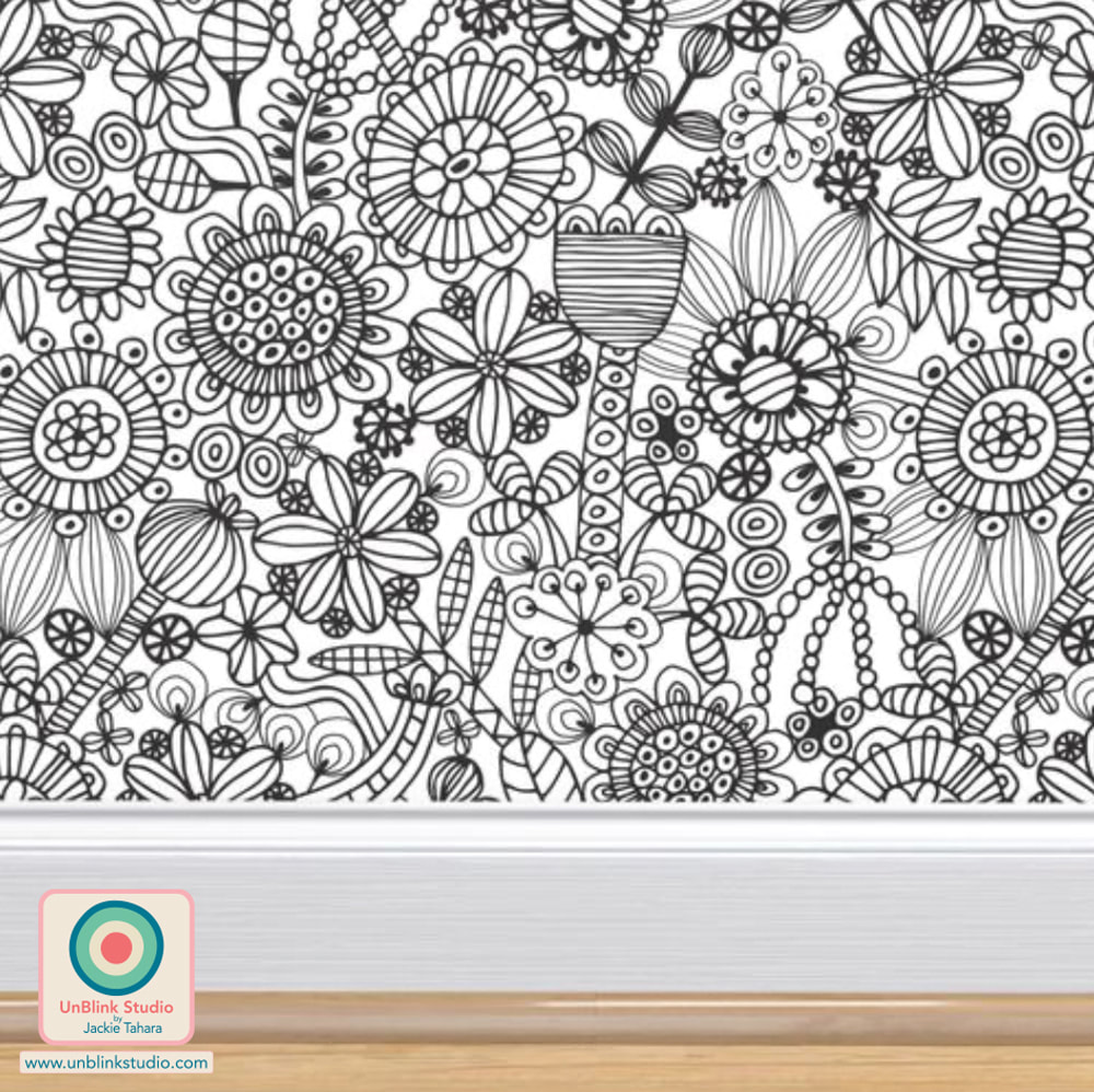
Colouring books are something that both Adults and Kids love! So I thought it would be a good design concept for this week's Spoonflower Design Challenge theme: "Home Hobbies". Wouldn't it be fun to get this design on Fabric, Wallpaper (especially Wallpaper!) or Home Decor and just start colouring in?! And I'm feeling the urge...I might have to add a colour version of this one too! Voting for this Challenge opens THURSDAY MAY 5 Link to the Spoonflower Design Challenge Page HERE! 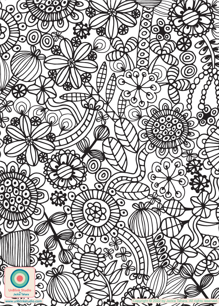
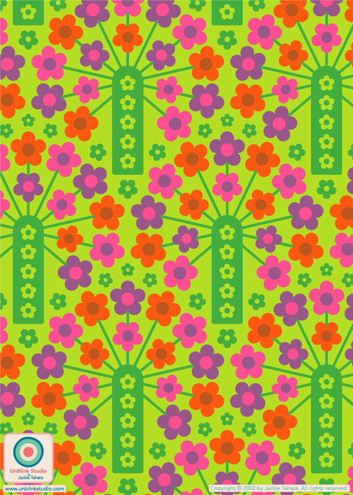
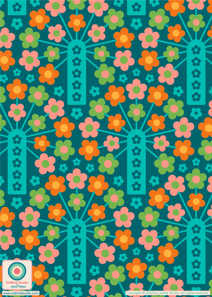
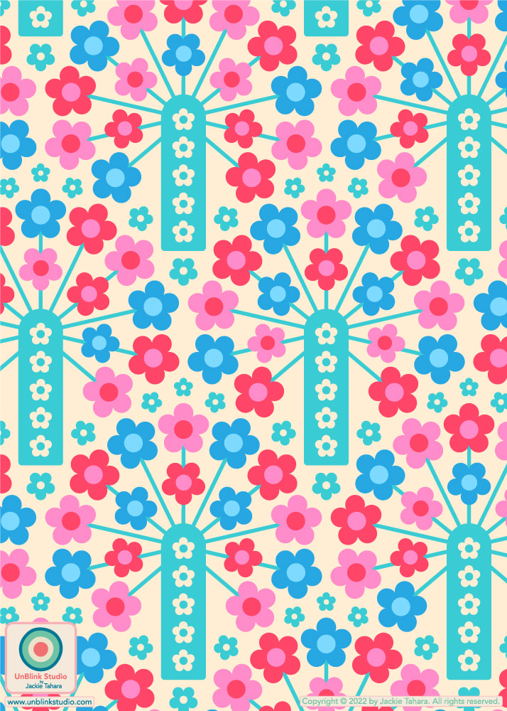
Some of you may have seen my "Sea Stars" pattern design recently in different colours, but here is the version I created specifically to enter in this week's Spoonflower "Petal Solids Coordinates: Pastel Comforts" Design Challenge! The challenge was to use 1, 2 or all 3 of the given colours (Honeydew, Lilac and Sky Blue, with Black and White optional) in a design. I ended up using a light turquoise instead of Honeydew (which is allowed)! It wasn't the easiest combo, but I hope you all like it! You can check out all the entries at the Voting Page AND DON'T FORGET: Everything in my Spoonflower Shop is 20% OFF until Sunday May 1! 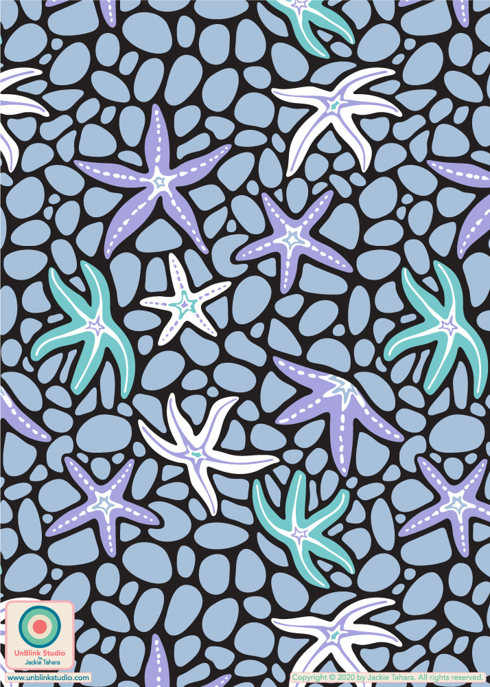 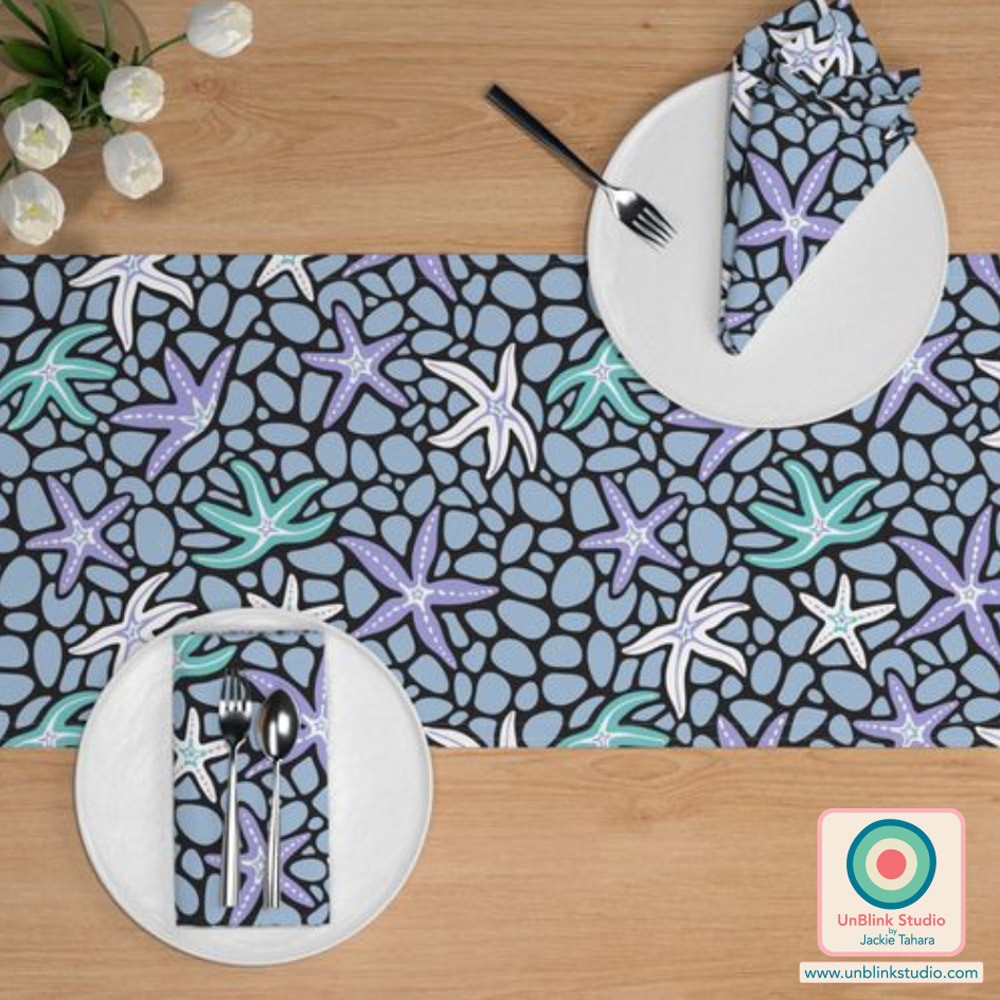 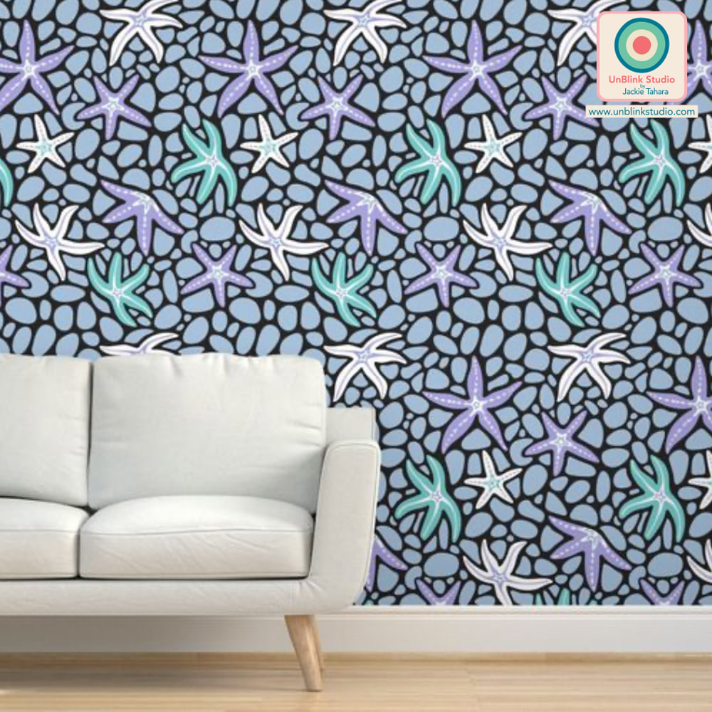  When I googled "teamwork" to get ideas for this week's Spoonflower "Teamwork" Design Challenge, alot of images with people and mechanical gears came up. So that gave me the idea of adding fun faces into clockwork gears! But WHO KNEW creating happy faces would be so difficult? It took me alot of revising and adjusting to make sure the facial expressions didn't end up looking creepy or nefarious or troubled or weird...But in the end, I hope this one makes you smile! I think this one would be great for Back-to-School too as I also intended it to encourage science, engineering, mechanics and STEM subjects! Link to the Voting Page HERE. BTW: I entered the Dark Blue version, but when I asked in a Facebook group which I should enter, the consensus came back as the Cream version…then I missed the deadline to switch them. So Dark Blue it is! Also check out the Dark version in my Spoonflower Shop! 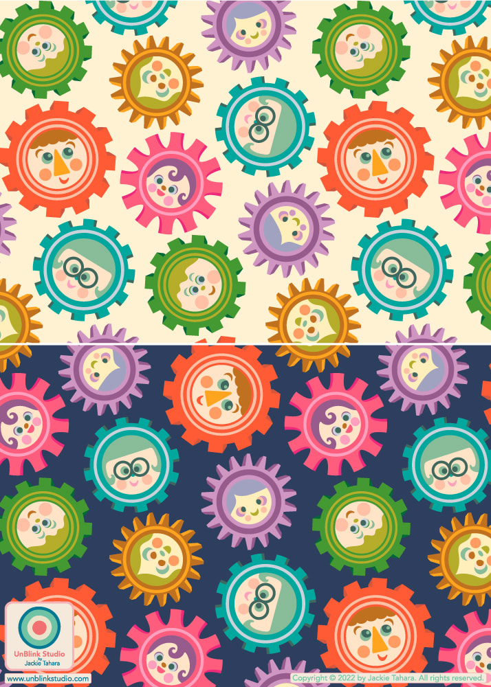 This week's Spoonflower Design Challenge is "Petal Solids Coordinates: In Bloom". Spoonflower has asked for designs that use 1, 2 or 3 of the requested colours which this week are "Coral", "Grass" and "Peony" (these limited colour palette challenges are amongst my favourites to enter)! Designers can use additional colours, but SF recommends not more than 4 colors total (not including Black and White) to ensure the designs coordinate well with their Petal Signature Cotton Solids. I initially was pretty happy to see this week's 3 bright colours (it made me think of jelly beans for some reason)...UNTIL I tried to design with all 3 colours together. For some reason, it just wasn't working! So I decided to Divide and Conquer: I paired each colour with another colour to create 3 separate colourways of my "Jelly Beans" design, trying to make sure all 3 would Mix & Match too. And here they are: 1. CORAL on Purple 2. GRASS on Citron Yellow 3. PEONY on Blue Which one would you have entered? After going back and forth a bunch of times, I decided on #1: Coral on Purple. I just love the "neon-ness" of it! Aside from co-ordinating with the cotton fabrics, it sure would make some crazy wallpaper! Voting opens today Thursday April 14! You can check out all the entries and vote at the Voting Page AND you can also check out my Spoonflower Shop too! All these colourways and more are available in my Spoonflower Shop on Fabrics, Wallpaper and Home Decor in 3 sizes! 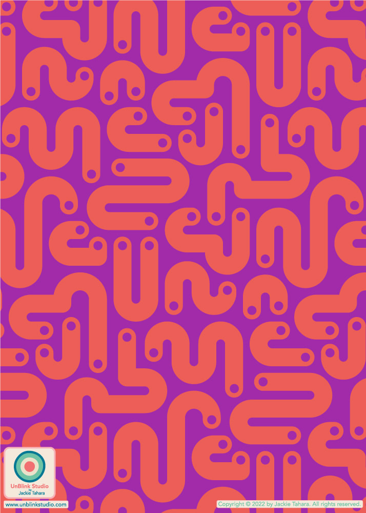
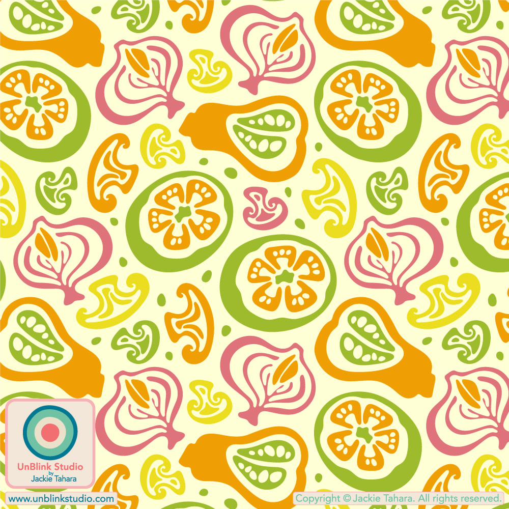
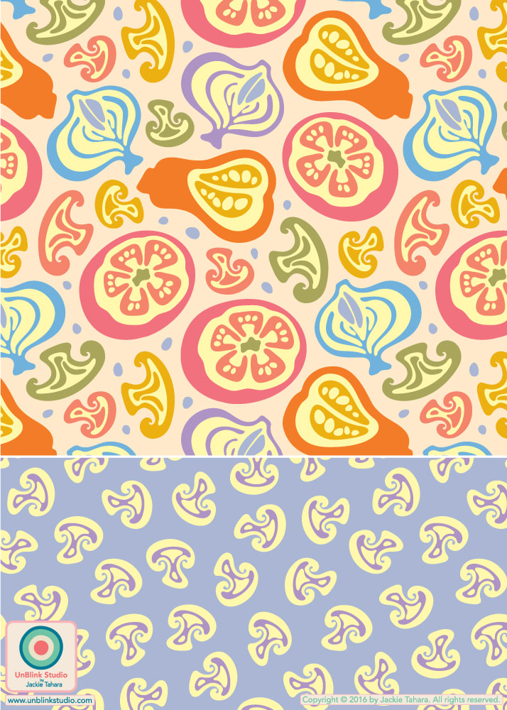
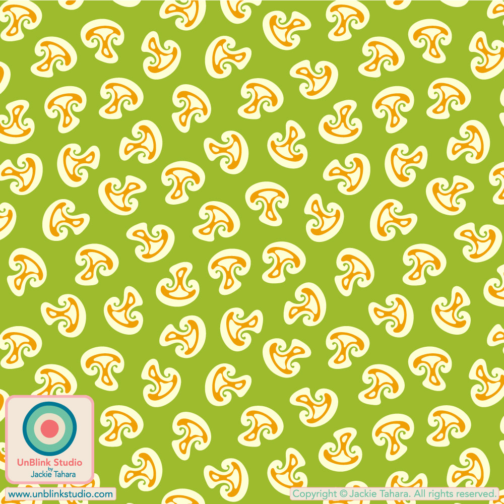
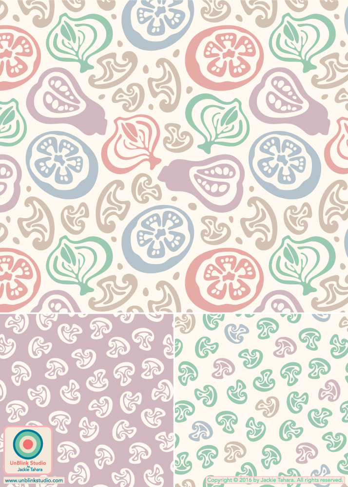
This week's Spoonflower Design Challenge is "Garden Party" and I had a really hard time trying to decide which design to enter. But I finally decided on my "Fresh-Picked" design because it has Fresh Veggies in Rainbow Colours! That just says GARDEN PARTY to me! Voting for this challenge is now open until Tuesday April 12! Check out the Voting Page to see all the entries. And click HERE to see this design in my Spoonflower Shop! **ADDENDUM: My "Fresh-Picked" design placed 24th (out of a whopping 1148 entries!) in the Spoonflower "Garden Party" Design Challenge! See all the winners HERE! 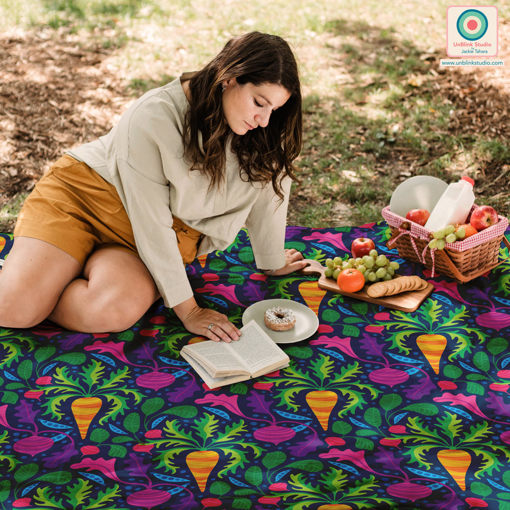 With thanks to The Indoorsy Project for this picnic mockup! 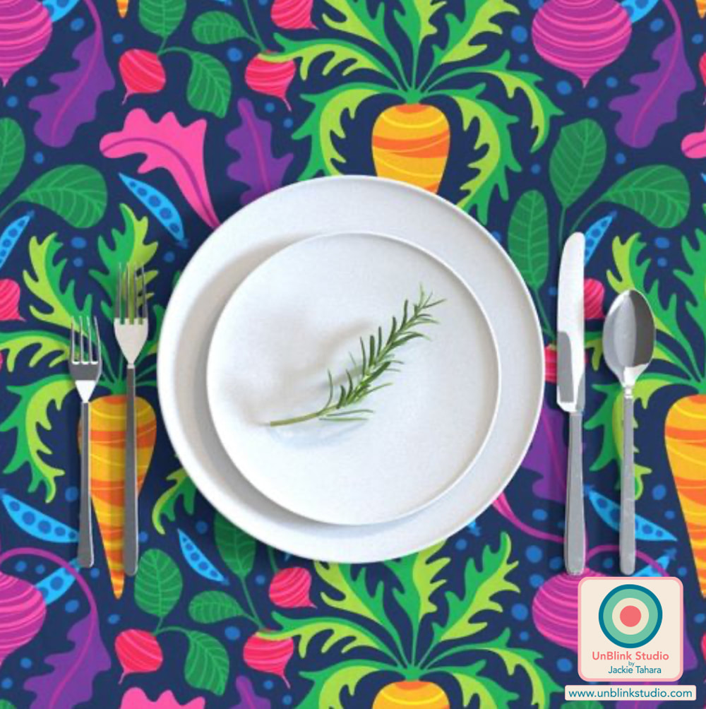 For this week's Spoonflower "LainSnow X Spoonflower: Floral Wilderness" Design Challenge, Spoonflower partnered with woman-owned swimwear brand LainSnow which requested a small-scale, boho-influenced floral print in sage green, yellows and coffee browns. The winner will have their design licensed by LainSnow! I entered the first yellow version of my "Garden Wild" floral, but also couldn't help adding a coffee brown version to my Spoonflower Shop too! I would love a vote for this one, so I've added a handy link to the Voting Page! Thanks to all (voting closes April 5)!
I entered my "Cow Parsley" design in this week's Spoonflower "In the Weeds" Design Challenge! But you know me, I had to try it out in a BUNCH of colours! Although the first version below is the one I entered in the Challenge (link to the Voting Page HERE), now that I'm seeing them altogether, I'm not sure which one I prefer?! Anyway, the first one is the only one I had finished before the deadline, and all the colours are now available in my "Cow Parsley" Collection in my Spoonflower Shop on Fabrics, Wallpaper and Home Decor in 3 sizes, so I guess it doesn't matter which one I prefer?! Although I'd be interested to know which one YOU prefer...
This Week's Spoonflower Design Challenge: "Petal Coordinates Limited Color Palette: Candy"!3/10/2022 The idea behind this week's Spoonflower "Petal Coordinates Limited Color Palette: Candy" Design Challenge was to create a pattern design using the 3 given colors of Cotton Candy, Lilac and Seaglass with optional Black and White (I love these kinds of challenges!) Here is my entry, "It's A Jungle Out There"! Voting is open now until March 15, and you can check out all the entries at the Voting Page! BTW: This floral now comes in a bunch of other colourways too...Of course, I couldn't resist the opportunity to play with colour! Check out all the colourways HERE! 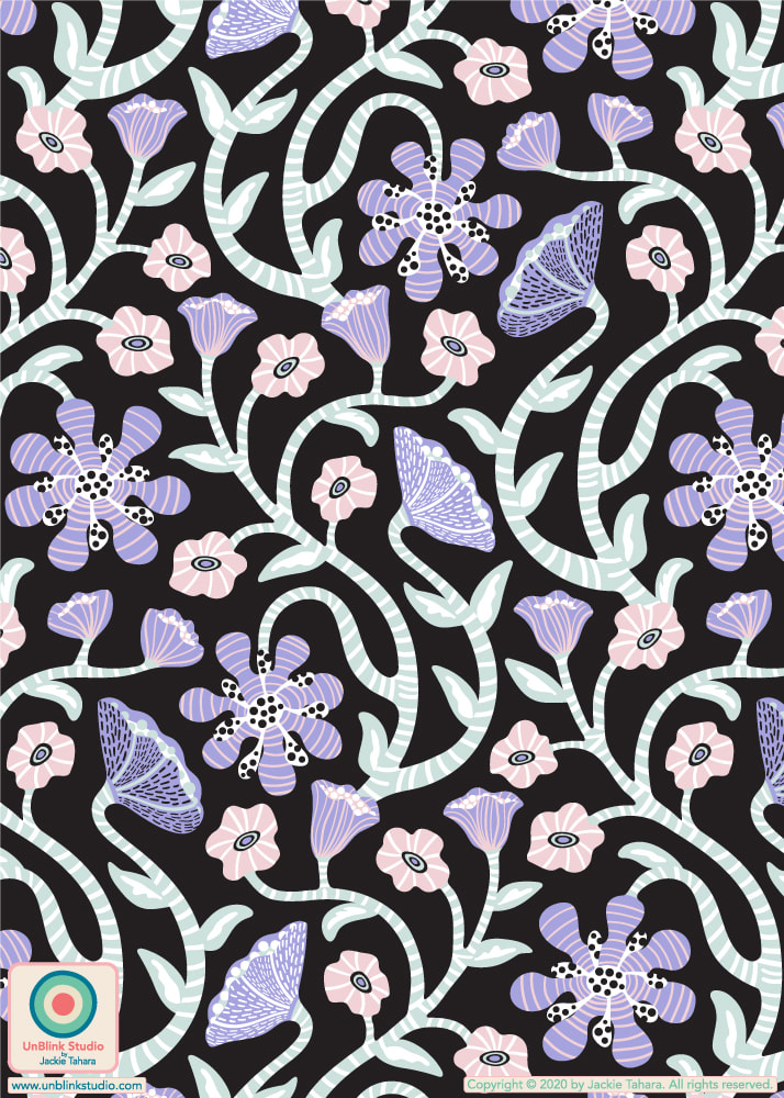 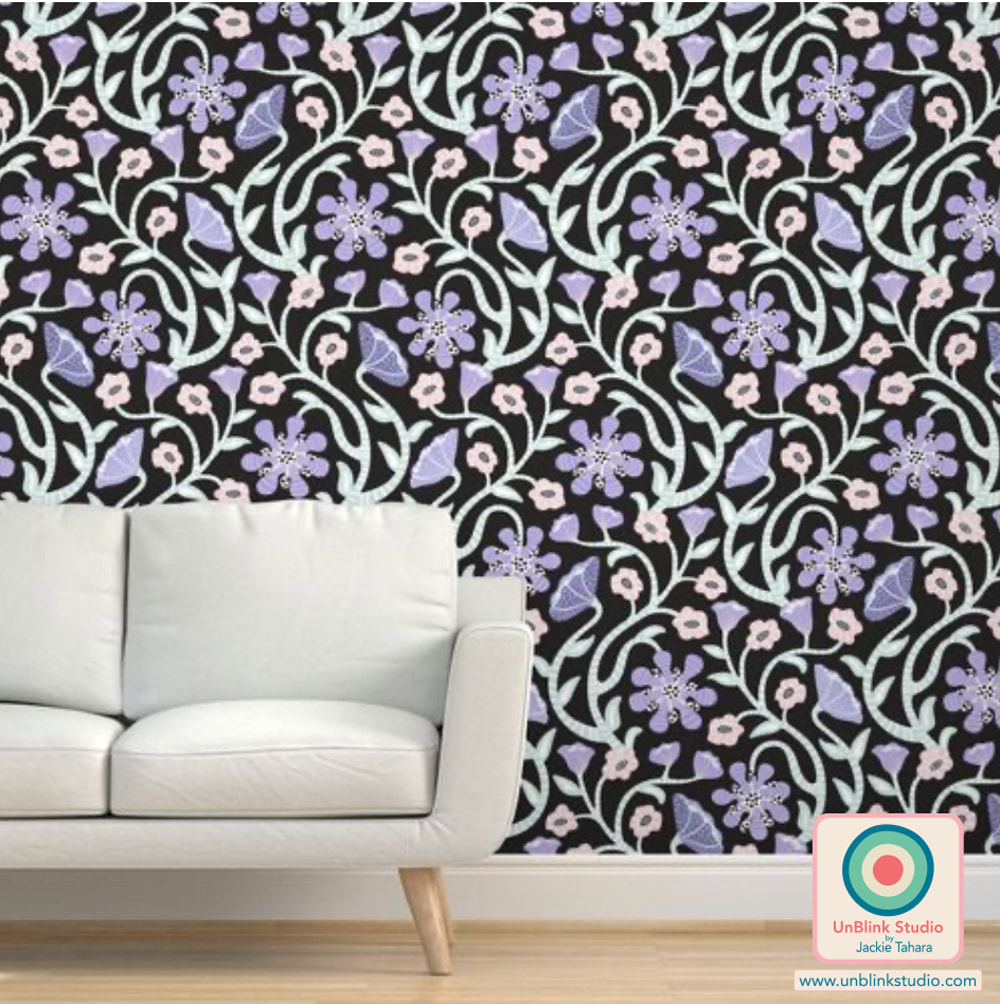 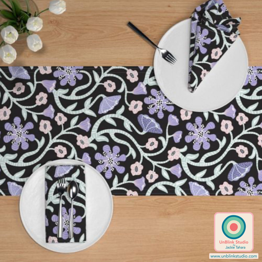 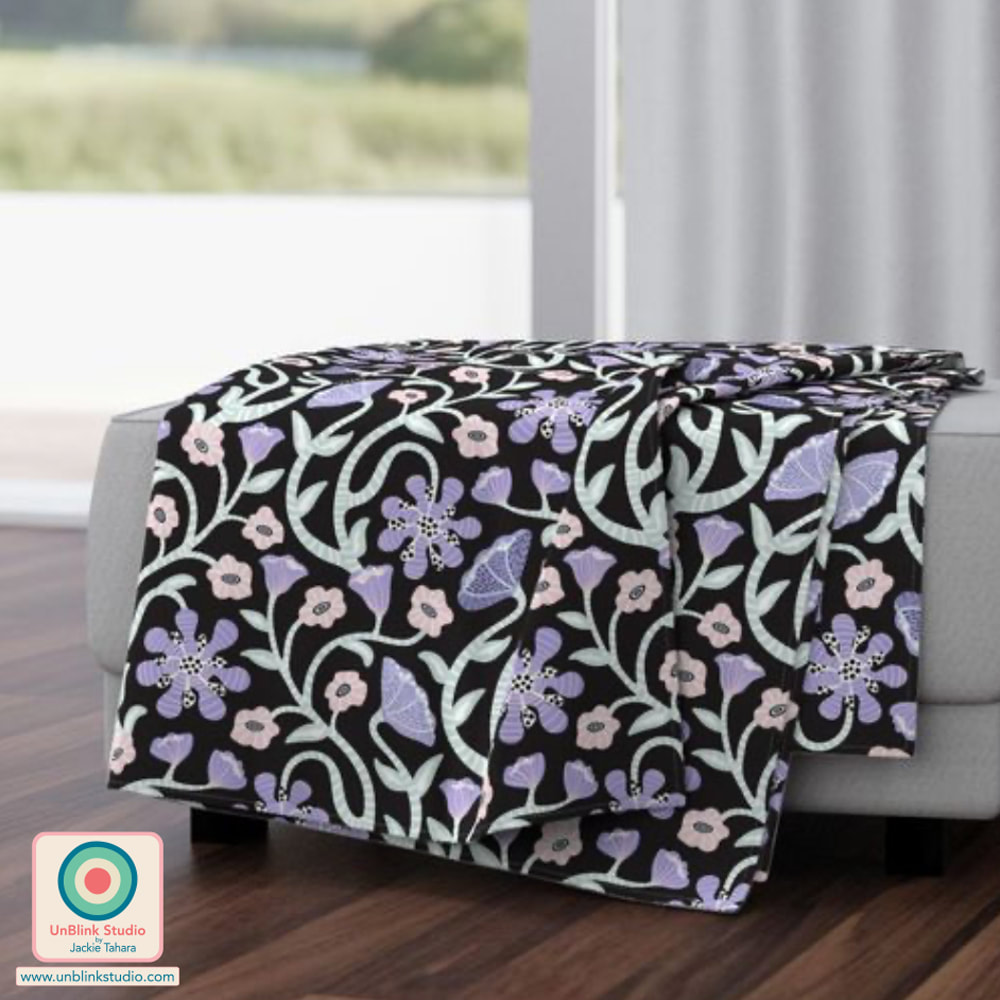 If you know me, you probably realize that I don't really do "neutral" alot! So when I saw this week's Spoonflower Design Challenge is "Neutral Botanicals Grasscloth" Wallpaper, I felt some chagrin. But I rose to the occasion and created my "Gladiolus Garden" design in warm neutrals...And you know what? I like the soft colours! Then I realized: Neutrals Are Colours Too!! . OF COURSE, there is a more brightly-coloured version of this design in my Spoonflower Shop too, see below! If you want to check out the entries, head to the Voting Page! And if you would like to see these designs in my Spoonflower Shop, check them out (and other co-ordinating designs) in my "Abstract Floral" Collection!
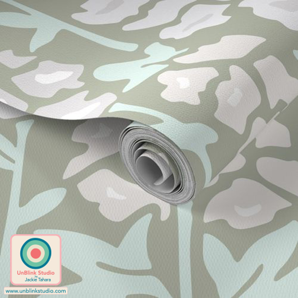 I'm participating in a very fun and inspiring pattern design project which is launching today...the "Collectively Independent Spring 2022" Collection on Spoonflower! For this project, 59 Designers from 14 Countries used 1 Colour Palette to create 1079 (!) Pattern Designs, all organized into 6 Sub-Collections: HERO PATTERNS, FLORALS, BASICS, PLAID, BLENDERS and CHECKS. Because each of us pattern designers had the freedom to design whatever we wanted to fit within each Sub-Collection (each designer was limited to 5 designs per Sub-Collection), there's a fabulous mix of themes and styles (I have my eye on some favourites!), but all are united by the single chosen colour palette. So it's a snap to MIX & MATCH different patterns for your next project, whether you need Fabrics, Wallpaper or Home Decor! There really is something for every taste! I might suggest you have a look at the HERO PATTERNS and FLORALS first, then start adding BASICS, PLAID, BLENDERS and CHECKS to round out your project. And maybe you should "limit" your time since once you start looking you might not be able to stop! Have FUN! THE COLOUR PALETTE The chosen colour palette consists of 7 beautiful colours. Some designers used all 7 colours in their designs and some used only a few. To see more from the Designers, be sure to check out #designerspr22 on Instagram! 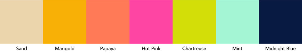 HERO PATTERNS Here are the 5 patterns I submitted to the HERO PATTERNS Sub-Collection which also contains handy and useful Solid Colours too! Check out the HERO PATTERNS Sub-Collection HERE!
FLORALS Always one of my favourite themes, check out the designs I submitted to the FLORALS Sub-Collection! Check out the FLORALS Sub-Collection HERE!
BASICS and PLAID The BASICS Sub-Collection includes Geometrics, Stripes, Chevrons, Dots, and the like. Have a look at the BASICS Sub-Collection HERE and the PLAID Sub-Collection HERE for some beautiful co-ordinating patterns!
I didn't submit designs to the BLENDERS and CHECKS Sub-Collections, but be sure to check them out too! The Spoonflower "Collectively Independent Spring 2022" Collection
FAST FACTS: 1 Colour Palette 7 Colours 59 Designers 14 Countries 1079 Designs 6 Sub-Collections Be sure to check out #designerspr22 on Instagram for more! If you create something with any of the designs in this "Collectively Independent Spring 2022" Collection, please do tag me @unblinkstudio or send me a pic so I can see the results! Happy choosing and creating! So I must admit to some chagrin when I saw that this week's Spoonflower Design Challenge was "Pockets". I mean...What to do with this one?! I procrastinated for awhile, and then some more, then sat down and started making random pocket shapes, then added some "lace", then I decided I needed some bright colours, then thought pockets full of flowers might be fun...And after ALOT of fiddling around with placement, colours, wavy stems, and finally, adding some polka dots...Here is my "Rainbow In My Pocket" design. I entered the first version with the dark background, but did add both colours to my Spoonflower Shop in 3 sizes! What do you think, did I enter the right one?! 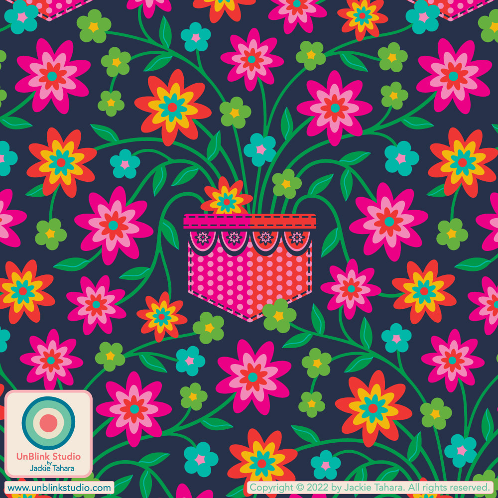 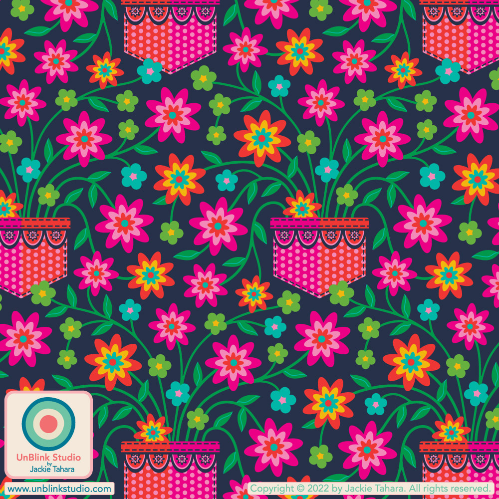 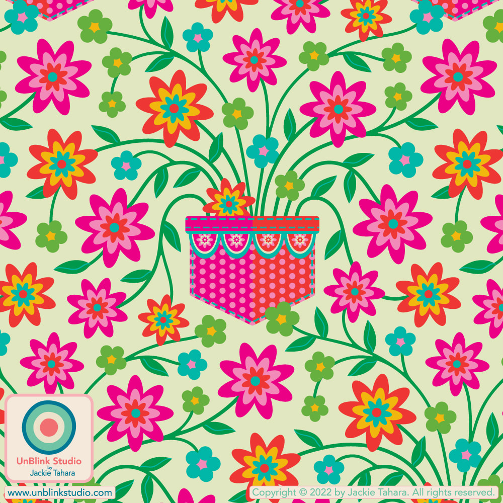 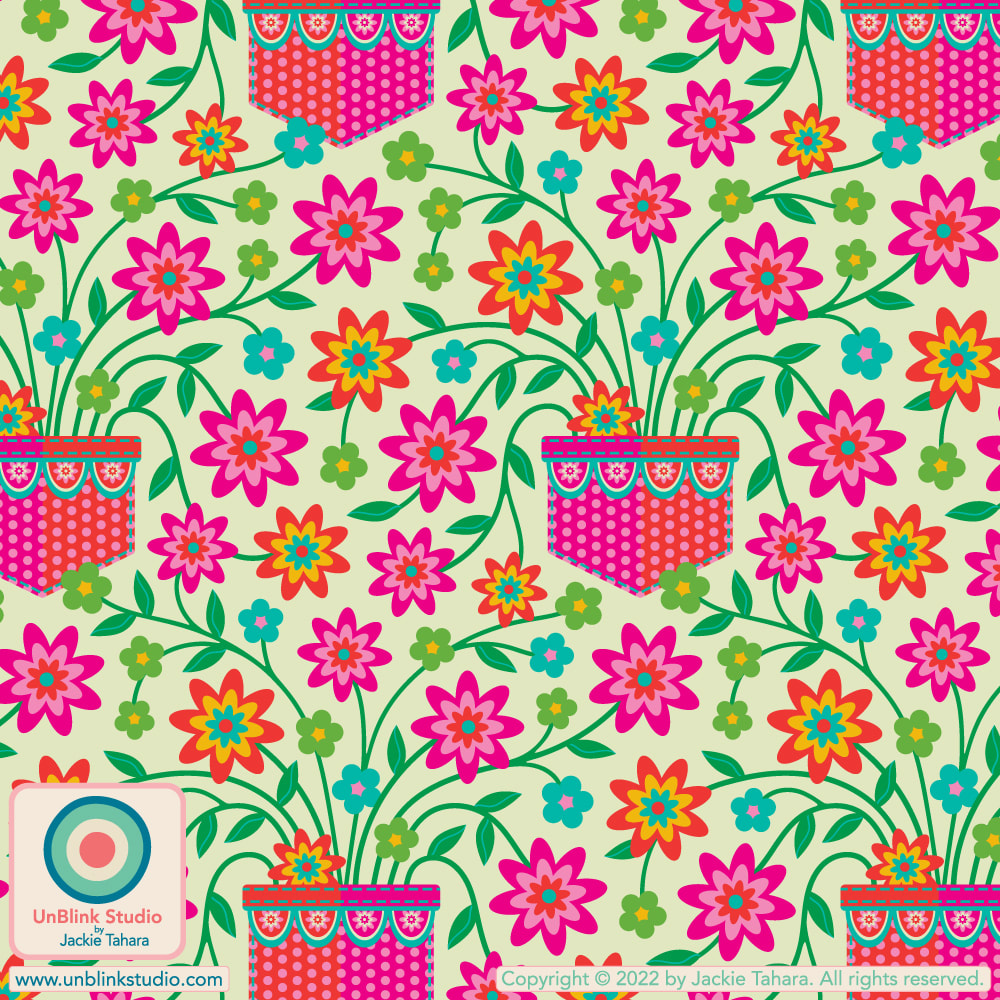 |
AuthorJackie Tahara of UnBlink Studio Archives
May 2024
Categories
All
|
 RSS Feed
|
|
|
|
|
|
All images on this website are Copyright © Jackie Tahara. All rights reserved.
If sharing, pinning or blogging my images, please always credit me and link back to my website. Supporting artists is a good thing to do! Thank you!
If sharing, pinning or blogging my images, please always credit me and link back to my website. Supporting artists is a good thing to do! Thank you!