|
Victoria Johnson's excellent 5-week course "Create Collections" finished today. I really recommend this course if you are a surface pattern designer who wants to create gorgeous pattern collections (who of us doesn't?) for fabrics, home decor, etc. It is well-paced and really teaches how to focus and think about every step that goes into creating a collection: colour palettes, designing placement prints, understanding secondary and coordinate patterns. If you are interested in learning more about Victoria's courses, check out Victoria Johnson Create Explore! Meanwhile, here is a peek at the collection I designed during the course! 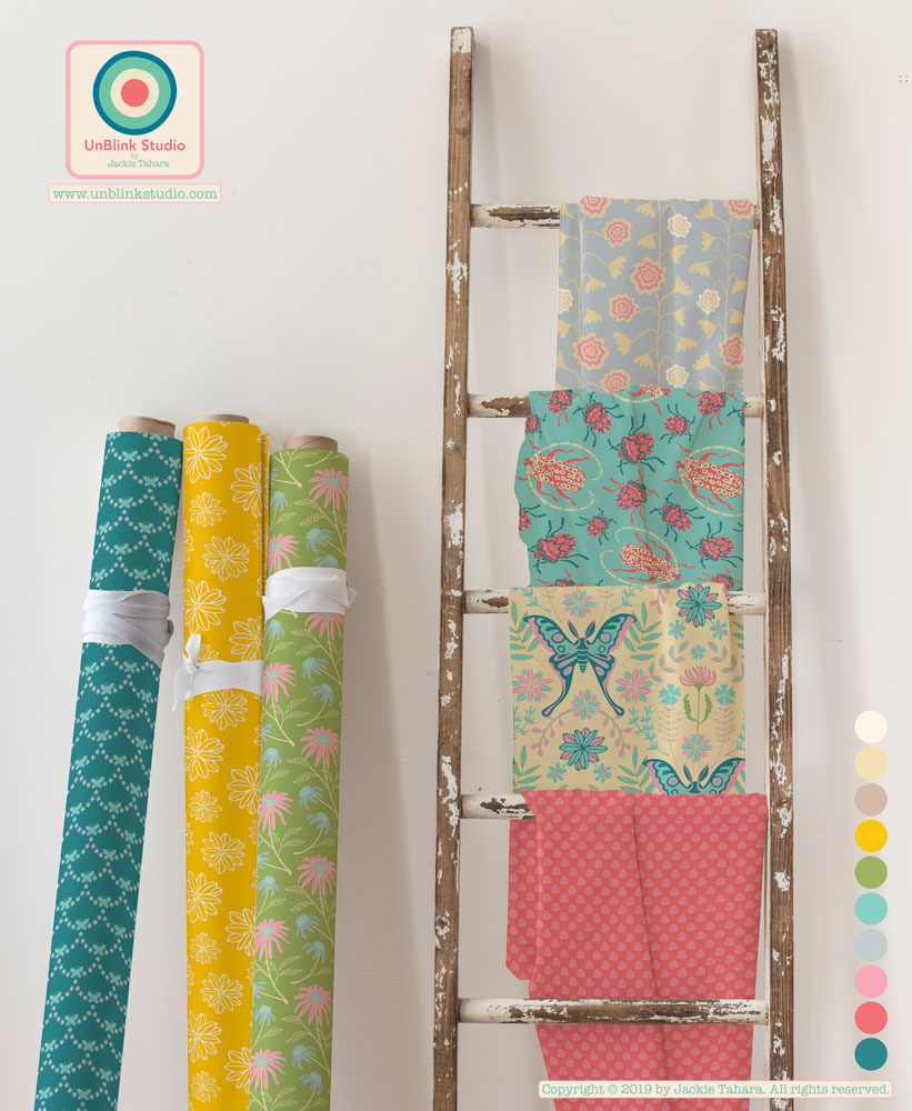 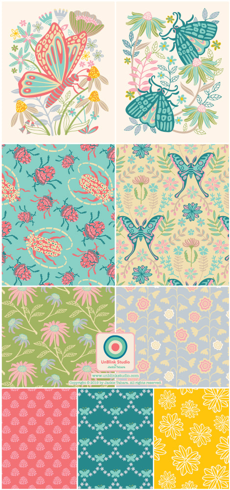
0 Comments
Remember Black Velvet Paintings? This Week's Spoonflower Design Challenge is "Paint By Numbers"!5/30/2019 I decided to enter my "Pink Flamingos" pattern design in this week's Spoonflower "Paint By Numbers" Design Challenge because it reminds me of all those black velvet paintings...remember those? You can link to the Voting Page here to see all the entries! 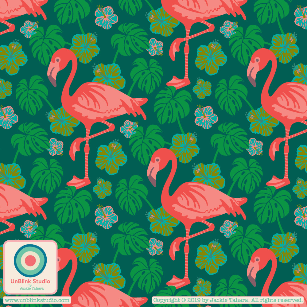 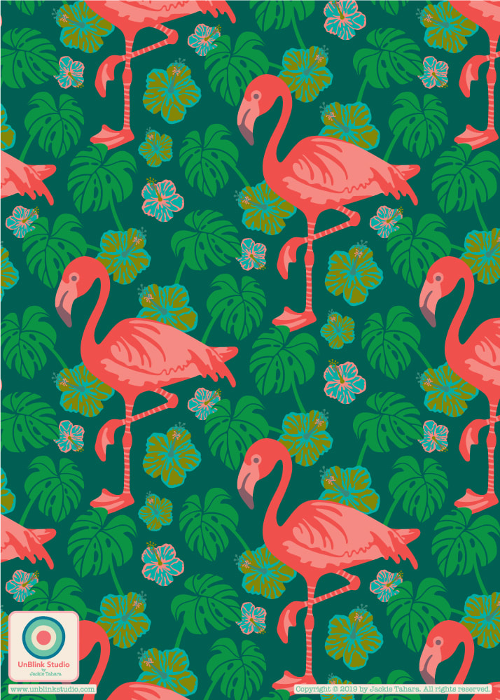 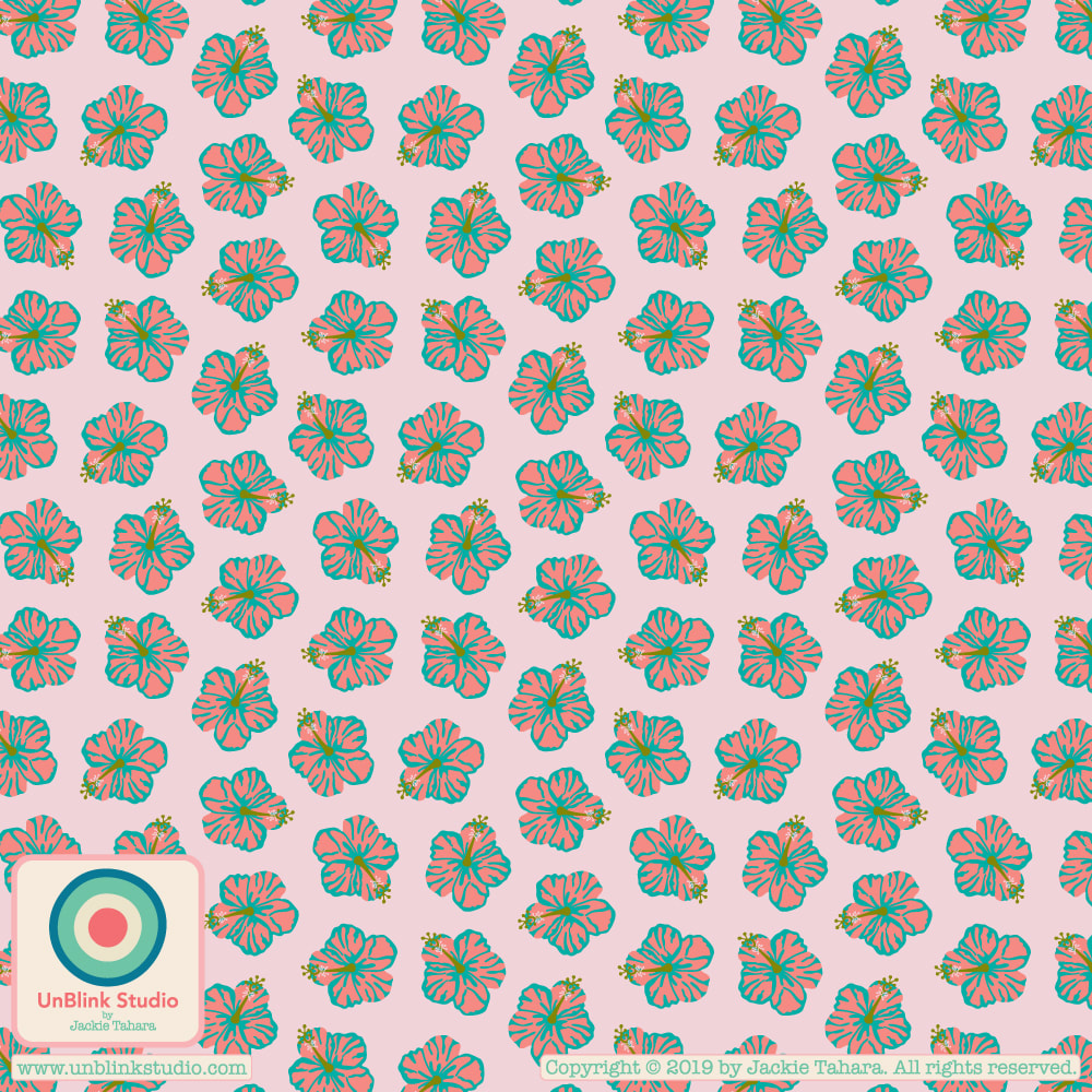 Here is the start of a new pattern design collection that I am going to call "Celestun" because it was influenced by the trip I took a couple years ago to Merida in the Yucatan, Mexico. Nearby is the Celestun Biosphere Reserve where flocks of wild pink flamingos feed on shrimps that live in mangrove forests along the Ria Celestun.
One thing that is great being a member of The Colour Gang is it makes you think about colour palettes and how re-colouring existing motifs can really revise an older pattern design into something fun and new! As an example, I recoloured my "Coastal Critters" motifs (originally designed as placement prints for round plates!) and used them to make some eye-catching, sea-themed repeat patterns. I did try to put all 3 creatures into a single design, but that just didn't work. I also tried using differently coloured creatures in a single design (I tried so many combos) but that didn't sit well either. Sometimes simpler is better. So I finally realized that making 3 separate designs, each with its own creature and monochromatic colour scheme (based on my Japan-inspired "Neon Nights" colour palette from a few posts ago), somehow worked the best, in my opinion! Now I love these! So here they are..."Blue Jellyfish", "Pink Squid" and "Green Octopus"! I hope they make you smile! 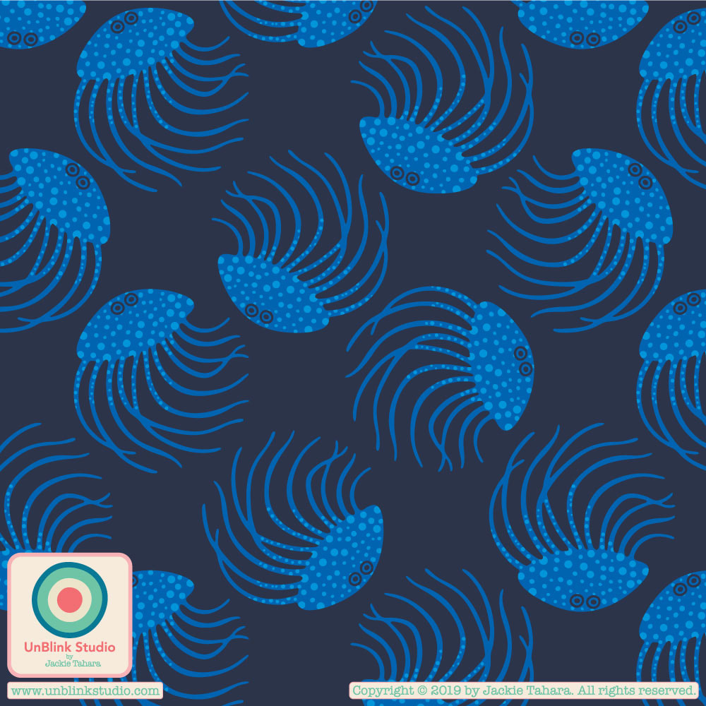 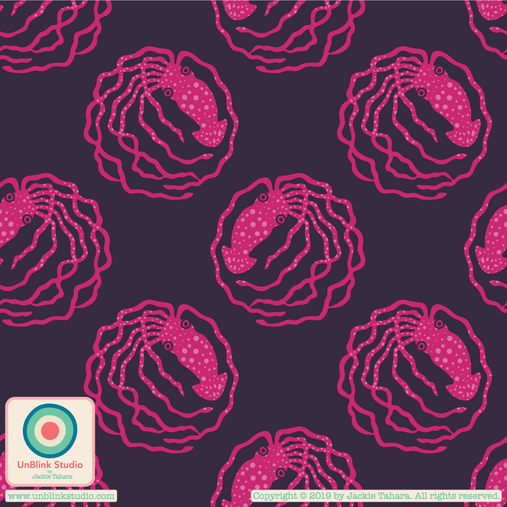 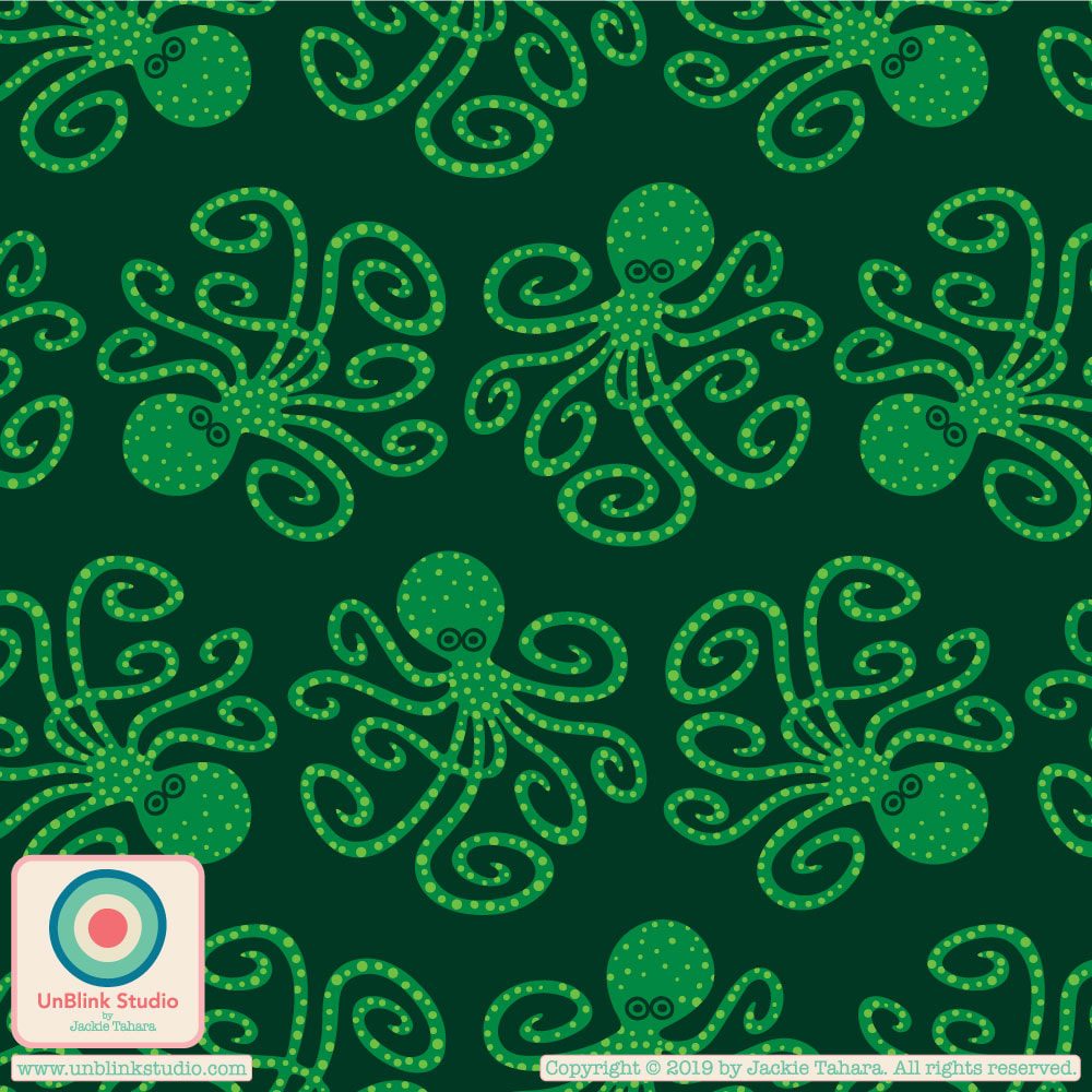 A couple of weeks ago in the Colour Gang, the creative challenge was to create a tropical-themed pattern using one of 3 (or all 3!) colour palettes given. The one I decided on was called "Midnight Forest"...featuring dark grounds, exotic forests and their inhabitants. So here is my brand new "Dream" pattern design...can you spot the "inhabitant"? 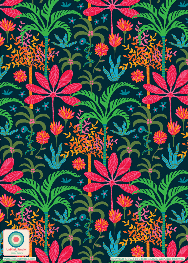 Now that the portfolio-building course FolioFocus 2018 is over (alas!) I decided to just design something I wanted to, with no particular brief/trend/theme in mind! So here is my new "Fanciful" Collection...love these colours. I never thought I liked brown much, but I do like the earthiness of this colour palette! How about you? 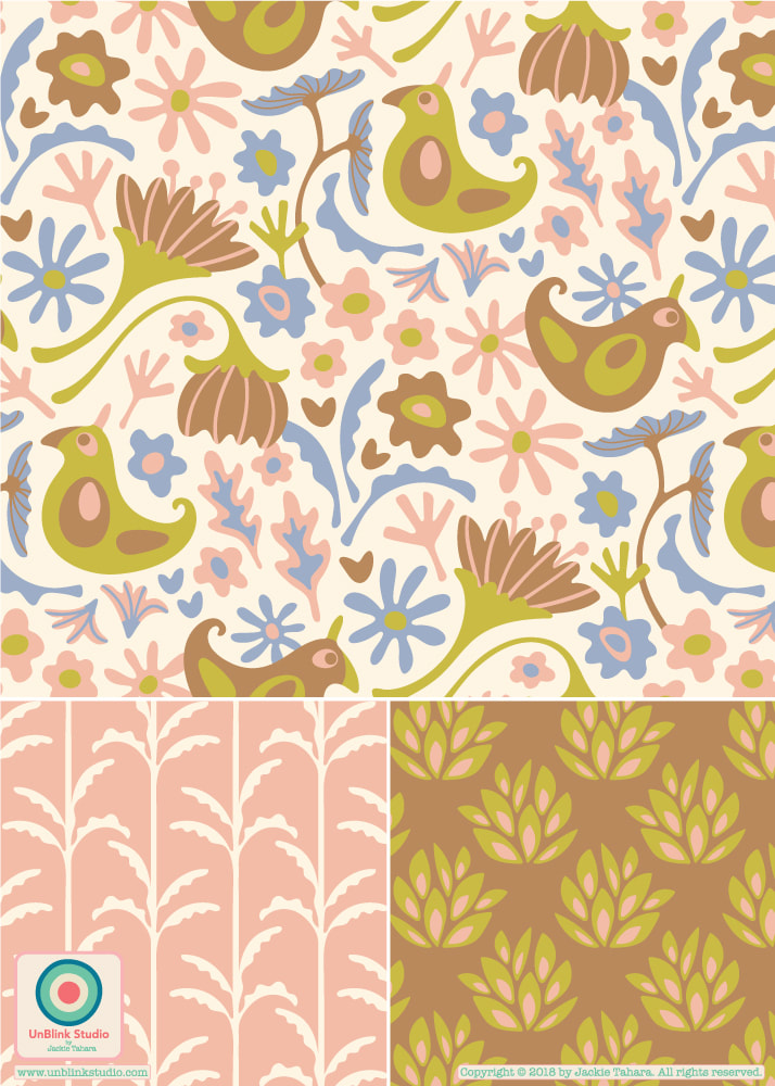 This week's brief in Folio Focus 2018 was to create some fun farmyard characters...So here is my "FAMILY FARM" collection of pattern designs featuring affectionate roosters, hens and cute little chicks! I can see these guys on some fun kitchen linens, stationery or childrens wear! Contact me if you would like to license these designs! To see all my newest pattern designs, I also invite you to check out my IG at: https://www.instagram.com ! 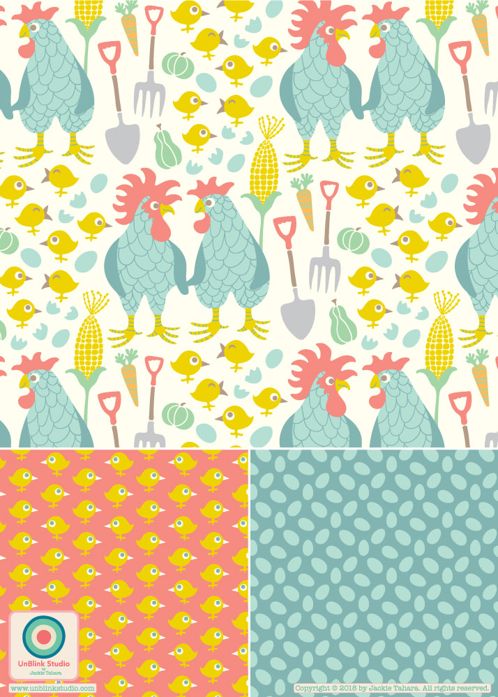 I've still been working on this week's "AstroSynergy" brief for FolioFocus2018. Here is the next in my Signs of the Zodiac series, "Aries" (see my earlier post for "Taurus"), again with a placement print and several repeat pattern designs. I would like to create a collection for each Sign of the Zodiac, each with its own unique colour palette and motifs, but also have all the different collections working together. Are you an Aries? Would love to hear what you think of this one! Do they work together? 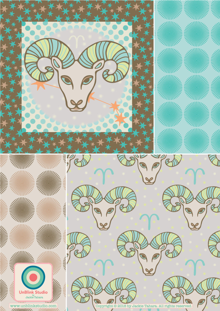 This week's brief for FolioFocus 2018 was "AstroSynergy"! So I decided to design some Signs of the Zodiac, starting with "Taurus". Here is a collection with a placement print and several repeat designs. I might try and do "Aries" next...Are you a Taurus?! This collection would be wonderful on bedding, as shown! 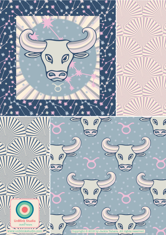 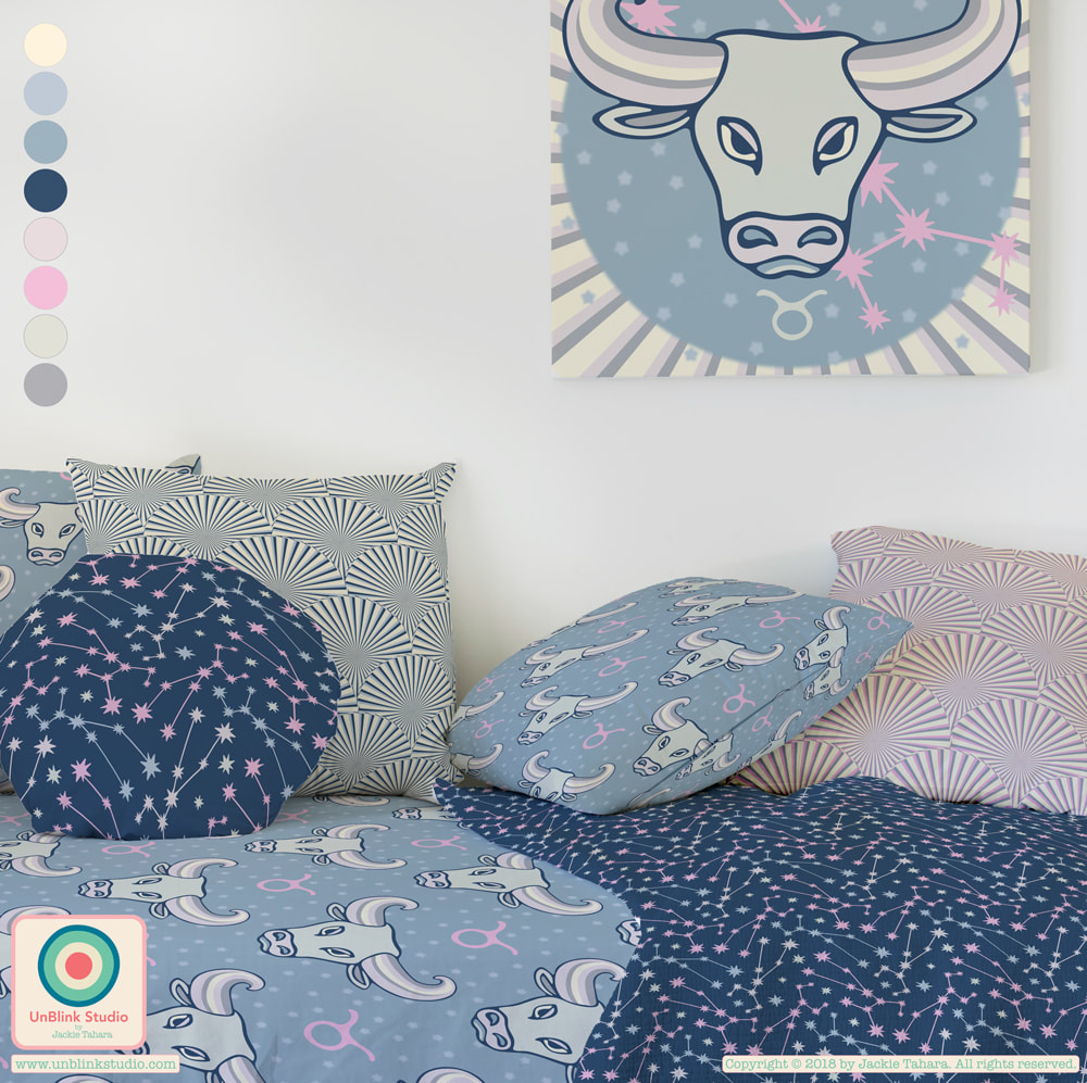 Working with some new colour palettes I created while doing a creative exercise in the Colour Gang yesterday, I created this new UNICORN design with a couple of coordinates! This mini-collection is available to license! 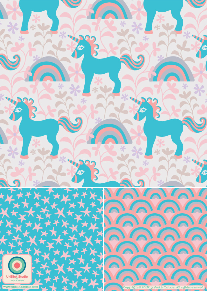 Someone commented that they thought my "Snake Eyes" pattern and coordinate (in that Pop Brights Retro colour palette) would look great on notebooks, so here they are on a journal set! What do you think? BTW: I couldn't resist trying out my "Chirp Chirp" pattern design on a journal set as well! 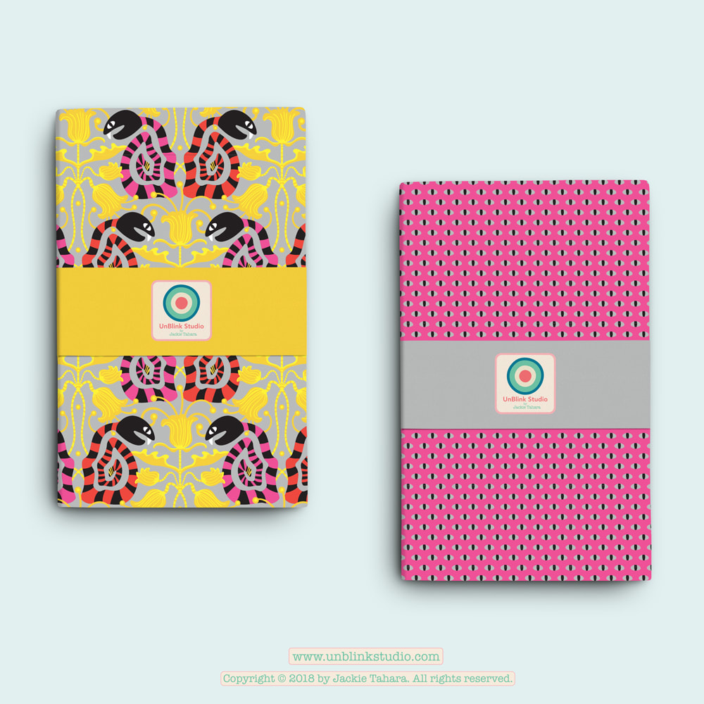 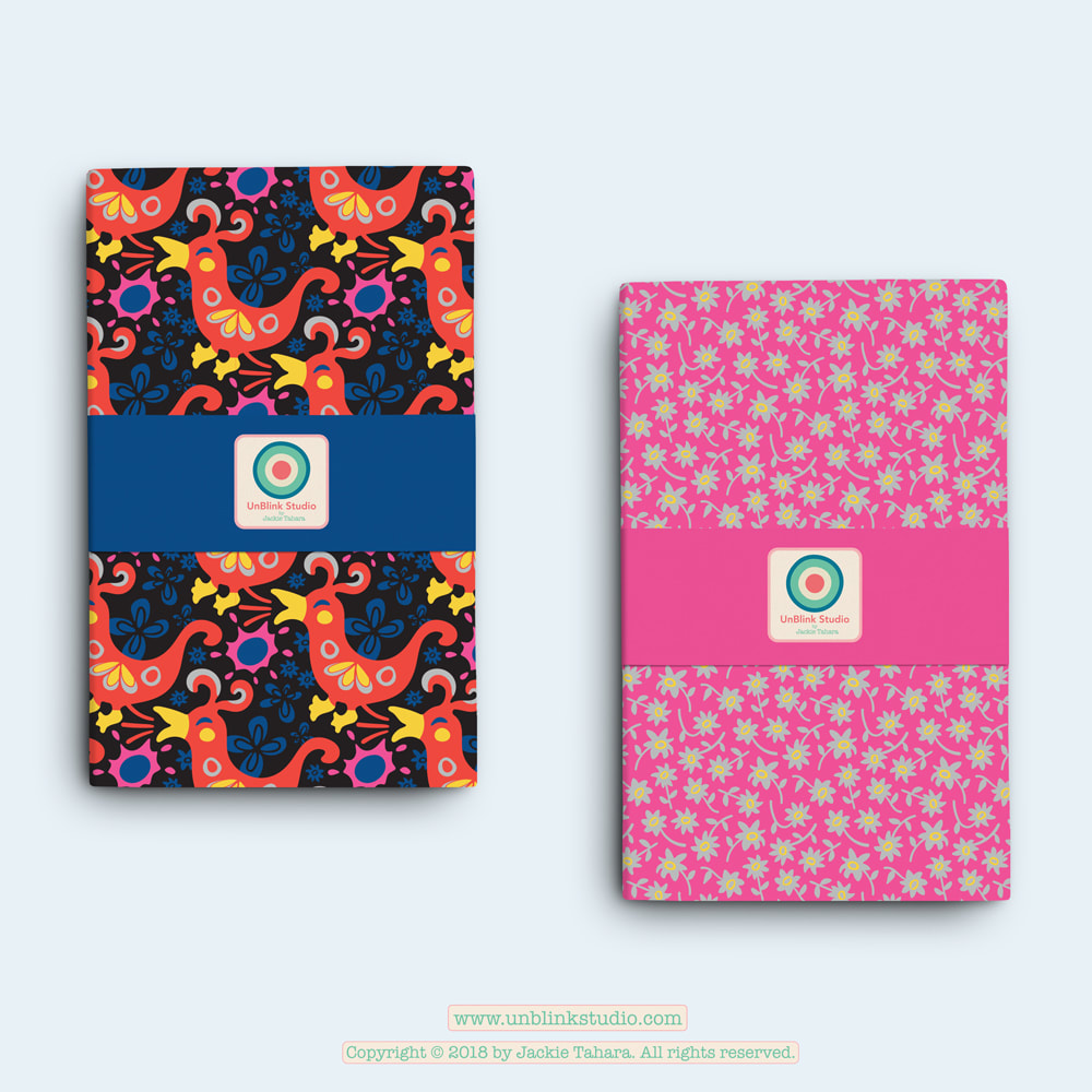 Oh, I am having so much fun with that retro pop brights palette suggested by the Colour Gang! So here is another new pattern I call "Snake Eyes" with coordinate. Do you think it's a bit weird? What types of products would you see this one on??! 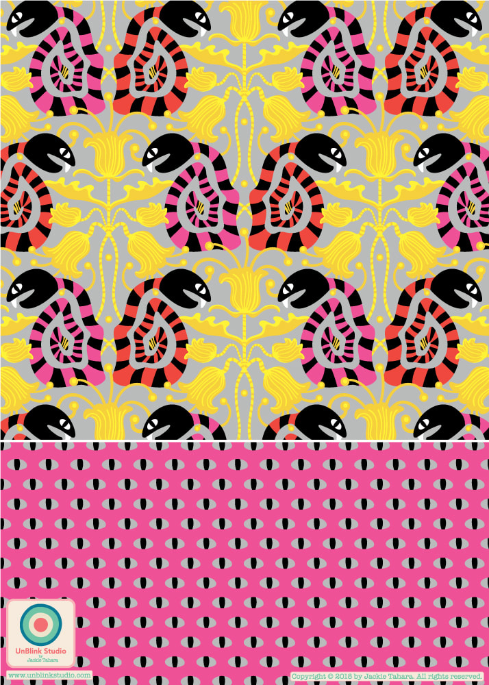 Had a great time with the two Retro Colour Palettes from last week's Colour Gang creative challenge...Earthy and Pop Brights! Here is a new pattern I am going to call "Chirp Chirp" (with coordinates). Please do tell me which one you like best! I'm on the fence with this one! 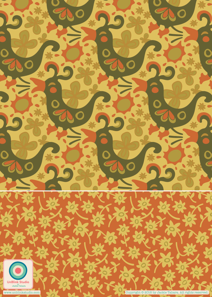 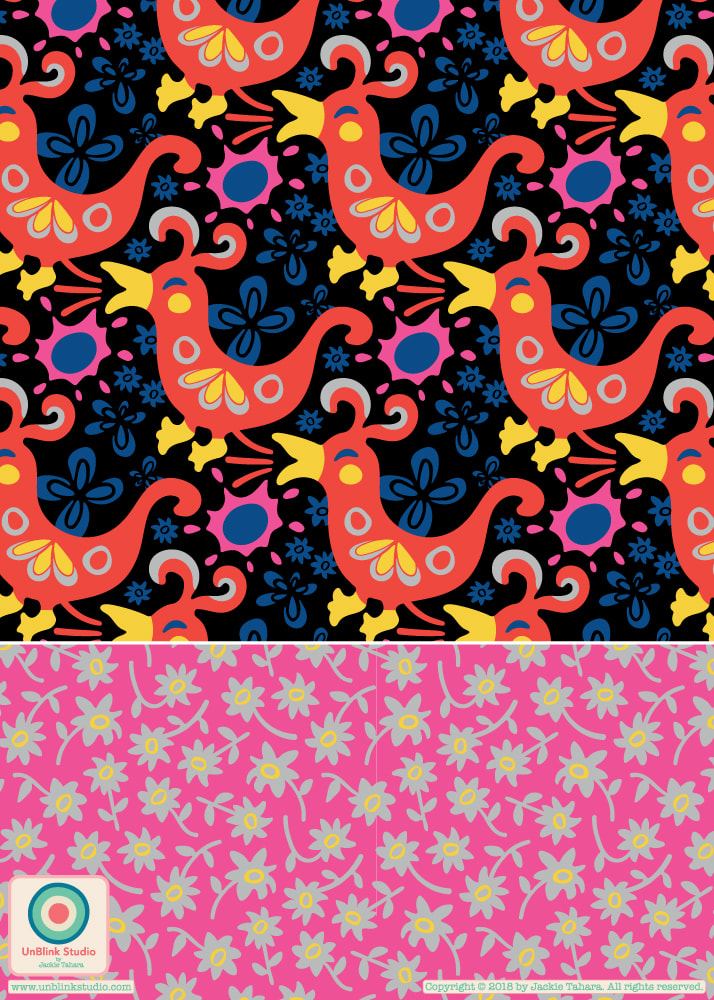 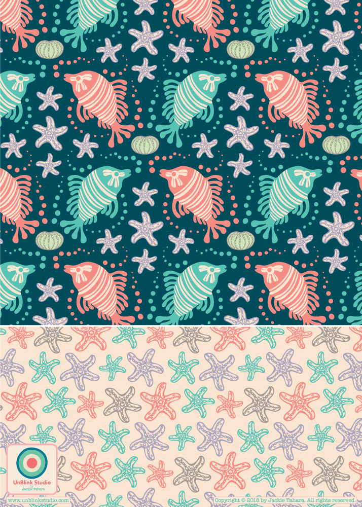 Just wanted to share the beginnings of a new collection I am calling "Little Grunt Sculpin". Grunt sculpins are one of my favourite fishes, they are super funny and cute! I suggest checking them out on Youtube. They are sometimes called "bizarre" and "ridiculous" and don't really swim but rather scoot along the sea bottom!
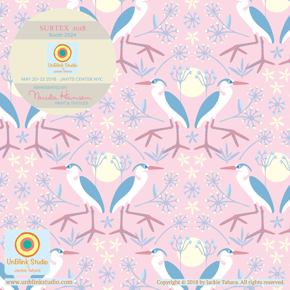
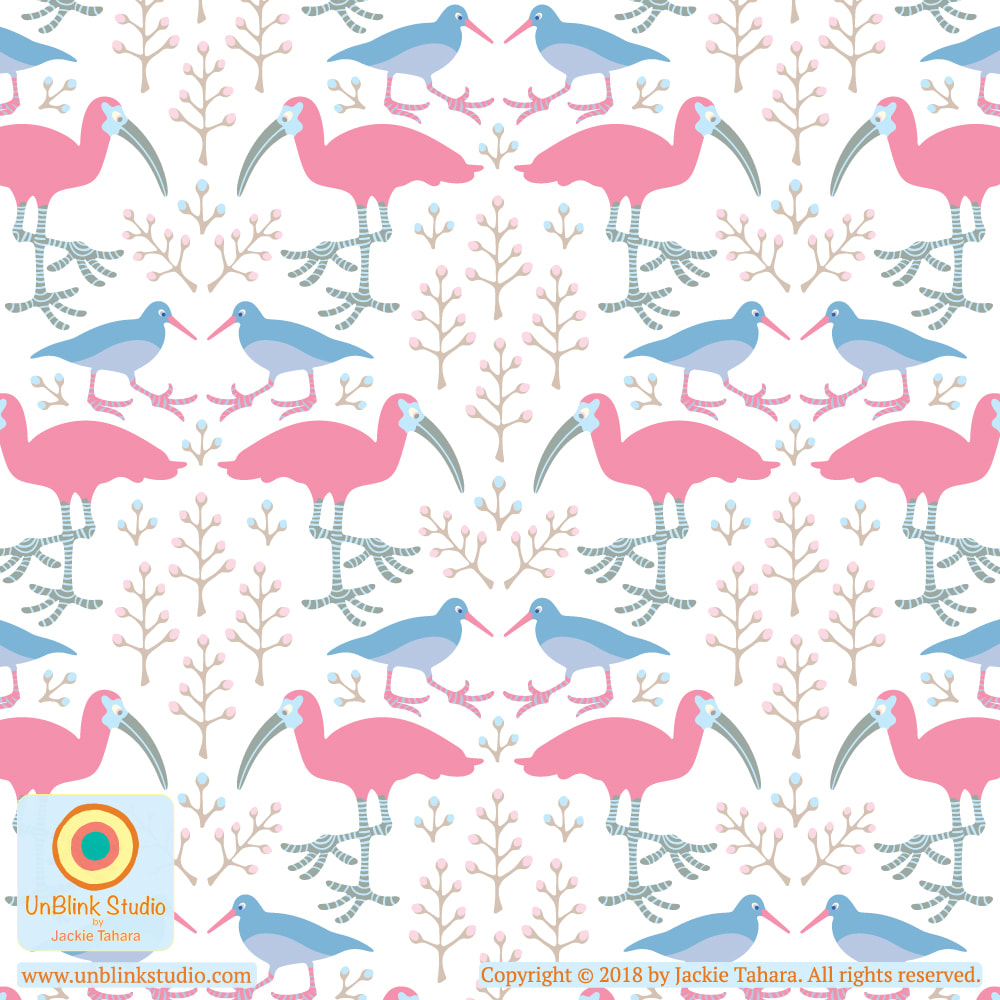
I love birds with BIG FEET! So I've been working on my pattern designs featuring water birds...herons, oystercatchers and scarlet ibis! This collection will be available at both Surtex and Blueprint Show 1 this May in NYC where I will be showing with Nerida Hansen Print & Textiles! If you want to see some of the coordinates in this collection, check out my Fauna page in my Portfolio! Happy Weekend everyone!
|
AuthorJackie Tahara of UnBlink Studio Archives
April 2024
Categories
All
|
 RSS Feed
|
|
|
|
|
|
All images on this website are Copyright © Jackie Tahara. All rights reserved.
If sharing, pinning or blogging my images, please always credit me and link back to my website. Supporting artists is a good thing to do! Thank you!
If sharing, pinning or blogging my images, please always credit me and link back to my website. Supporting artists is a good thing to do! Thank you!