|
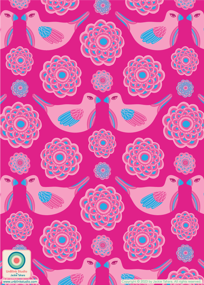
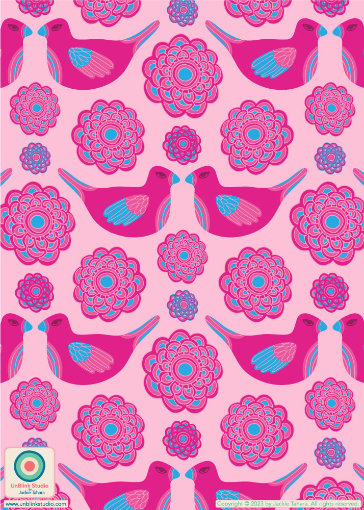
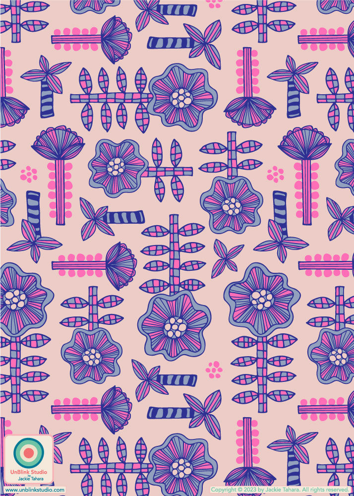
I’ve entered my “Lovely” design in this week’s Spoonflower “Cute, Cuter, Cutest Kids Sheets” Design Challenge! I entered the first Light Pink on Dark Pink version but it's also available in another (also Pink!) colour option too, see below! Can you guess which recently-released movie influenced the colour palette? You get ONE guess! Public voting closes tomorrow August 8 (sorry for the late notice, I've been on vaca)! You can check out all the entries at the Voting Page HERE. And if you'd like to channel your inner [insert answer to my question here], you can now purchase these designs in 3 sizes in my Spoonflower Shop on Fabrics, Wallpaper and Home Decor! Answer to my question: Barbie (of course)!
0 Comments
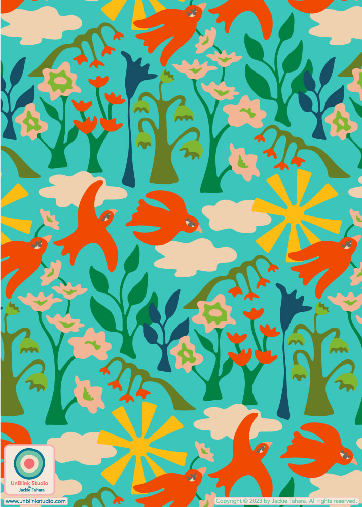
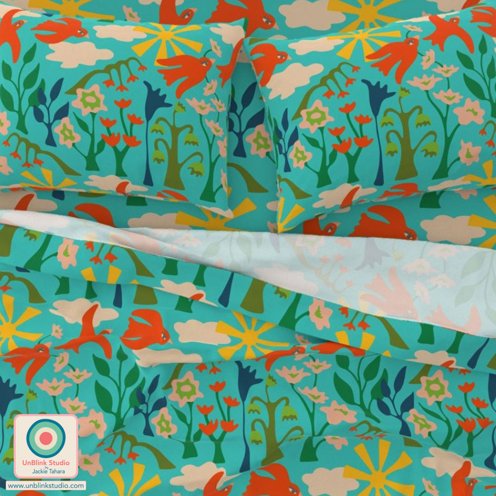
I know I'm getting a bit ahead of myself, but I've managed miraculously to get a bit ahead of things here in the studio for next week's Spoonflower "The Skies Above Bedding" Design Challenge! So I've just entered my "Daydream In The Garden" design, it's very dreamy, happy and colourful! The idea was to re-create the feeling of gazing up into the Summer sky while daydreaming in the flower garden!
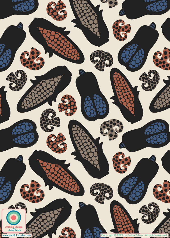
Public voting for this Challenge opens Thursday July 27 and you can link to the Voting Page HERE! If you'd like to SHOP this design in my Spoonflower Shop on Fabrics, Wallpaper and Home Decor, it's now available in 3 sizes. Check out the Large-Scale version HERE which I think just might be best for bedding! For this week's Design Challenge, Spoonflower is partnering again with East Fork Pottery to challenge artists to create designs for Autumn table linens, using only two or more of East Fork's core glaze colours: Amaro, Blue Ridge, Morel, Black Mountain, Eggshell and Panna Cotta (love the colour names, btw)! So here is my entry: "Harvest Veg with Lotsa Dots"! I went for max graphic impact! Public voting opens today Thursday July 20 and I would love your vote for this one! You can link to the Voting Page HERE!
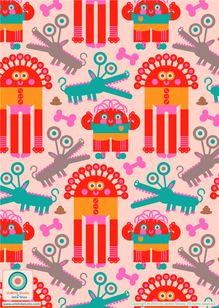
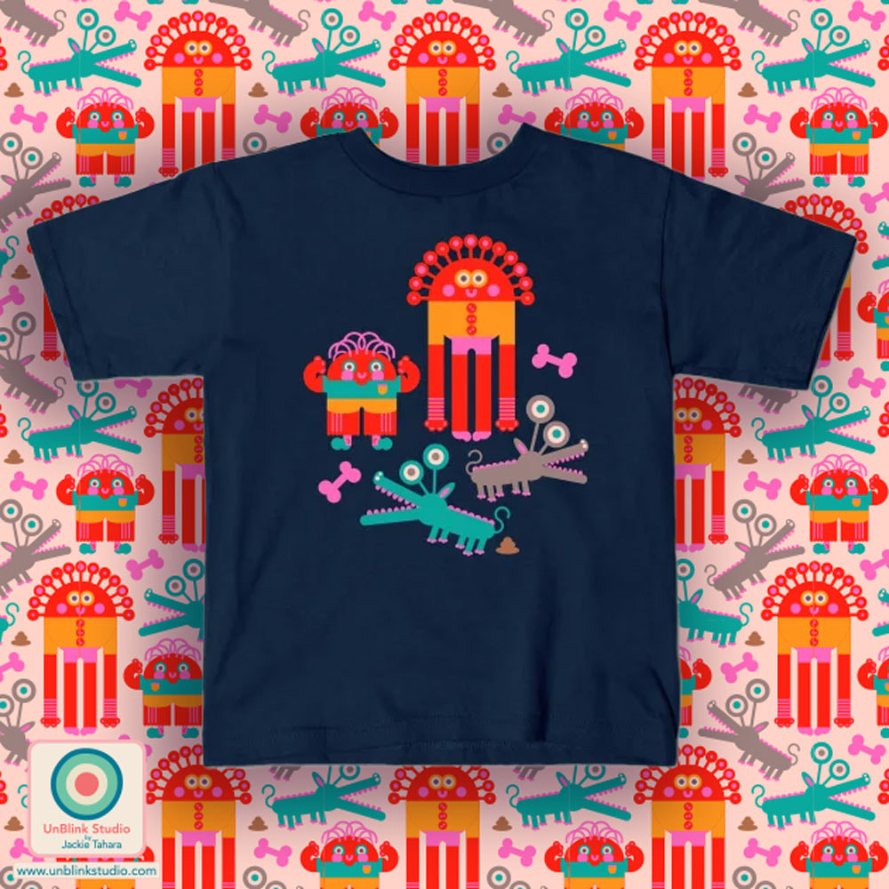
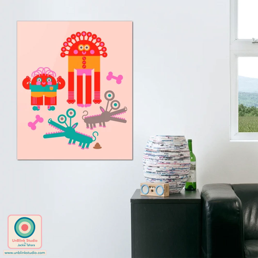
. AND CLICK the image below to see my "Harvest Veg With Lotsa Dots" design in my Spoonflower Shop where it's now available on Fabrics, Wallpaper and Home Decor! These cute Monsters have discovered that pets can sometimes have poopoo accidents! Ah well, they love their pets anyway! I entered my "Monsters and Their Pets" design in Spoonflower's "Monster Mash" Design Challenge! You can now purchase this design in my Spoonflower Shop on Fabrics, Wallpaper and Home Decor!
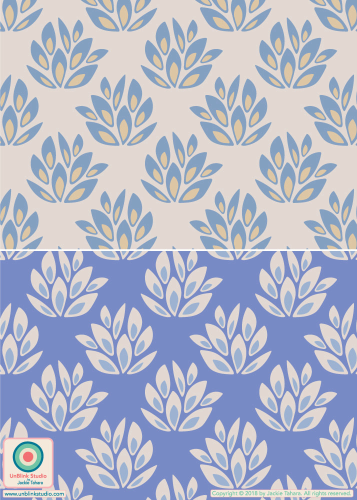
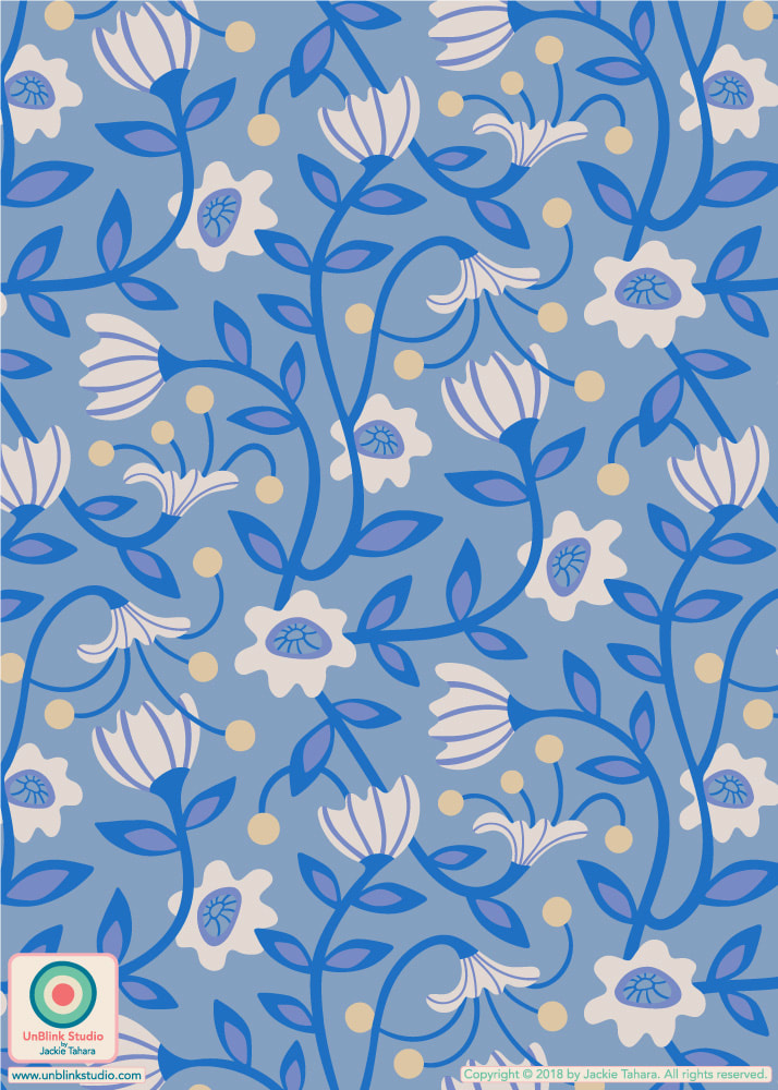
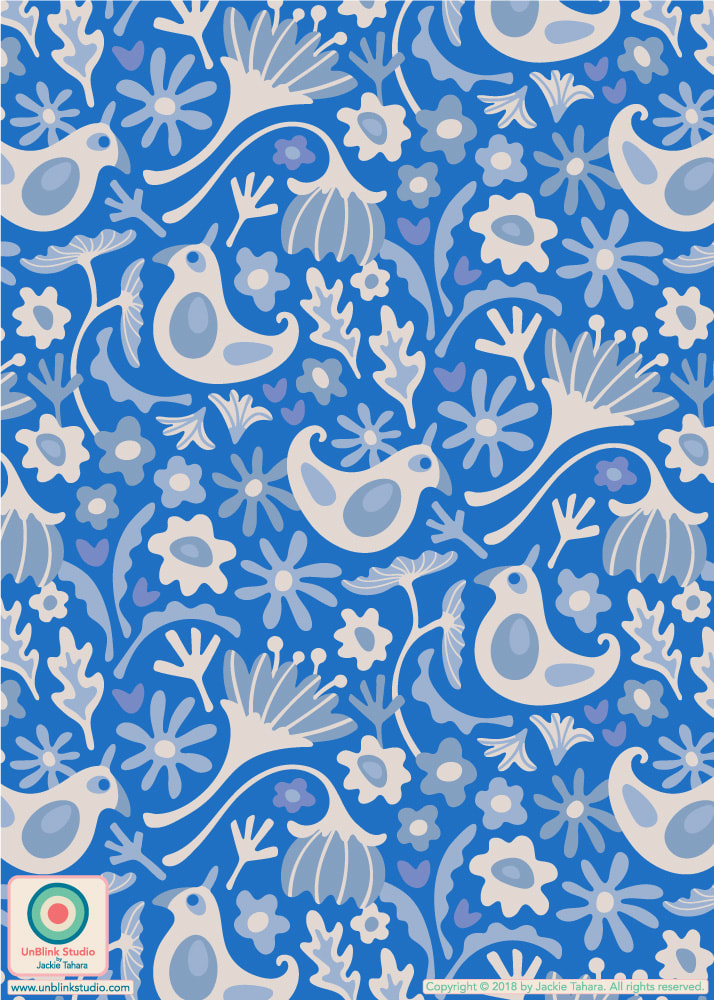
AND how could I resist?! This design is also now available on Graphic Tees, Wall Art, Totes and more in my TeePublic Shop AND on Lots of Other Products in my Redbubble Shop too! . DESIGN NOTE: For some reason (not sure why, really), I wanted to try out a design using just geometric shapes. So look closely….These guys are composed of just various shapes which I created by "adding" shapes together or "subtracting" shapes from other shapes! I very much enjoyed this process, it was actually quite Zen! And it was very fun discovering how little changes and details can add personality (check out the biceps on the little guy and the pigeon toes on the tall guy!)…I might have to try more of these! Another Catch-Up Post: My Entry for Spoonflower's "French Country Table Linens" Design Challenge!7/20/2023 I found it quite difficult to figure out what exactly "French Country" meant when it comes to pattern design (other than toile). I researched quite a bit and what struck me were the use of soft colours, especially blue and white. I hoped my "Thicket" design is French Country, at least in "feel", because I entered the Blue and White on Periwinkle version below in Spoonflower's "French Country Table Linens" Design Challenge (it also comes in the Blue White and Deep Cream version too)! And then I created my "Fanciful" Collection around this theme in Blue & White too! Have a look at the full "Fanciful" Collection on Fabrics, Wallpaper and Home Decor in my Spoonflower Shop! Each print comes in 3 sizes and there are co-ordinating solids too!
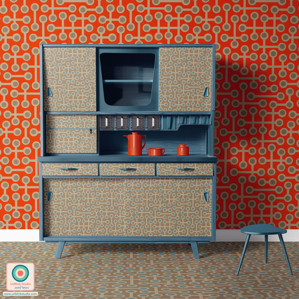
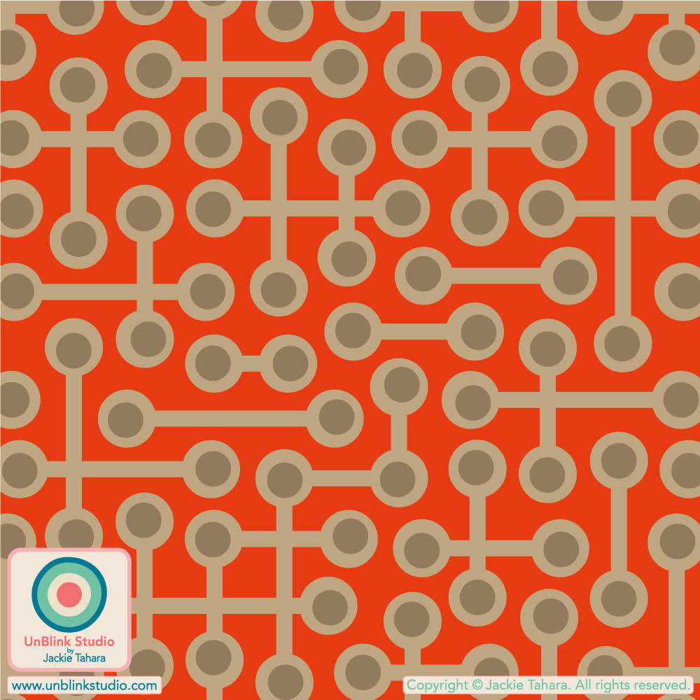
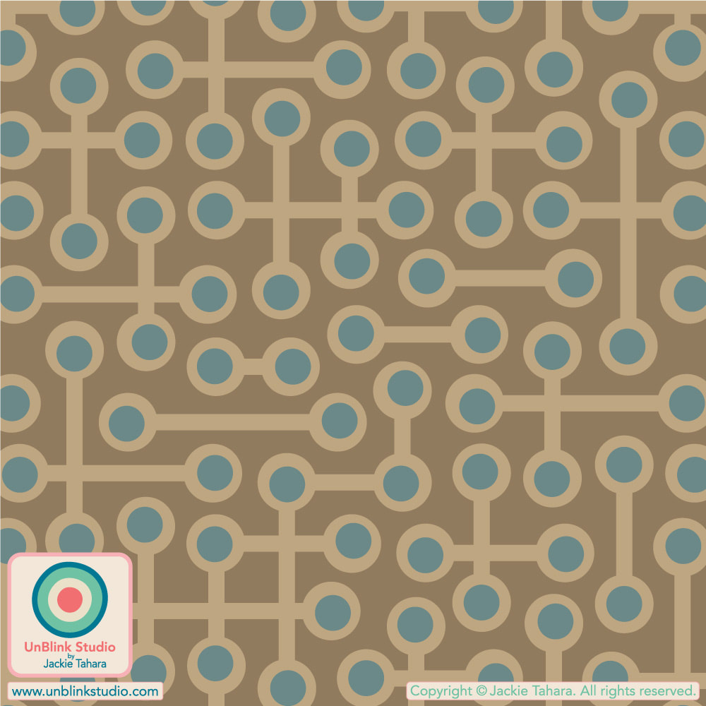
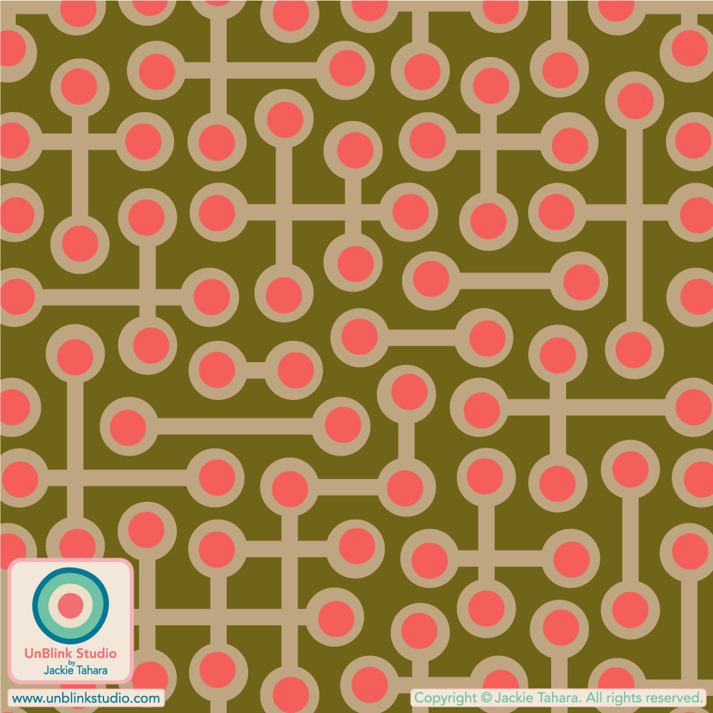
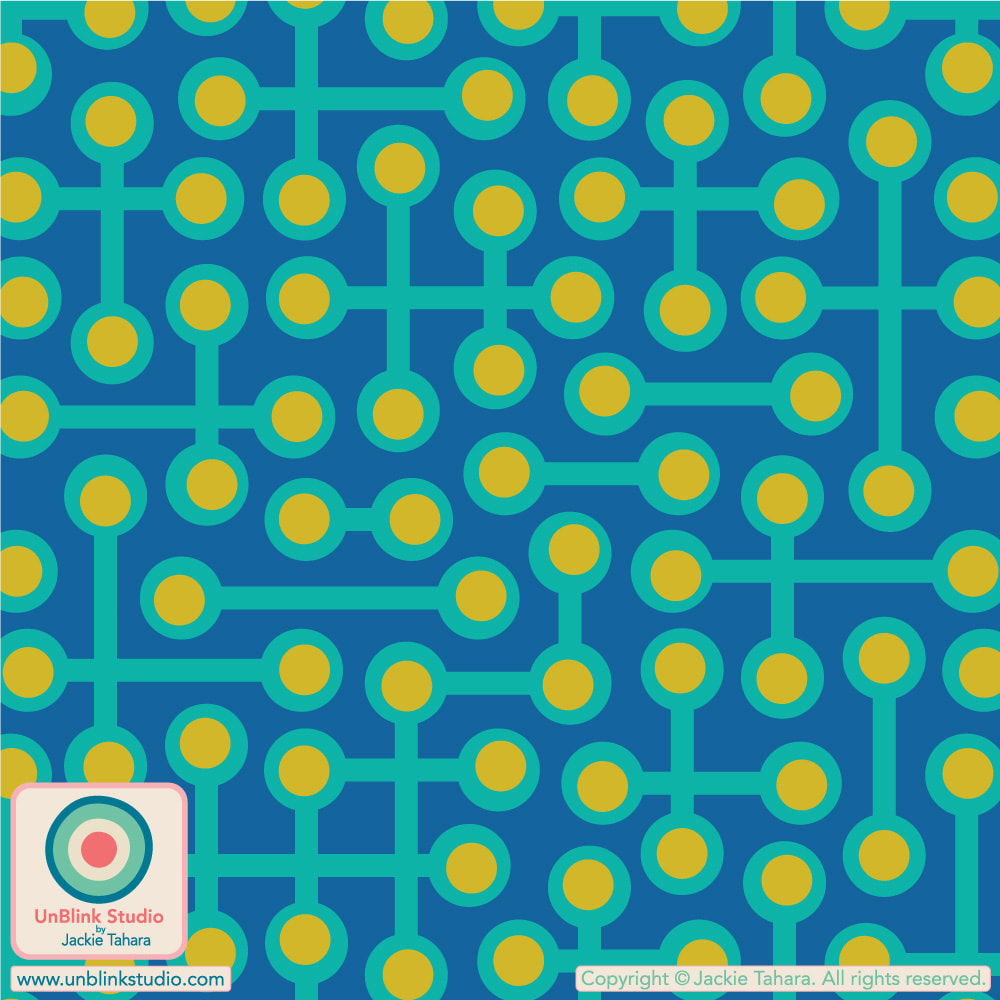
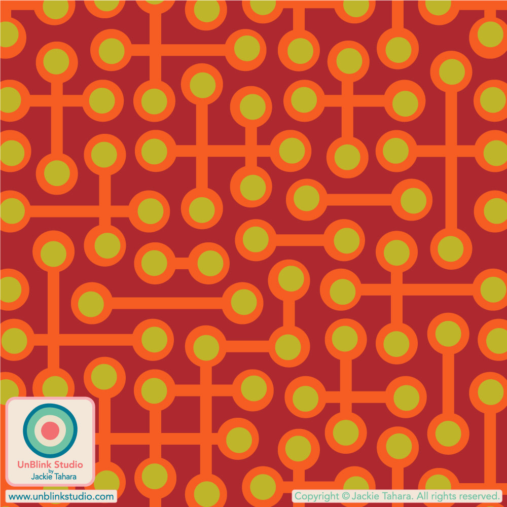
BTW: Public voting for this Challenge is now closed, but you can check out the current Challenge at the Voting Page! When you need to get your RETRO fix! Here is my abstract geometric "Circuits" pattern design in Coral Orange (on wallpaper) and Neutral Sand Brown (on cupboard and floor).
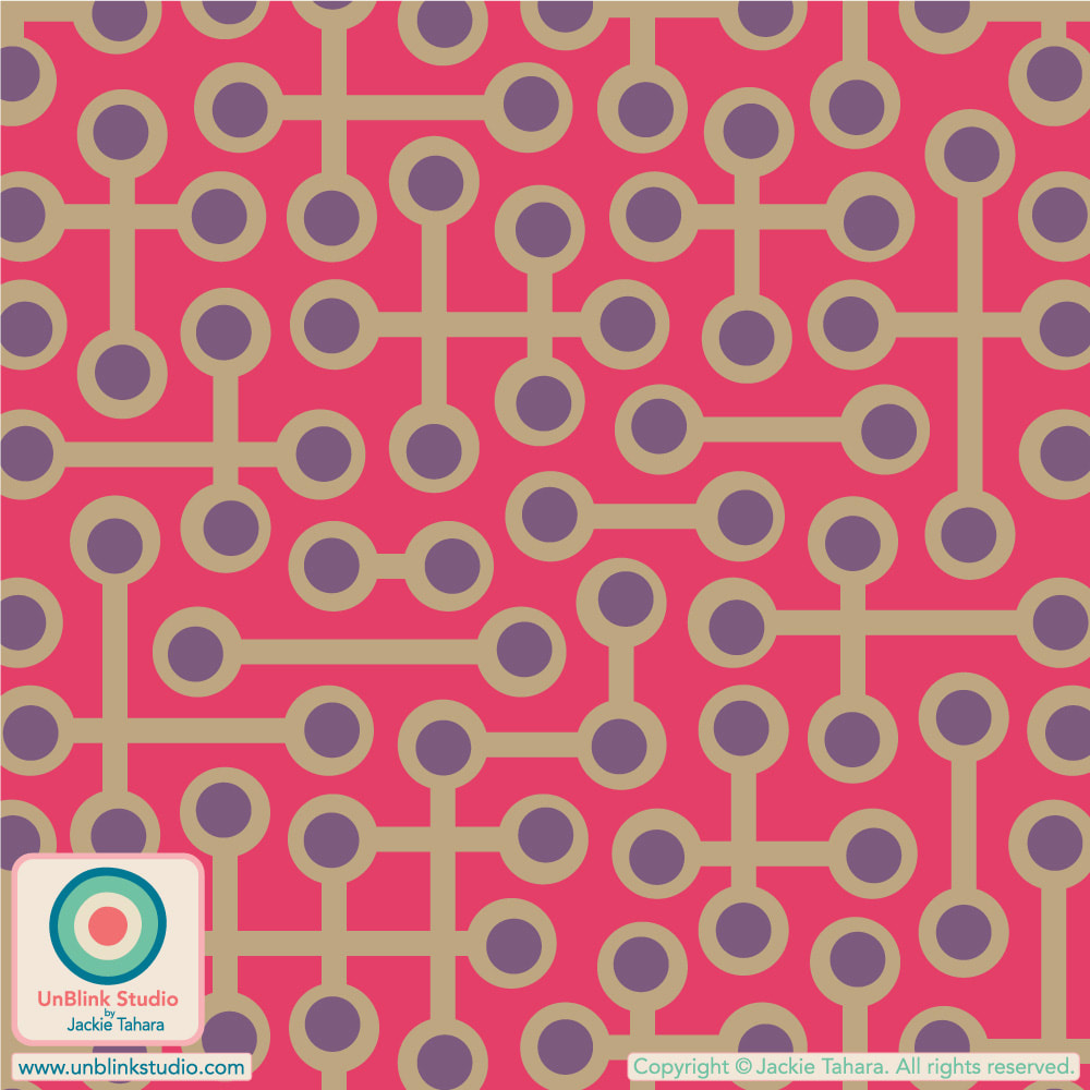
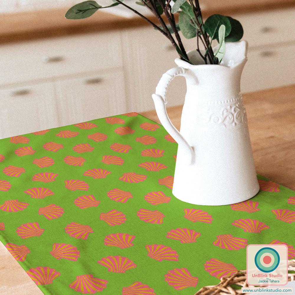
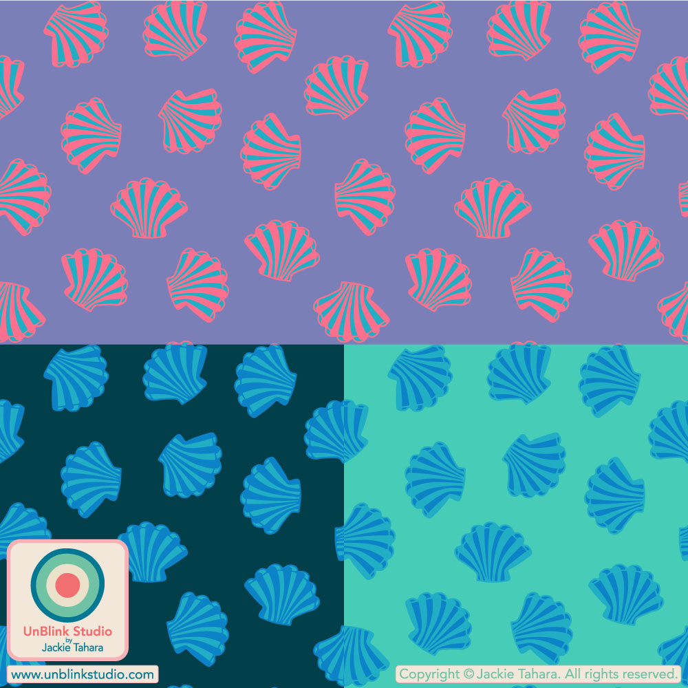
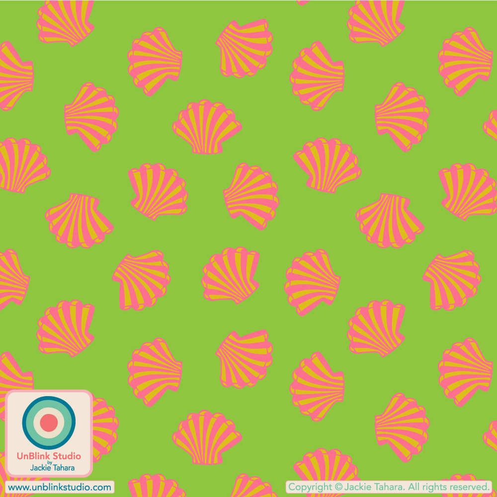
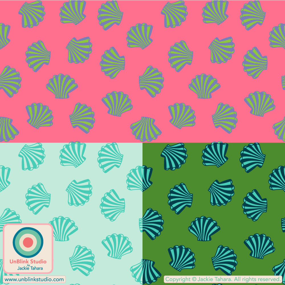
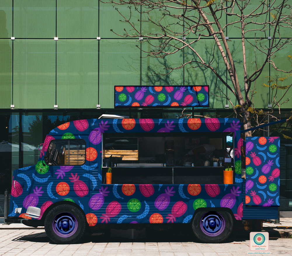
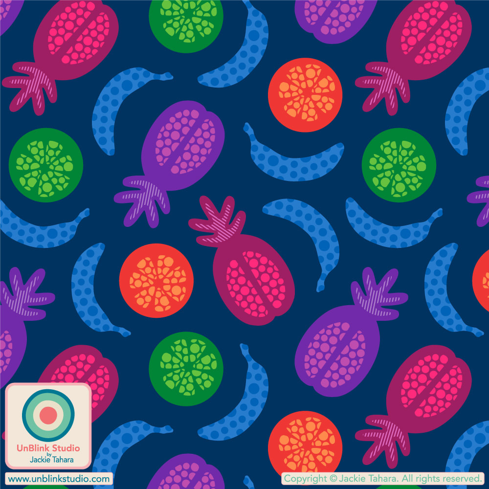
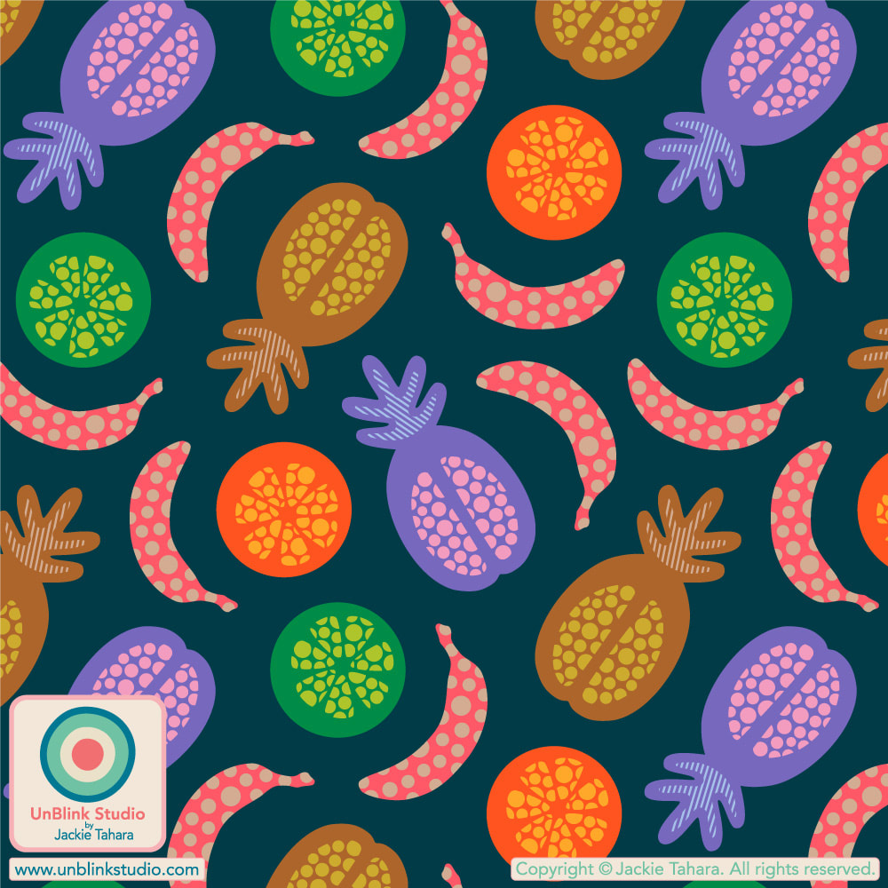
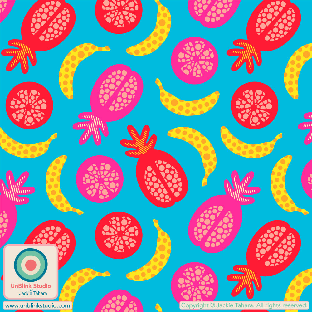
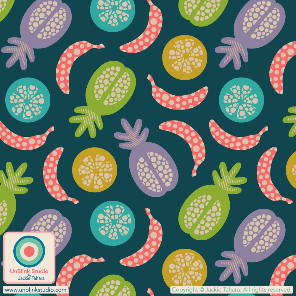
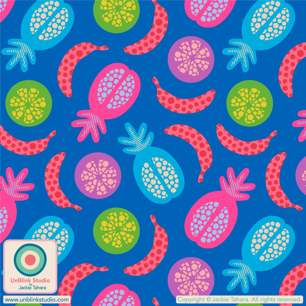
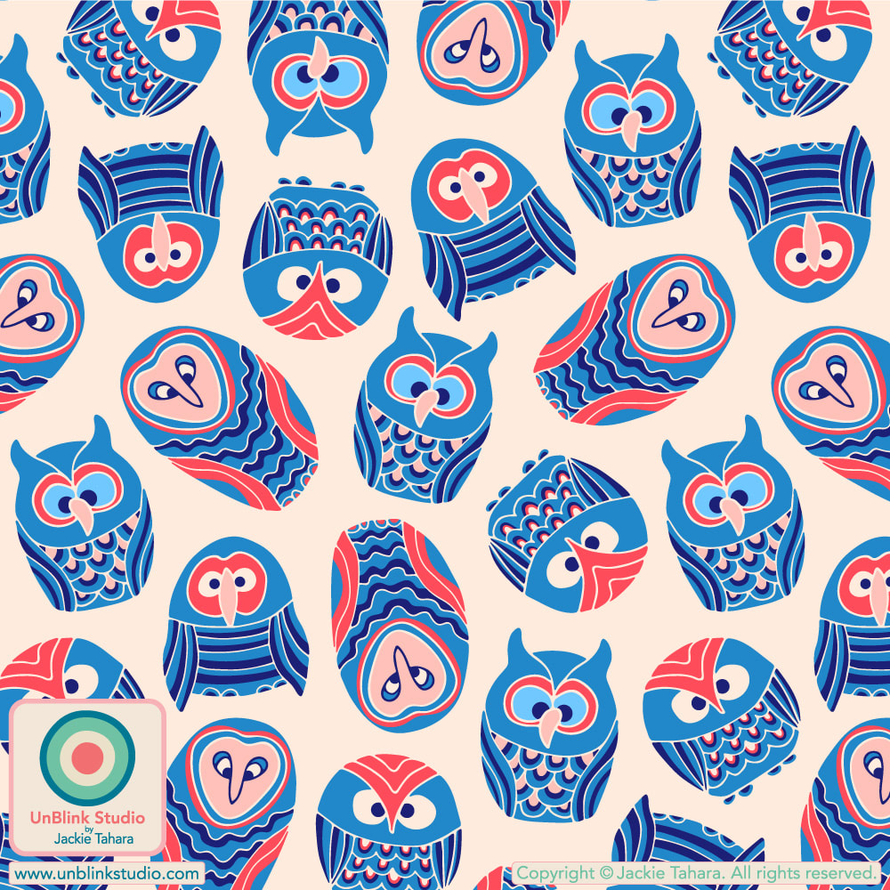
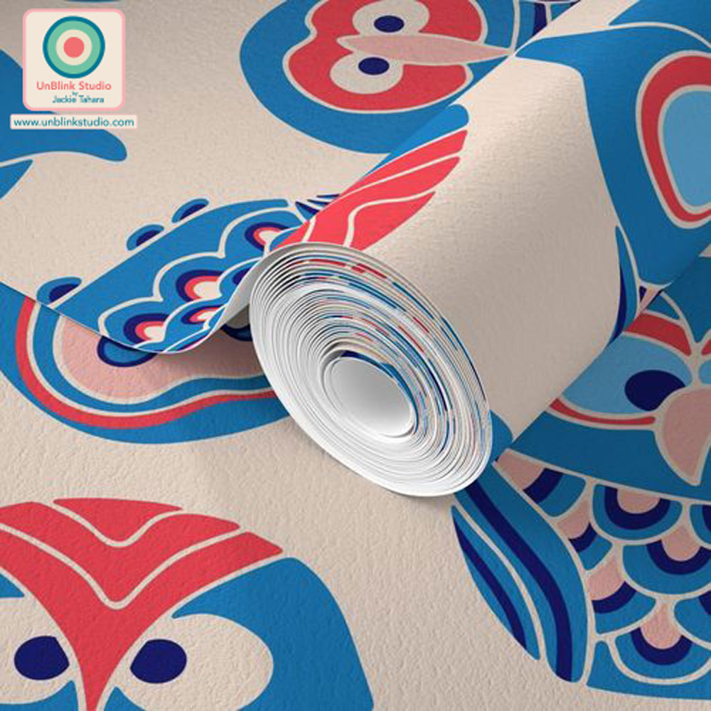
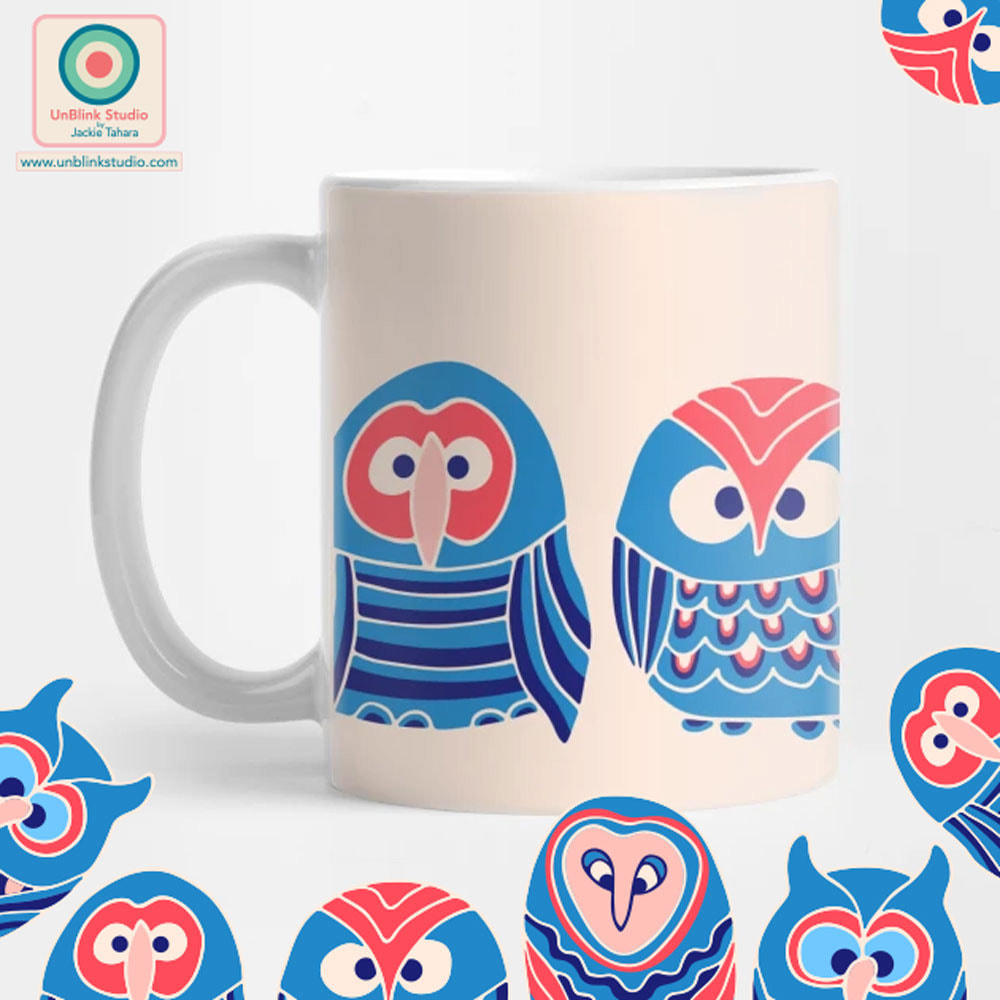
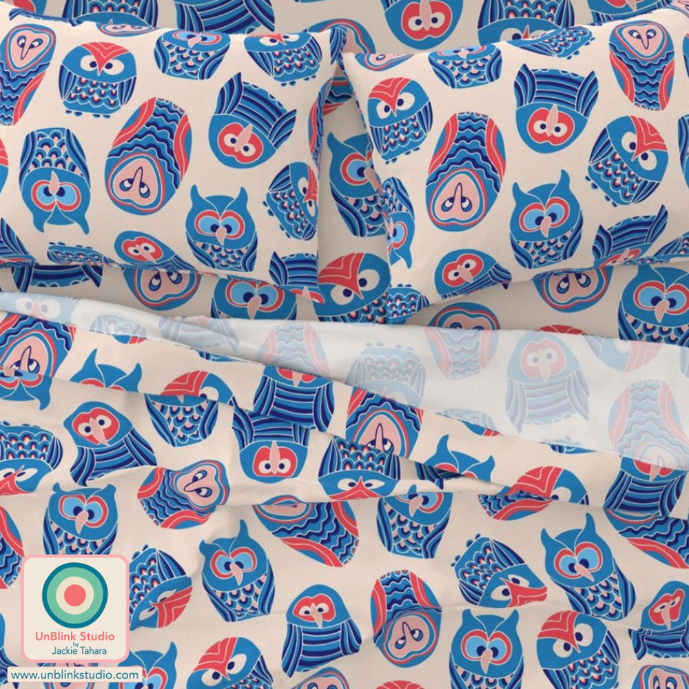
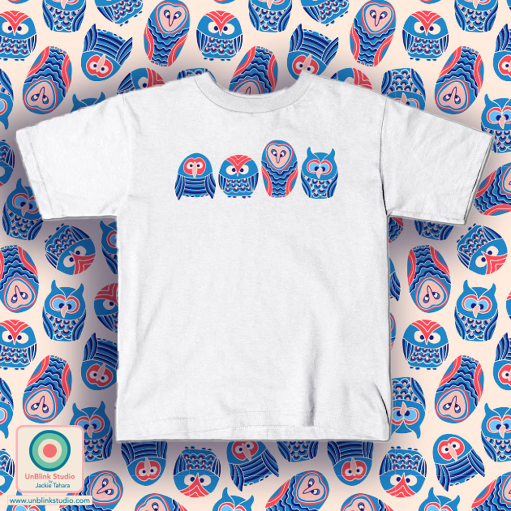
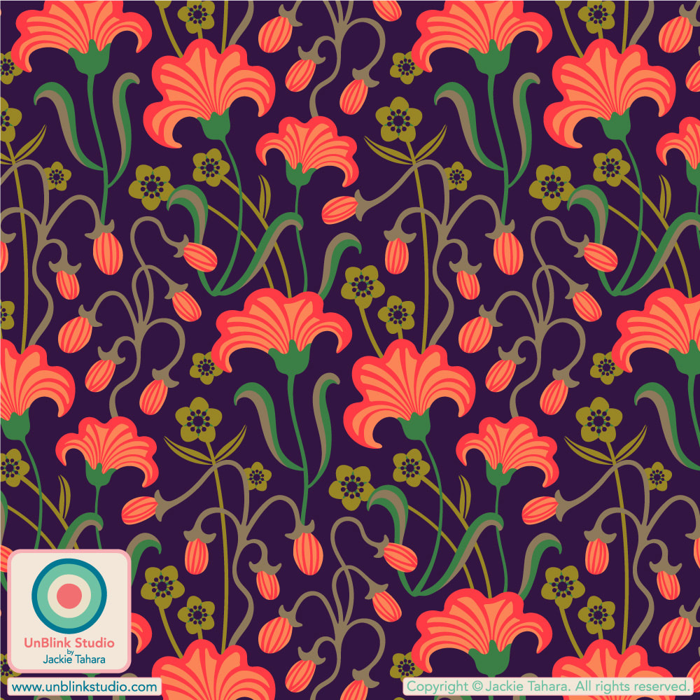
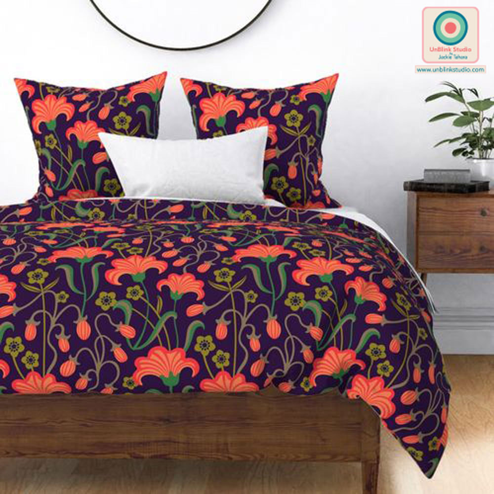
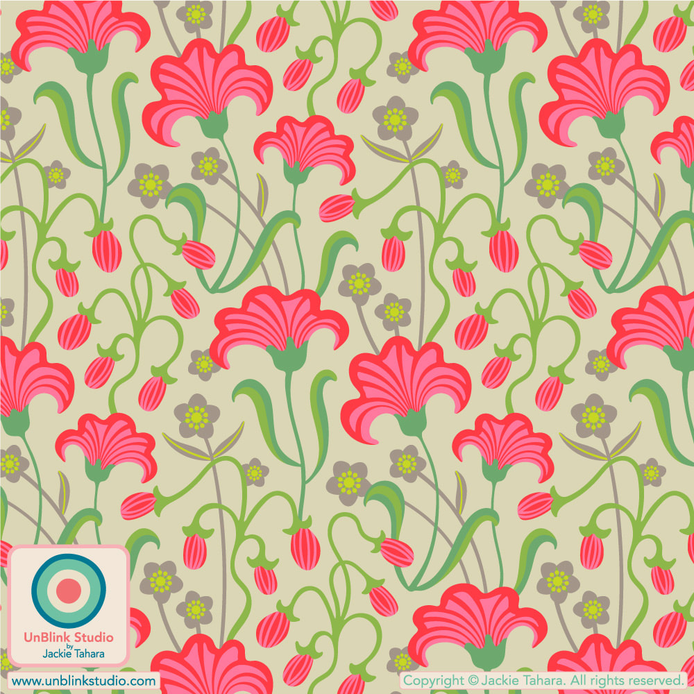
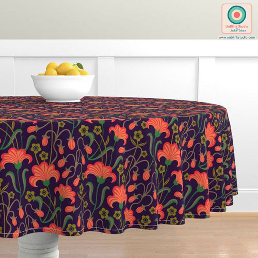
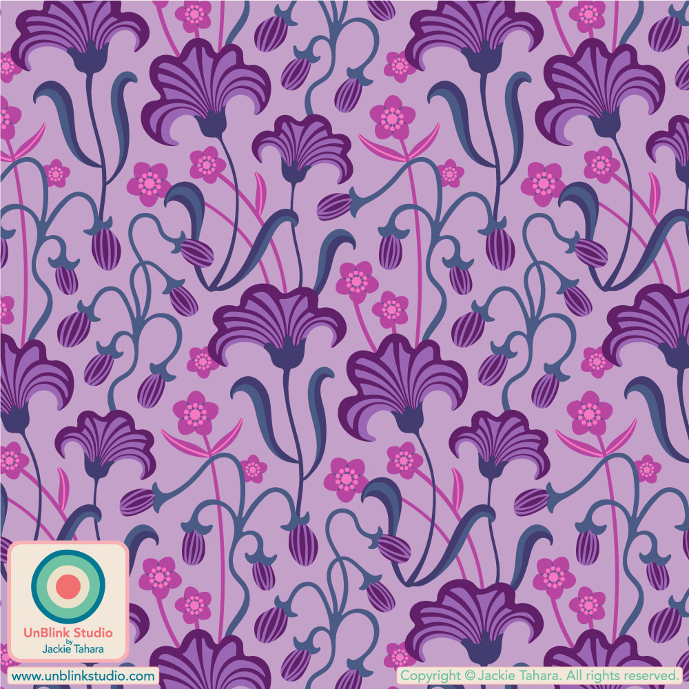
I've entered the Coral Orange version in this week's Spoonflower "Non-Directional Wallpapers" Design Challenge, but you KNOW it comes in a bunch of other colourways too (see below)! Public voting for this Challenge is on now until next Tuesday July 4 (July!?) and you can link to the Voting Page HERE! I'd love your vote for this one! If you want to see all the colourways of this design now available in my Spoonflower Shop, it's easiest to see them all in one place in my "Abstract and Geometric Themes" Collection. Each one comes in 3 scales on Fabrics, Wallpaper and Home Decor! I've been super busy the last few weeks, so missed posting about the last four Spoonflower Challenges! I wanted to catch up with them, so I hope you enjoy this recap! Wedding Table Linens Challenge (June 8 2023): "Seahells" For this Challenge, I knew I wanted something not-so-traditional. So I decided to enter my "Seashells" design in the first Pink, Yellow and Green colourway! Maybe perfect for a "destination" wedding in some warm tropical beach locale? You can see all the various colourways in my "Age Of Aquariums" Collection in my Spoonflower Shop! Tropical Fruits Challenge (June 15 2023): "Tropical Fruits With Lotsa Dots" Although I entered my "Tropical Fruits With Lotsa Dots" in the first Juicy Brights colourway (it's pretty fun on a Food Truck, right?) in the Spoonflower "Tropical Fruit" Design Challenge, I couldn't help trying this design out in a bunch of other colourways too: Earthy Brights, Mid-Century Vintage, Pop Art Brights and Postmodern. Should I keep going? Call me obsessed! They're all now available in my Spoonflower Shop in 3 scales on Fabrics, Wallpaper and Home Decor in my "Fruits and Vegetable Themes" Collection (with lots of other fresh designs too!) Click the images to go directly to that colourway in my Shop! Birds of Prey Wallpaper Challenge (June 22 2023): "Woo Hoo" Would these guys be what you think of when you think of "Birds Of Prey"? No?! Well, owls are birds of prey, even if they're funny and cute! I should know, one grabbed my head when I was running one dark morning, probably thought my ponytail was an animal tail (what would that have made my head?!) You can find my "Woo Hoo" design in my Spoonflower Shop in 3 scales; my TeePublic Shop for Graphic Tees and more; and in my Redbubble Shop on lotsa fun products! Buttercups Home Decor Challenge (June 29 2023): "Charmed With Buttercups" And FINALLY (for this post anyway)...After some last-minute mind-changing I decided to enter my "Charmed With Buttercups" design in the first moody Coral, Olive and Beige on Dark Purple colourway in the "Buttercups Home Decor" Design Challenge! I did create several other colourways for this design (see below), thus all the last-minute mind-changing, but thought the first colourway would be perfect for Home Decor! You can link to each colourway in my Spoonflower Shop by clicking on the images below! The links will connect you with the Medium-Scale versions (except the Duvet cover which is shown in Large-Scale), but these also come in both a Small- and Large-Scale too! PHEW! NOTE TO SELF: Don't miss posting about the Spoonflower Challenges each week! I'll try to keep up from now on. I hope you enjoyed this though!
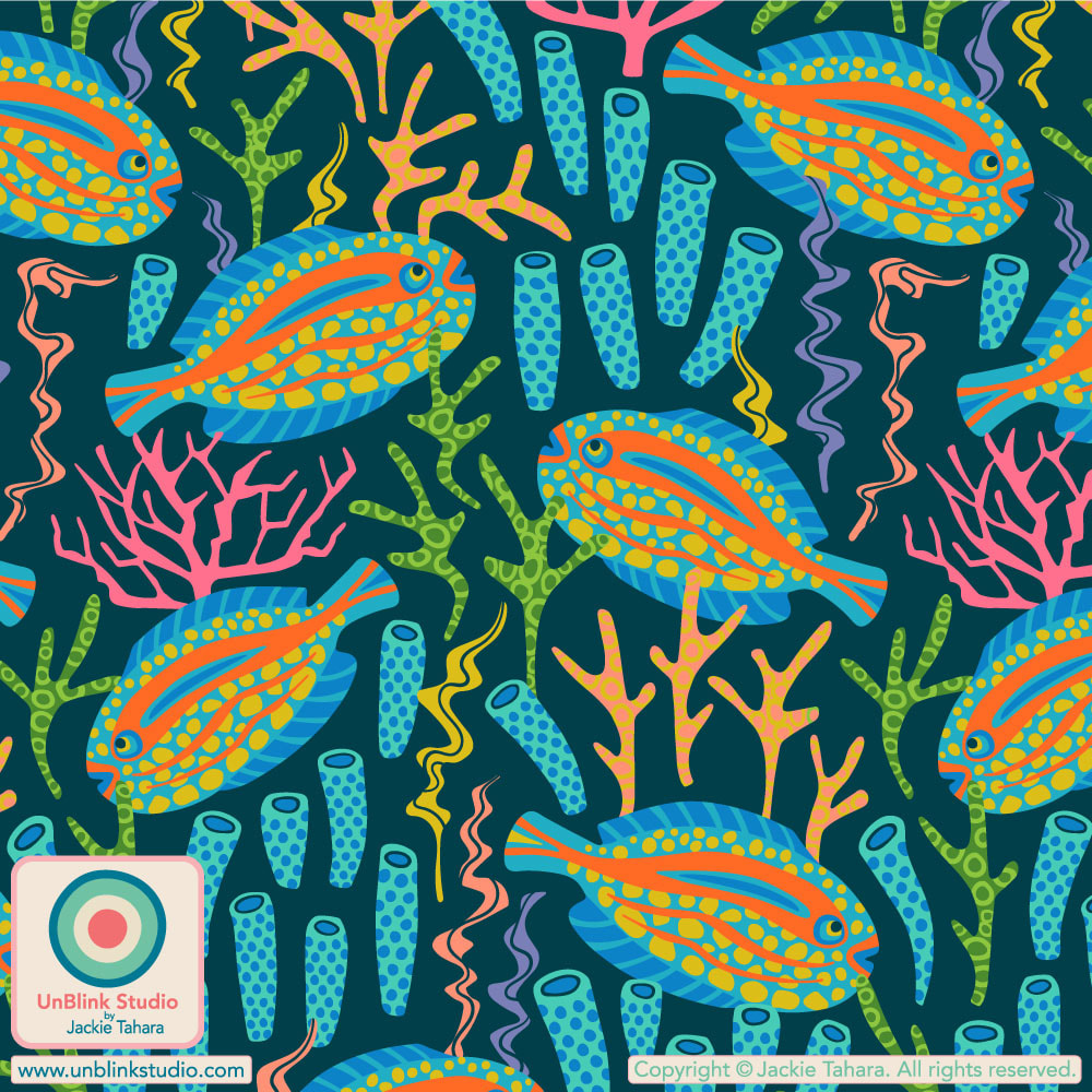
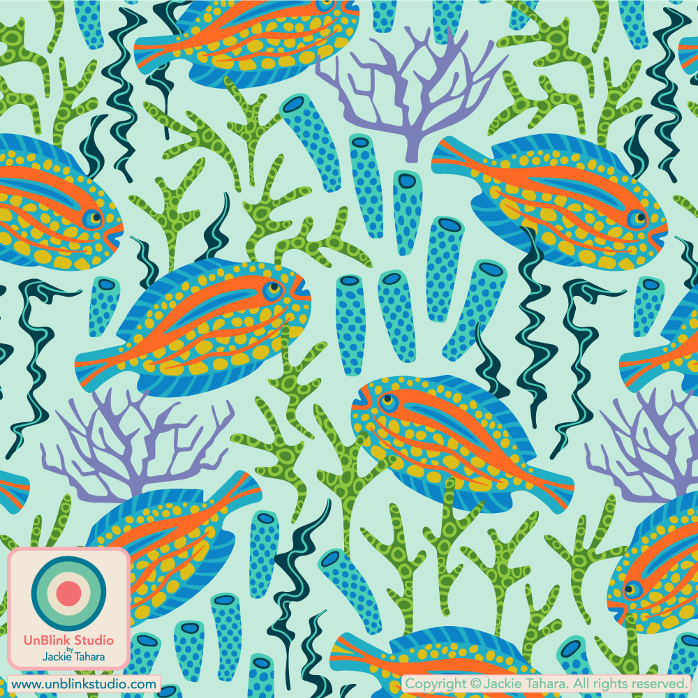
For this week's "What a Wonderful World" Design Challenge, Spoonflower partnered with Peppermint Magazine. The winning designs will be featured in a fashion spread in this Australian magazine! I entered my "Tropical Zone" design full of colourful spotted fish swimming amongst corals and sea plants. I entered the version with the dark background, but it also comes with a light aqua background too! You can link to the Voting Page HERE!
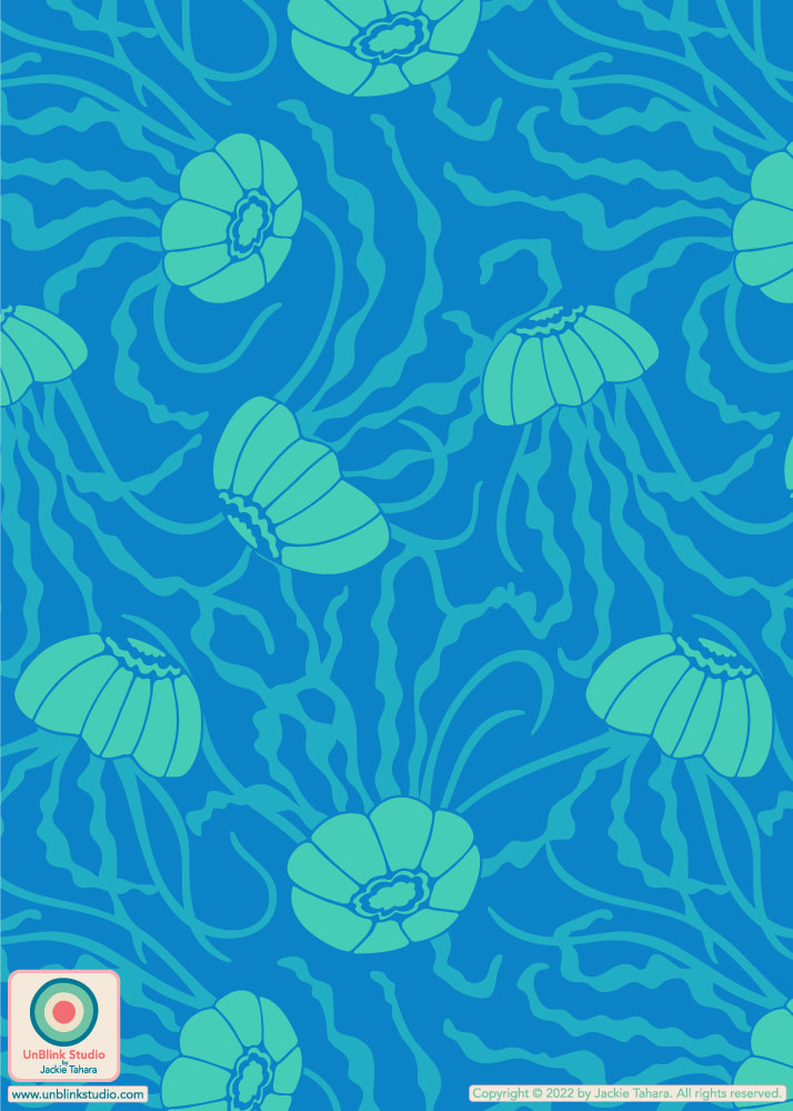
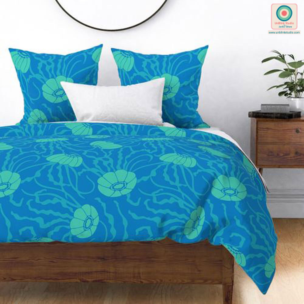
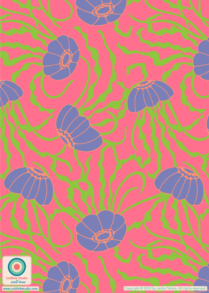
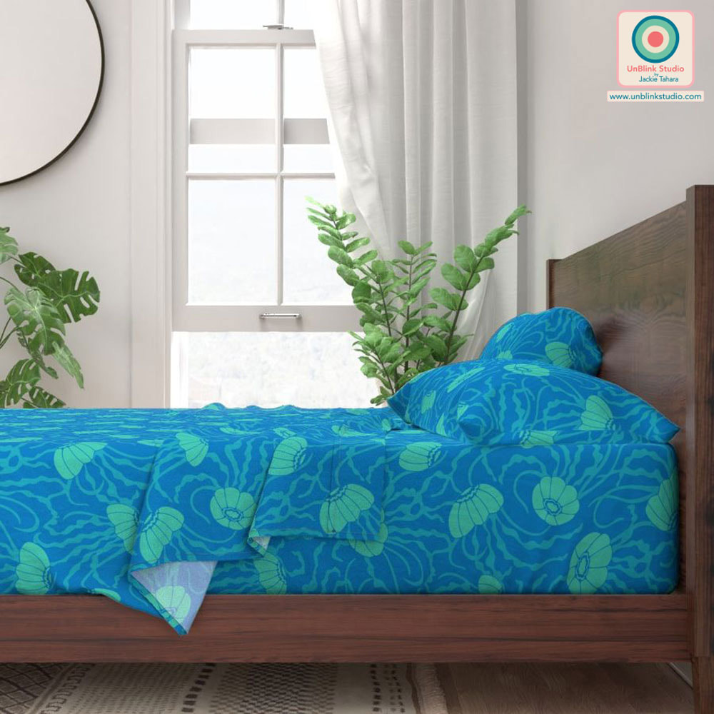
My "Tropical Zone" pattern design is part of my new "Age Of Aquariums" Collection which is now available in my Spoonflower Shop! With all the different colourways and scales there's a huge 102 designs to choose from in this new Collection! My "Jellies" design is part of a new pattern collection that I first talked about in one of my Newsletters a couple months back, and one of my subscribers wrote back to me and said how calming and soothing the design was! So I thought it would be perfect to enter in this week's Spoonflower "Sweet Dreams Bedding" Design Challenge! This design comes in two colourways, but I entered the Blue version because it is much more calming IMHO! I'll just drift away now...
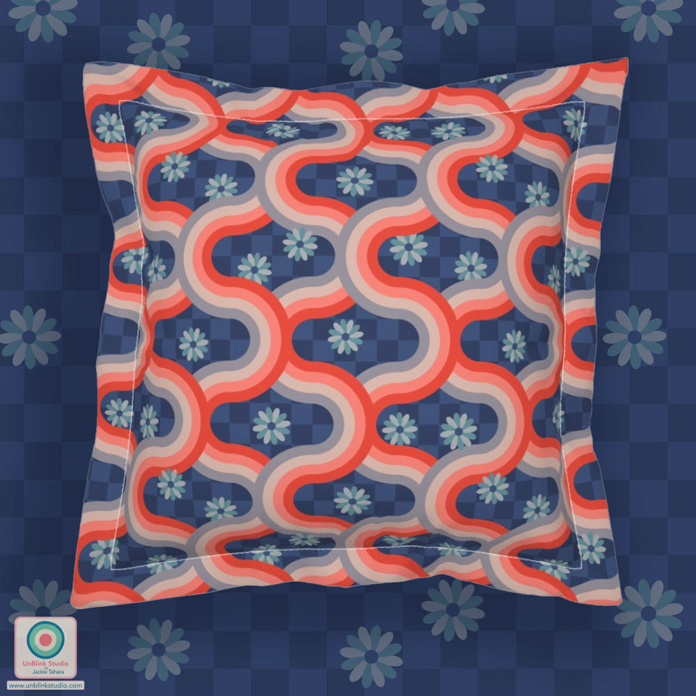
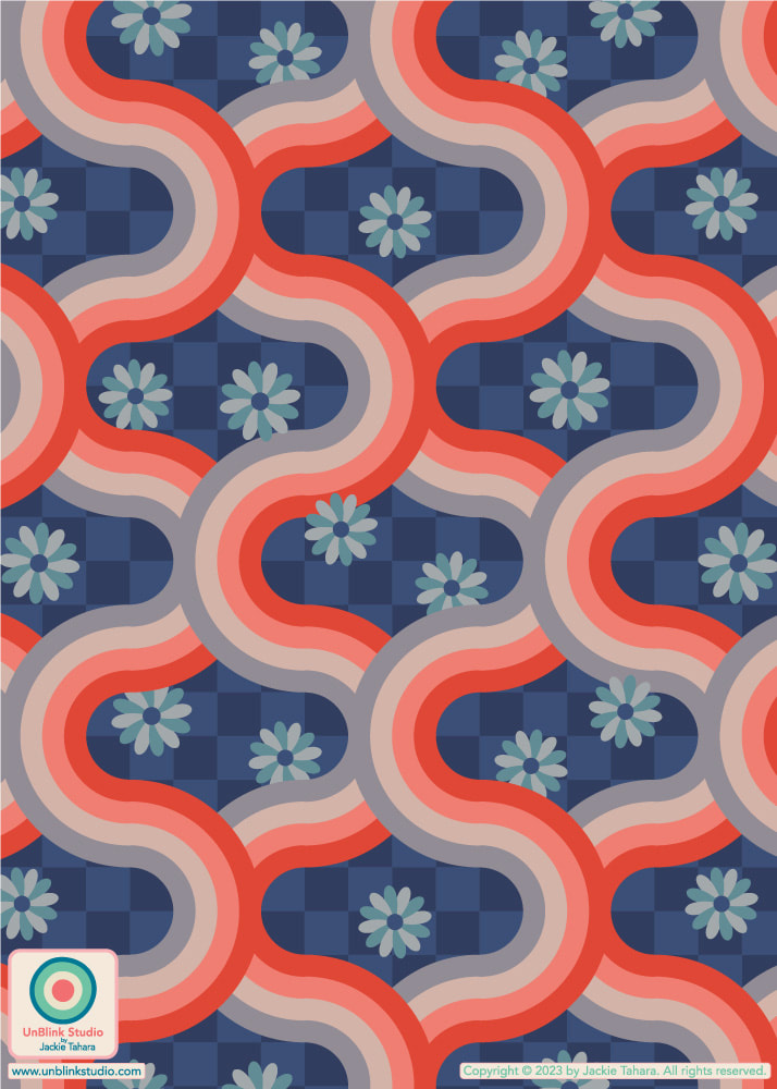
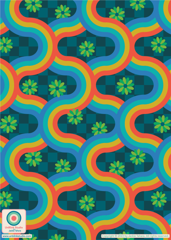
. Public voting for this Challenge opens today Thursday May 18 and closes next Tuesday May 23. You can link to the Voting Page HERE, and see the Blue version in my Spoonflower Shop HERE! You can also link to these designs by clicking on the images below. OH and stay tuned for more from this collection! This week's Spoonflower Design Challenge is "Pattern Clash". The idea is to combine different types of patterns in one design for maximalist home decor or funky apparel fabric. So here is my brand new "Kyoto" pattern: it's a retro geometric on a checkerboard with florals. Pattern Clash, right?! Currently, it's available in TWO different colourways: Rust Red Blush Gray on Blue Checkerboard and Bright Rainbow Colours on Teal Checkerboard (see below), although I just might have to try this one out in some other colours! I did decide to enter the first version on the advice of many of you, thanks for letting me know your preferences!
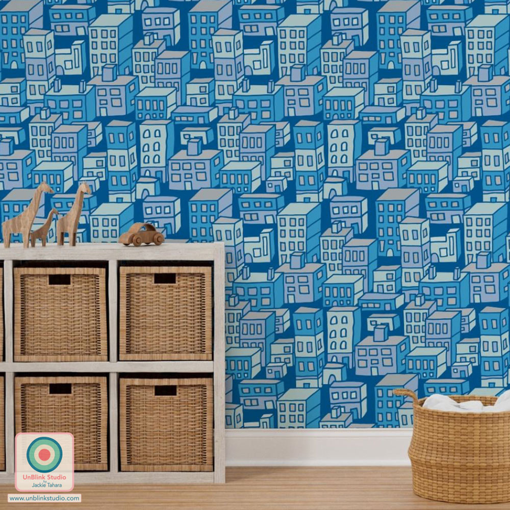
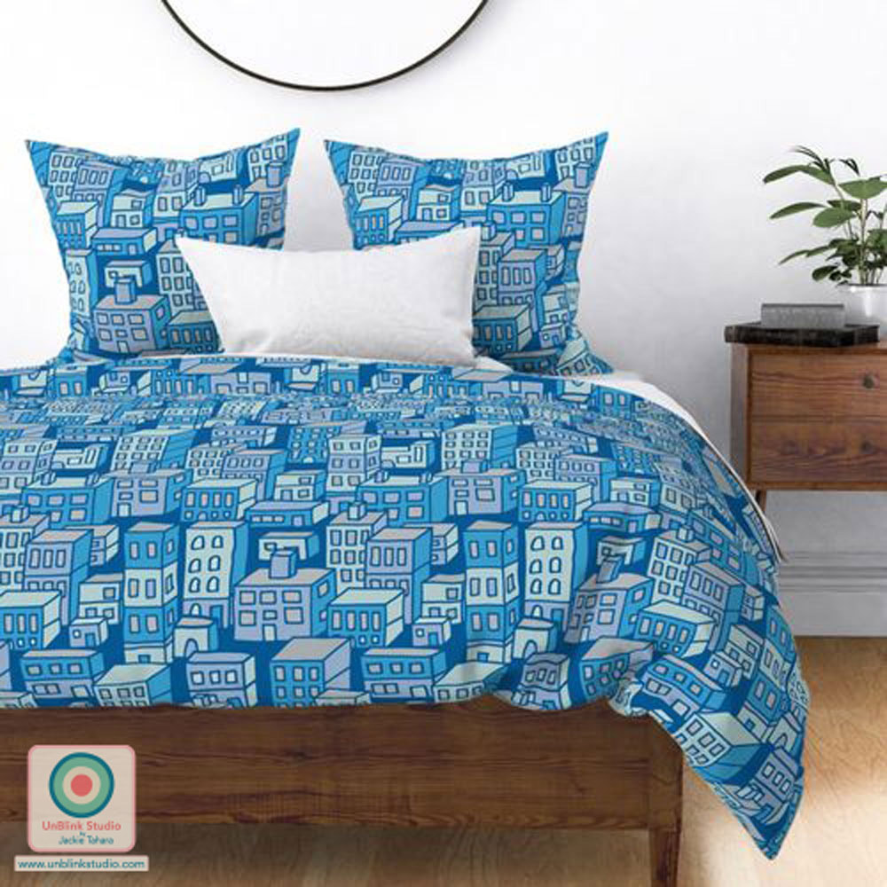
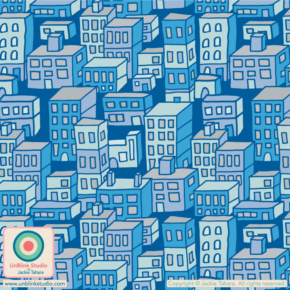
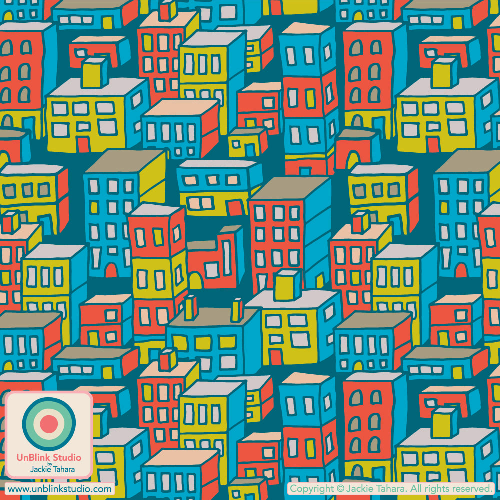
Voting for this Challenge opens Thursday May 11 and you can link to the Voting Page HERE. If you would like to see these designs in my Spoonflower Shop, just click on the IMAGES below. Each colourway is available in four sizes: Tiny-, Small-, Medium- and Large-Scale! Okay, I've done it! I've been sitting on my “Downtown” design for a (loooong) while, but I decided to finally add it to my Spoonflower Shop. When I saw the palette of saturated Blues and Greens that we had to use in this week's Spoonflower "Pantone Ultra-Steady Wallpaper" Design Challenge, I immediately thought the colours would really do well with this design, and I think it gives this urban scene a very quiet and still vibe. I still love this design in its original Bright Retro Colours (scroll to the bottom to see), but now I like it in the Ultra-Steady colours too! Public voting for this Challenge opened Thursday May 4 and closes next Tuesday May 9! You can vote at the Voting Page HERE and I'd love your vote for this one!
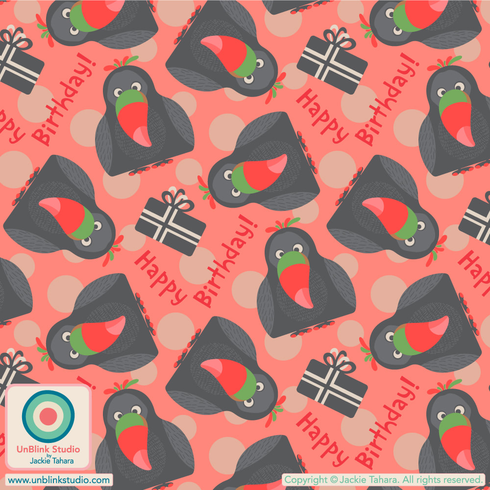
. My "Downtown" design is now available in my Spoonflower Shop not only on Wallpaper, but also on Fabrics and Home Decor too, in Both Colourways and 3 sizes (click the images below to link directly to these designs in my Shop)! Happy Birthday Tou-Can!
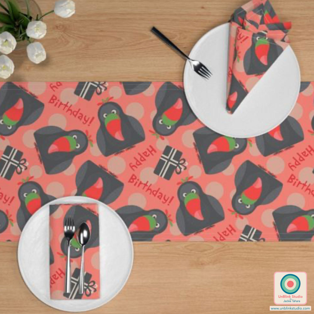
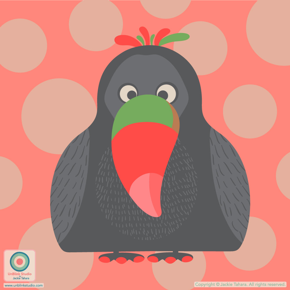
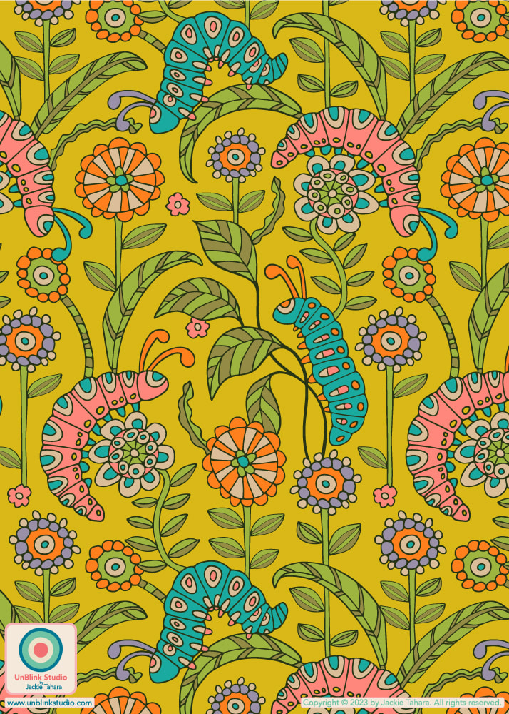
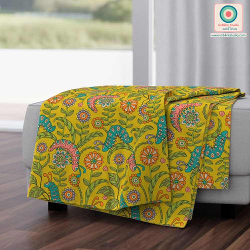
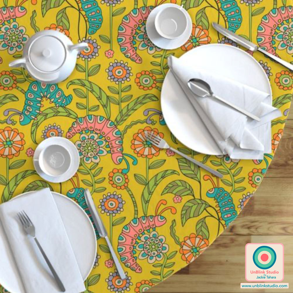
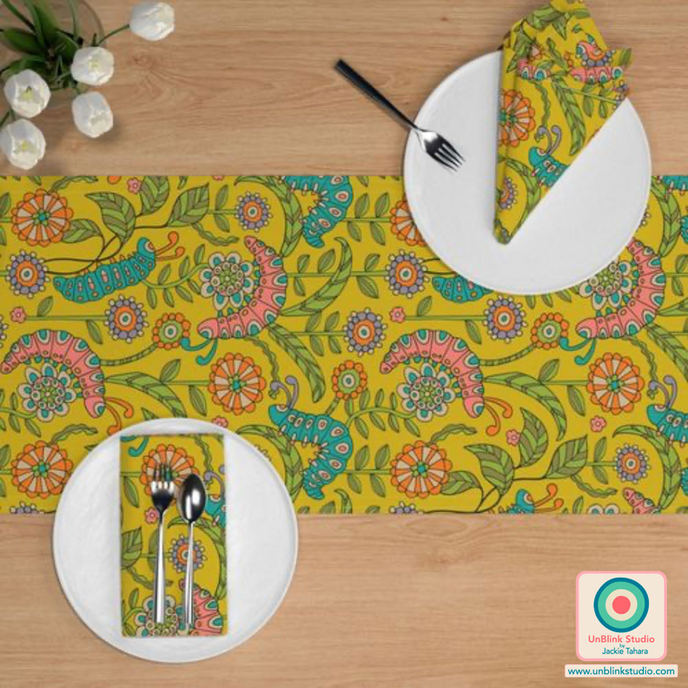
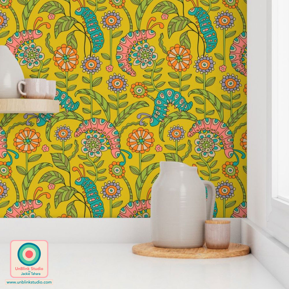
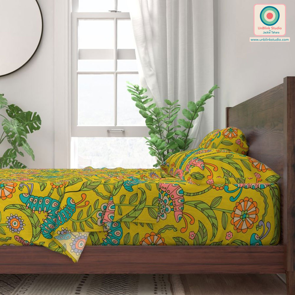
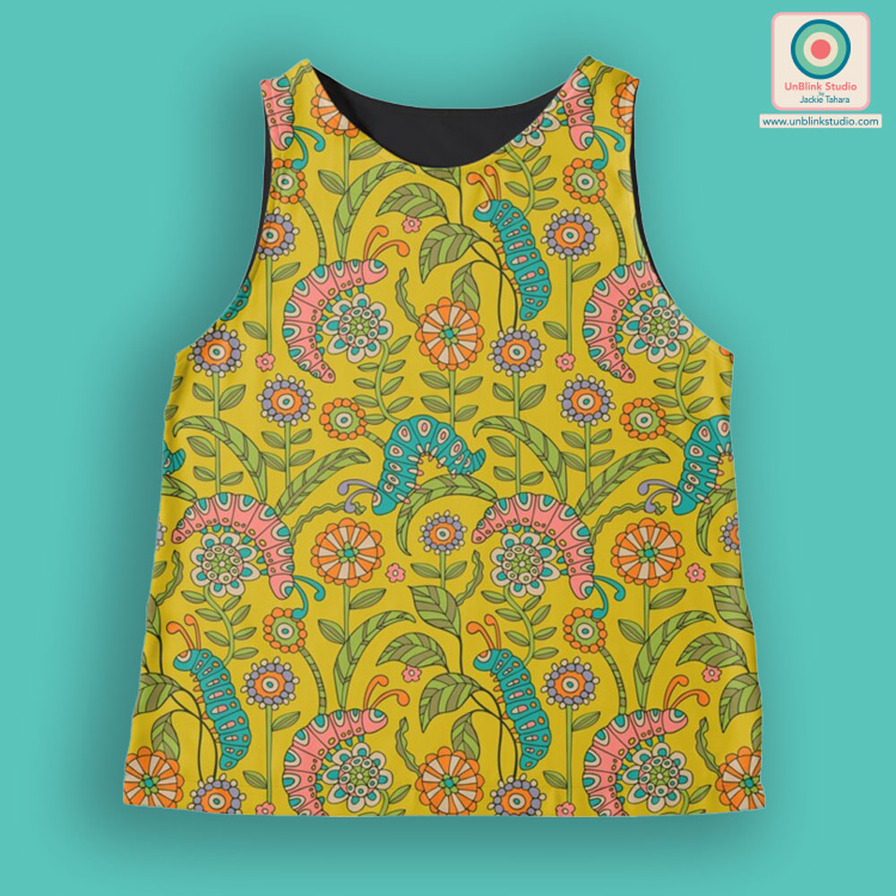
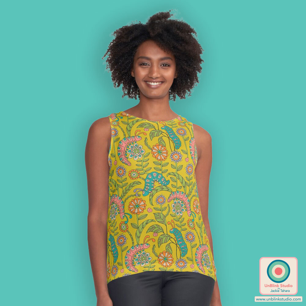
Happy Birthday Tou-Can! Happy Birthday Tou-Ca-An! Happy Birthday Tou-Can! 🎼🎶🎵🎶🎵🎼🎵🎶 . This guy makes me smile! I've entered my fun(ny) "Happy Birthday Toucan" design in this week's Spoonflower "Happy Birthday Table Linens" Design Challenge! Public voting opened Thursday April 27 and closes on Tuesday May 2! You can check out the Voting Page HERE! This guy is available in my Spoonflower Shop on Fabrics, Wallpaper and Home Decor in 3 sizes. If you'd like to see the design in my Shop, you can click the images below! When I saw that this week's Spoonflower Design Challenge is "Doodle Bugs" and that they wanted design elements to be "hand-drawn", I took that to heart and started doodling bugs with my trusty fine-tip Sharpie, and my new "Caterpillar Playground" design is the result! I know you're probably thinking this design is great for kids, but I'd really like this one for myself on a top or dress! And HEY, come to think of it, I can make that happen! Public voting for this Challenge opens today and you can link to the Voting Page HERE! This fun design is now available in my Spoonflower Shop on Fabrics, Wallpaper and Home Decor in 3 sizes HERE. AND you can also get this design in my Redbubble Shop on Apparel, Tech Accessories, Wall Art and so much more HERE! Keep scrolling down to see just some of the products with this fun design from both Shops! From my SPOONFLOWER SHOP! From my REDBUBBLE SHOP!
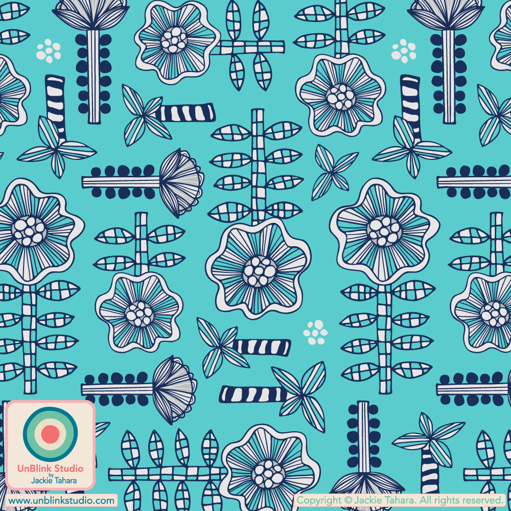
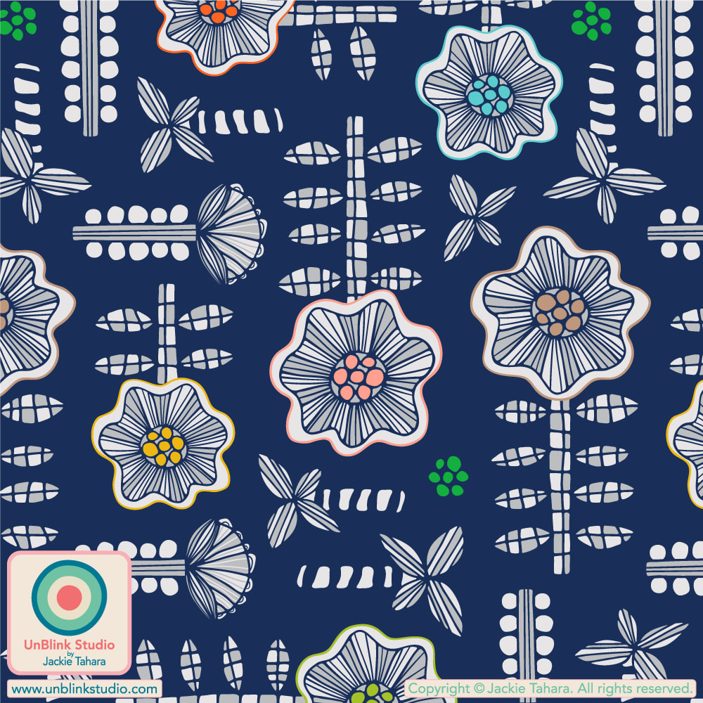
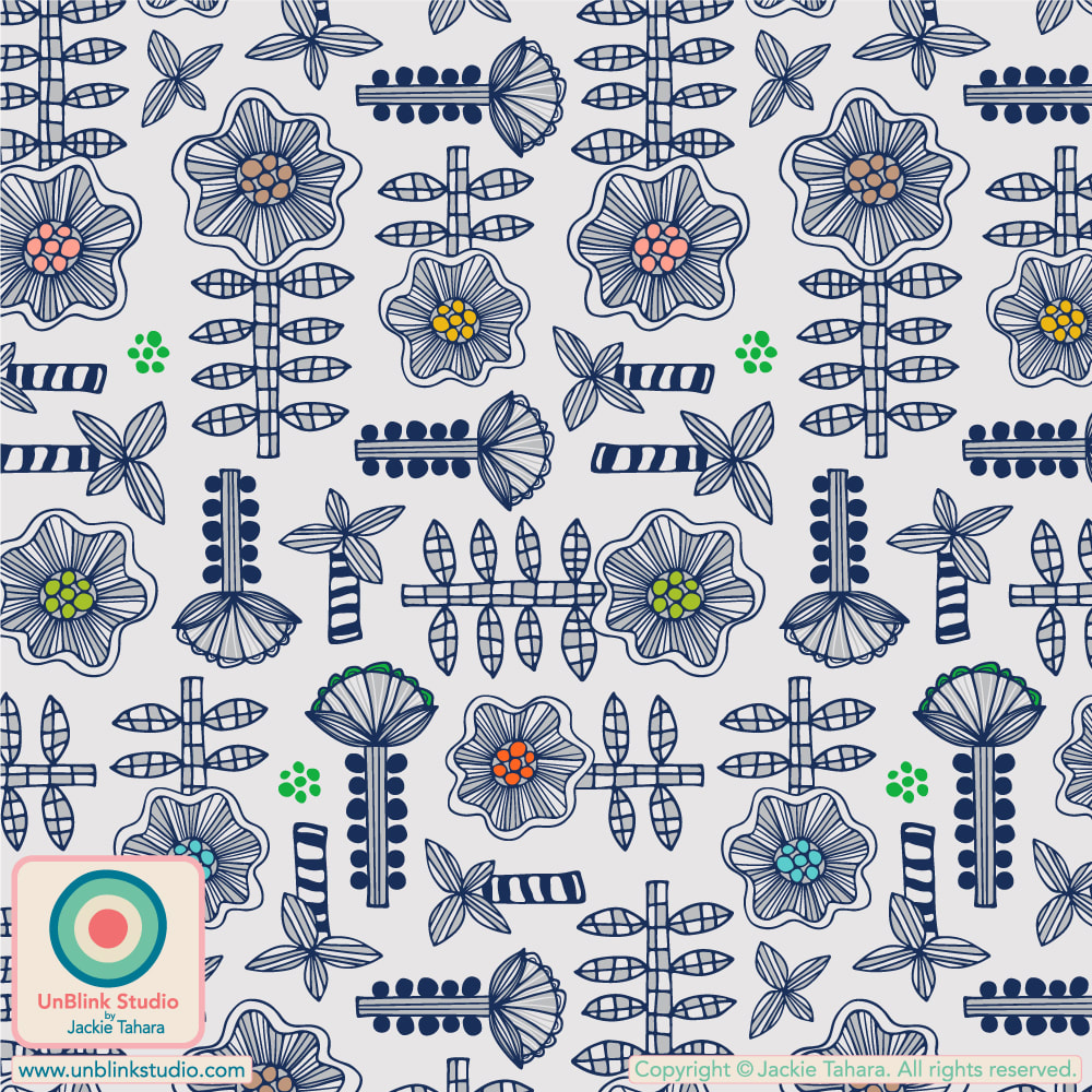
This week's Spoonflower Design Challenge is "Miniature Dollhouse Wallpaper" and I planned to enter my "Daisy May" design, either in the original "Dark Blue" or "Light Gray" version in a cute Tiny Scale, but I wasn't sure which. But then I thought, well, neither just didn't seem very Dollhouse-y to me, so I tried it in a Turquoise version, hmmm, better (see below for all these colour options!)...But I thought it still needed more Dollhouse-iness! So then I tried it out in Pink and Lavender Purple. Now THAT says Dollhouse-y to me, so I entered it!
Public voting for this Spoonflower Design Challenge opened on Thursday April 13 and closes next Tuesday April 18! You can link to the Voting Page HERE! Click the images below to see the Tiny-Scale versions of my "Daisy May" design in my Spoonflower Shop. They are all available also in Smalll-, Medium- and Large-Scale versions too! I was recently interviewed by Cara Dudgeon of the World Textile Information Network (WTiN) which provides in-depth content that tracks key trends and innovations within the textile manufacturing industry, and has been reporting on the textile industry for over 100 years.
In this interview, we discuss creating and maintaining a unique design style and process, while still keeping in mind the needs of clients and specific markets. It was a really fun chat! Read or listen to the interview at WTiN and even better, you do NOT have to be a WTiN Member to access this interview! With thanks to Cara and WTiN. |
AuthorJackie Tahara of UnBlink Studio Archives
April 2024
Categories
All
|
 RSS Feed