|
ILLUSTRATORS FOR HIRE Member I recently applied to join Illustrators For Hire (@illustratorsforhire) and was accepted! As an IFH Member, I'm joining a curated group of select professional illustrators and surface pattern designers. Check out my Florals + Plants and Patterns pages there! Get in touch with me if you'd like to discuss working together on your project! 
CREATIVEHOWL Surface Pattern Designer Directory You can now find me listed in the Surface Pattern Designer Directory on Creativehowl (@creativehowl)! 
0 Comments
"Washi Tape Patchwork" for the Spoonflower "Winter Holiday Patchwork" Design Challenge! Why Not?!7/3/2024 Here is my entry for this week’s Spoonflower “Winter Holiday Patchwork” Design Challenge, called “Washi Tape Patchwork”. You might ask: Why Washi Tape? My answer: Why not?! Not to mention I’d LOVE to create designs for Washi Tape!! Public Voting for this Challenge opens Thursday July 4, and you can link to the Voting Page HERE! Click the Image below to SHOP this design in my Spoonflower Shop (it comes in several scales too)  This week’s Spoonflower Design Challenge is “Hide and Seek Wallpaper”. For this one, I started thinking about those “Where’s Waldo?” books that are so fun (if you don’t know, Waldo had round glasses and a striped shirt and you had to spot him in a sea of detailed drawings in various settings; sometimes you’d think you found him because you’d find what you thought was his striped shirt only to realize that it wasn’t him, just the stripes were on something else to trick you!) So I started thinking about stripes on stripes and “hiding” something in amongst the stripes! So here is my “I Spy A Bird” pattern design. Can you spot the bird (I know, I know, it’s not super difficult)! Public voting for this Challenge opens Thursday June 20 and you can link to the Voting Page HERE! I entered the first Light Aqua and Dark Teal version, but it also comes in Beige and Salmon Red, and Beige and Charcoal Black too (all colours influenced by Japanese kimono style)! And it just might come in some other colours soon too…😉 . If you'd like to SHOP these print designs in my Spoonflower Shop on Fabrics, Wallpaper and Home Decor, click on the images below (they link to the Large-Scale versions, but they also come in Small- and Medium-Scale versions too!) . If you'd prefer, you can also SHOP these designs in my Happywall Shop on Wallpaper (one scale only). All products in my Happywall are produced in and ship from Sweden! 
 My Entry for the Spoonflower "Cottagecore Halloween" Design Challenge is "Sugar Skulls Celebration"!6/5/2024 This week’s Spoonflower Design Challenge is “Cottagecore Halloween” and I really didn’t know what to do with this one! I pondered it for days (this is normal for me, I often mull over a theme while I go about my daily life and work until something just hits me!) Then I tried something with tossed pumpkins, but wasn’t feeling it. Then I tried fun gourds with jack-o-lantern faces but nah, it looked more Autumn Harvest than Cottagecore Halloween. And suddenly it was Monday (ie. the day before this Challenge closed), and then it hit me...Sugar Skulls! I added flowers and pastel colours for that Cottagecore feel, then felt the need to add bunting (not sure why)...And yay! I managed to get my new “Sugar Skulls Celebration” print design done on time to enter in this week’s Spoonflower Challenge! Spooky but sweet?! Creepy but cottage-y?! . Public voting for the Spoonflower “Cottagecore Halloween” Design Challenge opens Thursday June 6 and you can link to the Voting Page HERE! I'd love your vote for this one!   With thanks to @theindoorsyproject for this fun mockup!
I’ve entered my new “Garden Beauties” floral print in the Spoonflower “Vintage Glam Metallic Wallpaper” Design Challenge! This Challenge was a bit, well, challenging because it required envisioning how the gold metallic of the wallpaper would change the overall look of the design (FYI: white parts of a design will print as gold metallic). I stuck with just Black & White or, I guess, Black & Gold. If you’d like to see how this floral looks in its “original” Black & White colours (available on non-metallic wallpapers) scroll down to the last image! . If you would like to vote in this Challenge, SO SORRY! Voting closed Tuesday June 4 (WHAT? June already?!), but you can still vote in the next Spoonflower Design Challenge: "Cottagecore Halloween"...See my next Blog Post! . If you'd like to see my "Garden Beauties" Gold Metallic wallpaper in my Spoonflower Shop, just click the images below!  
See below for my new "Garden Beauties" floral print in its original Black & White colourway (pssst, it also comes in a lot of other colours too in my Spoonflower Shop!)  Modern design website Design Milk has been discovering and highlighting “what’s cool and what’s next in architecture, interior design, automotive, fashion, technology + art” since 2006. So I was very honoured when they reached out to ask if I would like to be the Featured Artist for their monthly Designer Desktop Wallpaper for June 2024! Read the feature HERE and get my free downloadable “Akkorokamui” design for your computer, phone or tech device!  Just released! My "How Does Your Garden Grow?" and "Soft Summer" Fabric Collections (see both below) are now available from Canadian fabric company Mia Presley Designs! Available for Wholesale only. Click the images below to directly link to these new Fabric Collections at Mia Presley Designs! HOW DOES YOUR GARDEN GROW? Collection  SOFT SUMMER Collection  Read my latest interview with Roberta Wax in the Journal of the Craft Industry Alliance! We talk about my journey to finding surface pattern design (a meandering path to be sure!), my inspirations and some of the "wisdom" that I've gathered over my years in design. You can read the FULL INTERVIEW HERE!  Celebrity portraits by Chris Chapman for Deadline, shot during TIFFs 2021 and 2023.
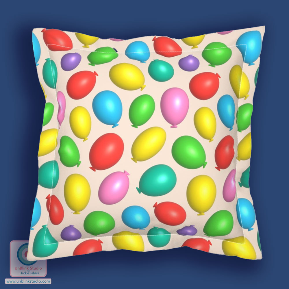
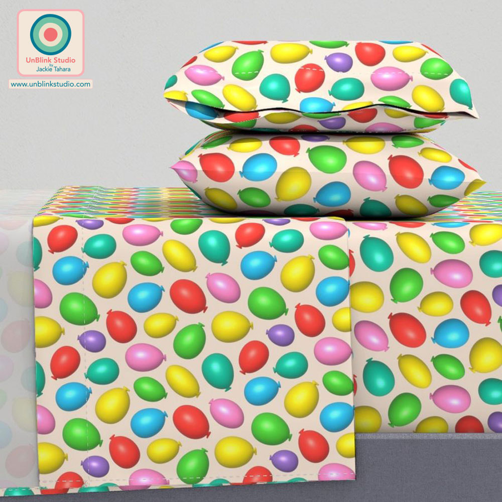
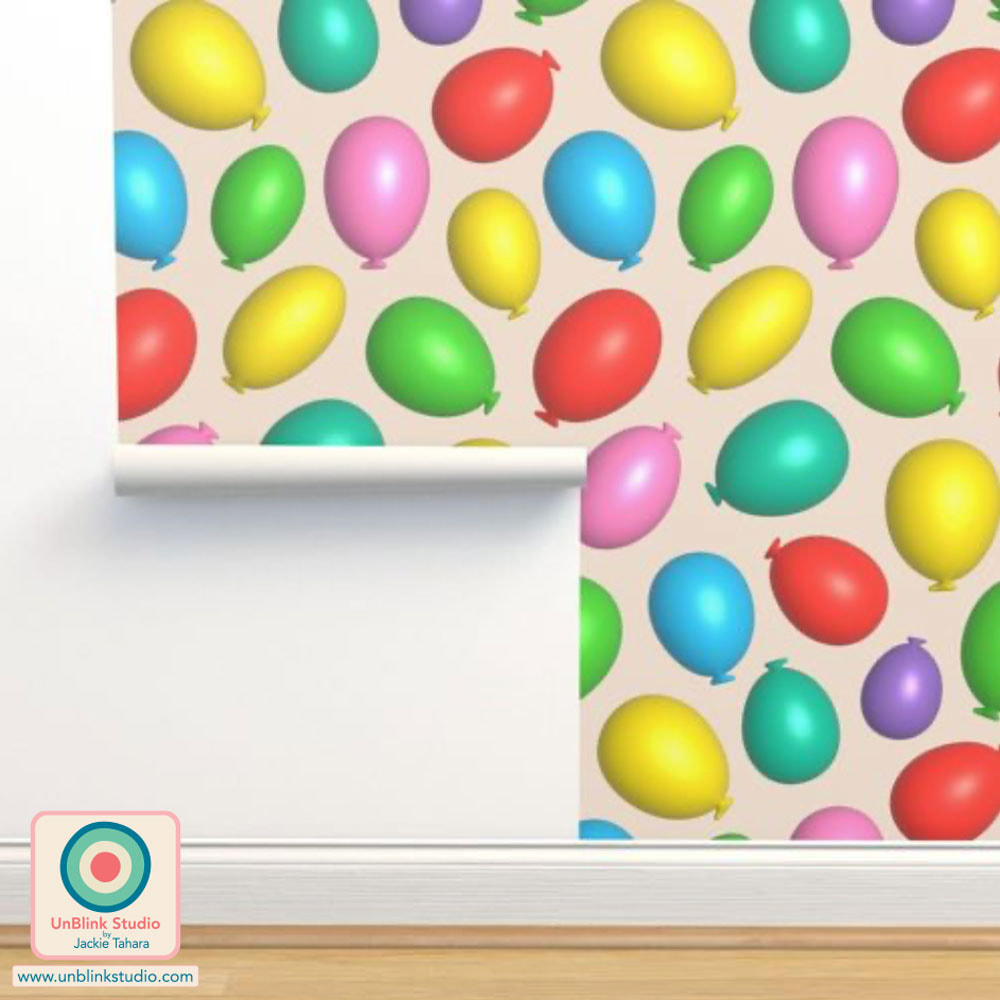
My “Seashells By The Seashore” coastal wallpaper in a Multi (first pic below) and a Blue colourway have been included in the new “Coastal” Collection curated by the team at Happywall and now available in their online Shop. Go have a look at all the dreamy wallpaper options by various fellow designers in the full Collection HERE! While you're there, I invite you to check out my Happywall Shop which has a large selection of my wallpapers! All Happywall products are produced in and ship from Sweden. 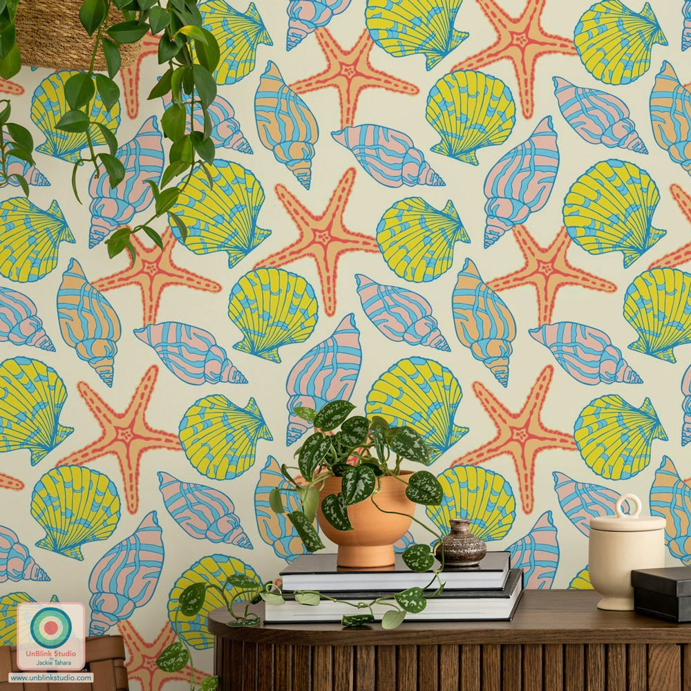 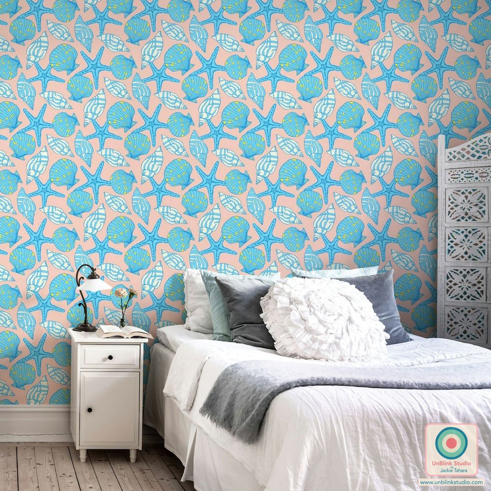 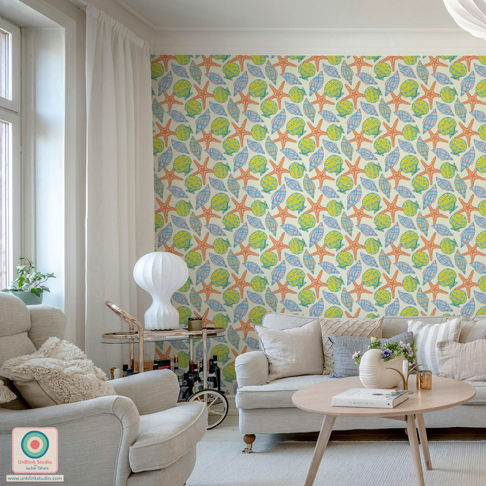 Recently I’ve posted print designs with CRABS and SHRIMPS, so when I saw that the current Spoonflower Design Challenge is “Crustacean Core”, I thought, hmm, time for LOBSTERS! Public voting for this Challenge closes next Tuesday May 21, and I’d love your vote for my new “Lobster Dinner” design! You can link to the Voting Page HERE! . FUN FACT: The claws of mature lobsters are different, one is the larger “crusher” claw (this dominant claw can be either left or right) that moves slowly and is used to break up hard food; the other is a smaller “pincher/cutter” claw that moves faster and is used to tear up soft food (they can even catch small fish with it!) I wish I had known this fact before I finished my new “Lobster Dinner” print design because then I would have had fun exaggerating that difference...But I see that the claws did end up being different anyway!  And it just so happened that Uppercase Magazine and the website They Draw announced a joint illustration comp (entries closed May 10 2024), so I couldn't resist adapting this repeat pattern into an illustration in the required square format! Have a look at my "Lobster Dinner" entry below and on the They Draw website! 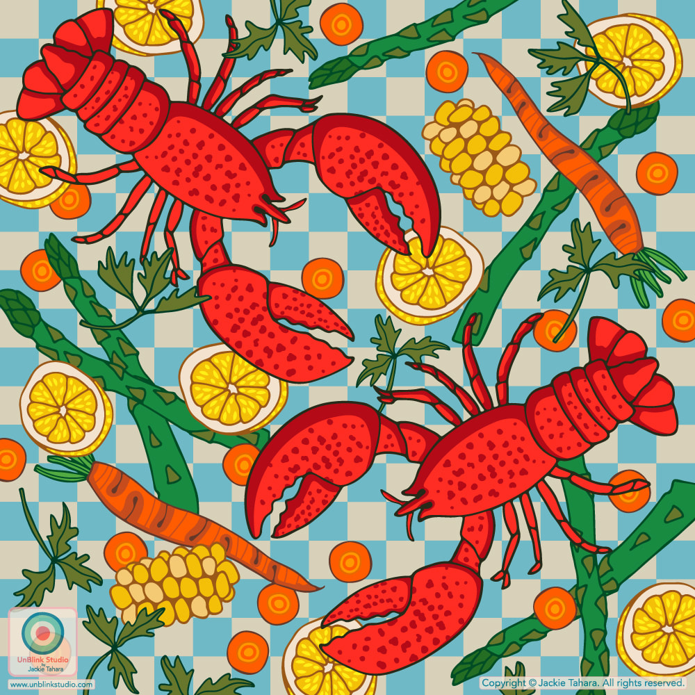 And now for something COMPLETELY different... Every once in awhile, I really like to “experiment” a bit with my print designs, and this time I was inspired by the Spoonflower Design Challenge theme: “Party Walls”! For this theme, I immediately thought about BALLOONS...This Challenge was for Wallpaper, but I really think my new “Party Balloons” print design also makes for some REALLY FUN bedding and home decor too! What kid (or adult!) wouldn’t want this pillow or sheet set (see below)?! What do you think?! Sorry for the late post, but public voting for the "Party Walls" Challenge closed May 7, but you can vote in the current Challenge HERE! And you can still shop this design in my Spoonflower Shop HERE. This links to the Large-Scale version, but it is also available in a Small-Scale and Medium-Scale version too! 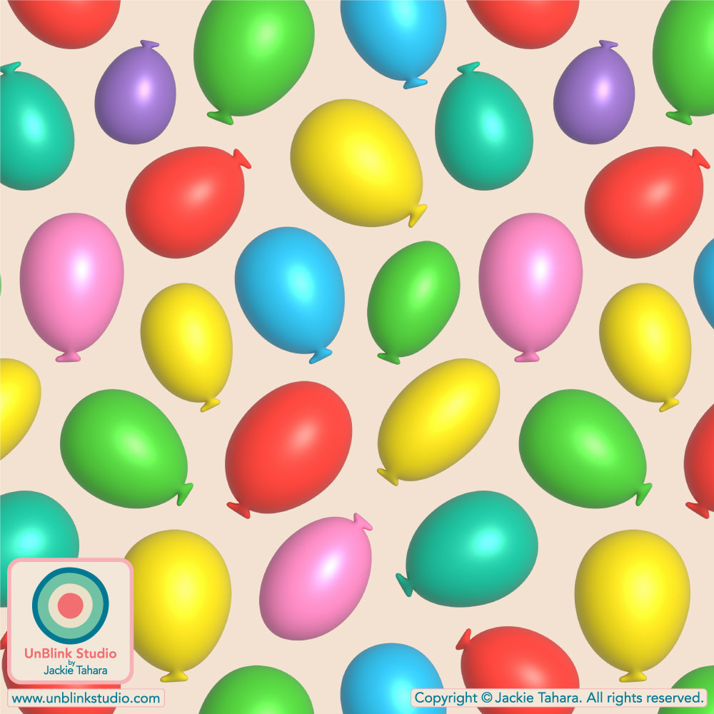
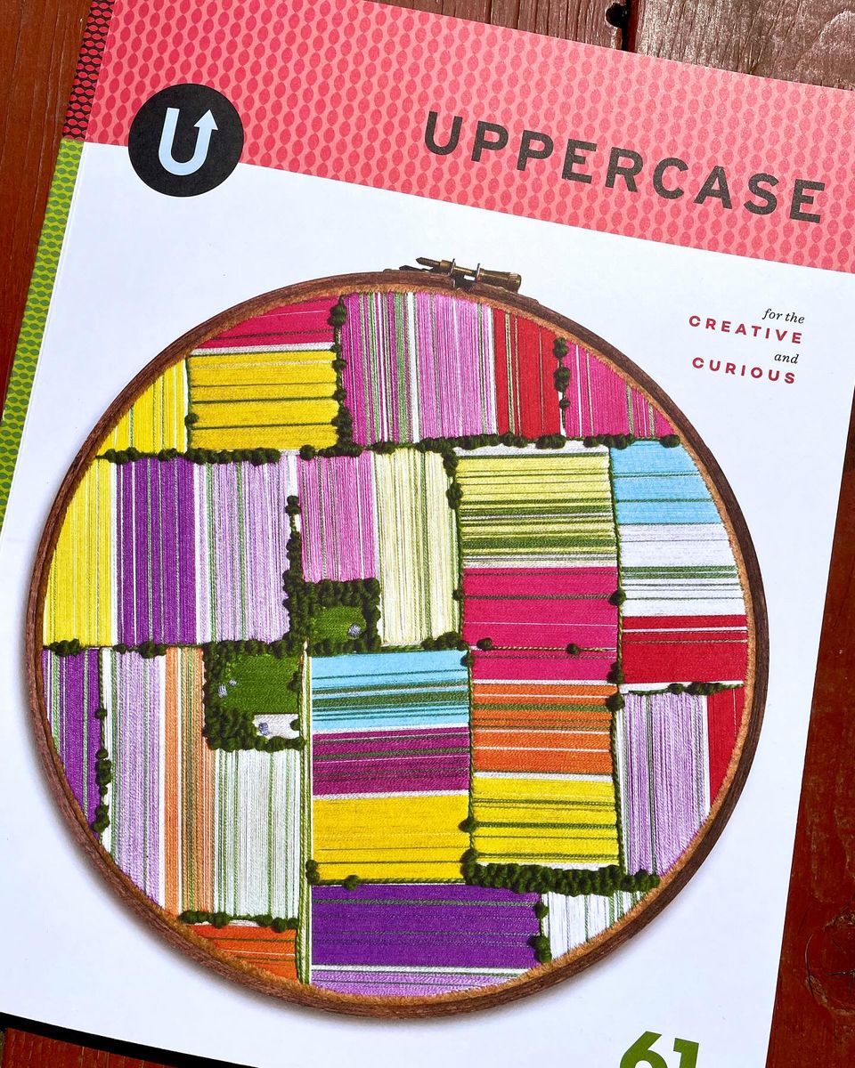
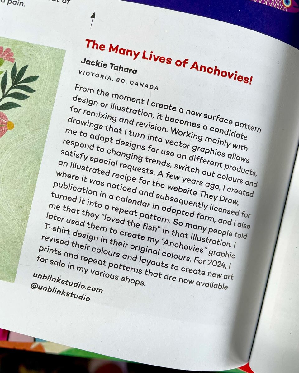
 The current Spoonflower Design Challenge is “Textured and Tonal Wallpaper”. When I saw “textured” I immediately started thinking about ikat weavings (maybe because I have several beautiful Indonesian ikat textiles hanging in my house, not to mention stacks of batik fabrics, woven silks, Indian block prints, call me obsessed...ANYWAY...). So I created my “Diamond Ikat” to enter in the Challenge. And then it got me motivated to re-fresh my “Spice Islands” Collection in these new Exotic Colours (Hot Pink, Purple, Red, Blue, Dark Teal, Blush Sand)! Now the whole "Spice Islands" Collection is available in my Spoonflower Shop on Fabrics, Wallpaper and Home Decor, and in my Sweden-based Happywall Shop on Wallpaper. Selected designs from this Collection are also available in my Society6 Shop on Bed & Bath, Tech Accessories, Apparel and much more! . Although I entered the first “Diamond Ikat” colourway in the Spoonflower Challenge, I ended up falling down the colour rabbit hole AGAIN, so you can see it now comes in a BUNCH of different colourways! Public voting for this Challenge closes Tuesday April 23. Sorry for the late notice, but if you're in time you can link to the Voting Page HERE! 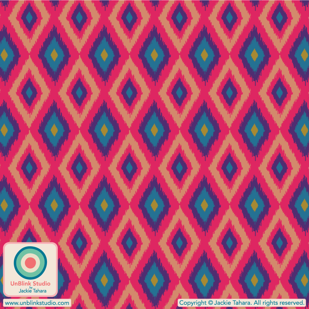 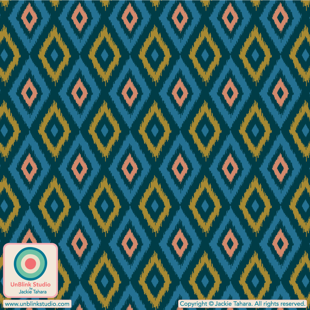 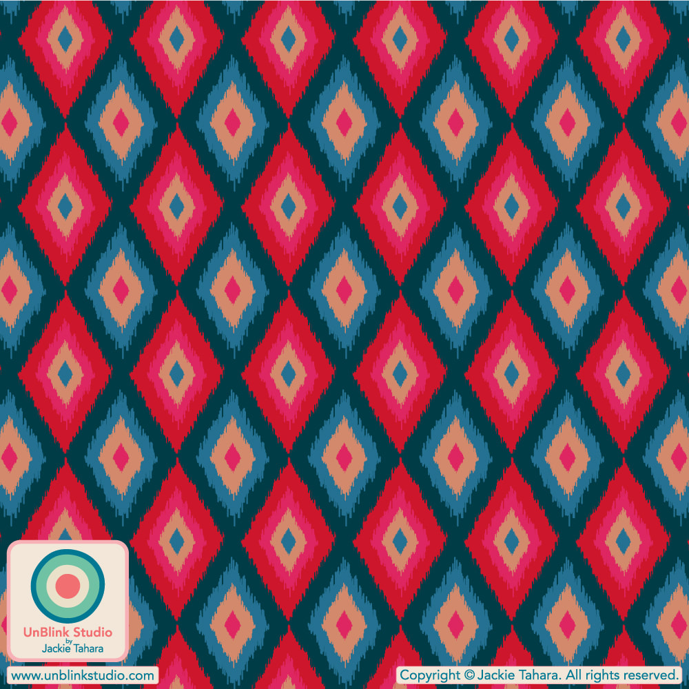 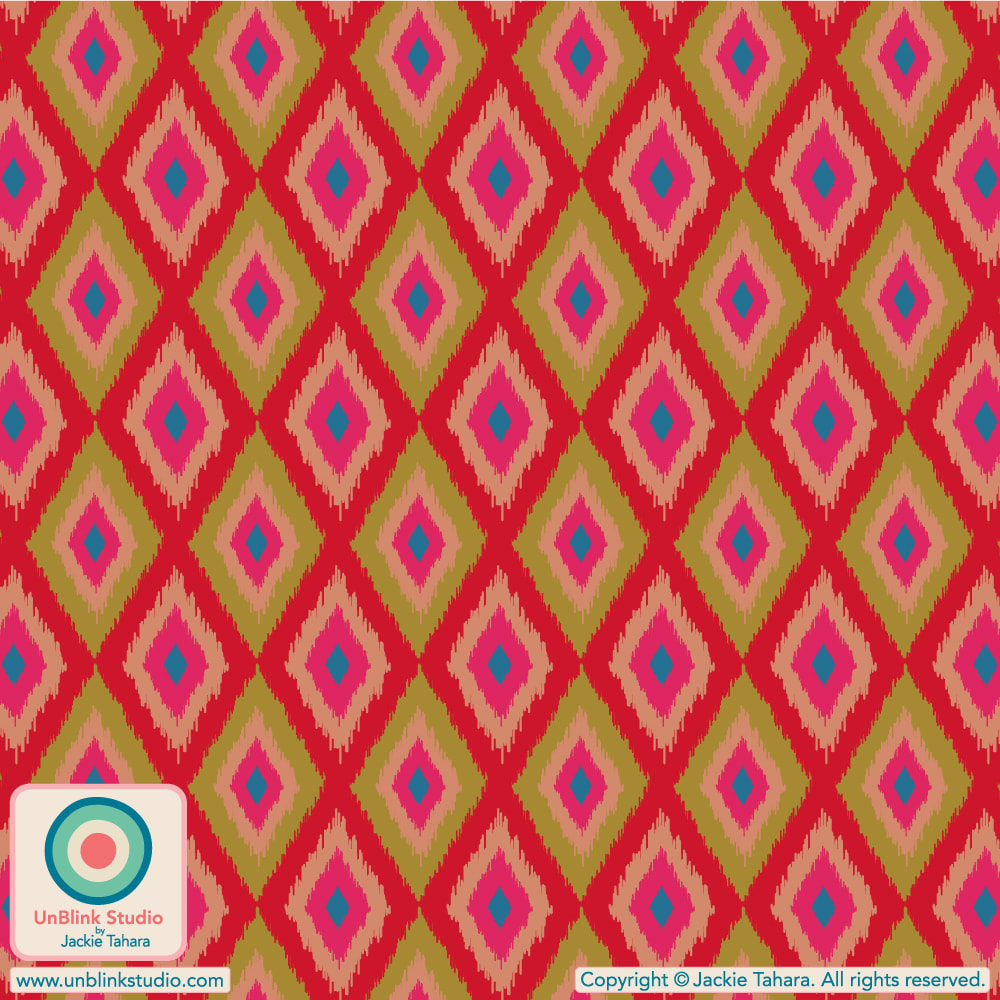 If you are a licensee or manufacturer who would like to know the latest in upcoming print trends for kidswear, the brand new "Prints & Graphics Sourcing Guide: Kidswear S/S 25" has just been released by WGSN, the world's leading consumer trend forecaster. This Guide includes several of my pattern designs in its identification of the key trends for Spring/Summer 2025 Kidswear! Please NOTE: You must be a WGSN subscriber to access this Guide. 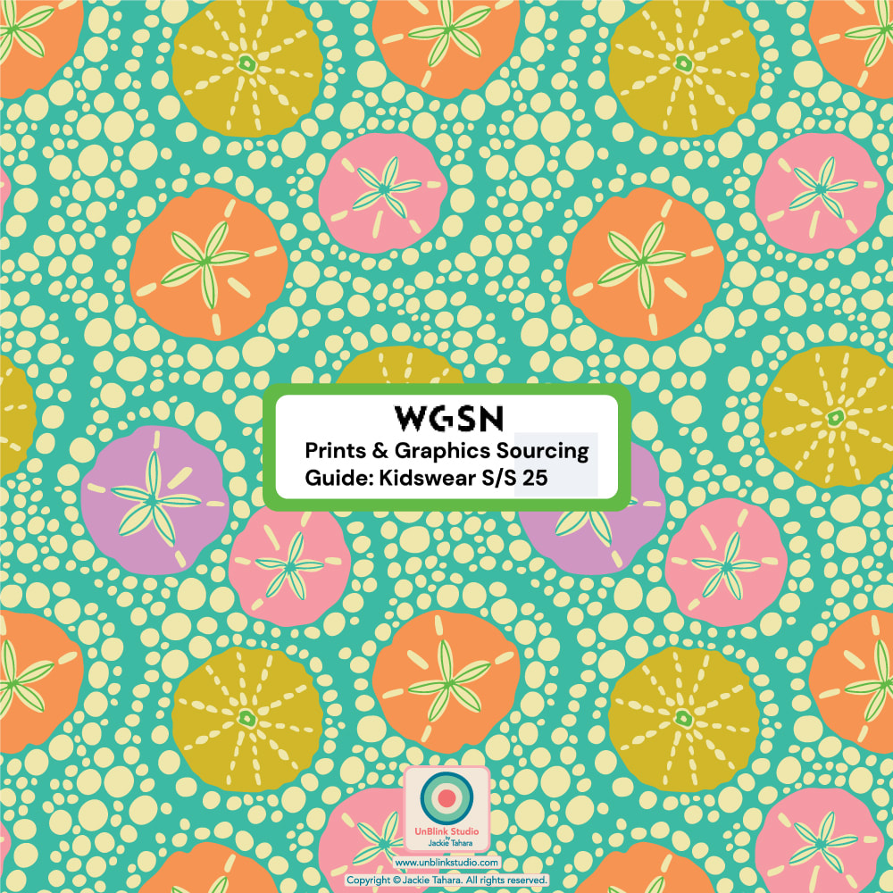 YAY!! I just got the newest Issue #61 of one of my favourite magazines Uppercase Magazine (which I highly recommend, I’ve had a subscription for years and so look forward to receiving each new inspiring issue, and I probably have EVERY book they’ve published, especially love the Encylcopedias of Inspiration!) and was happy to see the story behind my “Anchovies” artwork has been included in the “revisit/review/remix/revise” article! Read the story behind this artwork (see the last pic to read it here!) so you can understand why it was included for this theme! With thanks to Janine of Uppercase Magazine for including my artwork! 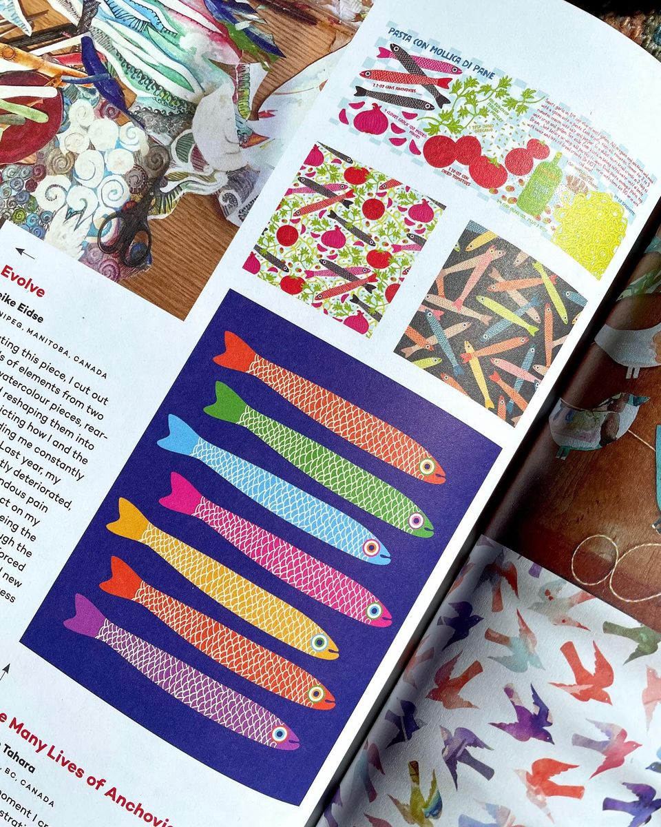
My Entry for the Spoonflower "Treat Yourself" Design Challenge: "Tempura Udon" (Of Course!)4/3/2024 The current Spoonflower Design Challenge is “Treat Yourself” and here’s my idea of a special treat! Imagine staring into a big steaming bowl of “Tempura Udon”, especially if you’re sitting in a little noodle ya in Kyoto after a full day of sightseeing and wandering about, on holiday...but I digress... Public voting for the “Treat Yourself” Challenge opened Thursday March 28 and closes next Tuesday April 9. You can link to the Voting Page HERE! . Eye Roll Note: When I asked my husband what he thought of my new “Tempura Udon” pattern design (I really like it, so I thought he’d say “Cool!” or “Groovy!”), you know what he said? “It looks like it’s in a square bowl”. Yeeees, but it’s a repeat pattern, soooo....🙄 . SHOP This Design! This yummy design is now available in my Spoonflower Shop on Fabrics, Wallpaper and Home Decor in several scales. You can SHOP the Medium-Scale HERE, but there is also a Large-Scale and Small-Scale version in my Shop too! If you prefer, my "Tempura Udon" print is also available in my Happywall Shop on FUN Wallpaper too! Ships from Sweden! 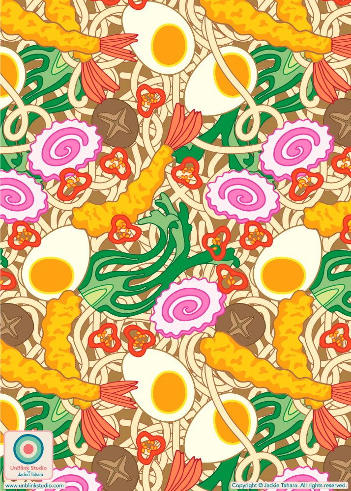 |
AuthorJackie Tahara of UnBlink Studio Archives
July 2024
Categories
All
|


 RSS Feed
|
|
|
|
|
|
All images on this website are Copyright © Jackie Tahara. All rights reserved.
If sharing, pinning or blogging my images, please always credit me and link back to my website. Supporting artists is a good thing to do! Thank you!
If sharing, pinning or blogging my images, please always credit me and link back to my website. Supporting artists is a good thing to do! Thank you!